
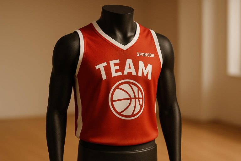
When creating custom basketball jerseys, proper logo placement is essential for a polished, professional look that aligns with league rules. Here’s what you need to know:
- Key Placement Areas: Focus on the chest, back, shoulders, and shorts for maximum visibility and impact.
- Size Matters: Logos should be proportional to the jersey, typically between 3–5 inches. Leagues like the NCAA limit team logos to 2.25 square inches.
- League Rules: Always check specific guidelines for logo size, placement, and sponsor restrictions to avoid penalties or redesigns.
- Consistency: Uniform logo placement across all jerseys ensures a cohesive team appearance.
- Avoid Mistakes: Steer clear of overlapping graphics, poor contrast, or inconsistent sizing.
Tools like digital templates and sublimation techniques can help you preview and perfect your design. Whether you’re showcasing a team logo or sponsor branding, strategic placement ensures your jerseys stand out on and off the court.
A Complete Guide to Design Placements
Basketball Jersey Logo Placement Rules
Understanding league logo placement rules is crucial to avoid penalties and expensive redesigns. Always check the specific decoration rules for your league before finalizing your jersey design.
"Before designing your basketball jersey, it’s a good idea to know the basketball uniform decoration rules and regulations." – Epic Sports
Now, let’s dive into the rules for team and sponsor logo placement.
Team Logo Placement Rules
The NCAA allows team logos up to 2.25 square inches, positioned between the neckline apex and the left shoulder seam.
For team names and player identification, NCAA guidelines permit a player or institutional name, or mascot, to appear on the back within the neutral zones. However, only two names are allowed: the school name and the player’s name. These must be placed horizontally and spaced at least one inch away from the number.
Numbers also have specific rules. Arabic numbers must appear on both the front and back, centered horizontally in the neutral zone. Back numbers must be at least 6 inches high, while front numbers should measure at least 4 inches high and 1 inch wide. Numbers may include colored borders, but the border width cannot exceed 0.5 inches.
These detailed NCAA regulations highlight the precision required for professional uniform design.
Sponsor Logo Placement Rules
Sponsor logos may be placed on the top shoulder, chest, sleeve, or near the back neckline. Some leagues also allow sponsor logos on shorts, commonly on the side panels or lower leg area.
The design should ensure sponsor logos are visible yet not overpowering, maintaining a balanced aesthetic. Additionally, the logo’s color should contrast appropriately with the jersey fabric to make the sponsor branding stand out effectively.
Professional jerseys aim to balance performance with commercial appeal. Sponsorship logos are strategically placed to boost marketability while preserving the team’s visual identity. Many associations also enforce rules against logos that conflict with ethical or moral standards, so it’s crucial to ensure sponsor content aligns with league policies.
Always double-check that your logo placements meet all league requirements to avoid compliance issues.
Best Areas for Logo Placement
When it comes to placing logos on basketball jerseys, the chest and back are the go-to spots. But there are other areas to consider that can elevate your branding game. By using additional spaces like the shoulders and basketball shorts, you can make the most of your jersey design while keeping it visually balanced.
Shoulder and Shorts Placement Options
Shoulder placement is a sleek and modern way to display logos. This spot ensures visibility from various angles during gameplay, making it ideal for sponsor logos or secondary team emblems. For the best effect, place the logo about 2 to 3 inches from the shoulder seam. This method adds branding without taking away from the main design elements.
Basketball shorts are another smart option for logo placement. Logos can be added to the side panels or lower leg areas, offering clear visibility without overcrowding the jersey. Some leagues even allow logos on shorts, giving you more room to promote brands while keeping the design functional and athletic.
Logo Sizing and Alignment Tips
Getting the size and alignment of your logo just right is key to creating a polished jersey design. If the logo is too large, it can dominate the jersey; too small, and it might go unnoticed. The goal is to strike a balance where your logo looks sharp, professional, and complies with league rules.
Logo Size Guidelines
Each league has specific rules about logo dimensions, so it’s important to know what applies to your team. For example, the NCAA limits logos to 2.25 square inches, so designs must fit within this boundary to stay compliant and maintain a professional appearance.
On the other hand, professional leagues like the NBA don’t enforce strict logo size rules, allowing teams more freedom in their branding decisions.
For high school teams governed by NFHS rules, the restrictions are the strictest – logos aren’t allowed on jerseys at all. Recreational and club leagues often adapt these rules, so always check with your league before finalizing your design.
| League | Logo Size Restriction |
|---|---|
| NCAA | 2.25 sq inches |
| NBA | Not specified |
| NFHS | Not allowed |
Keeping Logo Alignment Consistent
Once you’ve nailed the size, proper alignment is the next step to ensure a cohesive look across all jerseys. Uniformity in placement is what separates a professional design from an amateur one.
Consistent placement across all jersey sizes is critical. Whether it’s a small jersey for a guard or an extra-large one for a center, the logo should always appear in the same relative position. This can be achieved by using digital templates and precise measurements to standardize placement. Before finalizing, you can use temporary chalk markings to double-check alignment and avoid costly errors.
Digital simulation tools are particularly useful for previewing logo placement. They allow you to create a master template with exact measurements tied to key reference points, such as shoulder seams or necklines. Always use precise measurements in inches rather than vague descriptions like "center of chest" to eliminate guesswork and make it easier for the equipment manager or team coordinator to ensure accuracy.
Color consistency is just as important as alignment. The colors in your logo should maintain the same vibrancy and contrast across all jersey sizes and styles. This not only reinforces your team’s branding but also ensures a polished and unified appearance on the court.
sbb-itb-4d95ad3
Common Logo Placement Mistakes to Avoid
When designing jerseys, avoiding common logo placement mistakes is key to achieving a professional look and staying within league rules. Let’s dive into some missteps you’ll want to steer clear of.
Overlapping Graphics and Poor Contrast
Placing logos carelessly can make jerseys appear cluttered and even violate league regulations. Some common errors include overlapping logos with player names or numbers, cramming too many elements into the design, using colors that don’t contrast well (making logos hard to see), misaligning logos so they look off-center or crooked, and varying logo sizes inconsistently across the jersey.
Inconsistent sizing, in particular, can disrupt the overall design. A logo that’s too large can dominate the jersey, while one that’s too small might go unnoticed. The sweet spot lies in selecting a size that balances visibility with aesthetics.
Additionally, the fabric and printing method you choose can impact the clarity and durability of the logo. Certain materials or techniques may not hold up well, so it’s crucial to ensure the logo placement complements the jersey’s fabric and printing process.
League Regulation Violations
Failing to adhere to uniform guidelines can result in hefty consequences, from costly reprints to league penalties. These rules exist to maintain a uniform team appearance. In some cases, violations can even jeopardize your team’s eligibility to compete.
Always review the specific rules for your sport and league before finalizing your jersey design. Guidelines can vary significantly between recreational leagues, high school teams, and collegiate competitions. What’s acceptable in one setting might not fly in another.
Another common compliance issue is using outdated or incorrect logo versions. Always double-check that you’re working with the latest, approved logo to meet brand standards and avoid potential legal problems with sponsors or governing bodies.
Using Wooter Apparel‘s Design Tools
When it comes to designing professional basketball jerseys, Wooter Apparel has your back with tools that make the process straightforward and effective. Their free design services and advanced features ensure that your logo placement is spot-on. Let’s dive into how their digital preview tools and sublimation techniques can elevate your jersey design.
Digital Tools for Logo Placement Preview
Wooter Apparel provides free design services that allow you to see exactly how your logos will look on your jersey before placing an order. Their in-house graphic design team works closely with you, whether you’re starting from scratch or refining an existing concept – at no extra charge. This means you can tweak every detail, from logo centering to overall layout, before production starts.
"Start Your Custom Order Today! Let us bring your design to life!"
These tools make it easy to adjust elements like size, alignment, and color contrast. By previewing your design, you can spot and fix potential issues, such as overcrowding or low contrast, ensuring the final product matches your vision. These digital features work hand-in-hand with the sublimation process to deliver high-quality results.
Benefits of Custom Sublimated Jerseys
Wooter Apparel’s fully sublimated jerseys take your designs to the next level. Sublimation embeds your logos directly into the fabric, creating a smooth, durable finish that stands up to the rigors of the season. This process not only ensures your logos maintain their crisp, vibrant look but also enhances color accuracy for a professional appearance. The result? Jerseys that reinforce your team’s identity while looking sharp on the court.
Conclusion: Key Points for Logo Placement Success
Nailing the placement of your logo on custom basketball jerseys comes down to a few key principles that ensure a polished and professional look. The chest, back, and shoulders are prime spots for visibility – these areas naturally draw attention both on and off the court, making them ideal for showcasing your team’s brand. Thoughtful positioning not only boosts visibility but also keeps your design compliant with league rules.
Your logo should be clear and proportionate – big enough to be seen from the stands without dominating the overall design. The goal is to enhance the jersey’s look, not distract from it.
Don’t overlook technical details like color contrast and fabric compatibility. Strong contrast ensures your logo pops, while choosing the right fabric and printing method helps it stay sharp and vibrant through every game and season.
FAQs
What are the most common mistakes to avoid when placing logos on custom basketball jerseys?
When creating custom basketball jerseys, getting the logo placement right is crucial to achieving a polished and professional appearance for your team’s branding.
One mistake to avoid is placing logos in spots where they’re hard to notice or overshadowed by other elements, like player numbers or names. Another pitfall is overcrowding the jersey with too many logos, which can make the design feel chaotic and take away from its overall appeal. Additionally, misaligned, off-center, or crooked logos can instantly make the jersey look less professional.
To keep your jerseys looking clean and cohesive, position logos thoughtfully. Ensure they’re balanced with the rest of the design and don’t interfere with key details like numbers or team names. Smart logo placement not only boosts your team’s branding but also ensures the jerseys are functional and visually striking on the court.
How do I make sure my basketball jersey design meets league rules for logo placement?
To make sure your basketball jersey design meets league rules for logo placement, start by reviewing the specific guidelines set by your league. Most leagues require that logos, such as the league or sponsor logos, stay within a size limit of 2.25 square inches. These logos are usually positioned 2 inches below the neckline on the back or 5 inches below the shoulder seam on the front, ensuring they don’t interfere with the jersey numbers.
The manufacturer’s logo should be placed on the top right side of the jersey and must also adhere to the 2.25 square inch size restriction. Following these placement guidelines will not only keep your design compliant but also ensure your team looks sharp and professional.
What are the best ways to visualize and perfect logo placement on custom basketball jerseys?
Designing custom basketball jerseys with thoughtfully placed logos is essential for creating a polished and unified team appearance. To make this happen, tools like Adobe Illustrator or Photoshop can be incredibly helpful. These programs let you test different logo sizes and placements, so you can fine-tune your design before it goes into production.
If you want a more lifelike preview of your jerseys, try using mock-up templates or 3D visualization tools. These options allow you to see how the logos will look on the actual jersey, helping you feel confident about your choices. Putting effort into perfecting the logo placement doesn’t just boost team identity – it ensures your jerseys grab attention on the court.