
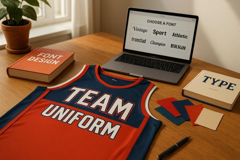
Choosing the right font for your team uniforms is about balancing readability, style, and team identity. Fonts on jerseys do more than display names and numbers – they shape how your team is perceived and ensure clarity during gameplay. Here’s what matters most:
- Readability: Fonts must be clear from a distance and under various conditions (e.g., bright sunlight or stadium lights). Bold, simple fonts work best for fast-paced sports.
- Team Branding: Fonts should reflect your team’s personality – sleek for modern teams, retro for nostalgic vibes, or bold for strength.
- League Rules: Always check font size, style, and placement guidelines to avoid penalties or redesigns.
- Contrast and Visibility: Light text on dark backgrounds (or vice versa) ensures easy readability. Avoid extreme contrasts that strain the eyes.
- Custom Fonts: A unique font can set your team apart, but it must remain functional across jerseys, merchandise, and digital platforms.
Modern production techniques, like sublimation, allow for durable and detailed typography, making creative designs possible without sacrificing performance. Whether you’re designing for youth leagues or professional teams, the right font enhances your team’s identity while ensuring players are easily identifiable. Focus on clarity, style, and consistency to leave a lasting impression.
The 10 Best FREE Fonts for Sports Design
Font Readability and Legibility Basics
Continuing from our earlier discussion on typography’s role in shaping team identity, let’s delve into the basics of readability and legibility – two key elements in uniform design. Legibility refers to how easily individual letters can be distinguished, while readability focuses on how smoothly the eye can process words and blocks of text. Typography expert J. Ben Lieberman puts it succinctly:
"Legibility" is based on the ease with which one letter can be told from the other. "Readability" is the ease with which the eye can absorb the message and move along the line.
Both are crucial for team uniforms, where quick and clear identification of players is essential in fast-paced games. While legibility is a prerequisite for readability, improving one doesn’t always guarantee the other.
What Affects Font Readability
A variety of factors influence whether fonts on team uniforms are easy to read. Font size is one of the most important considerations. Player names should measure at least 2–3 inches tall, while numbers typically range from 6–8 inches. But size alone won’t ensure clarity.
Contrast plays a major role as well. High contrast between text and background colors generally improves readability, but extreme contrast can sometimes hinder legibility, especially for individuals with dyslexia. A good rule of thumb is to use light-colored text on dark backgrounds or vice versa. For better accessibility, experts suggest avoiding pure black on pure white and instead recommend softer tones like off-white paired with off-black.
Other factors like kerning (the spacing between letters), tracking (overall spacing across a word), and letter proportions also contribute to readability. Features such as x-height (the height of lowercase letters), stroke contrast, character shapes, and the size of counters (the enclosed spaces within letters) all impact how easily text can be read.
Font weight and style are equally important. Bold, simple fonts are often the clearest, which is why block fonts are preferred in sports like football, hockey, and rugby. On the other hand, sleek sans-serif fonts are often used for basketball, soccer, and baseball uniforms. Script fonts, while visually appealing, are better suited for sports like volleyball, golf, or corporate leagues, where text is viewed up close.
Making Fonts Visible in All Conditions
Uniforms need to remain readable across various lighting conditions, from bright midday sun to evening games under stadium lights. High-contrast combinations, like black with yellow or white with red, work well for visibility. To reduce glare in bright sunlight, matte or anti-glare finishes are recommended. For low-light environments, bright tones like white, yellow, and neon are ideal because they reflect light effectively.
Distance and motion add another layer of complexity. Names and numbers must remain clear from far away, so testing different font sizes is essential to ensure visibility for spectators and officials alike. Decorative fonts should be avoided, as they can compromise clarity during fast-paced gameplay.
Environmental factors also come into play. Weather conditions, field surfaces, and viewing angles can all affect how uniforms appear. Designers must consider how text looks when players are running, standing still, or viewed from different perspectives.
Following League Font Rules
Most sports leagues enforce specific guidelines for font styles, sizes, and placement to maintain consistency and ensure fair play. These rules often emphasize clarity and professionalism, restricting overly decorative or stylized fonts that could make player identification difficult.
Font size requirements vary depending on the sport and league level. For example, professional leagues require player names and numbers to be easily legible and consistent to facilitate identification during games.
Placement rules are also important. Many leagues dictate where logos, names, and numbers can appear on uniforms. Ignoring these guidelines can lead to costly redesigns or penalties, so it’s crucial to confirm league requirements before finalizing any design.
Matching Fonts to Your Team Brand
Choosing the right fonts goes beyond just making text easy to read – it’s a chance to showcase your team’s personality and build a unified brand presence. The right font can capture the essence of your team’s identity and make a lasting impression on fans and supporters alike.
Picking Fonts That Match Team Personality
Fonts have the power to evoke emotions and shape perceptions. Think about how different styles can complement your team’s image: classic script fonts often convey a sense of prestige (perfect for teams with a long-standing history), while bold or sleek fonts project strength and a modern edge. If your team wants to tap into nostalgia, retro or vintage fonts can connect fans to a rich history or cherished memories.
Keeping Brand Consistency
Using consistent fonts across all platforms is key to creating a recognizable and unified brand identity. As J2 Marketing explains:
"Choosing the right font for your brand is a vital decision that can significantly impact how your brand is perceived. Fonts aren’t just a matter of aesthetics; they convey tone and personality and can even influence the emotions of your audience."
The Adobe Acrobat Team echoes this sentiment:
"Selecting the right fonts is crucial for any business when defining brand identity and setting the tone for corporate messages."
To achieve this consistency, establish typography guidelines that specify the typeface, size, and weight for various text elements. Stick to a maximum of three fonts – one for headings, one for subheadings, and one for body text. These guidelines should be part of a detailed brand guide that ensures your fonts are used correctly across all materials, from uniforms and warmup gear to promotional items and digital content.
Using Custom Fonts for Your Team
Custom fonts can take your team’s branding to the next level, offering a distinct identity that sets you apart. While standard fonts can work just fine, a custom font adds a personal touch that reflects your team’s unique character. For example, in 2018, Airbnb introduced its custom font, Cereal – a modern, approachable sans-serif designed by Dalton Maag. This font was crafted to embody qualities like warmth, simplicity, and accessibility, while ensuring it was easy to read across all platforms and materials.
For sports teams, custom fonts can be designed to complement team colors, uniform materials, and even specific sizing needs. Collaborating with experienced uniform designers is essential to ensure the typography works seamlessly on sports apparel. Wooter Apparel, for instance, specializes in creating custom team uniforms with fully sublimated designs. They even offer free custom design services, making it easy to integrate unique typography that perfectly represents your team’s style and spirit.
sbb-itb-4d95ad3
Testing Fonts for Real-World Use
Once you’ve established brand consistency, the next step is to put your chosen fonts to the test in real-world scenarios. This means evaluating how they perform during actual games, under stadium lights, and when viewed from the stands.
Testing Fonts on Uniform Materials
Uniform materials can distort even the sharpest fonts, so it’s essential to print samples on actual fabrics to assess their clarity. Start by checking the contrast between your font and background colors. According to the Web Content Accessibility Guidelines, normal text should have a contrast ratio of at least 4.5:1, while large text requires a minimum of 3:1. Tools like the WebAIM Contrast Checker can help you ensure your color combinations meet these standards.
Different fabrics, like polyester or mesh, can affect how fonts appear. These materials might blur or distort text in ways that aren’t noticeable on a computer screen. Testing with various font sizes is also important to confirm that both large jersey numbers and smaller design elements remain legible across different fabric types.
Choosing Fonts for Different Sports
Beyond material considerations, evaluate how fonts perform within the visual context of each sport. Every sport has its own visual style, and your font choice should align with those expectations. For example:
- Football often uses bold, blocky letters with strong horizontal elements.
- Basketball tends to favor tall, vertical forms.
- Soccer frequently incorporates dynamic angles and curves to convey motion.
Ensure the fonts work not only on jerseys but also on stadium signage, scoreboards, and digital screens. Jersey numbers, in particular, must be easily recognizable from a distance, while digital applications may require font versions optimized for smaller screens.
A great example is Premier Sans, a typeface developed for the Premier League. It was designed to perform well across multiple platforms and sizes while maintaining clear, distinct numerals.
Balancing Style and Function
After testing fonts on materials and for specific sports, you need to strike a balance between style and readability. Fonts must look good and perform well. While clarity is crucial for player identification, you don’t have to sacrifice style entirely. Opt for bold fonts with clean lines to ensure they remain legible from any distance.
Avoid overly decorative fonts that might look appealing up close but become unreadable from afar. For example, an ornate script may impress on paper but could fail when viewed from the stands.
Collect feedback from coaches, players, and fans to gauge clarity and overall appeal. What appears clear to you might not be as legible to others, especially when viewed from different angles or distances.
Keep your audience in mind when finalizing your font choice. Youth sports might benefit from fun, approachable fonts, while professional leagues often require a more polished, authoritative look. Extreme sports, on the other hand, might call for edgier typefaces that match their high-energy vibe.
Lastly, test your fonts across digital devices – desktops, laptops, tablets, and smartphones – to ensure they render consistently and remain easy to read. A strong digital presence reinforces your team’s identity, tying together the design of physical uniforms and online branding. These real-world tests ensure your font choices are both practical and impactful, helping your team stand out on and off the field.
Current Font Trends in Sports Uniforms
The world of sports typography is shifting, blending timeless traditions with cutting-edge design in 2025. Teams are opting for fonts that radiate energy, embody competitive spirit, and ensure clear visibility during games.
Popular Sports Fonts in 2025
Bold sans-serif fonts remain a staple in sports design, but they’ve evolved to be more refined. Booster Sans, with its clean, geometric style, is a favorite for uniforms and stadium banners alike. Retro-inspired fonts are also making waves, with Gridiron Slab modernizing classic varsity lettering. This font gives teams a confident and established look, ideal for emblems and patches.
Dynamic, angular fonts are gaining traction for their ability to convey speed and motion. Velocity Italic is a prime example, with its slanted design suggesting movement – perfect for racing teams and extreme sports. Similarly, Rushblade uses sharp, precise lines to project a cutting-edge image, appealing to teams that want to stand out.
"Sports fonts need to do heavy lifting – they must be bold enough to catch the eye, dynamic enough to convey motion, and distinctive enough to stand out in a crowded field." – Design Work Life
The influence of esports is also reshaping traditional sports typography. Apex Pro combines minimalist aesthetics with futuristic touches, appealing to tech-savvy brands and younger audiences. Zonex pushes this trend further with geometric designs that create striking logos for modern sports teams. For maximum readability, Titan Block has become the go-to for stadium signage and merchandise. Its bold, all-caps design ensures visibility from any distance, meeting the crucial need for clear player identification.
These trends reflect the growing impact of advanced production methods on typography design.
How Fully Sublimated Designs Change Typography
Advances in production techniques, particularly fully sublimated uniforms, are transforming the way typography is integrated into sportswear. By embedding designs directly into fabric, sublimation eliminates issues like cracking or peeling, opening up new creative possibilities.
Through sublimation, companies like Wooter Apparel enable intricate designs, gradients, and color variations that traditional printing methods can’t achieve. Fonts like Neo Outline, with its sharp, modern edges, pop on jersey numbers and digital graphics. Sublimation’s durability allows teams to experiment with more elaborate typography without worrying about wear and tear.
This technique also brings fonts like Sprint Script into play. With its handwritten, athletic style, it adds personality and energy to team logos and specialty designs when embedded directly into the fabric. Sublimation even supports detailed fonts like Ultramax Stencil, a rugged design that conveys endurance and toughness – perfect for teams seeking a gritty, determined image. The precision of this process ensures every detail stays sharp, no matter how intense the game.
Custom Fonts in Competitive Sports
Custom fonts are becoming a key tool for professional and collegiate teams to carve out distinct brand identities. In 2014, the NBA’s Charlotte Hornets revamped their branding with a custom typeface called "Buzz City", modernizing their look while emphasizing their connection to Charlotte. Similarly, Arsenal, an English Premier League club, introduced a bespoke font named "Avenir Next" in 2019, aligning with their sleek and contemporary image.
"Fonts are a key part of your club’s visual story, representing their ethos and bringing designs to life." – Avery Dennison
Custom typography creates an emotional bond that extends beyond the field. A team’s unique font sparks instant recognition and loyalty among fans, making it a powerful tool for building team culture and engagement. This trend is also trickling down to amateur and youth sports. Fonts like Gameday, with its bold, angular sans-serif design, offer a professional look without the need for a fully custom solution. Similarly, Quarterback captures the essence of football with its strong, angular style, giving teams a sport-specific edge.
Teams are also choosing fonts that reflect the essence of their sport. Cricket, a script font inspired by the elegance of the Olympics, balances sophistication with motion, making it ideal for teams wanting to project both class and athleticism. For the fitness world, Crossfly – a modern, geometric design – fits perfectly with CrossFit and yoga branding.
Investing in distinctive typography pays off in merchandise sales, social media engagement, and overall brand recognition. As graphic designer Preston Lee explains:
"The right sports font instantly communicates energy, strength, and competitive spirit – whether you’re designing team jerseys, creating event posters, or building a fitness brand from scratch"
Conclusion: Key Points for Choosing the Right Font
When selecting a font for your team, it’s all about finding the sweet spot between readability, brand identity, and practicality. A font that looks amazing on paper won’t do much good if fans can’t read player names and numbers from the stands. On the flip side, the clearest font might fall flat if it doesn’t reflect your team’s personality.
Testing your font in real-world scenarios is crucial. As noted by researchers Legge and Bigelow:
"The legibility of print depends on the physical characteristics of the text and viewing conditions and the vision status of the reader."
Factors like stadium lighting, distance from viewers, and how fabric moves during play can significantly impact how a font performs. Make sure text sizes are appropriate for how far away they’ll be viewed.
Your font should also align with your team’s identity while maintaining a professional look. Consistent typography across uniforms, promotional materials, and merchandise strengthens brand recognition. Modern production techniques, like fully sublimated designs, open up creative possibilities. For example, companies like Wooter Apparel use this technology to embed intricate fonts and vibrant colors directly into the fabric, ensuring durability without cracking or peeling.
Keep in mind the specific demands of your sport. High-speed sports require fonts that stay clear and legible during fast-paced action, while others might allow for more decorative styles. Don’t forget to factor in league rules and how the uniforms will appear both on the field and in photos.
Investing in the right typography isn’t just about aesthetics – it’s about fostering team pride, enhancing fan connection, and projecting professionalism. When you strike the right balance between visibility, personality, and durability, your font becomes a powerful symbol of your team’s identity, one that players and fans will proudly stand behind season after season.
FAQs
How can I make sure the font on our team uniforms follows league rules?
To make sure your team’s uniform fonts meet league rules, start by carefully reviewing the league’s specific guidelines. Pay attention to details like font size, style, and placement, especially for jersey numbers and logos. The font should be easy to read and meet any visibility requirements for gameplay.
If you’re uncertain about any of the rules, don’t hesitate to contact your league or check with your uniform provider to verify compliance. Following these steps will help you steer clear of game-day problems while ensuring your team looks polished and professional.
How can I test if a font will look good and be readable on team uniforms?
When designing fonts for team uniforms, it’s important to focus on size and contrast to ensure readability. The font should be easy to read from a distance and should stand out against the uniform’s colors. Opt for high-contrast color combinations to improve visibility, especially during games where clarity matters most.
Another key step is testing the font directly on the uniform material. Print samples on the actual fabric to evaluate durability and color clarity. This helps confirm that the design stays sharp and legible, even after repeated wear and washing. By following these steps, you can create uniforms that not only look great but also support your team’s identity and performance.
How can I choose a unique team font that’s also easy to read during games?
When choosing a font for your team’s uniforms, it’s important to strike a balance between standing out and staying easy to read. Bold, clean sans-serif or block fonts – like Varsity or Jersey-style fonts – are ideal. These fonts are designed to be highly visible, even during the fast action of a game, making names and numbers easy to spot from a distance.
Steer clear of overly decorative or script-style fonts, as they can make reading difficult, especially during quick movements on the field. Instead, opt for fonts with simple, geometric shapes that help your team look sharp while ensuring clarity for players and fans alike. Readability should always take priority, so your uniforms remain both stylish and practical in any game situation.