
Discover Perfect Palettes with a Color Scheme Converter
Designing a project that looks cohesive and professional often comes down to one key element: color. Whether you’re building a website, crafting a brand identity, or working on a print piece, finding the right hues can feel overwhelming. That’s where a tool to adapt and transform color schemes becomes a game-changer. It simplifies the process by taking a single shade and turning it into a full, harmonious set of tones for your creative work.
Why Color Harmony Matters
Ever notice how some designs just feel right? That’s often due to a well-balanced palette. For beginners or hobbyists, though, diving into color theory can seem daunting. You don’t need to spend hours studying wheels and charts—a simple palette generator can suggest matching shades in seconds. Input a base tone, like a vibrant teal or a soft gray, and get instant ideas for complementary or nearby hues that work together. Plus, seeing a quick visual mockup helps you decide if the vibe matches your vision before you commit.
Tips for Using Generated Palettes
Remember that screens can trick the eye. A palette that looks flawless online might shift in print or on another device. Always test your colors in context, and don’t shy away from tweaking them slightly to fit your needs. With the right tool, exploring options for your design becomes less of a chore and more of a creative spark.
FAQs
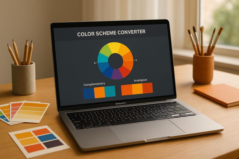
How does the Color Scheme Converter pick related colors?
Great question! Our tool uses basic color theory, based on the color wheel, to suggest palettes. For instance, if you input a red shade like #FF0000, a complementary scheme will pair it with a green tone directly opposite on the wheel. Analogous schemes pick colors next to your input, while triadic ones grab three evenly spaced hues. It’s a simple, reliable way to get balanced combinations without needing a design degree.
Can I trust the colors I see in the preview?
The preview is a handy starting point to visualize your palette, but keep in mind that colors can look different depending on your screen or device settings. A bright blue on your laptop might shift slightly on a phone or in print. We always recommend testing your final palette on the medium you’re designing for—whether it’s a website, poster, or logo—to make sure it pops just right.
What if I don’t know HEX or RGB codes?
No worries at all! You don’t need to be a tech wizard to use this tool. Just type in a common color name like ‘blue’ or ‘coral,’ and we’ll handle the rest by converting it to a usable code behind the scenes. If you’ve got a specific shade in mind, you can also play around with the input until the preview matches what you’re picturing. It’s all about making this easy for you.