
Proper logo placement on team uniforms is essential for a polished, professional look. Whether you’re designing jerseys for youth leagues or competitive teams, getting the size, alignment, and spacing right ensures your uniforms stand out for all the right reasons. Here’s what you need to know:
- Key Placement Zones: Logos typically go on the left chest, center chest, right chest, sleeves, upper back, lower back, and shorts. Each area serves a unique purpose for branding or team identity.
- Sizing Guidelines: Logo sizes should vary by garment size (e.g., 3–4 inches wide for adults, 2–2.5 inches for youth). Adjust placement for women’s cuts and larger sizes to maintain balance.
- Alignment & Symmetry: Use clear reference points like the center seam or shoulder seams to ensure logos are straight and evenly placed. Test for symmetry, especially with paired logos on sleeves.
- Spacing Rules: Maintain consistent margins (e.g., 1.5 inches from the neckline for chest logos) to avoid crowding or overlap. Allow extra space in high-stretch areas to prevent distortion.
- Pre-Production Checks: Create physical samples to confirm placement, scaling, and visibility during actual use. Gather team feedback and document final measurements for consistency.
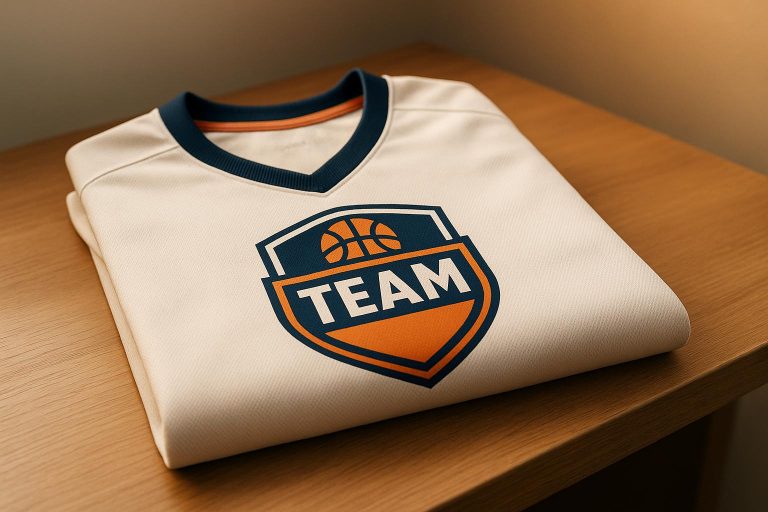
Logo Placement 101: Tips to make the Perfect Shirt!
Logo Placement Zones on Team Uniforms
Knowing where to place logos on team uniforms is key to creating a polished and cohesive look. Each placement area serves its own role, contributing to the overall identity of the team. Picking the right spot for logos or branding elements ensures the uniform looks professional and functional. Below, we’ll cover the main placement zones and how to measure and size logos for each.
Standard Placement Areas
The left chest is the classic spot for team logos. Positioned near the heart, it carries a symbolic connection to team spirit and identity.
The center chest is ideal for making a bold statement. It’s perfect for large team names or a primary sponsor’s logo, thanks to the wide, uninterrupted space available on the jersey’s front.
The right chest offers balance when multiple logos are involved. It’s often used for secondary sponsor logos, league emblems, or special patches, complementing the left chest placement.
Sleeves provide versatile branding opportunities. The upper sleeve is great for sponsor logos or identifiers, while the lower sleeve works well for smaller details like manufacturer logos or emblems.
The upper back, located between the shoulder blades, is highly visible and works well for team names, player surnames, or larger sponsor logos during gameplay. The lower back, just beneath the jersey number, is a subtler option for smaller logos or league identifiers, blending into the design without distraction.
Additional branding spots include shorts or pants, particularly along the upper thigh or side seams, which can enhance the uniform’s overall design.
Measurement Guidelines for Placement Zones
Logo sizing and placement should be adjusted based on whether the uniform is for adults or youth. Scaling the logo proportionately ensures the design fits the jersey layout while remaining clear and visually appealing.
For left chest logos, scale the size to be noticeable but not overpowering. Align the logo with the shoulder and side seams for a clean look.
Center chest logos should be large enough to stand out but still fit neatly within the jersey’s front panel. Centering the logo both horizontally and vertically ensures a balanced appearance.
When placing logos on sleeves, make sure they’re clear and well-positioned. Whether on the upper or lower sleeve, keep them spaced from seams and cuffs for a tidy look.
For back placements, center the logo and leave enough space from the neckline to maintain a balanced and professional design.
Always consider the fit of the uniform and the intensity of the activity when finalizing logo placement. Proper adjustments ensure the design looks great and stays functional on the field.
Logo Sizing Guidelines
Getting the size of a logo just right is key to creating professional-looking team uniforms. If the logo is too big, it can overwhelm the design; if it’s too small, it might fade into the background. The goal is to make the logo noticeable without it taking over the entire uniform.
Different factors like garment size, age group, and gender-specific cuts all play a role in logo placement and sizing. A logo that looks perfect on an adult medium jersey might look awkwardly large on a youth small or sit incorrectly on a women’s cut shirt.
Step-by-Step Sizing Process
Start with standard adult measurements. For chest placement on adult shirts, logos are generally 3–4 inches wide, with 3.5″ x 3.5″ as a common standard size.
For youth sizes, scale the logo down to 2–2.5 inches wide to keep it proportional.
When it comes to women’s uniforms, the logo size can stay the same as men’s, but the placement often needs adjustment. Raising the logo by about 1 inch ensures it sits properly on the garment’s contours and maintains a balanced look.
For larger sizes (XL and above), subtle adjustments in positioning can make a big difference. Moving the logo 0.5 inches further from the center or collar for each size increment helps maintain proportionality.
| Shirt Size/Type | Logo Width (Chest Placement) | Vertical Placement | Horizontal Placement |
|---|---|---|---|
| Adult Shirts | 3–4 inches wide (commonly 3.5″ x 3.5″) | 3–4 inches below collar/shoulder seam | 4–6 inches from center |
| Youth/Toddler Sizes | 2–2.5 inches wide | Scale proportionally | Scale proportionally |
| Women’s Shirts | Same as adult | 1 inch higher than men’s shirts | Same as adult |
| XL+ Sizes | Same as adult | Adjust 0.5 inches per size increment | 0.5 inches further from center per size |
Before moving into production, mock up your design on actual garments. Look at the samples from various angles and distances to confirm the logo is visible, balanced, and works well with the overall uniform design. Keep in mind that what looks good on a screen doesn’t always translate perfectly to fabric.
Now, let’s address some common mistakes that can derail your uniform’s consistency.
Common Sizing Mistakes
Even with the right process, a few errors can throw off your design.
One common mistake is using a one-size-fits-all approach. Applying the same logo dimensions across all uniform sizes can make logos look too large on smaller garments or too small on larger ones, creating a mismatched appearance.
Another issue is ignoring garment features. Overlooking elements like pockets, seams, or zippers can lead to logos clashing with other design details, disrupting the overall look.
Oversized logos can feel cluttered, while undersized logos might go unnoticed, especially from a distance. The logo should enhance the uniform’s design, not overpower it.
Lastly, inconsistent scaling across different uniform pieces can ruin the cohesive look of a team’s apparel. Whether it’s jerseys, shorts, or other items, sticking to proportional guidelines ensures a professional and unified appearance. Consistency reinforces the team’s identity and keeps the uniform visually polished.
Alignment and Symmetry Checklist
Getting alignment right is what turns a uniform from “just okay” to polished and professional. Even small missteps in placement can throw off the entire look. To nail that polished appearance, it’s all about using consistent measurements and clear reference points, no matter the uniform style.
Vertical and Horizontal Alignment
Start by setting clear reference points before placing any logos. For chest logos, the garment’s center seam is your best horizontal guide – it helps keep the logo perfectly centered. For vertical positioning, skip the guesswork. Use a ruler to measure and mark the spot with an alignment tool, ensuring consistency every time.
Neckline styles can complicate things, so adjust placements to avoid overlapping with design elements. Always double-check alignment from multiple perspectives – lay the garment flat and look at it from different angles. Sleeve logos, for example, should use the shoulder seam as a guide to ensure they’re placed consistently across various sizes.
These steps help create a clean and balanced look, especially when paired logos come into play.
Symmetry for Paired Logos
Symmetry takes alignment to the next level, especially when dealing with paired logos like those on sleeves or shoulders. Even a tiny difference in placement can stand out when the logos are viewed together. Use a measurement template to account for variations in garment construction – sleeve styles like raglan and set-in have different seam placements, so adjustments are key. Always measure from consistent reference points to keep symmetry tight, and document your measurements for future use.
Don’t forget to think about how the uniform moves when worn. A logo that looks perfectly aligned on a flat surface might shift when the fabric stretches. Test sample uniforms in real-world conditions to spot any issues. Finally, check your alignment system across all sizes to make sure the look stays balanced, no matter who’s wearing it.
sbb-itb-4d95ad3
Spacing and Margin Guidelines
Consistent spacing is just as important as proper alignment when it comes to creating a polished and professional uniform. Smart spacing ensures your logos stand out, keeps uniforms looking sharp throughout the season, and protects your investment. Let’s break down the recommended margin guidelines for different placement zones to maintain a clean and balanced design.
Recommended Margins for Different Zones
Each placement zone on a uniform has specific spacing requirements to ensure visual balance and avoid design conflicts. For chest logos, leave at least 1.5 inches of space from the neckline and 2 inches from any side seams. This prevents the logo from being obscured by collar folds or appearing too close to construction seams.
When it comes to sleeve logos, maintain a minimum of 1 inch from shoulder seams and 0.75 inches from decorative piping or trim. For back logos, allow 3 inches of clearance from the neckline and 2 inches from player names or numbers. This spacing avoids overlap, especially when names vary in length.
If your uniform includes pockets or zippers, keep logos at least 1.25 inches away to prevent visual clutter. For number placement zones, ensure at least 2.5 inches of space from any logos to keep both elements clear and readable. These measurements generally work across most standard uniform sizes, but always test on your largest size to confirm appropriate spacing.
Hem and cuff areas need a minimum of 1 inch of clearance to prevent logos from disappearing into folds or experiencing wear and tear. For side panel logos, maintain at least 0.75 inches from construction seams to preserve clean lines and avoid distortion when the fabric stretches or moves.
By following these guidelines, you’ll ensure every logo maintains its clarity and placement integrity.
Avoiding Crowding and Overlap
Spacing isn’t just about margins – it’s also about avoiding overcrowding, which can make even the most well-designed uniform feel disorganized. The human eye needs negative space around logos and design elements to process them effectively. Overloading a uniform with too many elements reduces its visual impact and can create a cluttered appearance.
Start by mapping out all design elements before placing any logos. Establish a visual hierarchy, giving the most important element – usually the team logo – the most prominent position with ample space. Secondary elements, like sponsor logos, should complement the primary branding rather than compete with it.
Overlapping elements are a common mistake, often caused by trying to fit too much onto a single area. If space is limited, consider spreading elements across different parts of the uniform. For example, a clean chest logo paired with sleeve sponsor logos often looks more professional than cramming everything onto the front.
To catch potential spacing issues, review the uniform from about 20 feet away. What looks fine up close can blur or appear cluttered from a distance, especially when viewed from the stands. This simple distance test can help you spot problems before production.
Pay special attention to high-stretch areas like underarms and side panels. Logos placed too close together in these areas may distort or overlap when the fabric stretches during movement. Allow extra margin in these areas to maintain separation and clarity during active play.
Finally, consider the overall visual weight of the design. Even if logos are properly spaced, too many competing elements can overwhelm the uniform. Sometimes, less is more – a single, well-placed logo can have a stronger impact than multiple smaller ones scattered across the design. Prioritize simplicity to create a clean, professional look.
Pre-Production Quality Checks
Ensuring top-notch results starts with thorough pre-production quality checks. These steps are essential for maintaining a professional look and feel for uniforms, setting them apart from less polished alternatives. By following a systematic process, you can save time, reduce costs, and achieve consistent results across all sizes. Once you’ve finalized alignment, sizing, and spacing guidelines, it’s time to conduct these checks to confirm uniformity across every garment.
Creating and Inspecting Samples
Physical samples are invaluable when it comes to evaluating logo placement. They let you see exactly how your design translates onto fabric, offering insights that digital tools alone can’t provide. Producing samples in multiple sizes ensures that your scaling works properly across the range. After all, what looks great on a small size might feel crowded or off-balance on a larger one.
When reviewing these samples, check them from various distances and lighting conditions – whether it’s under gymnasium lights, in natural sunlight, or even in a stadium setting. This helps ensure the logo remains clear and visually balanced no matter the environment. Also, observe how the fabric drapes around the logo area and whether the placement affects natural movement. Testing the sample during typical athletic activities can highlight any practical issues you might not notice otherwise.
While physical samples are critical for real-world evaluation, digital mockups can speed up the process of exploring different placement options. Use mockups for initial brainstorming and comparisons, but rely on physical samples for final decisions.
"When in doubt, create physical or digital mockups and gather feedback from your target audience before finalizing your decision." – MaggieFrame
Document every adjustment made during the sampling process to ensure consistency in future orders. Complete these inspections before seeking team feedback on the design.
Team Feedback and Documentation
Involving the team in the review process is a smart way to avoid surprises and ensure everyone is on board with the final design. Coaches, team captains, and uniform committee members all bring valuable perspectives – coaches may prioritize functionality, while players focus on comfort and style.
To gather meaningful input, structure your feedback process with clear, specific questions. For example, instead of asking, "What do you think?" try, "Does the chest logo interfere with equipment?" or "Can you read the logo from across the room?" These targeted questions lead to actionable insights.
"Before rolling out your next batch, test placements with your target audience and on sample garments. Their feedback, paired with the technical and contextual insights above, will help you craft shirts that not only look great but also elevate your brand wherever they’re worn." – MaggieFrame
Share clear images of the samples via email and include these focused questions to collect written feedback. This approach minimizes miscommunication and ensures clarity during production.
Maintain a master file that includes approved placements, measurements, and artwork for future orders. Add photographs of approved samples and any special production instructions. It’s also a good idea to store digital files of the logo in multiple formats and resolutions to guarantee scalability and consistent colors during production runs.
Lastly, keep track of recurring feedback. If teams frequently request similar changes – like slight adjustments in logo placement – use this information to refine your guidelines. This proactive approach can help minimize revisions and streamline future designs.
About Wooter Apparel
When it comes to professional logo placement, choosing the right manufacturing partner is key. Wooter Apparel specializes in crafting custom team uniforms and apparel for a variety of sports, including basketball, football, baseball, softball, and soccer.
What sets Wooter Apparel apart is their sublimation process, which embeds logos directly into the fabric. This method ensures logos won’t peel, crack, or fade, maintaining their clarity over time. It also allows for intricate designs and bold, long-lasting colors, giving uniforms a polished, seamless look. These features align perfectly with the principles of our logo placement checklist, ensuring each logo enhances your team’s image.
Wooter Apparel also offers free custom design services and produces high-quality uniforms that keep logos looking sharp season after season. Whether you’re outfitting youth leagues or competitive adult teams, their expertise, premium materials, and design capabilities bring the logo placement checklist to life. Their dedication to precision reflects every step of the proportional logo placement process.
Conclusion
Getting logo placement just right comes down to proper sizing, alignment, and spacing. These elements ensure your logos grab attention without overpowering the overall design. Nail these basics, and you’re setting yourself up for a smooth pre-production process.
The pre-production phase is where teams can sidestep expensive errors. By creating samples and gathering feedback early, you can spot and fix any issues with sizing, alignment, or spacing before moving into full production. This step is especially crucial when dealing with multiple logos or intricate designs.
Working with professionals can take your results to the next level. Experienced apparel providers know how logos behave on different fabrics, how sublimation impacts the final look, and which placement strategies align with your team’s goals. A well-placed logo doesn’t just enhance your team’s image – it makes a strong impression on opponents, fans, and sponsors alike.
FAQs
How do I make sure logos are placed consistently on team uniforms, regardless of size or style?
When adding logos to team uniforms, consistency is key. Start by standardizing their placement on prominent areas like the chest, sleeves, or back. Use reference points such as shoulder seams, center lines, or exact measurements to guide where the logos should go. Typically, logos range from 2.25 to 5 inches in width, depending on the size and design of the uniform.
To keep everything uniform across different sizes and styles, consider using templates or design guides with precise measurements. Take the time to double-check the alignment and spacing to ensure every uniform has a clean, professional appearance.
What are the key mistakes to avoid when sizing and placing logos on youth and adult team uniforms?
When placing logos on team uniforms, there are a few common pitfalls to watch out for:
- Oversized logos: If a logo is too big, it can overwhelm the uniform and disrupt the overall design.
- Poor placement: Logos placed near seams or in hard-to-see spots may become distorted or lose visibility.
- Inconsistent sizing: Not resizing logos proportionally for youth and adult uniforms can lead to a mismatched look across the team.
For a cohesive and professional appearance, make sure logos are scaled appropriately, aligned correctly, and positioned consistently on all uniform sizes.
Why should teams review and approve uniform designs before production begins?
Before uniforms go into production, reviewing and approving their designs is an essential step. This ensures the final product matches the team’s vision and expectations. Catching potential issues with design, fit, or quality at this stage can prevent costly mistakes during mass production.
By involving the team in the feedback process, you can make adjustments that enhance the uniforms’ appearance, comfort, and functionality. Taking the time to refine these details not only avoids unnecessary expenses but also guarantees the uniforms meet the team’s standards, delivering a polished and professional look.