
When it comes to designing baseball uniforms, the right mix of colors and patterns can make your team stand out while boosting player confidence. A polished design reflects professionalism, builds team identity, and stays compliant with league rules. Here’s a quick guide:
- Team Colors: Choose colors that reflect your team’s identity, resonate with players and fans, and convey traits like power (red), trust (blue), or energy (yellow). Ensure they contrast well for visibility.
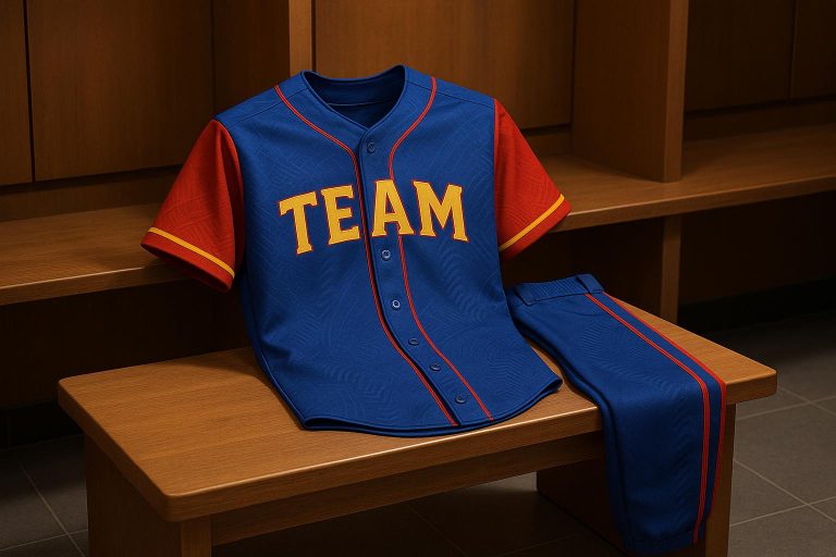
- Patterns: Pinstripes, color blocking, or gradients can elevate your look. Match patterns with your colors to avoid clashing and maintain a clean, unified design.
- League Rules: Follow guidelines like white/light colors for home uniforms, gray/darker shades for away games, and visible 6-inch numbers on the back.
- Customization: Use tools like Wooter Apparel for fully sublimated uniforms. This ensures durable, vibrant designs that resist fading or peeling.
A cohesive uniform design isn’t just about aesthetics – it’s about creating a lasting impression, boosting morale, and aligning with your team’s story. Keep patterns and colors balanced, comply with rules, and test designs under different lighting before finalizing.
HOW TO DESIGN A BASEBALL JERSEY
Baseball Uniform Design Basics
Creating baseball uniforms involves balancing league rules with creative freedom. Most leagues, including Major League Baseball (MLB), require home uniforms to be white or light-colored and away uniforms to be gray or darker shades. This tradition makes it easy for fans to distinguish the home team from their opponents on the field.
League Rules and Color Requirements
Baseball uniforms must meet specific league guidelines to ensure clarity and consistency. For example, jerseys are required to feature a minimum six-inch number on the back, while undershirts must match the uniform’s solid color. Additionally, contrasting numbers, logos, and design elements are essential for visibility.
Uniforms must also be consistent across the team. This means matching colors, trims, and styles for jerseys, pants, caps, and undershirts, creating a professional and unified look. League rules further regulate logo placement and size, with team names or logos typically displayed on the front of jerseys and player names positioned above the back numbers.
| Uniform Element | MLB Requirement |
|---|---|
| Home Colors | White or light-colored |
| Away Colors | Gray or darker shade |
| Back Numbers | Minimum 6 inches tall |
| Team Consistency | Identical color, trim, style |
Building Team Identity with Colors and Patterns
Once the league requirements are met, the focus shifts to designing a uniform that reflects the team’s identity through color and pattern choices.
Uniform design plays a key role in creating a team’s image. Take the Los Angeles Dodgers, for instance – they use blue as their primary color paired with white, resulting in a clean and instantly recognizable look. This consistent use of colors and patterns helps build a memorable brand.
Gray is a popular choice for away uniforms because it stays cooler than black and does a better job of hiding stains. Traditional elements like pinstripes add a classic baseball vibe while enhancing visual appeal, as long as they complement the team’s colors. To maintain a professional appearance, ensure all uniform components – jerseys, pants, and caps – share the same color scheme and design.
For teams looking to stand out, working with a custom uniform provider is a smart move. Fully sublimated apparel allows for cohesive designs across all uniform pieces. Additionally, modern uniforms now offer customizable options like alternate jerseys, throwback styles, and tech-enhanced features, making it easier to adapt to a team’s evolving identity.
How to Choose Team Colors That Work
Selecting the right team colors is more than just picking shades that look good together. It’s about creating a visual identity that resonates with players, fans, and the wider community. The right colors can unite style with purpose, making your team stand out on and off the field.
What Colors Mean in Sports
Colors aren’t just aesthetic – they carry psychological weight and can shape how people perceive your team. Here’s a breakdown of what some key colors convey and how they’ve been used effectively in sports:
- Red: Symbolizes power and dominance. The Boston Red Sox have built their brand around red, using its boldness to enhance visibility and energy.
- Blue: Represents trust and reliability. Teams like the Kansas City Royals use blue to project stability and prestige.
- Yellow: Brings energy and optimism. The Pittsburgh Pirates incorporate yellow accents to boost visibility and create a lively, positive atmosphere.
- Black: Communicates strength and authority. The Chicago White Sox use black to establish a commanding presence, though it should be balanced to avoid being overwhelming.
- Green: Suggests growth and harmony. The Oakland Athletics stand out with their use of green, a color that naturally ties to the baseball field and offers a unique identity.
| Color | Psychological Effect | Example Team | Usage Notes |
|---|---|---|---|
| Red | Power, dominance | Boston Red Sox | Enhances visibility and energy |
| Blue | Trust, reliability | Kansas City Royals | Classic, calming, and prestigious |
| Yellow | Energy, optimism | Pittsburgh Pirates | High visibility and vibrant energy |
| Black | Strength, authority | Chicago White Sox | Bold but can be overpowering |
| Green | Growth, harmony | Oakland Athletics | Distinctive and tied to nature |
Matching Colors to Your Team Brand
Your team colors should serve as an extension of your brand, reflecting its story and identity. Whether it’s tied to your team name, mascot, location, or history, successful color choices amplify these elements.
For example, the Chicago Cubs use colors inspired by the city flag, creating a strong connection to their local community. Teams with animal mascots often mirror their mascot’s natural colors, like the Cincinnati Reds, who have made red synonymous with their identity through decades of consistent branding.
Location-based color choices can also be powerful. Look to your city’s landmarks, local traditions, or regional symbols for inspiration. The Philadelphia Phillies, for instance, use a red, white, and blue palette to emphasize their ties to American identity and Philadelphia’s heritage.
Historical significance is another great guide. Drawing from past uniforms, local sports traditions, or community heritage can create a sense of continuity and deepen fan loyalty.
Involving players and key stakeholders in the decision-making process can also make a big difference. When everyone feels connected to the final design, it fosters stronger team spirit and fan engagement.
Finally, ensure your chosen colors work across all uniform elements and comply with league requirements. Test combinations to make sure they provide enough contrast for numbers and logos, avoiding problematic choices like all-black or all-white uniforms that can cause visibility issues. The best color schemes not only convey meaning but also integrate seamlessly into your overall design.
sbb-itb-4d95ad3
Adding Patterns to Baseball Uniforms
Patterns can take a simple baseball uniform and turn it into something striking. But the trick lies in blending those patterns with your team colors in a way that feels intentional and not chaotic. A well-chosen pattern can amplify your team’s identity, while a poor choice might make even great colors look disorganized.
Thanks to sublimation printing, teams now have access to intricate, long-lasting patterns. This technology opens the door to designs that were once impossible – ranging from subtle gradients to detailed geometric shapes that stay sharp and vibrant over time.
Picking Patterns That Match Your Team Colors
Once you’ve nailed your team colors, the right pattern can take your uniform to the next level. The best patterns work with your colors, enhancing them rather than clashing. It’s also important to think about how the pattern will look in different lighting conditions, as this can affect the overall appearance.
Pinstripes are a timeless choice for baseball uniforms. Teams like the New York Yankees have used them for decades because they add character without overpowering the base colors.
Color blocking is another effective option, especially if you want to emphasize certain parts of the uniform, like the sleeves or side panels. The Los Angeles Dodgers, for instance, use blue and white color blocking in their alternate uniforms to create crisp, clean lines that highlight their iconic colors.
Gradient effects bring a modern flair to uniforms, made possible through sublimation printing. These patterns work particularly well when transitioning between colors already in your palette. For instance, a gradient that fades from your primary color to white can add depth while keeping the design cohesive.
When choosing patterns, think about how bold your team colors are. For bright combinations like red and yellow, stick to subtle patterns such as thin piping or small accent stripes to avoid visual clutter. On the other hand, teams with softer color schemes can afford to experiment with more daring patterns. Whatever you choose, make sure the pattern flows across all elements of the uniform for a polished look.
Coordinating Patterns Across Jersey, Pants, and Cap
Once you’ve settled on a pattern, it’s time to apply it across the entire uniform. Start with the jersey as your main canvas. If you go with pinstripes on the jersey, consider pairing it with solid-colored pants that pick up one of the stripe colors. Alternatively, you can add a subtle side stripe to the pants that ties back to the jersey’s design. As for the cap, it should bring everything together with a logo or small accents that match the pattern’s color scheme.
Balance is key. If the jersey has a bold pattern, keep the pants and cap simpler to avoid overwhelming the overall look. Also, make sure numbers, logos, and player names remain clear and easy to read. Most leagues require jersey numbers to be at least 6 inches tall and highly visible, so patterns shouldn’t interfere with readability.
Before finalizing your design, test how it looks in different lighting and on actual fabric. What looks great on a computer screen might not translate the same way on the field. Creating sample pieces ensures the patterns and colors work together seamlessly in real-world conditions.
A well-coordinated uniform tells a unified story. Whether you’re leaning into classic pinstripes or experimenting with modern gradients, every design choice should reinforce your team’s identity. By keeping patterns aligned with your colors and applying them thoughtfully across all uniform elements, you’ll create a look that’s both cohesive and memorable. Custom uniform tools from Wooter Apparel make this process even easier.
Creating Custom Uniforms with Wooter Apparel
Once you’ve mastered the art of coordinating colors and patterns, it’s time to bring your uniform ideas to life. Wooter Apparel makes creating custom baseball uniforms a breeze, whether you’re envisioning classic pinstripes or bold gradient designs. Their design team excels at transforming your team’s identity into professional-grade uniforms that meet league standards, offering endless customization possibilities to ensure your team stands out.
The process begins with a focus on your specific needs, setting the foundation for a personalized design experience with Wooter Apparel.
How to Use Wooter’s Design Tools
Getting started with Wooter’s design tools is straightforward. It all kicks off with a free custom design consultation. You’ll be paired with a dedicated sales representative who will guide you through the entire process, from the first conversation to the final product.
Your sales representative ensures smooth communication and handles any questions or concerns along the way. To get the best results, share as much detail as possible with Wooter’s design team – your preferred colors, pattern ideas, logos, and branding elements. The more specific you are, the better they can craft multiple design options for you to review.
"The design team took my thoughts and created several perfect options for our swim team, using our logo created by one of our swimmers. The team absolutely loves the fit and comfort of the warm ups and wears them with pride."
– Tammy S., Customer Representative
Once your ideas are submitted, Wooter’s designers get to work creating visual mockups. They excel at turning rough sketches or concepts into polished designs, incorporating the principles of color and pattern coordination we’ve discussed. You’ll receive design proofs to review, and any adjustments are made quickly and accurately.
This collaborative process ensures your uniforms truly represent your team’s identity. As Olivia shares:
"Making them just how I wanted was easy, and the team did a great job paying attention to all the little details. They kept me updated throughout the whole process, which made it really easy. The clothes are really well-made, and they turned out even better than I thought they would."
– Olivia, Customer
With your custom design ready, it’s time to explore why sublimation is the go-to method for vibrant, durable uniforms.
Why Choose Sublimated Uniforms
Wooter Apparel specializes in fully sublimated uniforms, offering distinct advantages over traditional printing methods. Sublimation technology allows for unlimited color possibilities and intricate patterns that are difficult to achieve with screen printing or embroidery. Whether you’re going for complex gradients or detailed color blocking, sublimation ensures your design stands out.
The sublimation process embeds the design directly into the fabric fibers, resulting in uniforms that resist fading, cracking, and peeling. This durability is especially crucial for baseball teams that play numerous games and need their uniforms to maintain a polished look throughout the season.
| Feature | Sublimated Uniforms (Wooter) | Traditional Screen Print | Embroidery |
|---|---|---|---|
| Color Vibrancy | High, long-lasting | Moderate, fades faster | Limited, not vivid |
| Durability | Excellent, resists cracking | Prone to peeling/cracks | Durable, but heavy |
| Customization Options | Unlimited, full-color | Limited | Limited |
| Price | Competitive | Often lower | Higher |
Customer reviews frequently highlight the quality and longevity of Wooter’s sublimated uniforms. With over 2,000 five-star reviews and a 4.9-star rating from 1,238 reviews, teams consistently praise their durability. One customer shared:
"Turned out even better than we imagined! The color match was perfect… they look clean cut before every game!"
– Customer
Sublimation also guarantees consistent color matching across all uniform pieces – jerseys, pants, and caps maintain the same vibrant hues. This eliminates the issue of color mismatches that can make uniforms look uneven under stadium lights.
More teams are embracing personalized, tech-forward uniform designs, including alternate and throwback patterns for special events.
Uniform Design Checklist
Before finalizing your uniform order, take a moment to go through this checklist. It’s a simple way to make sure your team’s new look checks all the boxes and delivers the professional appearance you’re aiming for.
Checking League Rule Compliance
Start by diving into your league’s official rulebook. Pay close attention to any guidelines about colors, patterns, and numbering. These rules, which were covered in earlier sections, are crucial to avoid costly mistakes like reorders or even disqualification. Make sure every piece of your uniform, from jerseys to caps, aligns with these standards and reflects the approved design.
Keeping All Team Gear Consistent
Uniformity is key. Every visible part of your team’s gear – undershirts, socks, accessories – should match your chosen color scheme. To ensure this consistency, you can work closely with Wooter’s design team. Ordering prototypes is a smart move, as it allows you to check for color accuracy and pattern consistency across all items, including jerseys, pants, and caps.
Here’s what one satisfied customer, Duane R., had to say:
"Colors, patterns, fit are excellent. I love the custom jerseys they’re making for us… I ordered some prototypes so I could gauge their wear and make some tweaks. What they sent were above expectation…"
Don’t forget to include seasonal items like warm-ups, practice jerseys, and accessories. This way, your team’s identity stays consistent, no matter the occasion.
Key Design Tips Summary
Here are some final pointers to help you nail your uniform design:
- Double-check league rules to avoid costly reorders or compliance issues.
- Keep your color palette consistent across all layers, including undershirts and socks.
- Opt for patterns that complement your team colors – pinstripes work well for a classic look, while gradients can give a modern edge.
- Retro and throwback designs are making a comeback. Adding vintage touches can honor your team’s history while incorporating modern performance features.
- Test your design in different lighting conditions, as colors can appear differently under stadium lights.
- Involve coaches, team captains, and league officials in the approval process to ensure everyone’s on the same page.
FAQs
How can I design baseball uniforms that follow league rules while showcasing my team’s unique colors and patterns?
When designing baseball uniforms that meet league rules and still make your team shine, the first step is to carefully review your league’s uniform guidelines. These often outline important details like where logos can go, font size restrictions, and which color combinations are allowed. Knowing these rules upfront ensures you stay compliant.
After that, you can focus on showcasing your team’s colors and identity in a way that’s both bold and tasteful. Think about using complementary colors or adding subtle patterns to enhance the design without making it too busy. If you’re feeling stuck or want professional help, companies like Wooter Apparel offer custom uniforms. They can create fully sublimated jerseys that not only meet regulations but also give your team a look that stands out.
What makes sublimation printing a better option for baseball uniforms than traditional methods?
Sublimation printing stands out as a superior option for baseball uniforms when compared to traditional methods. Unlike screen printing or heat transfers, sublimation embeds the design directly into the fabric. This results in vibrant colors that stay intact – no fading, cracking, or peeling – even after countless washes and intense use. It ensures the uniforms look sharp and professional all season long.
What’s more, sublimation offers endless possibilities for customization. From intricate patterns to detailed logos and precise color matching, it captures your team’s unique identity effortlessly. Plus, because the design becomes part of the fabric itself, the material stays smooth and breathable. This means players can stay comfortable and focus entirely on their game without worrying about stiff or heavy uniforms.
How can I get my team involved in designing uniforms that truly represent our identity?
Creating uniforms that truly embody your team’s identity starts with collaboration. Here’s how you can make it happen:
- Gather Input: Invite players, coaches, and other key members to share their thoughts on colors, patterns, and styles that resonate with the team.
- Share and Refine Designs: Once you have draft designs, present them to the group for feedback. This step ensures the final look reflects everyone’s vision.
By involving the whole team, you not only create a sense of excitement but also ensure the uniforms become a symbol of your collective identity. Plus, exploring custom design options can make the entire process smoother and more engaging.