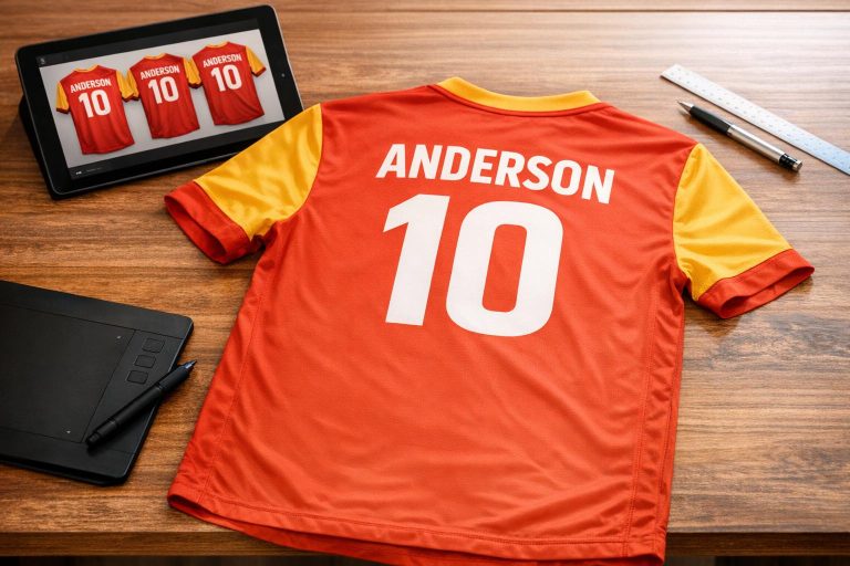
- Legibility: Use bold, simple sans-serif fonts for easy reading from a distance.
- Contrast: Ensure strong color contrast between text and jersey background.
- Branding: Align fonts with your team’s logo and colors for a cohesive look.
- Testing: Create mockups to check visibility and scalability for names and numbers.
Popular choices include Franchise Bold for its boldness, Bebas Neue for a sleek vibe, and Octin Sports for a strong, angular style. Always test designs before production to avoid costly mistakes. Tools like Wooter Apparel can simplify the process with professional mockups and durable printing.
What to Consider When Selecting Soccer Uniform Fonts
Picking the right font for soccer uniforms is a balancing act between practical visibility and showcasing team identity. The typography needs to perform well in real-world conditions – whether it’s during the fast-paced action on the field or from the distant view of fans in the stands.
Readability from a Distance
Fonts on soccer uniforms must stay legible, even from afar, despite players constantly moving. Simple and bold letterforms are the best choice because they maintain clarity and shape better than overly decorative styles during motion.
"Jersey typography must prioritize legibility above all else in sports uniform design. Unlike print design, jersey typography must be readable from significant distances, in various lighting conditions, and while in motion." – Jersied Typography Experts
Sans-serif fonts are often the go-to for soccer uniforms. Their clean, straightforward design makes them easier to read and ensures smooth results during sublimation printing. Medium to bold font weights are ideal since lighter fonts can fade into complex jersey patterns or become hard to see in low lighting. Proper letter spacing is equally important – too tight, and the letters may blur together; too wide, and they lose quick recognizability.
Additionally, boldness and color contrast play a major role in making sure the typography stands out in every situation.
Boldness and Contrast
Strong contrast between the font and the jersey background is key for visibility. Light text on dark jerseys – or dark text on light jerseys – creates the easiest-to-read designs for players, referees, and fans. Bold fonts hold up better under sublimation printing, while thinner styles can bleed and become unclear. Numbers should be designed to avoid confusion between similar digits, like 6 and 9. Using standardized color systems, such as the Pantone Matching System, ensures the final jersey colors match your design intentions.
Finally, the font should do more than just look good – it should reflect the unique identity of your team.
Alignment with Team Branding
The font you choose should align seamlessly with your team’s logo and overall branding. Teams with established brand guidelines often stick to a specific font for consistency across all platforms, from social media to on-field uniforms. Typography is a key element in expressing your team’s personality, whether you draw inspiration from professional designs or create something entirely original. This applies whether you are designing professional kits or custom soccer t-shirts for casual play. To avoid issues during production, always provide logos and fonts in vector formats (like .ai or .pdf) and create mockups that balance branding with the practical needs of the jersey design.
sbb-itb-4d95ad3
Common Fonts for Soccer Uniforms
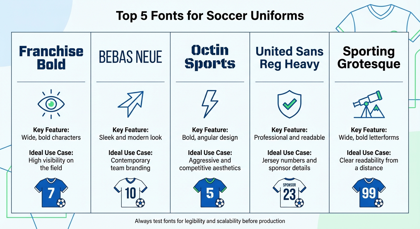
Comparison of Top 5 Soccer Uniform Fonts and Their Key Features
Choosing the right font can make all the difference when designing custom v-neck soccer jerseys. Below are five fonts known for their clarity and impact, making them popular choices for teams.
Franchise Bold
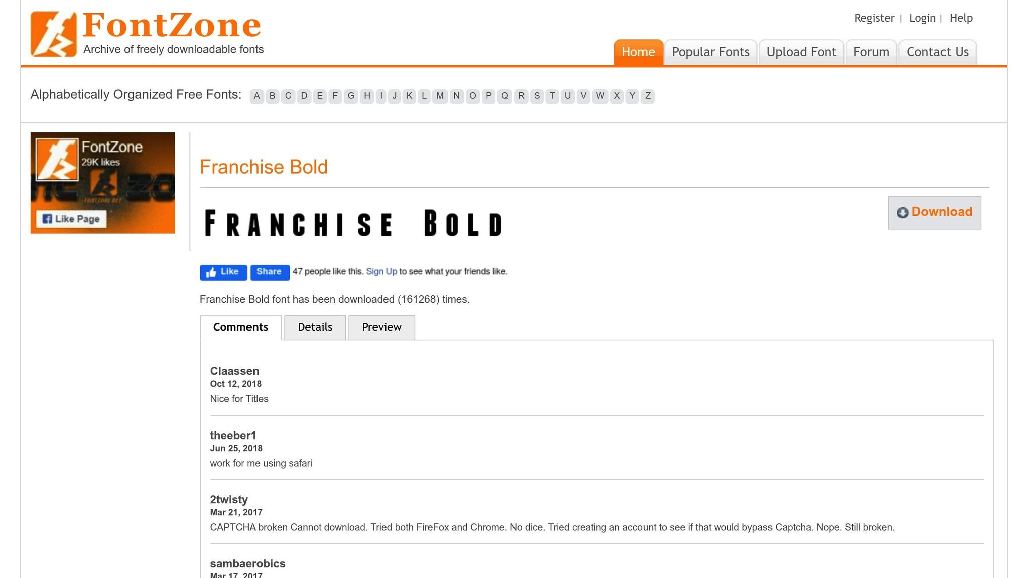
Franchise Bold stands out with its wide, heavy characters, ensuring excellent visibility and reducing the risk of printing issues like bleed. Its style blends a classic varsity look with modern readability, making it a timeless choice.
Bebas Neue
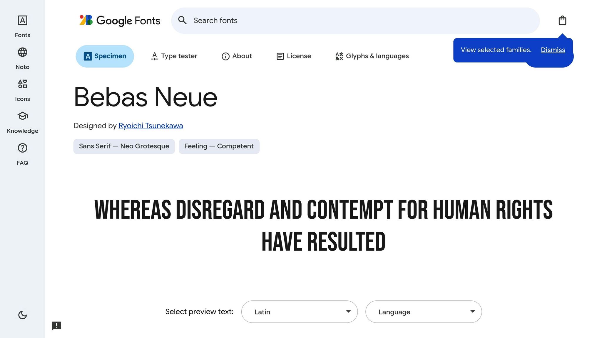
Bebas Neue is characterized by its tall, condensed letterforms that exude a sleek and modern vibe. This sans-serif font is ideal for teams looking to create a progressive and contemporary brand identity while maintaining legibility from a distance.
Octin Sports
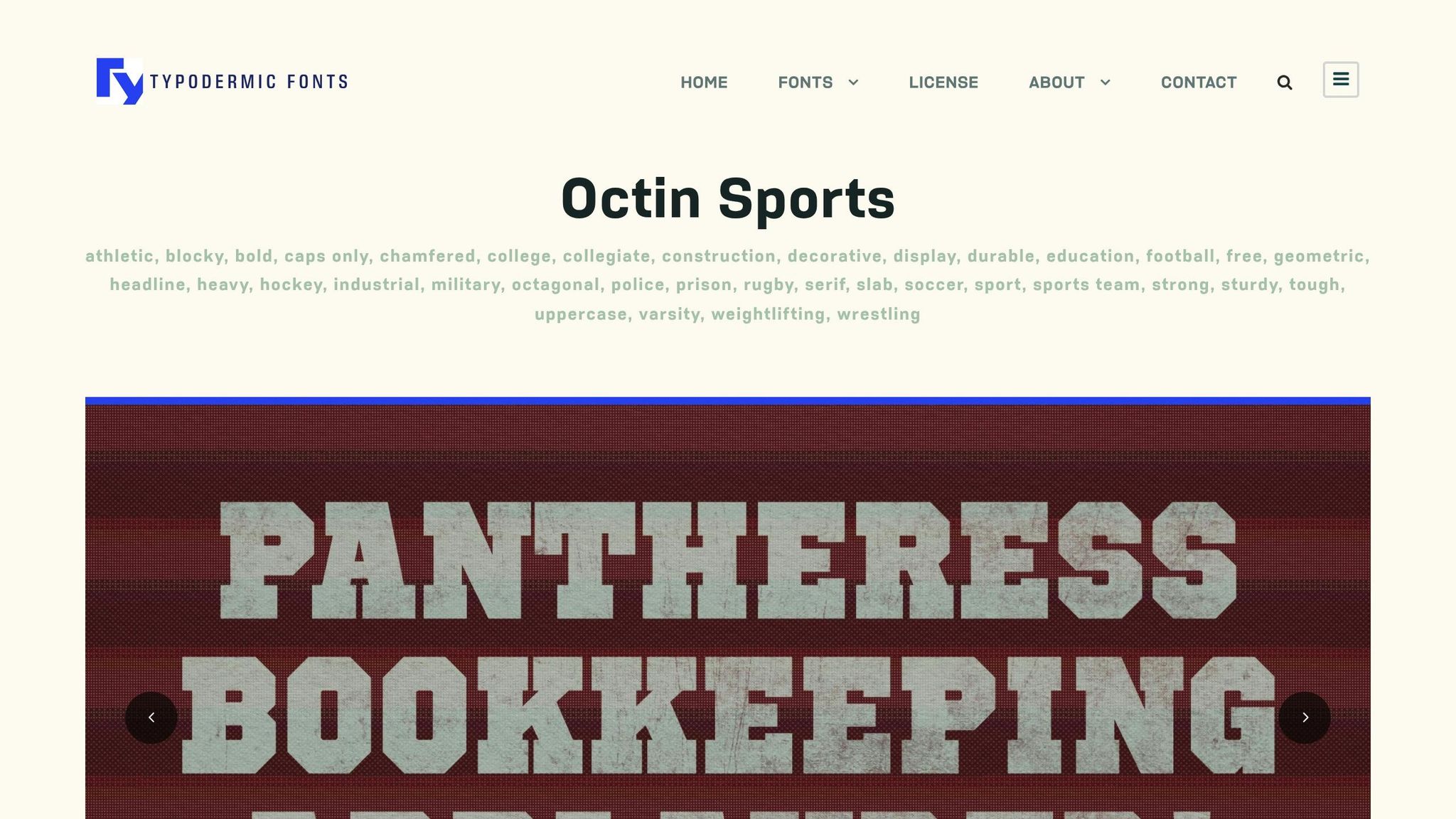
Octin Sports features thick lines and sharp, angular shapes, giving it a bold and commanding presence. This font is perfect for teams aiming to project a strong, competitive, and aggressive image.
United Sans Reg Heavy
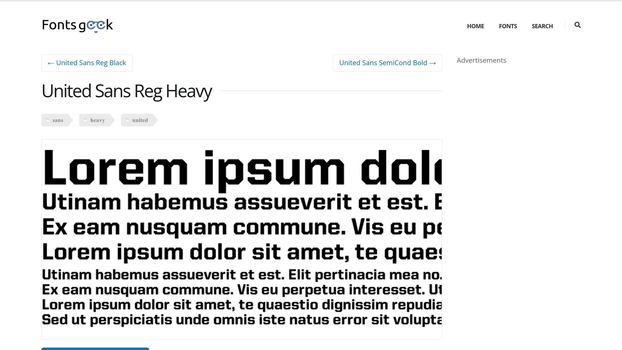
United Sans Reg Heavy offers a professional and versatile design that works well for both large jersey numbers and smaller sponsor names. Its readability under stadium lighting makes it a practical choice for teams balancing aesthetics with functionality.
Sporting Grotesque
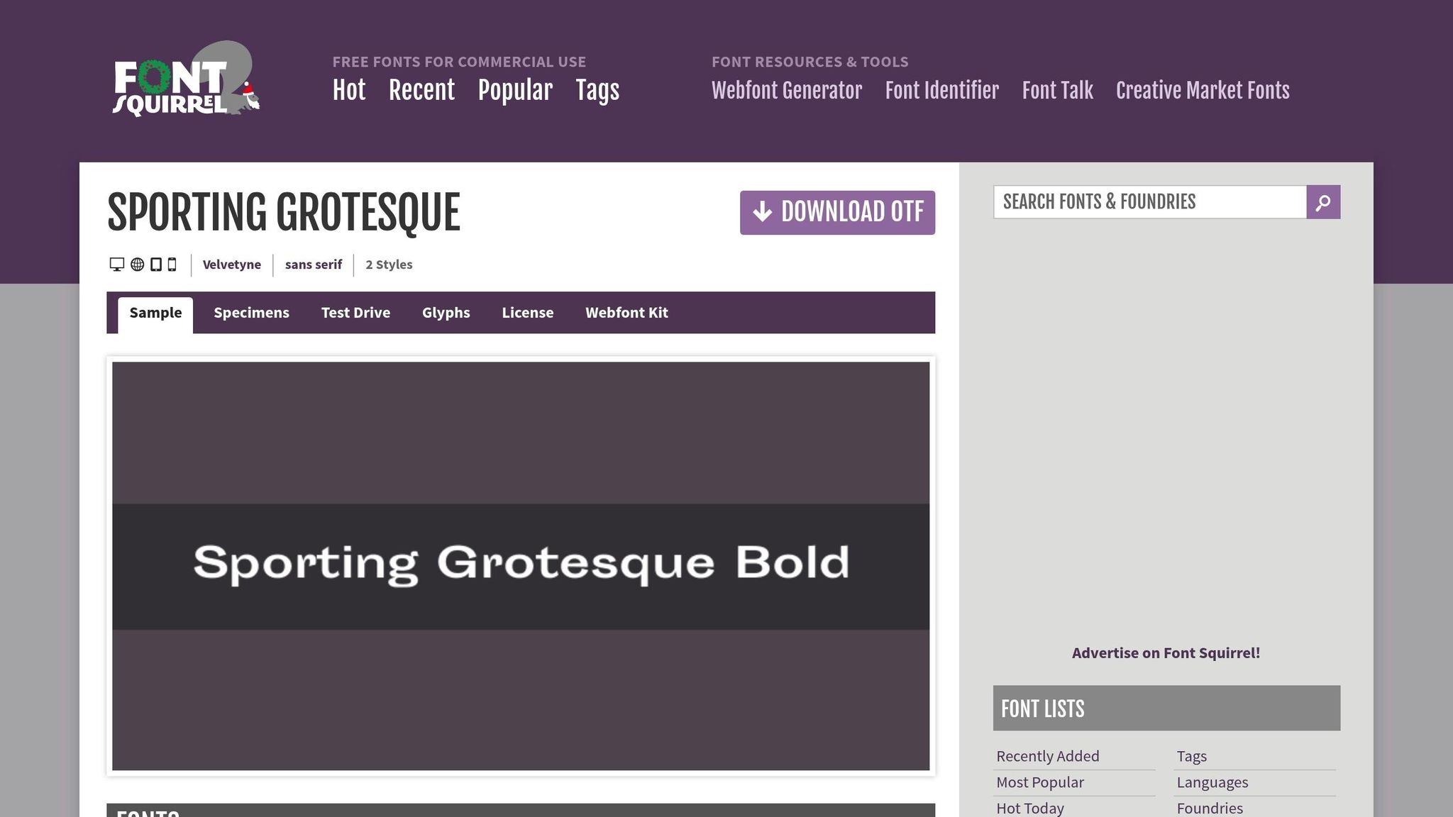
Sporting Grotesque is designed with bold, wide letterforms that ensure maximum readability, even from afar. Its straightforward and clean design is perfect for teams that prioritize clarity during gameplay.
Here’s a quick reference table summarizing the strengths of each font:
| Font Name | Key Feature | Ideal Use Case |
|---|---|---|
| Franchise Bold | Wide, bold characters | High visibility on the field |
| Bebas Neue | Sleek and modern look | Contemporary team branding |
| Octin Sports | Bold, angular design | Aggressive and competitive aesthetics |
| United Sans Reg Heavy | Professional and readable | Jersey numbers and sponsor details |
| Sporting Grotesque | Wide, bold letterforms | Clear readability from a distance |
These fonts can serve as a great starting point for your uniform designs. Be sure to test their legibility and scalability to ensure they meet your team’s specific needs.
How to Test Fonts for Your Soccer Uniforms
Create Mockups for Legibility Testing
Designing soccer uniforms starts with creating vector mockups (in formats like .ai or .pdf). These mockups give you a precise preview of how team names, logos, and numbers will look on the jerseys. The advantage of vector graphics is that they stay sharp no matter how much you scale them, which is crucial for testing visibility from a distance.
To take it a step further, you can use online design labs or apparel-building tools to experiment with different fonts and color combinations on 2D or 3D jersey models. While doing this, make sure to specify Pantone colors using the Pantone Matching System (PMS). This ensures accurate color contrast between the font and the jersey, as digital screens can sometimes distort shades. Adding one- or two-color outlines around the text can also improve visibility, making the design pop against the jersey’s background.
Consider Scalability for Numbers and Names
The font you choose needs to look clear and sharp at all sizes – whether it’s the large numbers on the back of the jersey or the smaller player names on the front. Always work with vector files to maintain crispness when scaling. If your font or logo files are low resolution, consider having them professionally redrawn in vector format to avoid pixelation or blurring when enlarged.
For consistency, map out player names and numbers using standardized roster sheets. Use sizing kits to test legibility on different jersey sizes, ensuring the design works across all dimensions. Once production begins, conduct a quality assurance test to confirm that the fonts and placements meet your expectations.
After confirming clarity and scalability, you can use expert design services to fine-tune your mockups for a polished final look.
Use Wooter Apparel‘s Custom Uniform Services
Wooter Apparel offers a hassle-free way to design your soccer uniforms. Their professional designers provide free mockups tailored to your team’s specific branding and ideas. They even supply a curated list of font options optimized for athletic wear. If you have a particular font in mind, you can share your font files or links, and they’ll incorporate them into the design.
"The most important thing about the font is telling us about any outlines you want to use for your letters + numbers." – Wooter Apparel
Wooter uses sublimation printing, a process where the design is embedded directly into the fabric. This ensures the final product is crisp, durable, and resistant to peeling, cracking, or fading. With a 4.9/5 star rating based on 1,238 reviews, Wooter Apparel is frequently praised for its excellent customer service and the ability to deliver designs exactly as envisioned.
Conclusion
When selecting fonts for jerseys, prioritize legibility from a distance, bold contrast, and how well they align with your team’s branding. As Wooter Apparel puts it, "Choose a font that’s easy to read, look for a bold font – fans want to see what’s written on jerseys too!"
Put your designs through thorough testing. Use scalable vector mockups to ensure fonts look clear at all sizes. Check that outlines and color contrasts enhance visibility and durability. Stick with timeless fonts rather than chasing trends – custom jerseys are meant to stand the test of time. Once you’re satisfied with the design, consider professional feedback to ensure a polished result.
Professional design services, like those from Wooter Apparel, can be a game-changer. They offer free, custom mockups with optimized font options and durable sublimated printing. To ensure color consistency, use the Pantone Matching System – did you know there are over 200 shades of orange in it? With the right font choices and careful testing, you’ll create uniforms that stand out both on the field and in the stands, boosting your team’s identity and presence.
FAQs
What’s the best way to make sure soccer uniform fonts are easy to read from a distance?
When designing fonts for soccer uniforms, readability is key. Opt for bold, straightforward typography with clean edges, steering clear of decorative or elaborate styles. Pair this with high-contrast color combinations between the text and the uniform’s background to ensure the lettering pops.
Make sure the font size is large enough to be seen from afar, and provide ample spacing between letters and numbers to avoid a cluttered appearance. It’s also a good idea to test the design in real-world settings, like outdoor fields or stadium lighting, to confirm it stays clear and easy to read from different angles and distances.
Why is color contrast important for font visibility on soccer uniforms?
Color contrast plays a key role in ensuring the text on soccer uniforms is easy to read. A well-thought-out contrast between the player names and numbers and the jersey background makes them stand out clearly, even from far away. This isn’t just about aesthetics – it helps with identifying players and boosts visibility, which can be crucial for safety during games.
When selecting colors, pairing light and dark shades is essential. Think white text on a dark jersey or black text on a light one. These combinations create sharp, eye-catching contrast that keeps the text readable at a glance.
How can I choose fonts that match my team’s style and identity?
To choose fonts that genuinely represent your team’s identity, start by pinpointing your team’s personality and core values. Is your team’s vibe bold and modern, classic and timeless, or sleek and forward-thinking? For example, bold, blocky fonts can project a strong, competitive energy, while script-style fonts might convey a sense of tradition or artistry. The key is to pick a typeface that matches these traits while remaining easy to read from a distance and providing good contrast with your uniform colors.
Once you’ve narrowed down a font, test it out as part of the full uniform design. Look at how it works for player names, numbers, and logos. Adjust elements like weight, spacing, and color to ensure everything stays readable and visually balanced. A medium-weight, bold font is often a safe bet for clarity and durability, especially when paired with high-quality sublimation printing. Lastly, share the design with your team to make sure it truly represents who you are.

