
Choosing the right font size for sports uniforms ensures player visibility, league compliance, and a professional look. Here’s what you need to know:
- League Rules: Check your league’s specific font size and placement requirements. For example, adult basketball back numbers are typically 6–8 inches tall, while youth soccer uses 4–6 inches.
- Viewing Distance: Numbers should be large enough for referees and fans to identify from a distance. Youth jerseys need smaller fonts due to closer viewing.
- Color Contrast: Use high-contrast colors (e.g., white on dark jerseys) to improve readability. Adding outlines can enhance visibility further.
Standard Font Sizes:
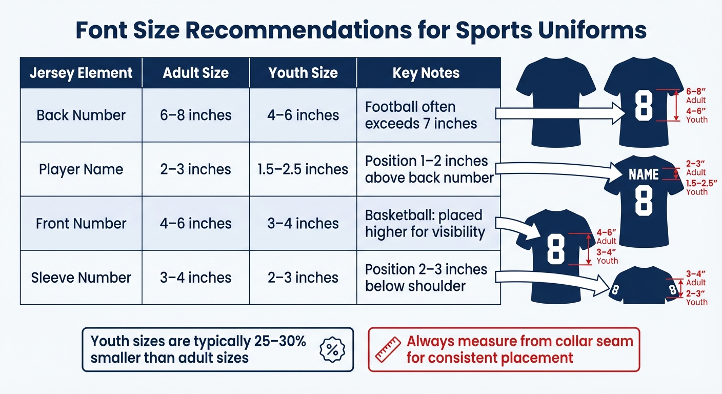
- Back Numbers: 6–8 inches (adults), 4–6 inches (youth)
- Player Names: 2–3 inches (adults), 1.5–2.5 inches (youth)
- Front Numbers: 4–6 inches (adults), 3–4 inches (youth)
- Sleeve Numbers: 3–4 inches (adults), 2–3 inches (youth)
Pro Tip: Test your design on a sample jersey to ensure readability and proper proportions before finalizing.
Keep font sizes balanced with other design elements like logos and stripes for a polished appearance.
Font Size Selection Checklist
Step 1: Check League Rules and Requirements
Start by reviewing your league’s official guidelines for font sizes and placements. These rules often cover the required dimensions for numbers, names, and their positioning on the uniform. The goal is to maintain fair play and ensure players are easily identifiable across teams.
For instance, many adult basketball leagues require back numbers to be at least 6 inches tall, while youth soccer leagues might need a minimum of 4 inches. Some leagues also specify precise placement, such as positioning back numbers 2–3 inches below the collar seam. If these standards aren’t met, your uniforms could be rejected before the season even begins.
To avoid costly errors, consult your league administrator or rulebook for exact specifications and document them before proceeding with your design.
Once you’ve confirmed compliance with league rules, think about how the uniforms will be viewed during play.
Step 2: Consider Viewing Distance
The distance from which your uniforms will be seen plays a big role in determining font size. Referees need to quickly identify numbers during fast-paced action, while spectators in the stands should be able to spot players from 50 feet or more.
For adult jerseys, back numbers typically need to be between 6 and 8 inches tall to ensure visibility from standard viewing distances. Youth jerseys, which are smaller and viewed from closer ranges, often work well with 4 to 6-inch back numbers. For player names, sizes of 2–3 inches for adults and 1.5–2.5 inches for youth are generally sufficient to maintain readability without overpowering the design.
To confirm your choices, view a sample jersey from a distance similar to that of the stands to ensure the text is easy to read.
With font sizes nailed down, the next step is to focus on color contrast to enhance visibility.
Step 3: Check Color Contrast
Strong contrast between the font color and the jersey fabric is crucial for readability during games. A simple rule to follow: use white text on dark jerseys and dark text on light jerseys. This ensures that names and numbers remain clear, even under varying lighting conditions.
Adding outlines to the text can further improve visibility from a distance. For example, white numbers with a black outline on a red jersey create layered contrast, making the text stand out more effectively. Before finalizing your order, print a test jersey and examine it under different lighting and from various distances to verify the contrast works well.
Keep in mind that stretchy fabrics can alter how colors appear and affect text readability when players are in motion. Always test your design on a stretched fabric sample to ensure the contrast holds up during gameplay.
4 Ways to Easily Decorate Sports Uniforms | How to Heat Press Letters & Numbers
Font Size Recommendations by Sport
Sports Uniform Font Size Guide by Position and Age Group
Recommended Sizes for Basketball, Football, Soccer, and Other Sports
Different sports call for specific font sizes to ensure visibility, meet league regulations, and suit the playing environment. For example, basketball, typically played in indoor arenas, requires larger numbers for quick identification. Football, with its expansive fields, often uses even bigger sizes to ensure numbers are clearly visible from the sidelines. These recommendations align with the compliance and visibility standards discussed earlier.
Here’s a breakdown of standard font size recommendations for adult and youth uniforms across major sports:
| Element | Adult Size | Youth Size | Sport-Specific Notes |
|---|---|---|---|
| Back Number | 6–8 inches | 4–6 inches | Football often exceeds 7 inches to maximize visibility. |
| Player Name | 2–3 inches | 1.5–2.5 inches | Positioned 1–2 inches above the back number. |
| Front Number | 4–6 inches | 3–4 inches | Basketball front numbers are placed higher for better visibility. |
| Sleeve Number | 3–4 inches | 2–3 inches | Common in basketball and football; typically positioned 2–3 inches below the shoulder. |
For youth uniforms, font sizes are typically reduced by 25–30% to maintain proper proportions on smaller jerseys while ensuring readability from standard viewing distances at youth events.
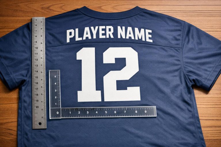
Sports like baseball and softball generally use smaller font sizes because the games are slower-paced, and the viewing distances are shorter. Soccer follows similar guidelines to basketball, especially for indoor games, unless FIFA rules specify otherwise. A key tip for consistent placement: always measure from the collar seam rather than the neckline, as necklines can vary by style, but the seam offers a fixed reference point.
sbb-itb-4d95ad3
Design Tips for Readability and Appearance
Here’s how you can fine-tune your jersey designs to ensure they’re both clear and visually appealing.
How to Ensure Readability
To make sure your fonts are easy to read, use a stroke width that holds up under game conditions. Thin lines can blur under bright stadium lights or from a distance, making it tough for spectators and officials to identify players.
Spacing is another key factor. Increase the letter spacing to prevent characters from blending together, especially on fabrics that stretch during play. This ensures that names and numbers stay sharp and legible.
For colors, contrast is crucial. If you’re working with complex patterns or mid-tone colors, adding a contrasting outline around letters and numbers can make them pop, even during fast-paced action. For more on color contrast, see Step 3 above.
The production method you choose also affects readability. Sublimation works well for intricate designs, embedding ink directly into the fabric. Embroidery, on the other hand, requires thicker, bolder fonts to remain clear. Heat transfer vinyl is a solid choice for simple block letters and can withstand 50–100 washes without losing its clarity.
Once you’ve nailed the basics of readability, it’s time to balance the design for a polished look.
How to Balance Design Elements
To avoid designs that feel overcrowded or too sparse, use proportional sizing and consistent references. For adult jerseys, back numbers that are 6–8 inches tall typically look balanced with the garment’s proportions. Front numbers in the 4–6 inch range work well alongside chest logos without overwhelming the design. A clear visual hierarchy is key: numbers should stand out, while player names and logos act as supporting elements.
For consistent placement, measure from the collar seam rather than the neckline, which can vary. Front numbers should sit just below the collar seam, and the armhole-to-armhole distance can guide horizontal centering to ensure alignment across all sizes.
Font choice also plays a big role in both readability and team identity. Bold block fonts like Franchise Bold are ideal for high-energy sports like football and hockey, offering maximum visibility. Sleek sans-serif fonts like Bebas Neue or United Sans Reg Heavy give basketball or soccer jerseys a modern, professional edge. If you’re designing for volleyball or corporate leagues, script fonts can add a touch of elegance – just make sure they’re legible from a typical viewing distance. For women’s teams, placing name bars at the bottom back of the jersey can prevent names from being obscured by long hair.
Lastly, always test your design on a stretched fabric sample and under different lighting conditions. This helps confirm that everything stays clear and consistent across your entire team’s jerseys.
Designing Custom Uniforms with Wooter Apparel

Wooter Apparel makes it easy to create custom uniforms that meet league standards while showcasing your team’s unique style. With an impressive 4.9-star rating from 1,239 reviews, they combine cutting-edge tools with expert design assistance to deliver top-notch results.
Available Customization Tools
Wooter Apparel’s design platform is packed with features to bring your vision to life. The 3D uniform preview tool lets you see your design on realistic models, making it easy to adjust player names, numbers, and font sizes. You can drag and drop elements, tweak placements, and preview how everything looks before finalizing. To make things even simpler, the platform uses AI-powered recommendations to suggest font and color combinations that are both readable and professional.
The typography library offers a selection of sports-approved fonts designed for clarity. If you have a custom font in mind, you can upload files in formats like .ai, .pdf, or .svg for seamless scaling – perfect for those standard 6–8-inch back numbers. And if your logo isn’t high-resolution, Wooter’s design team can redraw it as a vector file for a small additional fee.
For color accuracy, the Color Finder tool uses the Pantone Matching System. By specifying exact Pantone values instead of generic color names, you can ensure that your uniforms look exactly as planned. This feature is especially helpful when using high-contrast color combinations to enhance visibility on the field.
These tools make designing your uniforms straightforward, while ensuring the final product matches your expectations.
How to Order Your Custom Uniforms
Ordering your custom uniforms is a breeze with Wooter Apparel’s streamlined process. Start by using the 3D design tool or consult their free professional design team. As James C., a Verified Buyer, shared:
"Jason in design was great and prompt to respond to our questions."
The design team will help you fine-tune your ideas, pick fonts that are easy to read, and ensure everything aligns with league regulations.
For teams placing large orders, requesting a sizing kit is highly recommended. This allows you to double-check font and number proportions, as custom uniforms are non-returnable. Consistency is key, so use the collar seam as a guide when confirming placements.
Once your design is finalized, download the Wooter Order Form and fill it out with player names, numbers, and sizes. After completing payment, Wooter Apparel will produce your uniforms using durable sublimation printing, ensuring that names and numbers stay crisp all season long. The standard production time is 16 business days, but if you’re in a hurry, rush options are available in as little as 10 business days for a 25% surcharge.
Conclusion
Selecting the right font size for sports uniforms boils down to three key factors: visibility from a distance, league compliance, and a polished appearance. Start by reviewing your league’s regulations for font size requirements – they’re there to ensure players can be identified quickly and easily.
Contrast matters. Once you’ve met the compliance standards, focus on making the text stand out. Use white lettering on dark jerseys and dark lettering on light jerseys to ensure maximum readability, whether under bright stadium lights or in outdoor settings. Pair these contrasts with bold, sans-serif fonts that maintain clarity from the stands or on camera. Always test your design on a sample jersey before moving into full production to catch any sizing or placement issues early.
Font sizes should work harmoniously with other design elements like logos, stripes, and team colors. To maintain consistency, use fixed reference points, such as the collar seam, for placement across all jerseys. Documenting these specifications will make reorders or mid-season updates much smoother.
For a seamless production process, professional design tools are a game-changer. Wooter Apparel offers 3D design tools and expert guidance to help you visualize proportions, check color accuracy with the Pantone Matching System, and ensure each jersey matches your design perfectly. With a 4.9-star rating from 1,239 reviews, their sublimation printing method produces durable, vibrant uniforms that stay sharp and readable throughout the season.
Getting the font size right means creating uniforms that look sharp, perform well, and let your team shine with pride.
FAQs
What font size should I use for numbers and names on sports uniforms to meet league requirements?
When designing sports uniforms that meet league requirements, the first step is to review your league’s official size guidelines. For instance, high school football rules often require front numbers to be at least 8 inches tall and back numbers to measure at least 10 inches. On the other hand, FIFA sets back number dimensions between 25–35 cm. Using sport-specific size charts can help you get the right fit for both youth and adult uniforms.
Equally important is ensuring the font color stands out against the uniform background for easy readability. A good rule of thumb is to aim for a contrast ratio of at least 4.5:1. To avoid any compliance issues, always confirm the regulations with governing organizations like the NFHS or NCAA before finalizing your uniform design.
What should I consider when choosing font sizes for sports uniforms?
When choosing font sizes for sports uniforms, focus on readability. Stick with bold, clean typefaces that are easy to read from a distance, even under bright stadium lights. Steer clear of overly decorative fonts, as they can blur with movement. Instead, go for block or sans-serif styles that hold their clarity on fabric.
Font size and placement are equally important. Be sure to follow league guidelines – for example, high school football uniforms require numbers to be at least 8 inches tall on the front and 10 inches tall on the back. Position names high on the chest and center the numbers on the back, leaving about an inch of space between them. This creates a polished, professional appearance.
Don’t overlook contrast and durability. Select colors that stand out sharply against the jersey background to ensure visibility for players, referees, and fans. For long-lasting results, opt for printing methods like sublimation, which keeps colors bright and edges crisp throughout the season.
How do I choose the right font size and balance it with other elements on a sports jersey?
Choosing the right font size for a sports jersey is all about striking a balance between readability and design harmony. Start with the standard size recommendations for your sport and age group. For instance, adult soccer back numbers are usually 8 inches tall, while youth baseball player names are about 2 inches. These guidelines not only help you meet league rules but also ensure the text is easy to read.
Contrast is crucial – pick font colors that pop against the jersey fabric, especially under bright stadium lights. Bold sans-serif fonts are a solid choice for most sports, as they provide clear, sharp readability and a polished appearance. Be mindful of spacing – leave enough room between names, numbers, and logos to avoid a crowded look. Always test a mock-up to check that the font size and placement work well from a distance and enhance the overall jersey design.