
Picking the right colors for gaming jerseys is crucial for creating a strong team identity, standing out during broadcasts, and connecting with fans. Here’s a quick breakdown of what matters most:
- Define Your Team Identity: Choose colors that reflect your team’s values and playstyle (e.g., bold red for aggression, cool blue for strategy).
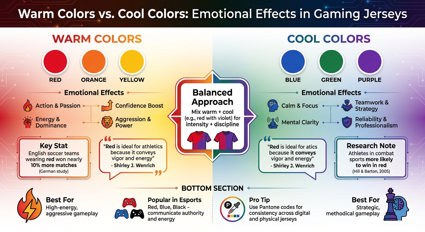
- Understand Color Psychology: Warm colors (red, orange, yellow) project energy and dominance, while cool colors (blue, green, purple) convey calm and focus.
- Ensure Visibility: High-contrast combinations (e.g., light text on dark backgrounds) improve readability on screens and in arenas.
- Test Colors: Check how your palette looks on fabric, under different lighting, and during broadcasts to avoid surprises.
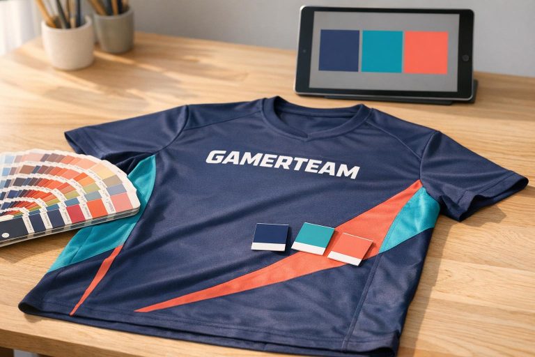
- Use Pantone Codes: Precise color codes ensure consistency across digital and physical formats.
- Consider Fans and Competitors: Select colors that resonate with your audience while differentiating your team from others.
Color Psychology in Gaming Jerseys
Warm vs Cool Colors in Gaming Jerseys: Emotional Effects and Psychology
Colors have a powerful way of shaping perceptions, influencing how players, fans, and even competitors feel about a team. Take red, for example – it’s a color that radiates energy and aggression, giving off a winning vibe. Studies back this up: English soccer teams wearing red uniforms won nearly 10% more matches, according to a German study. Similarly, a 2005 study by Hill and Barton found that athletes in combat sports like boxing and taekwondo were more likely to win when dressed in red. Meanwhile, yellow brings an air of energy, warmth, and resilience, while orange strikes a balance between strength and approachability. These warm shades grab attention on screens and broadcasts, creating a sense of power and excitement. This emotional pull is why teams often weigh the benefits of warm versus cool tones.
Warm Colors vs. Cool Colors: Emotional Effects
Warm colors – like red, orange, and yellow – are all about action and passion. They boost confidence and reinforce a sense of dominance. Shirley J. Wenrich, author of All the Colors of Life, highlights this point:
"Red is ideal for athletics because it conveys vigor and energy".
On the flip side, cool colors such as blue, green, and purple bring a sense of calm, focus, and mental clarity. Blue and green, in particular, foster teamwork and strategic thinking while projecting reliability and professionalism. Choosing between warm and cool tones often depends on your team’s gameplay style. If your team thrives on aggressive, high-energy moves, warm tones might be the way to go. For teams that lean on strategy and composure, cooler tones could be a better fit. Some teams even mix it up, pairing warm shades with cool accents – like red with a touch of violet – to blend intensity with discipline. This balance can be especially effective in games that demand both high energy and sharp focus.
Using Color Psychology in Esports
Esports teams frequently incorporate colors like red, blue, and black into their designs because these shades communicate authority and energy. Neon warm hues stand out on screens, while using Pantone colors ensures consistency from digital designs to physical jerseys. Thoughtful color choices don’t just enhance your team’s visual appeal – they also help build a connection with fans and establish your brand identity before the match even begins. By understanding how colors influence emotions and perceptions, you can take the next step in crafting a team identity that resonates both on and off the screen.
Step 1: Define Your Team Identity and Brand Values
Your jersey colors should embody your team’s identity and core values. Consider how you want to be seen by opponents and fans. Do you want to project an image of bold aggression or calculated strategy? These traits should shape your color choices from the very beginning.
The colors you pick need to work seamlessly across all team materials – jerseys, logos, social media graphics, and more. If your team has a professional style guide, use the specified Pantone colors as a reference. As Wooter Apparel explains:
"Pantone colors are universal standard that is used by all printers."
Using precise Pantone codes (like PANTONE 7413 C) ensures your colors match perfectly across different mediums, from digital designs to physical jerseys. This consistency strengthens your brand and ties your colors to your team’s on-field identity and legacy.
Match Colors to Team Personality
Your team’s playing style can guide your color palette. Fast, high-energy teams might lean toward bold colors like red or bright yellow to convey energy and dominance. On the other hand, teams with a more methodical approach might prefer cooler tones like navy or deep purple, which suggest focus and professionalism. Some teams strike a balance by pairing a bold primary color with softer secondary tones, showcasing versatility.
To avoid surprises when your jerseys arrive, use a Pantone Color Swatch Book to compare digital designs with fabric samples. Colors can look very different on a screen versus under stage lights, so this extra step can save you from unexpected results.
Include Team History and Legacy
For established teams, honoring your history reinforces your brand. While new teams have room to experiment, long-standing teams should consider past jerseys, memorable tournaments, and fan expectations. Drastic color changes might confuse your audience and weaken the recognition you’ve built over time. Instead, refresh your existing palette by adding modern accents or subtle updates while keeping the core colors intact.
If your team already has a style guide, it likely includes pre-selected Pantone colors that define your identity. Build on this foundation to ensure your brand remains consistent and recognizable.
Step 2: Check Visibility and On-Screen Contrast
Gaming jerseys are primarily showcased on digital screens – whether it’s during a Twitch stream, a tournament broadcast, or in social media clips. If your colors don’t translate well to cameras and monitors, your team’s branding can easily fade into the background. Poor contrast might also make player names and numbers hard to read under different lighting conditions. That’s why it’s essential to focus on visibility and contrast as you move from designing to testing your jerseys.
Ensure Colors Stand Out on Screens
High-contrast color combinations are a must for digital clarity. Light text on dark backgrounds – or the reverse – helps ensure that team names and player numbers are easy to read, even on smaller screens or low-resolution streams. Adding black and white accents can provide a sharp visual edge, helping your design grab attention in busy digital environments.
Wooter Apparel highlights the importance of precise color formulas and typography for optimal definition on fabric, ensuring jerseys look their best during broadcasts. In fact, customers have rated their jerseys 4.9 stars for their vibrant and accurate designs.
Test Colors for Broadcast and Camera Conditions
Once your design is ready, it’s time to test how your colors perform under different lighting and camera settings. Stage lighting, broadcast backgrounds, and even the camera’s configuration can distort or wash out certain colors. To avoid surprises, compare your digital designs with fabric samples and verify them using Pantone codes.
As Wooter Apparel advises:
"Giving us the color code from our color swatch will provide the best results".
For example, choosing a specific Pantone code – like PANTONE 7413 C for a rich, bright orange – ensures your jersey’s colors remain consistent and vibrant across all broadcast platforms. This attention to detail guarantees that your team’s branding looks sharp, no matter the lighting or camera setup.
Step 3: Pick Primary and Secondary Colors
Now that you’ve ensured your colors are visible and screen-friendly, it’s time to establish a clear color hierarchy. This step involves creating your color palette, starting with a primary color that becomes the cornerstone of your team’s visual identity. This color should take center stage on your jerseys, making an immediate statement about who you are. Secondary colors, on the other hand, serve as accents, adding depth and a polished look without overshadowing the main hue.
Select a Main Primary Color
Think back to your team’s identity guidelines from Step 1. Your primary color should align with your logo and other branding elements, using exact Pantone codes to ensure precision. As noted, "Your logo is what makes your uniform custom-branded and is probably the most important part of the uniform".
Avoid vague descriptions like "bright orange" or "dark blue." Instead, specify exact Pantone codes, such as PANTONE 7413 C, to avoid production errors. The Pantone system offers over 200 shades of orange alone, so being specific ensures you get the exact shade you envision. Using precise codes guarantees consistency, whether your design is digital or printed.
Add Complementary Secondary Colors
Once your primary color is locked in, choose secondary colors that complement it effectively. These secondary hues should enhance your primary color (think navy paired with gold or teal with orange) while maintaining balance. Use these accents for details like typography, trim, sleeve stripes, or collar accents.
For better contrast and readability, consider adding secondary color outlines to player names and numbers. This is especially useful when text sits against a bold primary jersey color. By providing Pantone codes for both primary and secondary colors, you ensure your jerseys maintain a consistent appearance, whether they’re produced in the middle of winter or the height of summer.
With your color palette finalized, you’re ready to test it in different settings to see how it performs.
sbb-itb-4d95ad3
Step 4: Test Colors in Different Settings
Once you’ve finalized your color palette, it’s time to see how it holds up in the real world. Colors that look flawless on your computer screen might behave differently on fabric under arena lighting or during live streams. To avoid surprises, test how your colors perform across various fabric types and digital displays.
Check How Colors Look on Different Fabrics
The type of fabric you choose can have a big impact on how colors appear. For example, polyester tends to hold colors better than nylon, making it a popular choice for gaming jerseys that need to stay vibrant after multiple washes and heavy use. Keep in mind that even within the same material, fabric batches can absorb dyes differently. Testing physical swatches is essential to ensure consistency.
To get an accurate idea of how your Pantone colors will look on fabric, use swatch tests. As Wooter Apparel points out, "The colors represented here are only for reference and are not an exact match to those that will be printed on fabric". A Pantone bridge book can help by letting you compare original Pantone colors with their printed equivalents, so you’ll know exactly what to expect.
Pay attention to colorfastness ratings, which measure how well colors resist fading or bleeding. These ratings run from 1 to 5, with 5 meaning no visible change. For gaming jerseys, aim for a score of 4 or higher for export-quality standards. You can test this by rubbing a white test square against the fabric, both wet and dry, to check for color transfer. Ideally, materials should score 4 for dry rubbing and between 3 and 3.5 for wet rubbing.
| Test Type | What It Evaluates | Why It Matters for Gaming Jerseys |
|---|---|---|
| Wash Fastness | Color loss and staining during washing | Jerseys need to withstand frequent laundering. |
| Light Fastness | Resistance to fading under sunlight or UV | Important for outdoor events and long-term storage. |
| Crocking | Color transfer from rubbing | Prevents color bleeding onto chairs, equipment, or players. |
| Perspiration | Stability when exposed to sweat | Essential for keeping jerseys looking sharp during play. |
These tests ensure your colors stay consistent and vibrant, no matter the setting.
Test Colors in Digital and Physical Environments
Gaming jerseys need to look great both on camera and in person. Lighting plays a huge role in how colors are perceived, and what looks bold on your monitor might appear muted under arena lighting. As EYSAN FABRICS explains, "The same fabric can look very different in different lighting conditions and under different light sources".
To account for this, evaluate fabric swatches in a color assessment cabinet with standardized lighting conditions like D65 or U30. This allows you to see how your jerseys will look under various lighting setups, from bright arena lights to the more controlled lighting of live streams. Ordering physical prototypes or sizing kits is another smart move to confirm how your colors appear on actual fabric before committing to full production.
For the best results, submit your artwork in vector format to ensure sharp, consistent designs, and conduct thorough Quality Assurance checks after production.
Step 5: Think About Your Audience and Competition
Know What Your Audience Likes
The colors of your jerseys should strike a chord with your fans. When the color palette resonates emotionally, it strengthens the bond between your team and its supporters, often leading to positive buzz and word-of-mouth excitement. Bold and well-chosen colors can build a lasting connection with your audience.
To achieve consistency, consider using a global standard like Pantone. This ensures that your colors appear the same across digital screens and in-person events. Once you’ve identified the hues that your audience loves, make sure your choices also help your team stand out in the crowd.
Differentiate from Competitors
Standing out isn’t just about looking good – it’s about ensuring your team has its own distinct identity. A unique color scheme helps avoid confusion during games or broadcasts, where overlapping designs can lead to mix-ups. Precision in your color codes is key to maintaining clarity.
Work closely with designers to create original concepts tailored to your team, rather than relying on cookie-cutter templates. This approach, often favored by top-tier teams, minimizes the risk of your design resembling a competitor’s. Using exact Pantone codes solidifies your team’s individuality, ensuring no accidental similarities with rivals. When your colors complement your logo and team name without overwhelming them, your brand becomes instantly recognizable – even in the middle of high-speed action.
Conclusion
Picking the perfect colors for your gaming jerseys is all about finding the right balance between showcasing your team’s identity, ensuring clarity on screens, and leaving a strong impression on your audience. Start by defining your team’s core values and making sure those colors work seamlessly across both digital and physical formats. Using tools like Pantone can help avoid inconsistencies and ensure your designs are spot-on. This groundwork sets the stage for smooth collaboration and top-notch results.
Working with professional designers – like the team at Wooter Apparel, boasting a 4.9-star rating from 1,239 reviews – can take your jersey designs to the next level. As one expert from Wooter Apparel explains:
"Pantone is a global standard that ensures we’re all speaking the same language when we talk about color, allowing us to do a better job of producing the colors that you ordered." – Wooter Apparel
Professional designers bring more than just creative flair. They can transform your logos into vector formats and match colors with precision, ensuring consistency and quality. This process ties back to the earlier technical steps, highlighting the importance of thorough testing and maintaining consistent color standards throughout the design journey.
FAQs
How do colors influence team performance in esports?
Colors have a unique ability to influence emotions, focus, and mindset, which can significantly impact team performance in esports. Take red, for example – it’s often associated with energy, aggression, and dominance, traits that can provide a competitive edge in high-stakes matches. Meanwhile, blue is known for its calming effect, helping players maintain focus and composure when the pressure is on.
Beyond individual performance, the right color palette can strengthen team morale and unity. Shades like green and blue promote a sense of balance and harmony, while bold colors like orange and yellow inject energy and enthusiasm. Choosing colors that reflect your team’s identity and objectives can help create a cohesive, motivated unit ready to tackle the challenges of intense gameplay.
Why should you use Pantone codes when selecting jersey colors?
Using Pantone codes is the key to maintaining consistent and precise jersey colors, regardless of the material or production method. It ensures that your final product aligns perfectly with your original design, even when working with different suppliers or producing multiple batches.
Pantone codes act as a universal language for color matching, simplifying communication and eliminating surprises when it comes to your team’s jerseys. This level of precision not only strengthens your team’s identity but also delivers a clean, professional appearance that stands out.
What should I keep in mind when selecting secondary colors for my team jersey?
When choosing secondary colors for your team jersey, aim for a combination that brings balance and contrast to your primary colors. These secondary shades should work harmoniously with the main palette while making the overall design visually striking and easy to read. They’re especially important for highlighting key elements like numbers, logos, and player names.
Think about how the colors will appear under different lighting conditions and on various materials to ensure a consistent look. High-contrast pairings are crucial for keeping details clear and readable during games. At the end of the day, your secondary colors should not only enhance the design but also represent your team’s identity and style.