
Uniform colors do more than look good – they define your team’s identity, boost morale, and even impact performance. The right combination ensures players stand out, numbers are easy to read, and your team feels cohesive when you order custom uniforms. Here’s how to get it right:
- Use Color Theory: Choose complementary (high contrast) or analogous (harmonious) schemes for balance.
- Apply the 60-30-10 Rule: 60% dominant color, 30% secondary, 10% accents.
- Test Visibility: Ensure light/dark contrasts for numbers and logos under game lighting.
- Leverage Color Psychology: Warm tones (red, orange) evoke energy; cool tones (blue, green) suggest calm.
- Ensure Accuracy: Use Pantone codes for consistent, precise color matching.
Color Theory Basics for Uniform Design
Color Wheel Relationships and Their Visual Effects on Team Uniforms
Color theory offers a structured way to select uniform colors, replacing random choices with intentional combinations that create harmony or striking contrast. Diana Hathaway Timmons, a color theory expert, explains:
"A color scheme that is based on color relationships is going to feel and look more harmonious than a scheme created without planning."
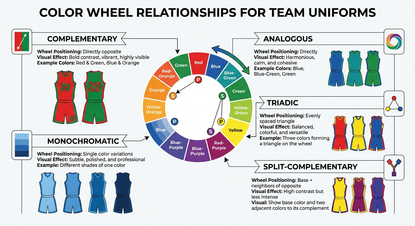
At the heart of color theory lies the color wheel, which organizes primary (red, blue, yellow), secondary (orange, green, purple), and tertiary colors in a circular format, illustrating their relationships. Complementary colors, like red and green or blue and orange, sit opposite each other on the wheel. These pairs provide maximum contrast, making elements like jersey numbers or logos stand out during fast-paced action. On the other hand, analogous colors – three hues next to each other, such as blue, blue-green, and green – create a more unified, tranquil look. For a vibrant but balanced approach, triadic schemes use three evenly spaced colors, forming a triangle on the wheel.
When applying these schemes, it’s best to pick one dominant color and use the others sparingly as accents. A split-complementary scheme, which combines a base color with the two colors next to its complement, offers high contrast with a softer, more varied effect compared to a direct complementary pair.
The Color Wheel and Color Relationships
Each type of color relationship creates a distinct visual impact, which can shape the overall feel of a uniform.
| Color Relationship | Wheel Positioning | Visual Effect on Uniforms |
|---|---|---|
| Complementary | Directly opposite | Bold contrast, vibrant, highly visible |
| Analogous | Directly adjacent | Harmonious, calm, and cohesive |
| Triadic | Evenly spaced triangle | Balanced, colorful, and versatile |
| Split-Complementary | Base + neighbors of opposite | High contrast but less intense |
| Monochromatic | Single color variations | Subtle, polished, and professional |
To refine your palette, consider whether a color leans warm or cool. For instance, warm greens with yellow undertones (like olive) feel inviting, while cool reds with blue undertones (like magenta) appear more composed. This distinction is key when crafting a cohesive design. Understanding these relationships also sets the stage for exploring how color temperature adds another layer to your uniform choices.
Warm vs. Cool Colors
Warm colors – like red, orange, and yellow – have longer wavelengths, making them visually "advance." They feel energetic, bold, and urgent, which is why they’re often linked to teams centered on speed and excitement. In contrast, cool colors – such as blue, green, and violet – tend to "recede", creating depth and a sense of calm. These hues are ideal for teams that prioritize precision and strategic play.
Some colors blur the line between warm and cool depending on their undertones. For example, lime green (yellow-leaning) feels warm, while teal (blue-leaning) is distinctly cool. Lighting also plays a role in how colors appear. Natural daylight skews cooler, while artificial stadium lights can range from warm (around 2,700K) to cool (5,000K or more). Testing uniforms under the actual lighting conditions of your games ensures the colors perform as intended. For instance, pairing a cool base color like navy with warm accents, such as yellow trim, can create visual balance and emphasize key design elements.
Color Psychology in Sports
Colors do more than define a team’s look – they also influence emotions and perceptions. Studies show that blue-rich light can boost alertness and focus, which may impact both players and spectators.
When choosing uniform colors, think about the image you want to project. Warm tones like scarlet or orange evoke energy and action, making them great for dynamic, fast-paced teams. Meanwhile, cool shades like navy or forest green suggest stability and calculated play. Adding neutrals – such as white, gray, or charcoal – can ground your design, while the choice between warm neutrals (tan, ivory) or cool neutrals (silver, slate) further shapes the mood. By leveraging these psychological cues, you can align your team’s on-field performance with its visual identity, ensuring the colors enhance rather than distract from your brand.
sbb-itb-4d95ad3
Maximizing Visibility and Contrast
Creating strong contrast between uniform colors is key to ensuring player visibility in games, photos, and broadcasts. The concept is straightforward: pair light colors with dark ones. For instance, a navy jersey with white numbers or a white uniform with black lettering makes it easier for fans and officials to read from the stands or during fast-paced gameplay. Below are some essential tips to refine contrast, improve outdoor performance, and optimize printing techniques.
Contrast Guidelines for Uniforms
Stick to a palette of two or three colors: one dominant shade and one or two accents. Using complementary colors – those on opposite sides of the color wheel, like purple and yellow or blue and orange – naturally enhances visibility and legibility across different lighting conditions. For a contemporary look, try pairing neutral base colors with neon accents, such as charcoal gray with neon orange or navy blue with neon pink. These combinations not only add energy but also ensure visibility under bright stadium lights.
When designing for home and away games, keep this rule in mind: darker dominant colors work best for home uniforms, while lighter contrasting colors are ideal for away uniforms. These strategies help ensure your team stands out, regardless of the setting.
Indoor vs. Outdoor Color Performance
Lighting conditions significantly influence how colors appear. Indoor venues, often lit by LED or fluorescent lights, can dull certain hues, while outdoor fields benefit from natural daylight. However, early morning or late afternoon games may present challenges with reduced lighting. Testing your uniform colors under the specific conditions your team plays in is crucial to maintaining consistent visibility, whether indoors or outdoors.
Fabric and Printing Considerations
The type of fabric used can change how colors and contrasts appear. Always test color combinations on actual fabric samples, as texture, sheen, and weave can alter the final look. Fully sublimated printing is a reliable option for preserving contrast and vibrancy, even after repeated washes. This method outperforms screen printing or heat transfers when it comes to retaining bold colors.
Requesting mockups and physical samples is a must. Seeing how the colors perform under your team’s typical playing conditions – whether under bright stadium lights or on outdoor fields – ensures that the final product meets expectations. Consistent color performance not only enhances visibility but also reinforces your team’s identity.
Wooter Apparel specializes in custom uniforms, using advanced printing techniques to deliver vibrant, high-contrast designs that stand the test of time.
Selecting Colors That Match Your Team Identity
Your team’s uniform colors do more than just look good – they play a big role in representing your brand. To create a strong connection between your team and its identity, start with your existing brand colors. These could come from a school mascot, league colors, or your team’s established logo. Keeping colors consistent across uniforms, social media, and other touchpoints helps build brand recognition. In fact, 81% of consumers are more likely to remember a brand’s color than its name.
Incorporating Brand Colors
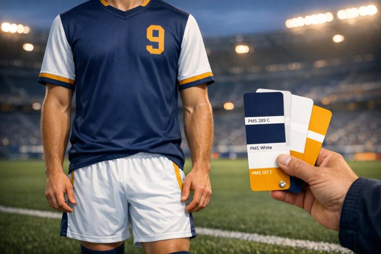
If your team already has official colors, use them as the foundation for your design. Begin with your team’s brand colors and their corresponding Pantone codes. You can find these in your organization’s style guide or by using an online Pantone Color Picker tool. Once you’ve identified the exact shades, share these codes with your manufacturer to ensure accuracy. This step sets the stage for a well-balanced design.
The 60-30-10 Color Proportion Rule
Once you’ve nailed down your brand colors, apply the 60-30-10 rule to achieve a visually balanced design. This rule suggests:
- 60% for the dominant color (like the main V-neck basketball jersey color)
- 30% for a secondary color (used in trim or side panels)
- 10% for an accent color (logos, numbers, or small details)
For instance, a basketball uniform might use navy blue for 60% of the design, white for 30% in side panels or collar trim, and gold for 10% as accents. If your team uses four colors, you can adjust to a 60-20-10-10 split to maintain a clear hierarchy. Sticking to these proportions ensures your design looks cohesive and professional.
Pantone Matching for Color Accuracy
Pantone matching takes the guesswork out of color selection by providing precise standards. For example, "navy blue" isn’t just a vague term – it has a specific Pantone number. When designing team uniforms, use the Fashion, Home + Interiors (FHI) system, which includes 3,049 colors tailored for textiles. Look for "TCX" references when working with fabrics to ensure accurate color matching.
Using Pantone standards guarantees consistency across all orders, no matter the supplier. This level of precision can enhance brand recognition by up to 87% and make products 50% to 85% more effective. Wooter Apparel, for example, boasts a 4.9/5 star rating from 1,334 reviews, with many customers praising their "amazing" colors and the precise match between designs and finished products.
Testing and Finalizing Your Color Choices
Once you’ve defined your color scheme, it’s time to put it through detailed testing to ensure it works seamlessly in real-world scenarios. Testing your colors before production can save you from costly mistakes. While digital mockups give you a good preview, testing in real-life conditions is equally important. Keep in mind that different printing methods can alter the way colors appear, so understanding these nuances is key to making informed choices. This process ensures your colors look just as you envisioned when it’s game time.
Using Digital Mockups
Digital mockups are a fantastic tool for refining your design. They let you experiment with color combinations and gather input from stakeholders before committing to production. If you’re collaborating with a manufacturer, ask for digital previews that showcase your design from various angles. This ensures everyone agrees that the colors accurately represent your team’s identity. For example, Wooter Apparel offers custom design services that allow teams to explore digital mockups, ensuring every detail – from subtle color differences to overall layout – matches the team’s brand. Before finalizing, check that colors align with branding, fonts remain legible from a distance, logos maintain their clarity at all sizes, and the design stays consistent across all pieces – jerseys, shorts, and accessories.
Testing Colors in Actual Conditions
What looks good on a screen might not translate the same way in real-world settings. To avoid surprises, request physical fabric samples to see how your colors perform in the environments where your team will compete. Many manufacturers offer color charts printed on the same fabric used for jerseys, with options ranging from larger charts for organizations to pocket-sized versions for smaller teams. Test these samples during practices or games to ensure visibility and contrast. Lighting conditions can have a big impact – colors that pop indoors might lose their vibrancy outdoors, or vice versa. Observing your colors in action helps you make confident decisions.
How Printing Methods Affect Color
Another critical factor to consider is how your chosen printing method affects the final appearance of your colors. For instance, sublimation printing delivers bold, fade-resistant colors and works well for intricate designs with gradients or multiple shades. On the other hand, embroidery is better suited for solid tones. Before placing your order, consult with your manufacturer to understand how their printing process might influence your design. To achieve precise color matching, use standardized Pantone Codes, which help ensure consistency across all production runs.
Conclusion
Team colors do more than just look good – they build identity by strengthening recognition, lifting morale, and even influencing performance. By understanding the basics of color theory, you can pick shades that energize or calm, shaping how your team is seen by fans and opponents alike.
High-contrast color combinations, like black and white or navy and yellow, make sure your uniforms stand out from a distance. Sticking to the 60-30-10 rule keeps designs balanced and polished, while real-world testing and using Pantone codes ensure your colors stay consistent across jerseys, shorts, and accessories.
Investing in well-designed uniforms that reflect your team’s identity is worth it. Teams that stick to two- or three-color schemes – with a strong base, a secondary accent, and a small pop of detail – achieve clean, bold designs that exude confidence. For fully sublimated, fade-resistant uniforms tailored to sports like basketball, football, and soccer, consider partnering with Wooter Apparel. They offer free custom designs and ensure every element of your uniform works together seamlessly.
To wrap it up, keep these principles in mind when finalizing your design: choose colors that align with your brand, prioritize high contrast, test in real-world settings, and maintain consistency across all gear. The right colors don’t just look sharp – they create a lasting impression, intimidate opponents, and unify your team.
FAQs
How do I choose a dominant, secondary, and accent color?
When choosing uniform colors, start by selecting a dominant color that represents your team’s identity and stands out in different environments. Then, add a secondary color that pairs well with the primary color, providing balance and contrast. Finally, pick an accent color to highlight details like trims or logos, adding a touch of visual flair. Keep in mind factors like color psychology, visibility, and league requirements to ensure the design looks polished and professional.
What contrast makes jersey numbers easiest to read?
For the best readability, ensure there’s a strong contrast between the light and dark colors on your jerseys. This helps the numbers pop against the background, making them easier to spot during games or events.
How can I ensure colors match across different fabric and print runs?
To keep colors consistent across different fabrics and print batches, rely on standard color codes such as Pantone, CMYK, RGB, or HEX, and make sure to document them for future reference. Always test colors on a variety of fabrics and under different lighting conditions to evaluate how they look and hold up over time. Maintaining thorough records of your color specifications and fabric details is key to ensuring uniformity in future projects.