
When choosing football jersey fonts, readability, durability, and style are the most important factors. Bold fonts ensure numbers are easy to read from a distance, while durable designs withstand the wear and tear of intense gameplay. The right font also reflects your team’s personality, whether it’s bold and powerful or sleek and modern.
Here are some top options:
- Jersey M54: Rugged and bold, ideal for visibility and a classic football vibe.
- Varsity: Timeless, bold, and perfect for school or league uniforms.
- Futura: Sleek and modern, offering clarity under stadium lights.
- Classic Block Fonts: Heavyweight and reliable, ensuring clear numbers even on stretched fabric.
- Condensed Fonts: Great for tight spaces or longer names, maintaining readability with bold strokes.
Key Takeaways:
- Prioritize bold, high-contrast fonts for maximum readability.
- Opt for durable fonts that maintain sharpness after repeated washes.
- Match your font to your team’s identity – classic, modern, or minimal.
For the best results, pair these fonts with high-quality sublimation printing to ensure durability and sharp visuals throughout the season.
7 Best Sports Fonts from Adobe Fonts
sbb-itb-4d95ad3
What to Consider When Choosing Football Jersey Fonts
When it comes to picking fonts for football jerseys, it’s not just about how they look – it’s about how well they perform during the game. A good font ensures numbers are clear, durable, and easy to read, even in fast-paced action. Here’s what to keep in mind:
Readability and Visibility
Bold fonts are non-negotiable for football jerseys. Whether it’s fans in the nosebleed seats, referees making calls, or broadcasters announcing the game, everyone needs to identify players quickly.
"Choose a font that’s easy to read, look for a bold font – fans want to see what’s written on jerseys too!" – Wooter Apparel
Contrast is just as important. Numbers should stand out sharply against the jersey’s fabric, no matter the lighting conditions.
"Make sure the text contrasts well against the color the text is on." – Wooter Apparel
Additionally, the sizing and spacing of numbers play a huge role in keeping them legible.
Sizing and Spacing
Numbers on jerseys need to be large enough – typically 10 to 12 inches – and spaced properly to avoid issues like print bleeding, which can blur the edges and make them hard to read.
"Ensure all text is legible, when text is too small there’s a chance that it can bleed and won’t be legible." – Wooter Apparel
While condensed fonts can work for tighter spaces, it’s important to leave enough room between digits so each number stands out clearly.
But readability isn’t the only factor. The font also needs to handle the physical demands of the game.
Durability and Fabric Compatibility
Football jerseys take a beating – players dive, tackle, and stretch the fabric constantly. That means the font must hold up under sublimation printing and endure countless washes without losing its sharpness. Delicate fonts just won’t cut it.
Since custom pro football jerseys are often used for multiple seasons, it’s smart to choose a durable, timeless font that keeps your team looking sharp year after year. A strong, well-chosen font helps maintain a polished and professional appearance on the field.
Top Fonts for Football Jersey Numbers
Here’s a look at some of the best fonts that combine style, readability, and durability – key elements for football jerseys.
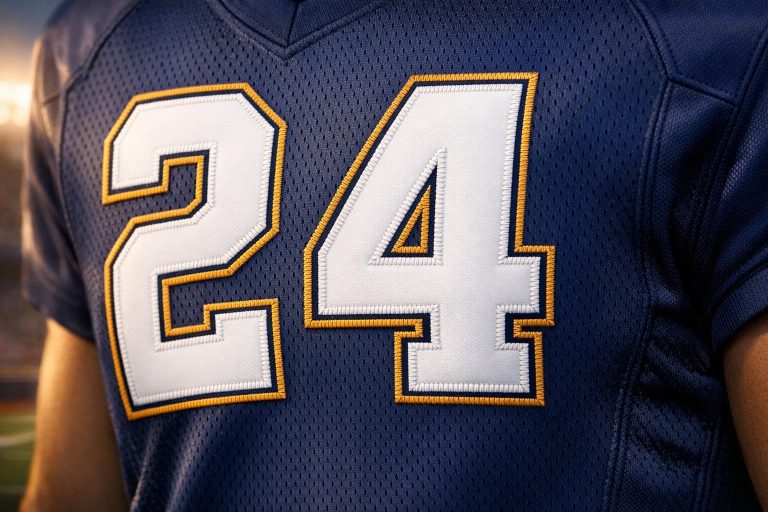
Jersey M54
Jersey M54 is a go-to choice for the gridiron. Its rugged design, featuring curved edges, creates a bold and compact look. The font’s heavy weight ensures that numbers stand out against any jersey color, while its well-balanced proportions make it easy to read from any angle or distance. It perfectly blends the traditional collegiate football jersey vibe with the modern need for visibility.
Varsity
Varsity embodies the timeless letterman style that has been synonymous with American football for years. Its bold, textured design ensures that names and numbers are highly visible on the back of jerseys. Graphic designer Brooke Arnold highlights its practicality:
"The numbers are all easy to read from a distance. That makes them all perfect for sports jerseys".
Futura
Futura brings a sleek, geometric edge to the game. This font, widely used by NFL teams, offers a clean and professional look that works well under stadium lights and on TV screens. Its precise proportions and strong strokes ensure clarity whether players are standing still or moving at full speed. Futura is the ultimate mix of modern design and functional readability.
Classic Athletic Block Fonts
Classic block fonts are a mainstay in football for a reason. Their straightforward, heavy-weight design ensures numbers remain clear and legible, even when jerseys stretch during intense gameplay. These fonts have stood the test of time, proving their reliability season after season.
Condensed Fonts
Condensed fonts, like Oswald and Teko, solve the challenge of fitting names and numbers onto limited jersey space. Their narrower design allows for larger text without overcrowding, which is especially helpful for longer names or double-digit numbers. With bold weights and clear spacing, condensed fonts maintain legibility while maximizing use of space.
These fonts set the standard for football jerseys, combining functionality and style to meet the demands of the sport.
Font Comparison
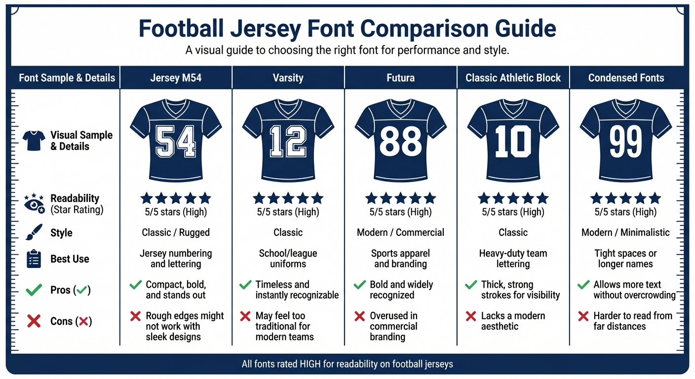
Football Jersey Font Comparison: Readability, Style and Best Use Cases
Picking the right font means weighing factors like readability, style, and practicality. Below is a breakdown comparing how different fonts perform based on these essential criteria.
Comparison Table
| Font Name | Readability | Style | Best Use Case | Pros | Cons |
|---|---|---|---|---|---|
| Jersey M54 | High | Classic / Rugged | Jersey numbering and lettering | Compact, bold, and stands out | Rough edges might not work with sleek designs |
| Varsity | High | Classic | School/league uniforms | Timeless and instantly recognizable | May feel too traditional for modern teams |
| Futura | High | Modern / Commercial | Sports apparel and branding | Bold and widely recognized | Overused in commercial branding |
| Classic Athletic Block | High | Classic | Heavy-duty team lettering | Thick, strong strokes for visibility | Lacks a modern aesthetic |
| Condensed Fonts | High | Modern / Minimalistic | Tight spaces or longer names | Allows more text without overcrowding | Harder to read from far distances |
Jersey M54 stands out for its rugged, compact design, making it a strong choice for football jersey numbers, where durability and visibility are key.
Using These Fonts with Wooter Apparel
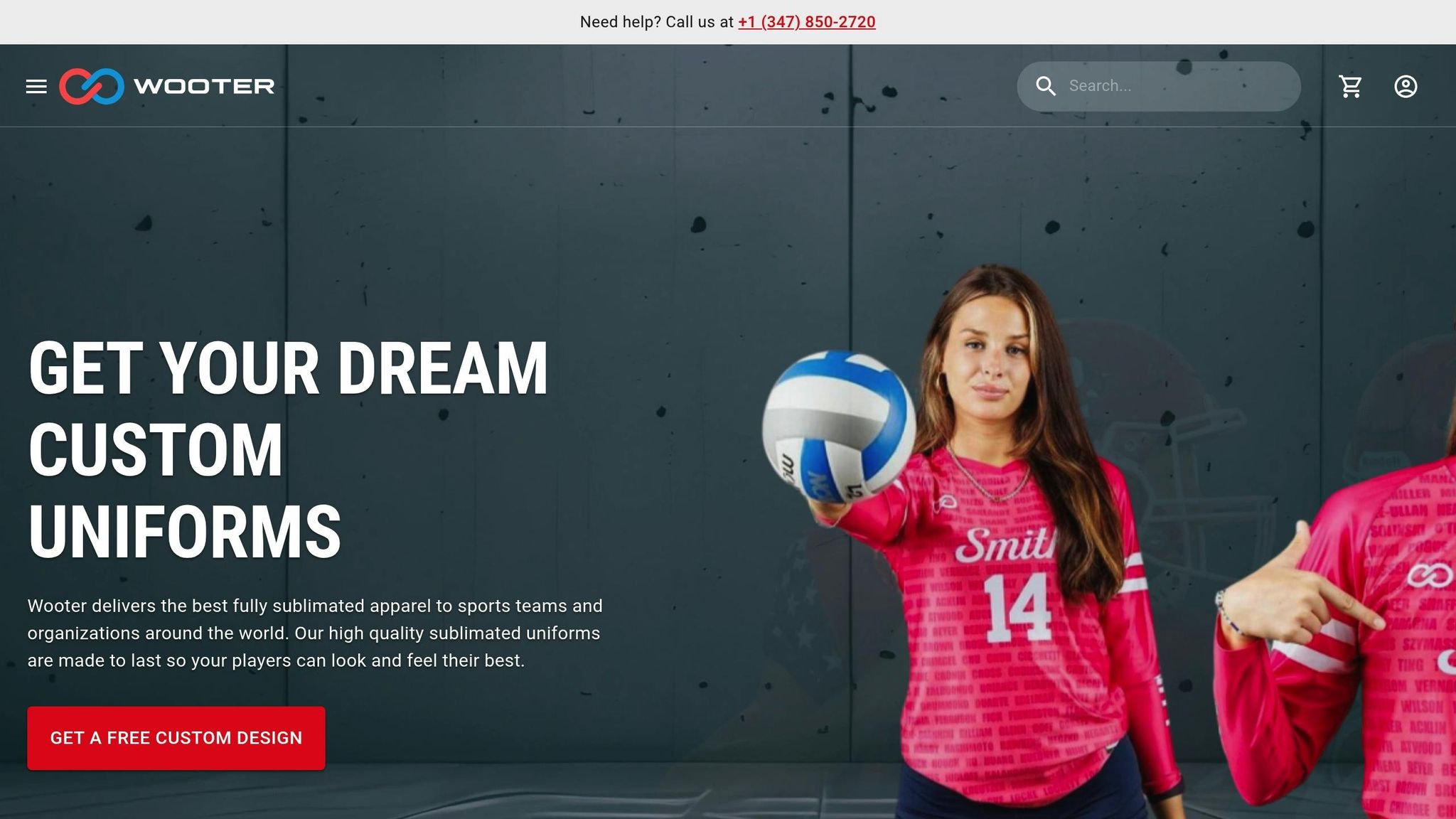
When pairing fonts with Wooter Apparel’s expertise, the result is clear, professional, and durable designs that stand out on the field.
Wooter Apparel uses a sublimation process that embeds the ink directly into the fabric. This ensures that fonts like Jersey M54 and Ostrich Sans Bold maintain their sharpness and vibrant appearance, even after repeated washes. Bold, blocky fonts work especially well with this process, as it preserves the smooth curves of Jersey M54 and the clean, tall lines of Ostrich Sans Bold, even on curved fabric surfaces.
Their free custom design service allows teams to collaborate with designers to pick fonts (like Sand-Knit, Varsity, or Futura), adjust number heights (ranging from 10 to 12 inches), and fine-tune spacing to avoid overlapping. Wooter Apparel also adheres to sports standards, ensuring numbers are centered, have high color contrast, and are scaled proportionally. Youth sizes typically use 8–10-inch numbers, while adult sizes go 12 inches or larger, ensuring every player’s uniform is easy to read during the game.
Teams can visit the Wooter Apparel website to request free designs, upload their logos, and choose fonts. Production is efficient, with a turnaround time of just 2–3 weeks. High school teams often prefer Jersey M54 for its bold, compact style, while college clubs lean toward Ostrich Sans Bold for its tall, readable numbers – both offering excellent visibility on the field.
Conclusion
The right font does more than just improve visibility on the field – it also highlights your team’s identity. Opting for bold, sturdy fonts like Jersey M54 or Ostrich Sans Bold ensures clear readability and a modern edge, while timeless choices like Varsity and Sand-Knit offer a classic, enduring appeal. Pairing these fonts with high-contrast designs guarantees maximum legibility during the game.
"Selecting the right sport font can make your custom sports uniform stand out on field." – Wooter Apparel
Wooter Apparel’s sublimation printing ensures that fonts stay sharp and vibrant, even after countless washes. Plus, their free custom design service lets you experiment with font styles and layouts to perfectly match your team’s vision. Boasting a 4.9/5 star rating from 1,349 reviews, Wooter Apparel is frequently lauded for its exceptional customer service, high-quality fabrics, and quick delivery.
Whether you’re designing uniforms for a high school team or a college club, the right combination of font and professional printing can create a unified look that inspires team pride and strengthens your brand. Make your team stand out by choosing fonts and design services that deliver both style and performance.
FAQs
What font works best for double-digit numbers?
When it comes to football jerseys, the best fonts for double-digit numbers are those that are bold, highly readable, and sports-focused. Fonts like Varsity, Jersey M54, and Tourney are fan favorites because they strike the perfect balance between style and functionality. Their design ensures that numbers remain clear and easy to spot, even from far away, making them ideal for the fast-paced action on the field.
How do I pick number colors for maximum contrast?
To make jersey numbers stand out, opt for high-contrast color combinations. For example, white numbers on dark backgrounds or black numbers on light backgrounds are easier to read. Pairing complementary colors, like blue and orange, can also create bold and visually striking designs. Always test the jerseys under various lighting conditions to ensure the numbers remain visible and meet league requirements.
Will sublimation keep jersey numbers from cracking or peeling?
Sublimation keeps jersey numbers intact by embedding the dye directly into the fabric. This method ensures the numbers won’t crack or peel, offering long-lasting durability and resistance to wear, so they stay in great condition over time.