
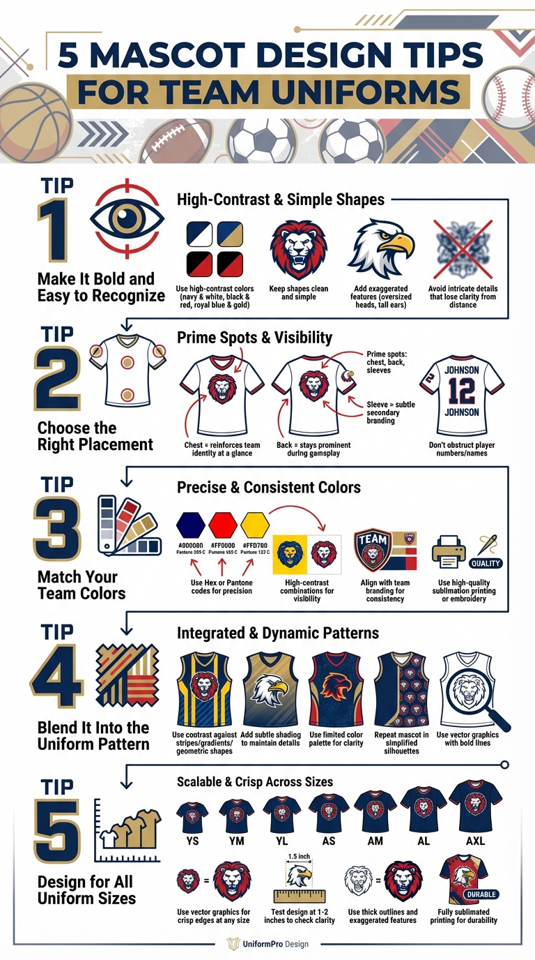
Mascots are the face of your team, creating a strong visual identity that stands out during games. A well-designed mascot is bold, recognizable, and seamlessly integrates with your team’s branding. Here’s a quick breakdown of the five key tips to design standout mascots for uniforms:
- Keep It Bold: Use high-contrast colors and simple, clean shapes for visibility in action-packed settings. Avoid intricate designs that lose clarity from a distance.
- Strategic Placement: Position the mascot on the chest, back, or sleeves to ensure visibility without interfering with other elements like player names or numbers.
- Match Team Colors: Use precise color codes (Hex or Pantone) to align the mascot with your team’s branding for a cohesive look.
- Blend with Patterns: Incorporate the mascot into uniform designs, such as stripes or gradients, while maintaining clarity and balance.
- Scalability Across Sizes: Ensure the mascot looks sharp on all uniform sizes, from youth jerseys to adult jackets, using vector graphics for consistent quality.
For professional results, consider working with experts like Wooter Apparel, who specialize in custom sublimated uniforms that keep your mascot vibrant and durable throughout the season.
5 Essential Mascot Design Tips for Team Uniforms
1. Make It Bold and Easy to Recognize
Visibility on Uniforms
Mascots need to grab attention, especially in action-packed settings like fields or arenas. High-contrast color combinations – think navy and white, black and red, or royal blue and gold – ensure a sharp and eye-catching appearance that stands out even from a distance. Avoid overly detailed or intricate designs, as these can lose their impact when viewed from afar. Instead, stick to bold, clean shapes that maintain their clarity in any setting.
Integration with Team Branding
Beyond visibility, your mascot should seamlessly tie into your team’s overall identity. It should feel like a natural part of your brand, not just an add-on. Use your team’s main colors prominently – whether through fur, skin tone, or outfit accents – to strengthen the connection between the mascot and your team.
"Give your mascot a feature or look that is a little different or unexpected, but one that’s easy for your fans to recognize." – Hogtown Mascots
Adding exaggerated features, like oversized heads or tall ears, can make your mascot instantly recognizable. These unique elements help create a silhouette that fans can spot immediately, even in a crowded stadium.
Durability and Clarity in Design
Simplicity is your best friend when designing a mascot. For highly stylized characters, sticking to just the head instead of the full body can keep the design clean and impactful. Overly elaborate designs can create unnecessary clutter, so aim for a balanced look that avoids competing elements. A streamlined design ensures your mascot stays visually clear and memorable.
sbb-itb-4d95ad3
Team Builder: The Easiest Way to Design & Print Team Uniforms
2. Choose the Right Placement
Where you place your mascot on a uniform can make or break its visual impact. The chest, back, and sleeve areas are prime spots for ensuring visibility and maintaining brand consistency. Chest placement is ideal for reinforcing team identity at a glance. Placing the mascot on the back ensures it stays prominent during gameplay, while the sleeve serves as a subtle secondary branding area that doesn’t compete with the main design.
When deciding on placement, make sure the mascot design is easy to spot from a distance.
Integration with Team Branding
Your mascot should work in harmony with other uniform elements, like player numbers and names. These identifiers need to be clear and easy to read, even from the stands, so stick with clean fonts and high-contrast colors. Position the mascot in a way that enhances, rather than obstructs, these key details.
Depending on your design goals, the mascot can serve as the main logo or as an accent element. For primary uniforms, the chest or back is a great spot for making the mascot the centerpiece. On alternate uniforms, consider placing it on the sleeves or shoulders for a more understated look.
After deciding on placement, verify that the design integrates seamlessly with all uniform elements.
Scalability Across Uniform Sizes
Uniform sizes range widely, from youth small to adult XL, and your mascot design needs to look great across the board. Test the mascot on every size before finalizing the design to ensure it remains recognizable and visually appealing, whether it’s on a child’s jersey or an adult’s warmup jacket. This step ensures consistency and avoids awkward scaling issues.
3. Match Your Team Colors
Once you’ve nailed down a bold design and smart placement, the next step is making sure your mascot reflects your team’s colors. A mascot should feel like an extension of your team’s identity. Use Hex or Pantone codes to precisely define your colors and weave them into your mascot’s key design features. This not only creates a cohesive look but also enhances visibility on the field.
Visibility on Uniforms
Getting the colors right isn’t just about aesthetics – it’s about function, too. High-contrast color combinations, like navy and white, black and red, or royal blue and gold, ensure your mascot stands out, even from far away. For instance, imagine a golden eagle set against royal blue uniforms – it pops, making it easy for fans to spot from the stands. Adding bold outlines in contrasting colors can further sharpen the mascot’s appearance during gameplay.
Integration with Team Branding
Colors do more than catch the eye – they build recognition. When your mascot’s color scheme aligns with your team’s branding, it strengthens the connection fans feel. Think of Alabama’s "Big Al" – its colors perfectly reflect the team’s identity, making it instantly recognizable. By matching your mascot to your team’s colors, you create consistency across uniforms, merchandise, and promotional materials.
Durability and Clarity in Design
Your mascot needs to look just as good at the end of the season as it did at the start. To achieve this, use high-quality sublimation printing or embroidery with color-matched threads designed to withstand wear and tear. Repeated washing, sweat, and abrasion can dull colors, so it’s essential to test samples on actual uniform fabrics. Pay special attention to areas that see heavy use, like shoulders. Partnering with experts – such as Wooter Apparel (https://wooter.com) – can help ensure your mascot’s colors stay vibrant and consistent for the long haul.
4. Blend It Into the Uniform Pattern
Incorporating your mascot into the uniform pattern can create a polished, cohesive look. The goal is to ensure the mascot feels like an integral part of the design rather than an afterthought. Done right, this approach reinforces team identity without making the design feel cluttered.
Visibility on Uniforms
When working with patterns like stripes, gradients, or geometric shapes, contrast is your best friend. For example, a wolf mascot outlined in white will stand out clearly against striped backgrounds. Adding subtle shading can also help maintain the mascot’s details, even on busier patterns. Stick to a limited color palette to improve clarity, and use negative space strategically to define the mascot’s shape. Overly crowded patterns can make the mascot disappear, so balance is key.
Integration with Team Branding
Repeating your mascot within the uniform pattern can strengthen your team’s identity. Use signature poses, simplified silhouettes, or accessories that tie back to your team logo. For instance, a bear head wearing a football helmet could be subtly repeated in the jersey fabric, reinforcing team colors while keeping the design clean. This approach works across all types of apparel, from jerseys to warm-up gear, ensuring a unified look. Teams that use bold animal silhouettes or simplified motifs in their patterns often achieve a strong, recognizable brand presence without overwhelming the design.
Durability and Clarity in Design
To ensure your mascot pattern lasts through wear and tear, use vector graphics with bold lines and minimal detail. This prevents blurring after washing and keeps the design sharp throughout the season. Highlight distinctive features, like exaggerated ears or tails, to make sure the mascot remains recognizable, whether it’s a small accent on a sleeve or a larger element on shorts. Always test your design on actual uniform fabrics before production to ensure it looks just as good in real life as it does on screen. For example, Wooter Apparel offers fully sublimated uniforms, allowing mascots to be seamlessly integrated into custom patterns while maintaining durability and visual impact across sports like basketball, soccer, and more. Check them out at Wooter Apparel.
5. Design for All Uniform Sizes
When designing a mascot for team uniforms, it’s crucial to ensure it works seamlessly across all sizes, from youth jerseys to adult warm-up jackets. A well-designed mascot should maintain its appeal and clarity no matter the scale.
Scalability Across Uniform Sizes
Your mascot must look sharp and recognizable whether it’s on a small youth jersey or a large adult jacket. Using vector graphics is key here – this ensures the design retains crisp edges at any size. To test scalability, shrink the design down to 1–2 inches. If details become blurry or indistinct, simplify the shapes and opt for thicker outlines.
Silhouettes with bold, clean shapes – like an eagle or wolf – tend to scale well. For instance, a wolf head that’s 6 inches wide on a jersey chest should still look great when reduced to 2 inches on shorts. Intricate details often get lost when scaled down, so keeping it simple is essential.
Once the mascot is resized, check how it appears on the field or court to ensure it stands out.
Visibility on Uniforms
High-contrast colors are your best friend when designing for visibility. These combinations make the mascot stand out, even from a distance. Thick outlines and exaggerated features also help ensure the design remains clear, whether viewed courtside or from the bleachers.
Avoid fine lines and delicate shading, as they can fade or become invisible during games, especially in dim lighting. Stick to bold, straightforward elements that hold up under various conditions.
After addressing size and visibility, focus on how well the design endures over time.
Durability and Clarity in Design
Durability is just as important as appearance. Fully sublimated printing embeds the mascot directly into the fabric, which helps maintain its vibrancy even after countless washes. This method also avoids issues like peeling or cracking that can happen with other printing techniques.
To ensure your mascot looks great on all uniform sizes and fabrics, request samples and test them after laundering. This helps confirm that the colors remain consistent and the design holds up across different materials.
For teams aiming to combine durability with standout designs, Wooter Apparel offers fully sublimated uniforms that stay sharp and vibrant across all sizes. From custom basketball jerseys starting at $16.99 to complete team uniform packages, their process ensures your mascot looks bold on both youth and adult gear. Learn more at Wooter Apparel.
Conclusion
A well-designed mascot can make your team’s uniforms unforgettable. By ensuring your mascot is bold and easily recognizable, placing it strategically, aligning it with team colors, integrating it into uniform patterns, and creating a design that works across all sizes, you establish a cohesive and standout look for your team. These elements work in harmony to ensure your team’s identity is visible from the stands and consistent across all gear.
For a polished execution, professional support makes all the difference. Wooter Apparel provides free custom design services, working with skilled graphic designers to ensure your mascot looks sharp, no matter the size. Their fully sublimated uniforms feature vibrant colors and fine details, earning them a 4.9-star rating from 1,349 reviews.
"I love the work that you guys created for my basketball organization. I highly recommend anyone who reads these reviews to head over to Wooter Apparel ASAP!" – Tavares R., Verified Buyer
If you’re ready to upgrade your team’s look, Wooter Apparel offers custom basketball jerseys starting at $16.99, with no minimum order required. Their Custom Uniform Builder allows you to upload logos, tweak colors, and preview your mascot design on various products, including jerseys and backpacks. With delivery in about two weeks, your team can be game-ready in no time.
FAQs
How do I simplify a mascot for long-distance visibility?
To make sure a mascot grabs attention from far away, stick to bold, high-contrast colors and use simple shapes. Intricate details can become messy or hard to see at a distance, so it’s best to avoid them. Focus on larger, prominent features that make the design pop. It’s also smart to test how the mascot looks at different sizes and distances to ensure it stays clear, recognizable, and visually appealing without feeling cluttered.
What mascot size works best on the chest vs sleeves?
Chest mascots are usually 6 to 10 inches wide, making them stand out prominently. For sleeves, a smaller size – around 3 inches wide – creates a balanced and proportional appearance. This sizing ensures the mascot design remains clear and visually harmonious across the uniform.
How do I keep mascot colors consistent across fabrics?
To keep mascot colors consistent across all types of fabrics, rely on standard color codes such as Pantone, CMYK, RGB, or HEX. It’s important to test how these colors look on various materials and under different lighting conditions to ensure accuracy. Make sure to document all color details and fabric guidelines thoroughly for future orders. Regularly check fabric samples and maintain a clear record of color codes to ensure consistency across production batches.