
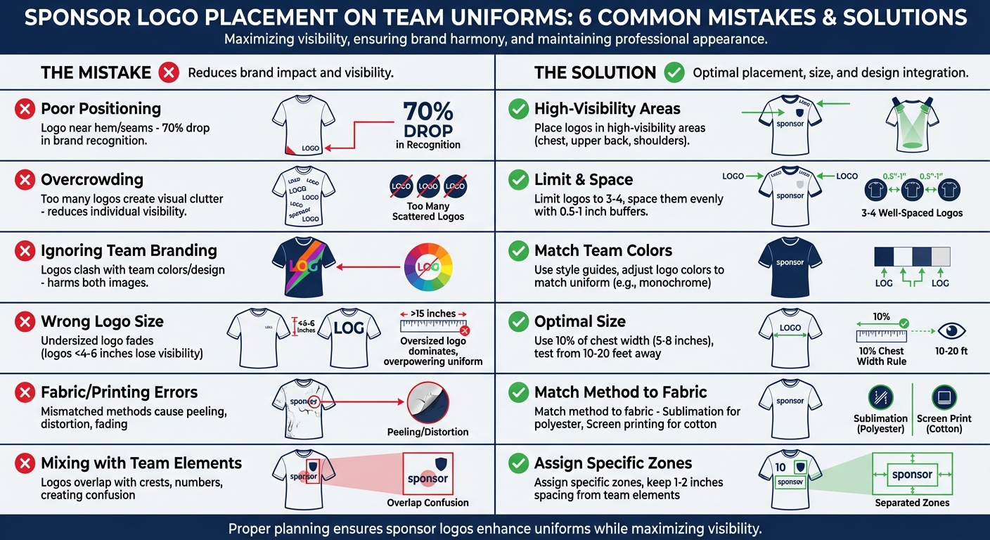
Poor sponsor logo placement on fully customizable team uniforms can cost your team both professionalism and sponsorship renewals. Here are the six most common mistakes teams make, along with practical ways to avoid them:
- Poor Positioning: Logos placed in low-visibility areas, like near hems or seams, fail to grab attention during games or broadcasts. Prioritize high-visibility spots like the chest or upper back.
- Overcrowding: Too many logos create visual clutter, making individual sponsors harder to notice. Limit logos to a manageable number and space them out.
- Ignoring Team Branding: Logos that clash with team colors or designs harm both the team and sponsor image. Use style guides to ensure harmony.
- Wrong Logo Size: Oversized logos dominate the uniform, while undersized ones fade into the background. Test logo sizes from a distance to ensure clarity and balance.
- Fabric and Printing Errors: Mismatched printing methods or fabrics can lead to peeling, distortion, or fading. Choose techniques like sublimation for polyester or screen printing for cotton.
- Mixing Logos with Team Elements: Overlapping logos with team crests, numbers, or other elements creates confusion. Assign specific zones to keep designs clean.
Summary Table
| Mistake | Impact | Solution |
|---|---|---|
| Poor Positioning | Reduces visibility | Place logos in high-visibility areas |
| Overcrowding | Creates clutter | Limit logos and space them out |
| Ignoring Branding | Clashes with team design | Use cohesive colors and design guidelines |
| Wrong Logo Size | Reduces clarity or overwhelms design | Test sizes from a distance |
| Fabric/Printing Errors | Peeling or distortion | Match printing method to fabric |
| Mixing with Elements | Confusion and clutter | Keep logos separate from team elements |
Key Takeaway: Proper planning ensures sponsor logos enhance your team’s uniform while maximizing sponsor visibility. Focus on strategic placement, sizing, and design harmony to maintain a professional look and strong sponsor relationships.
6 Common Sponsor Logo Placement Mistakes and Solutions for Team Uniforms
1. Poor Positioning That Reduces Visibility
Visibility and Prominence of Logos
Hiding logos in less noticeable spots is a major mistake. Placing them on the lower hem, inside seams, or anywhere far from eye level means they often go unseen during gameplay. Research highlights that in fast-moving sports, logos in poor locations can lead to a 70% drop in brand recognition because our brains naturally overlook elements that aren’t prominently displayed.
Placement makes a big difference. For instance, soccer jerseys with logos on the chest are remembered three times more often than those with logos on the thigh since cameras typically focus on players’ upper bodies during broadcasts. Similarly, minor league baseball teams with logos on pant legs experienced a 50% drop in recall compared to chest placements. In basketball, warmup jackets with logos near the hem become practically invisible when players are sitting on the bench.
To stand out, logos need to be positioned where they’re most likely to grab attention.
Appropriate Sizing for Clarity and Aesthetics
Size matters as much as placement. Logos should be placed at eye-catching spots like the chest, upper back, or shoulders – areas in the top third of the jersey – to capture up to 80% of viewers’ attention. When testing, use mockups and view them from 10–30 feet away under stadium lighting to ensure they’re legible from typical spectator distances.
Striking the right balance between size and placement ensures logos are both clear and visually appealing.
Avoidance of Clutter or Overlap with Other Design Elements
Even with the perfect size and placement, a cluttered design can ruin everything. Sponsor logos should never compete for space with player numbers, team crests, or other elements. Overcrowding creates visual noise, making it hard for any individual logo to stand out. Prime spots like the upper chest should be reserved solely for sponsor logos to maintain clarity and focus.
sbb-itb-4d95ad3
2. Overcrowding the Design with Too Many Logos
Avoiding Clutter and Overlap
Packing a design with too many sponsor logos creates visual chaos, reducing the visibility of each brand. When logos are crammed together, they compete for attention, making it harder for viewers to identify individual sponsors. This can significantly lower each sponsor’s Brand Impact Score (BIS), as research has shown. For context, in 2024, the 23 MLB teams using jersey patches generated $204 million in revenue – a clear indication of the financial stakes tied to proper logo placement.
Adding more logos doesn’t always translate to better exposure. Studies using human-vision AI reveal that NBA jersey patches strategically placed in high-visibility areas achieve up to 73% isolated visibility. However, when logos are bunched together, this visibility drops dramatically. Viewers typically notice logos within the first 3–5 seconds, but overcrowded designs shorten that window, making it harder for any single logo to stand out.
"Including too many sponsor logos on your uniform will negatively impact the exposure benefit and may deter sponsors from resigning." – KPI Sports
Aligning with the Overall Design and Branding
Overcrowding doesn’t just hurt sponsors – it also undermines your team’s branding. A cluttered uniform distracts from the overall design, creating a chaotic look that dilutes the team’s identity. While having more logos might inflate "Gross Advertising Value" due to total screen time, the "Net Sponsorship Value" takes a hit when poor placement and clutter reduce the quality and focus of the exposure.
The key is strategic restraint. Limit the number of logos to those necessary to meet financial goals without compromising the uniform’s design. Focus on placing primary sponsor logos within the central 50% of custom baseball jerseys or other uniforms – where broadcast cameras naturally draw attention. This approach ensures a clean, professional look while delivering meaningful value to sponsors, encouraging long-term partnerships. By keeping logo placement intentional and uncluttered, you set the foundation for effective sponsorship strategies. This starts with choosing premium team uniforms designed to showcase your partners effectively.
3. Ignoring the Uniform’s Design and Team Branding
This section highlights the importance of ensuring sponsor logos complement your team’s design and branding, building on earlier discussions about positioning and sizing.
Consistency with the Overall Design and Branding
Sponsor logos should blend seamlessly with your team’s identity rather than compete with it. When logos clash with team colors, fonts, or overall design themes, the result can feel disjointed and unprofessional. This not only impacts your team’s image but can also diminish the sponsor’s perceived value. To avoid this, consider creating a style guide or brand kit that outlines your team’s color palette, typography, and acceptable logo adaptations to ensure a cohesive look.
One way to achieve visual harmony is by adjusting logo colors to suit the uniform. For example, a bold red logo might need to be converted to a white or monochrome version when placed on a black jersey. As Bullseye Activewear and Promotions puts it:
"The first rule of using a logo is that it should look great, and sometimes that requires some adjustment".
Typography also plays a role. Formal typefaces like Times New Roman can convey authority, while playful fonts might suit a more relaxed team vibe. Aligning these elements with your team’s tone ensures a polished and unified appearance.
Appropriate Sizing for Clarity and Aesthetics
Getting the size of sponsor logos just right is essential. Oversized logos can dominate the uniform and distract from your team’s branding, while logos that are too small may fail to provide sponsors with adequate visibility. Striking a balance is key – logos should be noticeable without overshadowing your team’s elements. Opt for high-quality, scalable formats like SVG to ensure logos remain sharp at any size. For smaller applications, such as embroidery, consider simplified versions of complex logos to maintain clarity.
Avoidance of Clutter or Overlap with Other Design Elements
A clean, uncluttered design is critical for preserving the integrity of both team and sponsor branding. Sponsor logos should never overlap with essential elements like team crests, player numbers, or other key features. To achieve this, incorporate dividers or leave ample white space between logos and team elements. This approach ensures each brand stands out clearly while maintaining a professional and polished uniform design.
4. Choosing the Wrong Size for Sponsor Logos
Visibility and Prominence of Logos
Getting the size of a sponsor’s logo just right is crucial for visibility. While positioning and clarity matter, the size plays an equally important role in delivering value to sponsors and maintaining a polished look for your team. Logos smaller than 4–6 inches often fade into the background when viewed from typical distances of 10–20 feet. A logo that looks fine up close might lose its impact when seen from the stands. To avoid this, test different logo sizes at actual viewing distances before finalizing production.
Appropriate Sizing for Clarity and Aesthetics
A good rule of thumb is to make the sponsor’s logo about 10% of the jersey’s chest width, which typically translates to 5–8 inches for adult uniforms. This size ensures the logo is easy to read without overshadowing the team’s identity. Always scale logos proportionally to maintain their original design and avoid distortion. Use high-resolution files (minimum 300 DPI) to ensure the logo stays sharp regardless of size. Before production, create full-scale mockups and evaluate them from 10–20 feet away to confirm they’re effective for game-day viewing.
Suitability for the Fabric and Printing Method
The fabric and printing technique can also impact the ideal logo size. For instance, fully sublimated designs on performance fabrics – like those offered by Wooter Apparel – require vector files scaled 20–30% larger than the final print size to ensure crisp details during the heat transfer process [context]. Polyester sublimation works better with simpler, larger logos to prevent issues like blurring, while embroidery on textured materials can cause puckering if the logo is oversized. Incorrect sizing can also lead to fading or poor adhesion, reducing the logo’s durability. Paying attention to these factors ensures the logo not only looks good but also maintains its quality over time.
Avoidance of Clutter or Overlap with Other Design Elements
Spacing is key to keeping the design clean and professional. Leave 1–2 inches of space between sponsor logos and team elements. To maintain visual balance, sponsor logos should be scaled to about 15–25% of the size of your primary team graphics. For example, if your team crest measures 6 inches, the sponsor logos should stay within the 4–6 inch range to avoid disrupting the overall design. Oversized logos – anything over 10 inches – can dominate the uniform and even restrict movement. Following these guidelines helps create a cohesive look that enhances both sponsor visibility and the uniform’s overall appeal.
5. Overlooking Fabric Type and Printing Methods
Suitability for the Fabric and Printing Method
Pairing the right printing method with the uniform fabric is key to maintaining the durability and appearance of sponsor logos. For instance, using screen printing on stretchy sublimated fabrics can lead to logo distortion when the fabric stretches during movement. Similarly, heat transfer vinyl applied to moisture-wicking materials often peels after repeated washes. For sports like basketball and soccer, which typically use polyester uniforms, dye sublimation is the go-to method. This technique embeds dye directly into the fabric fibers, creating vibrant, breathable logos that stay sharp and visible from 10–20 feet away without adding bulk. On the other hand, for cotton blends, screen printing works better, as it resists fading over time. Choosing the wrong method could reduce the logo’s lifespan and impact, ultimately diminishing sponsor value.
Visibility and Prominence of Logos
The printing method also plays a big role in how visible and striking sponsor logos appear during games. Dye sublimation on polyester uniforms produces bold, colorful logos that remain clear and prominent under stadium lights and during fast-paced action. For cotton fabrics, screen printing ensures the logos retain their clarity and visibility throughout the game. To guarantee quality, test for wash durability (after 50 cycles) and stretch performance, especially for sports involving a lot of movement. Companies like Wooter Apparel offer fully sublimated custom jerseys made with performance fabrics, ensuring sponsor logos look sharp and professional all season long. These thoughtful choices help maximize sponsor exposure and create a polished team appearance.
Consistency with the Overall Design and Branding
The right combination of fabric and printing method not only boosts durability and visibility but also protects the team’s brand identity. For example, sublimation on polyester fabrics ensures uniform color consistency, helping sponsor logos blend seamlessly with the team’s overall design. On the flip side, mismatched choices – like applying vinyl to mesh fabrics – can result in a subpar, unprofessional look that hurts both the team’s image and sponsor credibility. To avoid this, use vector files for logos, which allow for proper scaling without pixelation, no matter the fabric or printing technique.
Avoidance of Clutter or Overlap with Other Design Elements
Improper printing methods can lead to messy designs where logos bleed into other elements, like jersey numbers or team crests. For instance, thick ink from screen printing on thin fabrics might overlap with these features. Dye sublimation avoids this issue by embedding the logo directly into the fabric, eliminating any extra layers. Before production, it’s smart to create a pre-production checklist: match the printing method to the fabric, test samples from a distance of 10–20 feet, and prototype on the actual uniform material to catch potential issues early. These steps ensure a clean, professional finish that enhances both the team’s and the sponsor’s image.
6. Failing to Separate Sponsor Logos from Team Elements
Visibility and Prominence of Logos
Getting the placement and size of sponsor logos right is just the beginning. It’s equally important to separate sponsor logos from team elements by giving them their own dedicated areas – like sleeves, side panels, or the back of the uniform. When team and sponsor logos are mixed together, it creates confusion and dilutes both identities. To keep things clear, sponsor logos should be placed in their designated zones, while team logos remain in prominent spots like the front chest. Placing logos at eye level ensures they’re noticed and remembered more easily by fans and attendees. This approach not only strengthens the team’s visual identity but also highlights the sponsor’s branding effectively.
Consistency with the Overall Design and Branding
"Sponsors want to align with professional, well-managed teams that have a clear and consistent identity".
When sponsor logos are randomly scattered or clash with team colors and fonts, the uniform can look disorganized. A lack of consistency in branding can hurt credibility. By assigning specific areas for team and sponsor logos, both brands maintain their integrity and professionalism. For example, team branding can dominate the chest area, while sponsors get their own zones like the sleeves or back. This separation ensures that both identities are clear and visually appealing. Plus, sticking to defined zones allows for better execution of printing techniques, making the separation even more distinct.
Avoiding Clutter and Overlap with Other Design Elements
Cluttered or overlapping logos can make a uniform look chaotic. To avoid this, dedicate specific zones for each logo and ensure they don’t interfere with team numbers, crests, or other design elements. For example, the front chest is ideal for the team logo, while sleeves or side panels are better suited for sponsors. Adequate white space between elements also helps create a clean, professional look. Using contrasting colors is another effective way to make each logo stand out. For instance, if your team’s uniforms are blue, choose a sponsor logo color that contrasts naturally or use an alternate version of the logo to ensure visibility.
Suitability for Fabric and Printing Method
The choice of printing method can make a big difference in keeping logos distinct. Sublimation works well for polyester, providing sharp and vibrant results. Screen printing is ideal for solid colors on cotton, while embroidery adds texture and separation. Wooter Apparel offers fully sublimated custom jerseys that keep sponsor logos crisp and clearly separated from team branding throughout the season. This ensures a polished and professional look that benefits both the team and its sponsors.
How to Avoid Logo Placement Mistakes
Collaborate with professional uniform designers who understand the balance between showcasing team identity and sponsor logos. For example, Wooter Apparel provides free custom designs for fully sublimated uniforms across various sports like basketball, soccer, and football. Their approach ensures sponsor logos are seamlessly integrated without overwhelming the design. To get started, supply clear branding guidelines, high-quality vector logo files, and specific visibility requirements. Reviewing mockups early is essential to see how logos will look on different body types and under game conditions. It’s also important to consider the durability of logos based on the printing method.
Choose the right printing method for your fabric. Sublimation is ideal for polyester uniforms, offering breathable, fade-resistant logos that endure washing and game wear. For intricate designs, heat transfer works well, while screen printing is better for solid colors. Sublimation printing is particularly effective for performance uniforms, as it ensures the logos remain intact without cracking or peeling. Always test samples before full production to confirm color accuracy and durability, avoiding methods like vinyl that can peel on stretchy materials.
Balancing sponsor visibility with team identity is key. Focus on central positions like the chest for team colors and primary logos, while placing sponsor logos in secondary areas such as sleeves or shorts. A detailed brand guide should outline logo sizes, positions, and spacing to maintain consistency. For example, primary sponsor logos should be 4-6 inches high, secondary logos 2-4 inches, with at least 1 inch of spacing from seams.
Test how logos appear from 10-20 feet away to mimic the perspective of fans and spectators. Prioritize eye-level areas like the chest or thighs for maximum visibility and use high-traffic zones such as front panels. Additionally, photograph uniforms under different lighting conditions – stadium lights and natural daylight – to ensure logos remain clear and readable. This step often uncovers issues that mockups alone may not reveal, saving time and money on reprints.
Finally, establish a placement hierarchy that aligns team identity with sponsor needs. Limit the number of logos to 3-4, spacing them evenly across the uniform with 0.5-1 inch buffers between elements. These guidelines help maintain a polished and cohesive look, strengthening both the team’s image and sponsor relationships. Sponsors appreciate professional branding, and a well-executed uniform design can build lasting partnerships beyond a single season.
Conclusion
Getting sponsor logo placement right isn’t just about aesthetics – it’s about maintaining strong sponsor relationships and ensuring your team looks professional. Missteps like poor positioning, overcrowding, conflicting brands, mismatched fabrics, or cramped spacing can take a polished uniform and make it look chaotic. Worse, it can reduce sponsor visibility and hurt your team’s overall image.
To get it right, focus on placing logos where they’ll be easily noticed – like eye-level spots or high-traffic areas. This approach not only improves visibility but also shows sponsors you value their investment. When sponsors feel appreciated, they’re more likely to stick around for the long haul instead of treating it as a one-time deal. By blending sponsor logos with your team’s visual identity, you create a unified look that benefits everyone involved.
Audiences tend to tune out logos that are poorly placed, so thoughtful integration is key for effective exposure. Uniforms with consistent branding also prevent a cluttered appearance, which can discourage sponsors from renewing their support.
A well-designed uniform does more than just look good. It boosts team spirit, appeals to fans, and delivers measurable value to sponsors. This combination strengthens partnerships and gives your team a professional edge that stands out both on and off the field.
If you’re ready to put these ideas into action, consider working with professionals like Wooter Apparel. Their fully sublimated, high-quality uniforms are designed to seamlessly incorporate sponsor logos into your team’s identity.
FAQs
Where should we put our main sponsor logo for TV and photos?
The prime spot for your main sponsor’s logo is the front chest area of the uniform. This placement guarantees optimal visibility and a professional appearance, especially during broadcasts and photos. For adult uniforms, aim for a logo width of 6 to 10 inches to ensure it remains clear and visually appealing. Getting the sizing and placement right helps the logo shine in TV coverage and photographs.
How many sponsor logos is too many on one uniform?
Placing three to four sponsor logos on a uniform strikes the right balance. Adding more than this can make the design feel overcrowded and distract from the overall look. To keep the jersey looking clean and professional, aim for no more than three to five logos.
What file types should sponsors send for the cleanest print?
Sponsors should supply vector files, such as .ai or .pdf, to guarantee top-notch print quality. These formats preserve sharpness and detail, making them ideal for intricate logos or designs.