
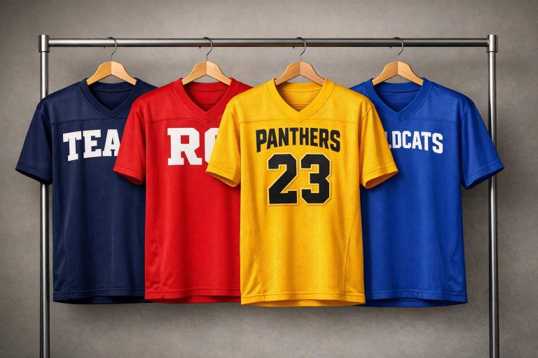
When designing team logos for jerseys, the right font and color combination can make a huge difference. Fonts should balance readability, style, and visibility, ensuring they stand out both on the field and from the stands. Bold fonts often perform better than thin or intricate ones, as they remain clear even during fast-paced action. Pairing these fonts with high-contrast colors amplifies their impact, making logos pop.
Here are five standout fonts for team jerseys:
- Jersey M54: Bold, blocky, and rugged, perfect for projecting strength and ensuring readability from a distance.
- Atletico: Sleek and angular with strong lines, offering a modern yet balanced look.
- Old School United: Retro-inspired with vintage charm, blending tradition with clarity.
- All-American Bold: Classic varsity style with thick strokes, ensuring clear visibility.
- Bank Gothic Medium: Clean and geometric, ideal for a polished, professional appearance.
Key Takeaways:
- Readability: Bold fonts with clean lines are easier to read during games.
- Colors: High contrast between text and jersey fabric boosts visibility.
- Font Size: Ensure team names and numbers are large enough for clarity.
- Durability: Fonts like Jersey M54 and Atletico work well with sublimation printing, ensuring designs remain sharp over time.
For custom designs, Wooter Apparel offers sublimation printing and free design services, starting at $16.99 per jersey. Their tools allow teams to experiment with fonts, colors, and layouts to create a standout identity.
Pro Tip: Use the "10% Rule" to test your design’s visibility – if it’s clear at 10% of its size, it’ll look great from 30 yards away.
1. Jersey M54
Readability
Jersey M54 boasts a bold and blocky design that ensures player names and numbers are easy to read, no matter the viewing distance. The curved edges of the font create a compact structure, preventing characters from blending together during high-speed gameplay. This feature is especially important for fans and officials who need to identify players quickly and accurately.
"Jersey M54 is a classic and rugged font perfect for apparel design and the numbering and lettering on sports jerseys." – Wooter Apparel
To maintain its clarity, pairing Jersey M54 with high-contrast colors – like dark text on light fabric or the reverse – is essential. This combination ensures the font remains sharp and distinct, even under varying lighting conditions.
Design Versatility
Jersey M54 isn’t just about readability – it also adapts effortlessly to different aspects of team branding. Whether used for team names or player numbers on custom V-neck baseball jerseys, the font creates a unified visual identity across the uniform. Its compact design integrates smoothly with various jersey patterns and logos, all while retaining its bold presence. Since custom lightweight softball jerseys are designed to endure multiple seasons, Jersey M54’s timeless design ensures it stays relevant year after year.
Visual Impact
With its rugged and assertive design, Jersey M54 exudes a competitive spirit, making it perfect for teams looking to project strength and determination. The curved edges add a tough, standout look that holds its own, even in crowded or intricate layouts. Proper scaling is key to preserving its striking visual impact.
sbb-itb-4d95ad3
2. Atletico
Readability
Atletico offers a bold, compact design that ensures team names and numbers are easy to read, even from a distance. Its strong, clean lines make text stand out clearly on the field, meeting the essential needs of sports typography. The high contrast between the font and the jersey’s base color further improves legibility, while the carefully spaced kerning prevents letters from feeling cramped. For optimal clarity, team names on custom button-down baseball jerseys are best displayed at sizes between 10–14 inches on the front, and player numbers should range from 8–10 inches on the back. This thoughtful sizing ensures that even during fast-paced action, details remain sharp and recognizable.
Visual Impact
The angular design of Atletico exudes strength and stability, giving teams a bold, modern look without overshadowing other jersey elements. Its sharp lines create a sleek aesthetic, and adding outlines can enhance depth, making the text stand out across different background colors. This design strikes a balance between commanding attention and maintaining a classic, enduring style.
Field Performance
Atletico’s bold structure and high-contrast features ensure excellent visibility throughout the game. Whether viewed from the stands or on the field, players remain easy to identify, keeping the focus on performance and team spirit.
3. Old School United
Old School United blends classic design principles with practical functionality, making it a standout choice for modern baseball and softball team jerseys.
Readability
This font is all about clarity. With bold, high-contrast strokes, it ensures excellent visibility even during fast-paced games. The thick lettering minimizes printing issues like "bleeding", preserving the sharpness of the design. Pairing the font with contrasting jersey colors enhances its readability, ensuring it stands out under various lighting and gameplay conditions.
Design Versatility
As part of the United font family – especially United Bold 2 and United Ext Stencil – Old School United is a versatile option for sports uniforms. Its ability to work seamlessly across different color palettes keeps the design looking sharp and cohesive. Teams can mix and match font weights from the United series to create a distinct identity or add sport-specific elements for a personalized touch. For script-based designs, placing title case text across the chest often delivers the best visual balance.
Visual Impact
Old School United taps into a vintage sports vibe, blending tradition with modern aesthetics. Its design includes standout features like serifs at the start of strokes, swash-style capitals, and varied tail widths that give it a retro charm. This timeless look is perfect for high-quality, durable jerseys that maintain their appeal season after season. The bold structure grabs attention without overpowering other design elements, making it a perfect balance of style and functionality. This retro-inspired design not only celebrates team traditions but also enhances the overall on-field presence.
4. All-American Bold
Readability
All-American Bold earns its place in the spotlight for its strong, clear design that performs exceptionally well on baseball and softball jerseys. Its thick, bold strokes make it easy to read, even from far away, ensuring fans can clearly see team names, player names, and numbers. As Wooter Apparel advises:
"Choose a font that’s easy to read, look for a bold font – fans want to see what’s written on jerseys too!" – Wooter Apparel
For adult jerseys, maintaining specific dimensions is key to readability: team names should be 10 to 14 inches across the front, player names should measure at least 2.5 to 3 inches on the back, and jersey numbers should stand 8 to 10 inches tall. These guidelines help ensure the font remains legible while meeting performance standards.
Design Versatility
Beyond readability, All-American Bold offers impressive design flexibility. Its classic outline design features transparent centers, allowing the jersey’s background pattern to subtly show through. This adds depth without sacrificing clarity. The font works seamlessly for tackle twill applications, as its thick letters are easier to cut and sew, and it’s equally suited for modern sublimation printing. A double outline can enhance finer details, while adjusting letter spacing for arched text across the chest ensures a polished, professional appearance.
Visual Impact
With roots in varsity and collegiate aesthetics, All-American Bold exudes strength and tradition. Its heavy strokes create a bold, commanding presence that feels both professional and balanced. Unlike script fonts, which can lose clarity from a distance, this block-style font retains its sharpness and distinction in all viewing conditions.
5. Bank Gothic Medium
Readability
Bank Gothic Medium stands out as a popular font for sports jerseys, thanks to its clean, geometric structure and clarity during fast-paced games. Its medium weight strikes a perfect balance – bold enough to grab attention without risking text bleeding, ensuring players’ names and numbers are easy to read from a distance.
"Ensure all text is legible, when text is too small there’s a chance that it can bleed and won’t be legible." – Wooter Apparel
To maximize readability, it’s essential to maintain a strong contrast between the text and the jersey’s background. The font size should also be large enough to preserve its sharp, crisp edges, ensuring clear visibility on and off the field.
Design Versatility
Like Jersey M54 and Atletico, Bank Gothic Medium prioritizes both legibility and a unified design. It adapts effortlessly across various sports and jersey styles, whether it’s football, basketball, or baseball. Its classic design ensures it remains stylish season after season, making it a reliable choice for long-term use. This font works well for player names, numbers, and even logos, while also complementing other fonts when paired thoughtfully.
Visual Impact
Ranked among the top three fonts for sports uniforms, Bank Gothic Medium delivers a polished and professional appearance on the field. Its geometric design conveys a sense of competitiveness and authority, drawing attention without compromising readability. The medium weight ensures the text stays prominent from any viewing distance. These qualities make it a versatile and impactful choice, performing well under various conditions and enhancing the overall look of any jersey.
Pros and Cons
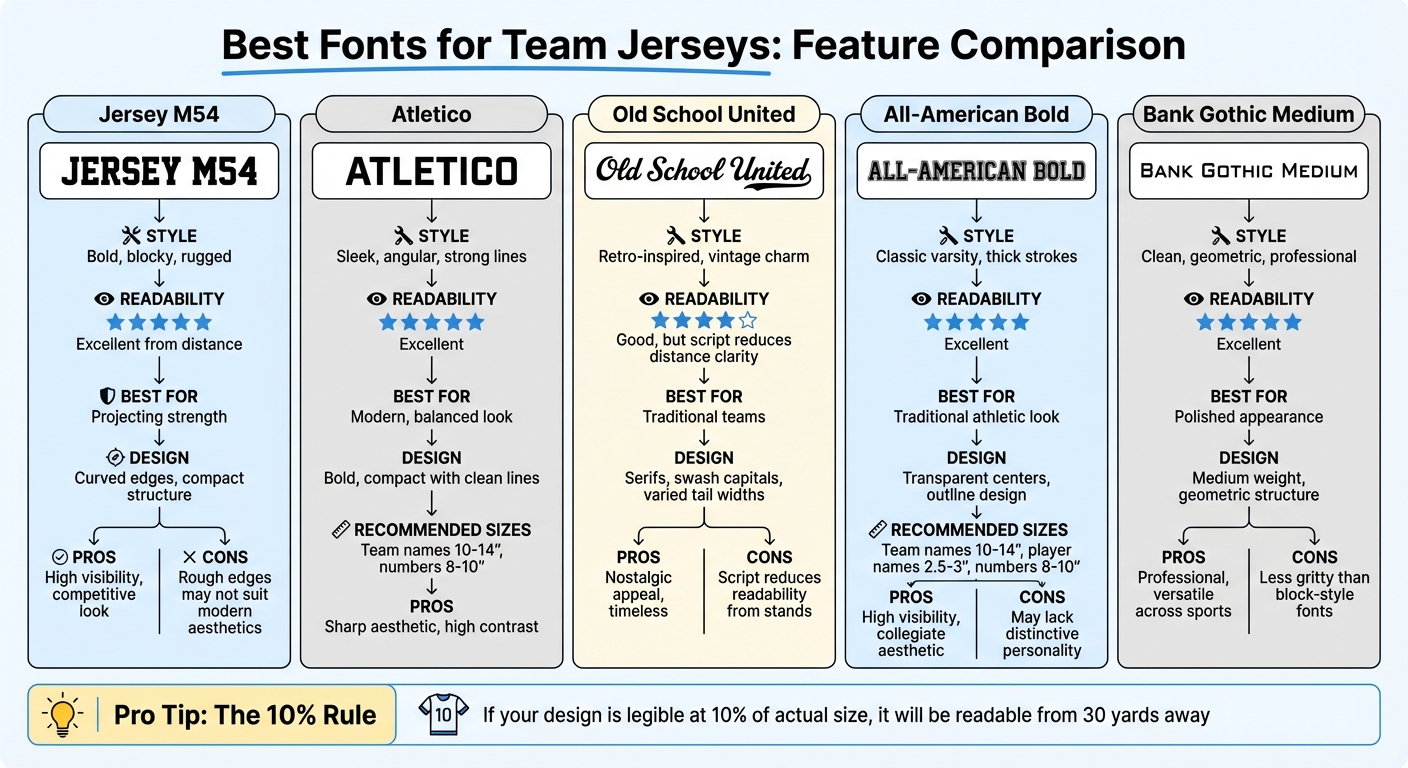
Best Fonts for Team Jerseys: Features and Performance Comparison
Here’s a breakdown of how each font balances style with functionality on the field.
Jersey M54 has a bold, rugged design that screams competitiveness. But, its rough edges might not align with sleek, modern brand aesthetics that lean toward cleaner, more polished styles.
All-American Bold stands out for its bold and traditional athletic look, making it highly visible. On the flip side, its simplicity might lack the distinct personality you’d find in more stylized fonts.
Bank Gothic Medium offers a polished, professional vibe and works well across different contexts. However, it doesn’t quite deliver the gritty feel that block-style fonts like Jersey M54 provide.
Script-based fonts bring their own set of challenges. Old School United captures a nostalgic, vintage charm but sacrifices some readability, especially from a distance.
"An ornate script ‘3’ is nearly impossible to read from the stands at speed." – Camille Dupont, Creative Director at RareCustom
Here’s a practical tip: apply the 10% Rule. If your design remains legible when scaled down to 10% of its actual size, it should be readable from 30 yards away. This simple test can help ensure your font choice hits the mark.
Wooter Apparel: Custom Jersey Design
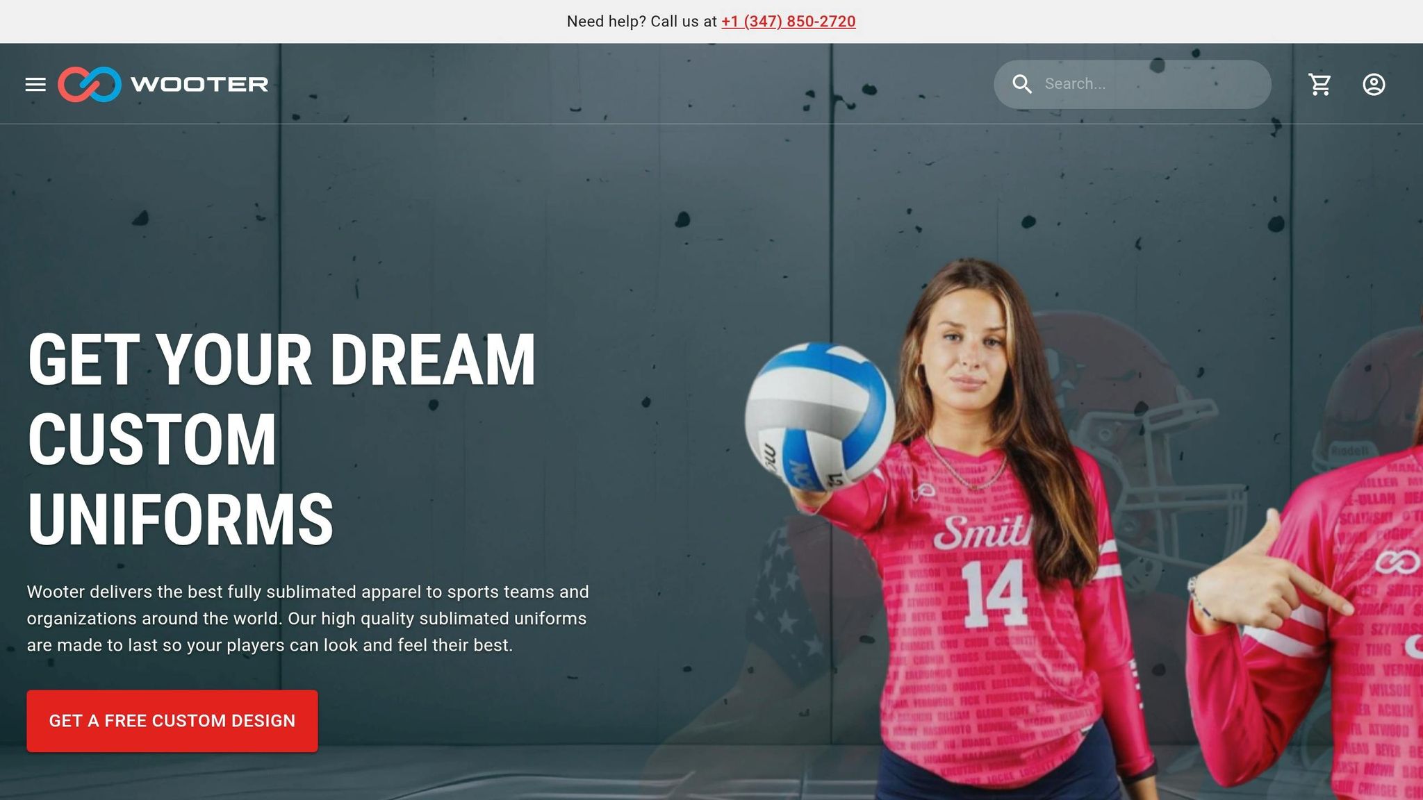
Wooter Apparel uses sublimation printing to embed fonts like Jersey M54 and Atletico directly into custom baseball and softball jerseys. This method ensures the designs stay vibrant over time without fading, cracking, or peeling. With a 4.9/5 star rating from 1,366 reviews, customers frequently highlight the durability and quality of these jerseys.
The design team at Wooter Apparel focuses on creating high-contrast designs to maintain clarity during fast-paced games. They recommend bold fonts over thinner styles, as thinner fonts may bleed during production, affecting readability. Every design decision reflects their commitment to precision and lasting quality.
"Uniform design is not just about the colors, patterns and logos being put together to create the perfect sports uniform design; selecting the right sport font can make your custom sports uniform stand out on field." – Wooter Apparel
Customization is made simple and effective with Wooter Apparel’s process. Their Apparel Builder tool allows users to preview font and color combinations, incorporate sport-specific elements, and select fonts that ensure logos remain timeless. These features make it easy to create a design that strengthens team identity and leaves a lasting impression on the field.
Pricing starts at $16.99 per jersey, with full team uniform packages available from $199.99. Orders typically ship within three weeks, and the company provides free custom design services to help teams find the perfect mix of fonts, colors, and layouts for a standout look.
Conclusion
Each font choice brings something distinct to the table, whether it’s about ensuring readability or evoking a sense of tradition. When it comes to designing baseball and softball team logos, the key lies in balancing visibility, style, and durability. For teams aiming for a bold or vintage appearance, rugged fonts like Jersey M54 deliver the strong visual impact needed to stand out on the field.
High contrast between text and jersey backgrounds is critical – fans need to quickly read names and numbers, especially during the fast pace of a game. This clarity not only enhances the viewing experience but also makes player identification effortless from the stands. Since custom uniforms are designed to last, opting for fonts that maintain their appeal over multiple seasons is a smart move. Adding sport-related elements, like a subtle baseball motif, can inject personality into the design without compromising its professional look.
Script fonts are excellent for team names displayed across the chest, giving a sleek and classic feel. On the other hand, block or serif fonts are ideal for numbers or bold statements, offering a more competitive and rugged vibe . If you go with script fonts like Brush Script, using title case ensures a polished and clean appearance.
With Wooter Apparel’s sublimation printing and free design services, teams can experiment with font and color combinations without any risk. Their experienced design team knows how to maintain clarity during production while crafting jerseys that leave a lasting impression. By combining bold font choices with high-contrast colors, teams can create a timeless identity – made even easier with Wooter Apparel’s custom design solutions.
FAQs
How do I pick jersey colors that stay readable under stadium lights?
To make sure jersey colors stand out under stadium lights, go for high-contrast pairings like dark text on a light background or light text on a dark background. Vibrant colors like royal blue, red, or black combined with white accents are excellent choices. Steer clear of color combinations that could fade into the background or resemble the glare from lights – such as very dark shades on dark jerseys – especially for night games, as they can reduce visibility.
What outlines or shadows make lettering stand out without looking busy?
Simple outlines or subtle drop shadows work wonders for making lettering pop while keeping things clean and easy to read. These design touches improve visibility without dominating the overall design – something highlighted in the article about the best fonts and colors for team logos on jerseys.
How do I know if a font will print cleanly without bleeding?
When selecting a font for clear printing without any bleeding, opt for bold fonts with thick, uniform strokes, like athletic block styles. These types of fonts ensure high visibility and minimize the chance of smudging. Steer clear of intricate or overly detailed fonts, as they can reduce clarity during printing and result in less sharp, harder-to-read designs.