
If you want a floral soccer jersey that works on the field, pick a pattern that stays readable, fits the shirt layout, and leaves clean space for numbers and logos. That is the main rule.
I’d sum up the best options like this:
- Go bold: all-over floral, tropical leaf, or tropical bloom prints
- Keep it balanced: cherry blossom sweep or local-flora layouts
- Keep it subtle: monochrome botanical line art or small floral accents
- Go old-school: retro floral vintage motifs
- Blend styles: abstract floral texture hybrids
A few design points matter most:
- Readability comes first: solid back panels help names and numbers stand out
- Color contrast matters: dark/light contrast helps under stadium lights
- Sublimation is a good fit for polyester kits: the dye bonds into the fabric, so full-print graphics can cover the jersey without cracking or peeling
- Placement matters as much as pattern choice: front sweeps, sleeve detail, and side-panel florals often work better than busy full coverage
- The full kit should match: shorts and warmups should use the same pattern in smaller amounts
The article covers 8 floral pattern styles and one simple choice: all-over florals for bigger visual impact, or accent florals for a cleaner match-day look.
Quick Comparison
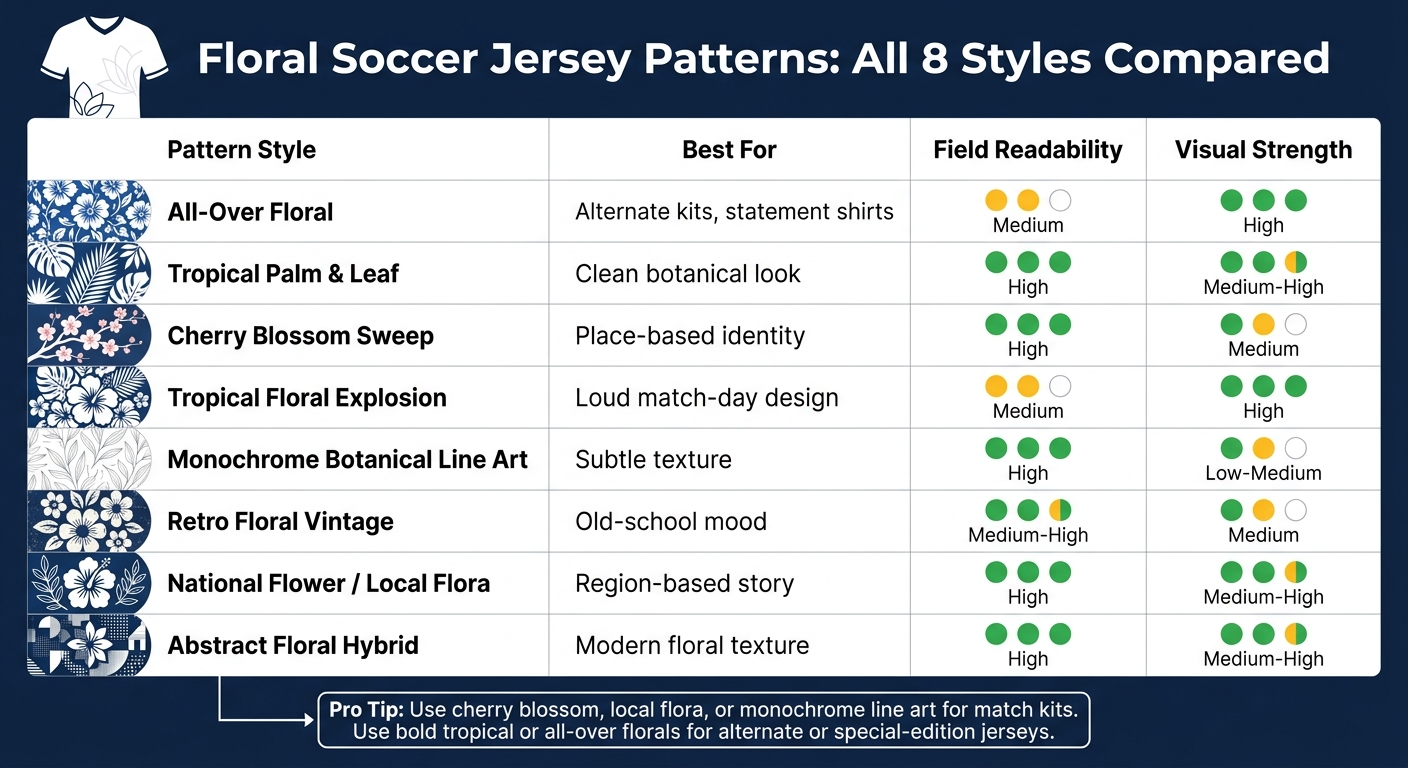
Floral Soccer Jersey Patterns: All 8 Styles Compared
| Pattern style | Best for | Field readability | Visual strength |
|---|---|---|---|
| All-over floral | Alternate kits, statement shirts | Medium | High |
| Tropical palm and leaf | Clean botanical look | High | Medium-High |
| Cherry blossom sweep | Place-based identity | High | Medium |
| Tropical floral explosion | Loud match-day design | Medium | High |
| Monochrome botanical line art | Subtle texture | High | Low-Medium |
| Retro floral vintage | Old-school mood | Medium-High | Medium |
| National flower/local flora | Region-based story | High | Medium-High |
| Abstract floral hybrid | Modern floral texture | High | Medium-High |
If I were choosing fast, I’d say this: use cherry blossom, local flora, or monochrome line art for the safest match-kit options; use bold tropical or full all-over florals for alternate or reversible-v-neck-soccer-jerseys special-edition jerseys.
sbb-itb-4d95ad3
What Makes a Floral Pattern Work on a Soccer Jersey
A floral jersey works when the pattern stays easy to read, fits the jersey’s main zones, and holds up on match-day fabric. That’s the line between a design that looks good from the stands and one that only makes sense up close.
Readability comes first. The Washington Spirit’s "Spirit in Bloom" kit is a good example. It used a pointillist cherry blossom pattern over a Spirit Green base, then added a solid green block behind the name and number area. That move kept the jersey readable on the field without stripping out the floral look.
After that, fabric does a lot of the heavy lifting. Breathable polyester wicking knits and mesh panels help the jersey stay cool, while sublimation bonds the floral print into the fibers.
Color control matters too. Use Pantone references to keep floral tones consistent across the full jersey, and rely on cut-and-sew placement so all-over motifs run across seams without looking broken or off-line.
Those same rules are what split subtle floral accents from full-coverage prints in the patterns below.
All-Over Florals vs. Accent Florals: A Quick Comparison
This split helps you pick the floral approach that fits the kit’s job. As you look through the pattern styles below, use this as a simple filter.
The main difference comes down to coverage. All-over florals spread one graphic across the full jersey. Accent florals, on the other hand, keep botanical details to smaller areas like trims, collars, or side panels. One isn’t better than the other across the board. They just do different things.
Here’s the clearest side-by-side view.
| Feature | All-Over Floral Prints | Accent Floral Treatments |
|---|---|---|
| Visual Impact | High; bold, graphic, and identity-driven | Moderate; cleaner, subtle, and professional |
| Readability | Can be busy; requires careful color and contrast control for numbers | High; keeps the main body clear for sponsors and player numbers |
| Branding Flexibility | Best for cultural storytelling and complex graphics | Best for maintaining traditional club identity with a modern detail |
| Best Use Cases | Alternate kits, custom crew neck soccer shirts, and limited-edition collector jerseys | Home kits, away kits, and v-neck soccer jerseys |
For match kits, a solid block behind the name and number area helps keep things readable. Small floral touches in trims or collar details can add contrast without taking over the whole design. And even with full coverage, that approach helps the jersey stay lightweight and breathable. That tradeoff sets up the pattern styles that come next.
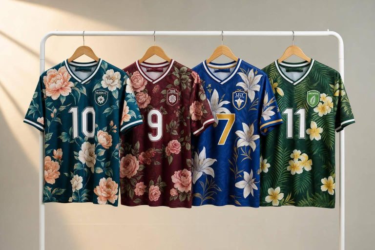
1. Wooter Apparel Custom Floral Sublimated Soccer Jerseys

If you want an all-over floral jersey, Wooter Apparel is a good example of how full sublimation can keep the pattern bold without making the kit hard to read. Wooter Apparel uses full sublimation to lock floral graphics, names, numbers, and logos into the fabric for a clean, durable finish.
Readability and Placement
The main rule is simple: keep the player name and number area on a solid field so dense florals don’t overpower identifiers. That gives the design room to stand out without getting in the way.
It also helps to use vector artwork. That way, petals and leaves stay sharp at any size and line up cleanly across panels.
Why It Works on the Field
Because the print sits in the fabric, even dense florals stay light and breathable during match play.
That same full-coverage approach also works well for the tropical and blossom styles that follow.
2. Tropical Palm and Leaf Motifs
For teams that want a floral look without the busyness of a dense blossom print, tropical palms are a smart pick. Palm fronds and broad leaf shapes give soccer jerseys a cleaner, more organized feel. They work best when the pattern moves in a clear direction. A simple way to do that is to run the main leaves on one diagonal, then place smaller leaves in the gaps so the print feels balanced and easy to read.
On-Field Legibility
The best tropical prints hold up from the stands and at close range. One approach that works well is a leaf-vein overlay on a solid base. From a distance, the jersey still looks bold. Up close, you get the extra botanical detail. On a bright yellow base, that kind of pattern stays clear on the field while still adding texture when viewed nearby.
Team-Color Compatibility
Tropical palm motifs pair well with deep jungle green and pure white because the contrast stays strong under stadium floodlights. If a team wants a quieter look, tonal shifts can help. Dark green speckles on a green base, for example, add detail without fighting the rest of the kit. Wooter Apparel has also used raglan sleeve and side-panel detailing to keep tropical kits lively without overcrowding the torso.
Performance-Friendly Sublimation
Sublimation helps keep fine leaf details sharp while the jersey still feels lightweight and breathable. It also lets names, numbers, and sponsor marks sit right inside the print, which gives the kit a smooth, built-in finish.
That same layout can also carry over when the floral style needs to move toward softer botanical patterns.
3. Cherry Blossom Sweep Patterns
Cherry blossom sweep patterns give jerseys a softer, cleaner floral look. The branches move across the shirt in one clear direction, which leaves open space for numbers and sponsor marks. That makes this style a smart middle ground between small floral touches and all-over flower prints or custom long sleeve crew neck t-shirts.
On-Field Legibility
A solid back panel helps keep names and numbers easy to read, while the floral sweep stays on the front. The Washington Spirit’s 2026 "Spirit in Bloom" kit did this well, using a solid Spirit Green back panel with pink cherry blossom branches sweeping across the front. Side striping also helped frame the floral front without making the layout feel busy.
After readability is handled, the big design choice is the direction of the branches.
Pattern Scale and Placement
Branch direction matters just as much as branch shape. When the sweep follows local geography, like a river path, the jersey feels more deliberate. The Washington Spirit placed its branches to echo the Anacostia River. D.C. United used a close version of the same idea in its cherry blossom away kit for the 2023 and 2024 MLS seasons, with branches sweeping across the front and a single branch icon at the back collar.
"The new D.C. United away kit realizes one of the city’s most recognizable – and natural – landmarks in the cherry blossom trees in their truest form as a patterned design of branches across the front of the shirt." – D.C. United
Team-Color Compatibility
Cherry blossom pink tends to show up best on black, white, or deep green base colors. Pairing sponsor accents with the blossom color also helps the kit feel pulled together.
Performance-Friendly Sublimation
Fine petal details and thin branch lines need high-definition sublimation so they stay crisp during play. Vector-based design files, like those made in Adobe Illustrator, help the artwork scale cleanly across jersey sizes without losing sharp edges.
That sense of controlled motion makes cherry blossoms a useful bridge between small floral accents and louder tropical prints. From there, the design can move into bolder botanical looks without dropping the flower theme.
4. Bold Tropical Floral Explosion Prints
If a team wants its floral look to hit hard, this is the loudest choice on the list.
Bold tropical floral prints lean on oversized hibiscus, layered palm shapes, and bright color to make a big match-day statement. The catch? Names, numbers, and the crest still need to stay easy to read.
On-Field Legibility
On a busy tropical background, bold, high-contrast lettering does the heavy lifting. It helps text stand out against all that color and pattern. Some newer templates also use gradient finishes, which shift the design from a dense floral area into a calmer or more muted zone where numbers and sponsor logos sit.
That small change can make a huge difference. Instead of fighting the artwork, the text gets room to breathe.
Sublimation also helps here. It keeps the background smooth, light, and even under numbers and logos, so the shirt doesn’t feel heavy or patchy.
Once the text is sorted, the next job is making sure the print feels like one design instead of a bunch of disconnected pieces.
Pattern Scale and Placement
Large tropical shapes need space. If they get chopped up at the seams, the jersey can look messy fast. Sublimated panel matching helps keep the print flowing across seams, so the artwork reads as one continuous pattern.
A few placement choices matter a lot:
- Shoulder panels can frame the design and give it more structure.
- Mesh zones should be mapped early, so airflow isn’t lost under dense artwork.
This is one of those details fans may not notice right away, but they can feel it when the shirt looks balanced instead of crowded.
Color Pairing
Bold tropical prints tend to work best with high-contrast base colors like forest green, yellow, and pink. The idea is pretty simple: pick a base that lets the floral elements pop instead of fading into the background.
When the base and print are too close in tone, the whole effect can flatten out. When the contrast is right, the pattern has much more punch.
Performance-Friendly Sublimation
With dye-sublimation, the ink goes into the fibers instead of sitting on top of the fabric. That means the jersey stays light and easy to wear, even when the print is dense.
For a quieter botanical look, the next pattern pulls back the color and keeps more of the texture.
5. Monochrome Botanical Line Art
After louder tropical prints, monochrome botanical line art gives you a cleaner, more restrained direction. It’s the quietest floral look in this list: tonal, single-color, and modern. Where tropical prints do the heavy lifting with color and size, line art works more like surface texture.
On-Field Legibility
Fine line art lives or dies on placement. It needs more precision than bold floral prints. Use high-definition sublimation so the lines stay crisp, then place names and numbers on solid, high-contrast blocks so they stay easy to read on the field.
Pattern Scale and Placement
Build the design on actual jersey templates so seams, the collar, and chest spacing make the motif feel deliberate instead of awkwardly cut off. Think of the motif as texture, not the star of the show. That simple shift usually leads to better placement across the garment, with the pattern spread more evenly instead of bunching up in one area.
Team-Color Compatibility
Monochrome line art is one of the easiest floral styles to match with team colors. Walthamstow FC’s "Yare" kit is a good example. It shows how a historic botanical pattern can be redrawn, matched to team colors, and sublimated into a modern uniform.
Performance-Friendly Sublimation
Because sublimation dyes the fibers directly, even a dense all-over line art pattern can keep the jersey soft, breathable, and quick to dry. Add mesh side panels, and you can help airflow in high-heat zones. Sublimation also helps dense line art stay soft, breathable, and fade-resistant.
That texture-first approach also makes botanical line art easy to blend with abstract shapes or hybrid floral graphics.
6. Retro Floral Vintage Motifs
Retro floral vintage motifs pull from old textile archives to give jerseys a nostalgic feel without making them look old-fashioned. If section 5 leaned on clean botanical line work, this style brings in more heritage and ornament. Picture cream-colored magnolias, archive florals, and muted palettes built around olive green, turquoise, and muted blue backgrounds. Small era-inspired touches, like scalloped labels, decorative ribbons, zig-zag stitching, and yellow piping, can push that throwback mood even further.
Walthamstow FC’s Yare kit shows how this can work on an actual match jersey. It adapts the 1892 "Yare" botanical pattern by John Henry Dearle into a fully sublimated match shirt.
On-Field Legibility
Busy floral prints can look great up close, but player names and numbers still need to read clearly from a distance. A solid name-and-number panel or ribbon helps separate those identifiers from the background. Bold block lettering also keeps numbers easy to read on top of detailed prints.
Pattern Scale and Placement
Scale makes a big difference here. Larger motifs tend to work better across the back, while smaller versions fit the chest and sleeves more naturally. Gold embroidery works best as a small sleeve accent, where it adds contrast without fighting the crest, sponsor, or other main branding areas.
Team-Color Compatibility
Muted vintage palettes tend to pair well with most team colors because the backgrounds stay quiet. Cream florals on a muted blue base, for example, leave space for a bold crest or sponsor logo to sit cleanly on the chest. Gold accents can add contrast without taking over the whole design.
Performance-Friendly Sublimation
Sublimation bonds ink directly into polyester fibers, so even fine botanical line work stays sharp and won’t crack or peel after repeated washes. If you want the same floral heritage with less literal detail, the next option moves into abstract hybrids.
7. National Flower and Local Flora Patterns
After heritage florals, the next move is flora tied to a country or region. National flowers and local plant life give a floral jersey a sense of place. It stops feeling like decoration and starts feeling tied to identity.
Two live examples show that this can go in very different directions and still land well. Nike‘s 2026 South Korea away kit uses a large Mugunghwa pattern on a Space Purple base. The Mugunghwa is South Korea’s national flower and stands for perseverance, so it fits a match jersey in a natural way. Chile’s 2026 away kit looks to the Desierto Florido, the rare superbloom of the Atacama Desert, and uses that idea to support a bold move into soft pink tones. In both cases, the floral pattern does more than decorate the shirt. It points back to place.
On-Field Legibility
Even a busy national-flora print needs one clean area for names and numbers. South Korea handles this well with mint logos and a clean name-and-number panel.
Pattern Scale and Placement
Scale changes how a floral pattern reads from the stands and on screen. Large motifs work best when the kit needs to make a clear statement from a distance. Smaller repeats work better when the goal is texture, not a main visual hit.
Oxford United’s 2026 "In Bloom" fourth kit sits between those two ends. Pink and green florals run down the sleeves and side panels of a pale yellow jersey, while the center torso stays clean. It’s a smart way to get visual interest without crowding the whole shirt. That same balance shows up in hybrid floral designs too.
Team-Color Compatibility
This category shows three clear color pairings:
- Mugunghwa on Space Purple with mint and Global Blue accents
- Desierto Florido florals on soft pink with tonal shifts
- Wild Rose motifs on pale yellow with pink, green, and navy accents
Performance-Friendly Sublimation
Sublimation helps intricate petal work and color gradients stay sharp through repeated washes without cracking or peeling. It also keeps breathability and moisture-wicking intact without adding weight.
8. Abstract Floral Texture Hybrids
For teams that want floral texture without a literal bloom print, abstract hybrids are usually the cleanest pick. They mix floral forms with geometry and gradients, which gives the kit a bold, modern look that still reads well on the field. This is the most layered version of the texture-first floral style, and it fits teams that want floral identity with some edge, not just surface detail.
The Men in Blazers "TWG Groundbreaking Floral" jersey shows the formula clearly: a sublimated floral body, 3D TPU crest, and heat-transfer chest graphics.
On-Field Legibility
The main challenge is simple: names, numbers, and crests still need to stay clear over the texture. Sharp lettering and strong placement help those key markers stay readable, especially when they sit on clean, high-contrast areas.
Pattern Scale and Placement
Shoulder panels or side inserts can add energy without crowding the chest. Gradients also help by fading the floral texture into a cleaner team color near the back and chest, which makes legibility better.
Team-Color Compatibility and Performance-Friendly Sublimation
Abstract hybrids tend to work best on high-contrast bases, like black with neon cyan or pink accents. That contrast helps the pattern stay readable even when the shapes are irregular.
Sublimation bonds the dye directly into the fabric fibers, which helps preserve wicking performance and keeps the print from cracking, peeling, or fading over time.
That same balance carries across the rest of the kit, which you can customize when you get an instant quote for your team.
How to Carry a Floral Pattern Across a Full Soccer Kit
Once the jersey pattern is set, use it as the base for the rest of the kit. That way, the jersey, shorts, and warmups feel like one system instead of a bunch of separate pieces.
The simplest way to do this is to treat the jersey as the master pattern. Then bring that same look into the shorts and warmups in smaller, more controlled amounts. Think of it like turning the volume down, not changing the song.
Before production starts, lock in the colors and pattern placement across every piece. That step matters. If one item shifts in tone or layout, the full kit can feel off fast.
It also helps to line up the floral direction with the team crest and the brand style. If the crest feels sharp and clean, the pattern should follow that mood. If the brand look is softer or more classic, the floral work should fit that too.
For uniform rules, keep solid number and sponsor panels on the front and back of the jersey so key identifiers stay readable across the full kit.
Conclusion
Choosing the right floral pattern for a soccer jersey comes down to three things: who the team is, where they play, and how bold they want the look to be. After that, the last check is simple: fit, readability, and identity. The best option is the one that matches the team’s identity, location, and visual goals.
A team with deep roots might lean toward a cherry blossom sweep or a national flower motif. A club that wants a clean, modern look may prefer monochrome botanical line art instead. It stays subtle, keeps the jersey sharp, and still helps the kit stand out.
That same idea applies across the whole range, from subtle line art to full tropical prints. Bold floral prints make the biggest visual statement. But the louder the pattern gets, the more control the layout needs. Names and numbers need solid panels. Crests and sponsors need clear safe zones. And the color contrast has to hold up under stadium lighting.
Sublimation makes that possible without giving up performance. The design stays clear through training and matches without cracking or fading.
A floral jersey should look intentional, stay readable, and perform under game conditions. For teams ready to build a custom kit, Wooter Apparel offers fully sublimated soccer jerseys and free custom designs.
FAQs
Which floral pattern is best for match-day use?
For match-day use, fully sublimated floral patterns work best. With sublimation, the pattern is built into the fabric instead of sitting on top of it. That helps the jersey stay lightweight, breathable, and moisture-wicking, without feeling heavy or stiff.
For the look itself, distributed floral elements or balanced layouts across the shoulders and panels tend to work best. They give the jersey a polished, wearable look that still feels right during active play.
How do floral jerseys stay readable on the field?
Floral jerseys stay easy to read by using high-contrast colors for names and numbers, so they stand out in bright light, dim light, and everything in between. A clear visual hierarchy helps too: the floral pattern carries the main color story, while contrasting accents draw attention to key details.
Balanced spacing between floral elements keeps the design from feeling crowded. That extra breathing room helps the jersey hold its shape on the eye and keeps important details visible.
Should I choose all-over florals or accent florals?
It comes down to the look you’re after. All-over florals give the jersey a bold, modern feel and make a strong statement on the field.
Accent florals lean more balanced and polished. They place the pattern on spots like the shoulders, chest, or lower panels, which helps keep logos and player numbers clear and easy to read.
With sublimation, the design stays vibrant, breathable, and fade-resistant.