
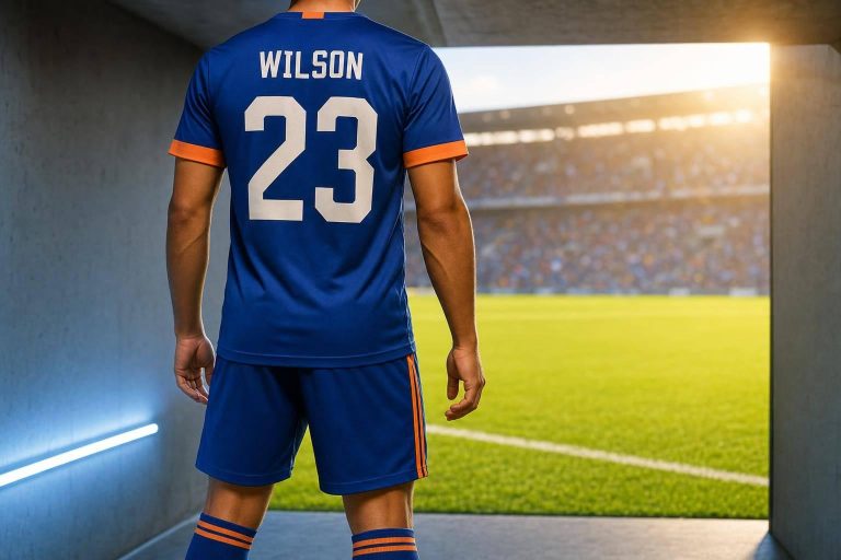
The best team colors do 3 jobs at once: stay easy to read, fit your team, and feel okay to wear in heat. If I were picking a uniform set today, I’d focus on high number contrast, a simple 3-color palette, venue lighting, field or court surface, and summer heat before I cared about style.
Here’s the short version:
- Use strong contrast between the jersey and numbers so refs and teammates can read them fast.
- Keep the palette simple with 3 colors max: primary, secondary, and accent.
- Test colors at your venue because gym lights, floodlights, and dusk can change how colors look.
- Match colors to the surface since grass, turf, and hardwood affect visibility.
- Think about heat and stains because dark jerseys run hotter, while light jerseys show dirt faster.
- Use accents in small spots like outlines, necklines, and side panels to help reading and polish the look.
A few rules stand out fast. Red, white, navy, black, and royal blue are common picks because they tend to read well in play. Yellow on white is one of the weakest combos for visibility. And if your team plays outside in June through August, a light base jersey can help with comfort.
Bottom line: I’d pick colors only after checking them under game lights, from about 50 feet away, and against the surface the team plays on most.
Quick Comparison
| Tip | What I’d check first | Main risk if ignored |
|---|---|---|
| Contrast | Dark jersey + light numbers, or the reverse | Numbers are hard to read |
| Team identity | School, town, or club colors | Team looks generic |
| Lighting and surface | Grass, hardwood, gym lights, night games | Colors fade into the background |
| Heat and comfort | Dark vs. light base jersey in summer | Players feel hotter outdoors |
| Accent color use | Outlines, trim, logos, side panels | Uniform looks messy or hard to read |
If you want a color plan that works on game day, these 5 tips cover the main choices without overcomplicating it.
1. Use High-Contrast Jersey and Number Combinations
The contrast between a jersey’s base color and its numbers has a direct effect on how easy the uniform is to read during fast play. If the numbers blend into the jersey, referees and teammates can lose track of them at game speed. Once the numbers are easy to read, you can pick a base color that still matches your team and prints well.
Dark jerseys like black, navy, and maroon need light-colored numbers to stay clear. Light jerseys like white, light gray, and pastels tend to print cleanly and often give sharper, easier-to-read results for small text and fine details.
For amateur teams, it usually makes sense to stick with common solid colors like black, white, navy, red, and royal blue. They’re cost-effective, more consistent from batch to batch, and tend to hold color better through a season. Bright, saturated shades like royal blue and scarlet red also stand out well against grass, turf, and hardwood. After you narrow down your options, check how the colors look in the same lighting your team plays under.
Before you lock in a color choice, test samples under the actual lighting at your home venue. Test samples under your home venue’s lights before you commit.
sbb-itb-4d95ad3
2. Pick Colors That Reflect Your Team Identity
Once contrast is handled, the next step is figuring out what your colors say about your team. Color signals identity fast. Before you lock in a palette, think about your team’s values and local roots. A tough, hard-nosed team might skip pastels, while a team built around control and precision may lean toward calmer shades like blue or green.
If your team is connected to a school, neighborhood, or local group, start there. Using school or community colors builds instant recognition. Copying a pro team’s exact color scheme does the opposite. It can make the team feel generic instead of original. And of course, the palette still has to hold up under actual game conditions.
Keep it simple. For most amateur teams, three colors are enough: two main colors and one accent. Go past three, and recognition starts to fade. One easy rule to use is the 60-30-10 split:
- 60% primary
- 30% secondary
- 10% accent
Consistency matters just as much as color choice. Once you settle on a palette, record the exact Hex and Pantone codes and use them across jerseys, shorts, warmups, and accessories.
3. Match Your Colors to Lighting and Playing Surface
Once your palette fits your team, test it in actual game conditions. Colors can shift a lot from one setting to another. A jersey that looks sharp in a gym can get lost on a grass field at dusk, so base your choice on where your team plays most often.
The playing surface makes a big difference. On natural grass, red, yellow, and white tend to stand out, while green and earth tones can blend into the field. On hardwood courts, navy, royal blue, and black usually create the strongest contrast.
Lighting changes things too. The same jersey color can look different once the lights come on. Sodium-vapor field lights can push red jerseys closer to orange. Fluorescent lighting can make greens look muddy. And at twilight, blue shades can fade into the background as daylight drops.
Before you place an order, ask for a physical fabric sample and check it from 50 feet away under your venue’s actual lighting. That small step can save you from a color choice that looks great up close but falls flat on game day.
4. Factor in Heat, Comfort, and Season Length
After visibility, look at how color changes heat and comfort. This has a direct effect on outdoor games. Dark colors like black, navy, and maroon absorb more heat and UV radiation, which can wear players down faster in warm weather. That hits hardest from June through August.
Lighter shades like white, light gray, and pale primaries reflect solar energy and can help players stay cooler during long games. If your team colors give you room, go with a light base jersey for warm-weather leagues. If you need a darker style, use those tones on trim, side panels, and numbers instead of across the whole jersey.
The fabric and print method also play a part. Traditional screen printing on dark jerseys often needs a white underbase layer, which can add weight and make the jersey less breathable. Sublimation printing skips that step by fusing the dye into the fabric fibers. The result is a lighter, cooler uniform for summer play.
There’s also the day-to-day side of it. Light jerseys show stains faster, while dark jerseys tend to hide wear longer. A simple middle ground is to use darker accents in spots where you want contrast and better durability.
5. Use Accent Colors to Improve Readability and Style
A third color can make a uniform easier to read and give the team a sharper look. A lot of teams stop at a base color and a contrast color. But a small accent can pull the whole palette together without making it feel busy.
Stick with a three-color palette: base, contrast, and accent. Keeping the accent limited helps the design stay clean instead of cluttered.
Placement matters just as much as color choice. Accent color tends to work best on:
- Number and name outlines
- Sleeve or side panels
- Necklines
- Logos or wordmarks
Using the accent as a number outline can help visibility, which matters on the field and in the stands.
For football and youth sports, charcoal with neon yellow is a strong pick because it shows up better under stadium floodlights and on film. If you want a more classic look, navy with white and a red accent reads cleanly from the stands and on camera.
One thing people miss: accent colors can look great on a mockup, then fade under gym fluorescents or stadium floodlights. Before you lock anything in, record a phone video under your venue’s lighting and see how the colors hold up.
Wooter Apparel‘s fully sublimated uniforms are a good fit for more detailed accent color work because the dye is fused into the fabric, which helps cut down on peeling or cracking. Use the quick color planning guide below to lock in your final palette.
Quick Color Planning Guide for U.S. Amateur Teams
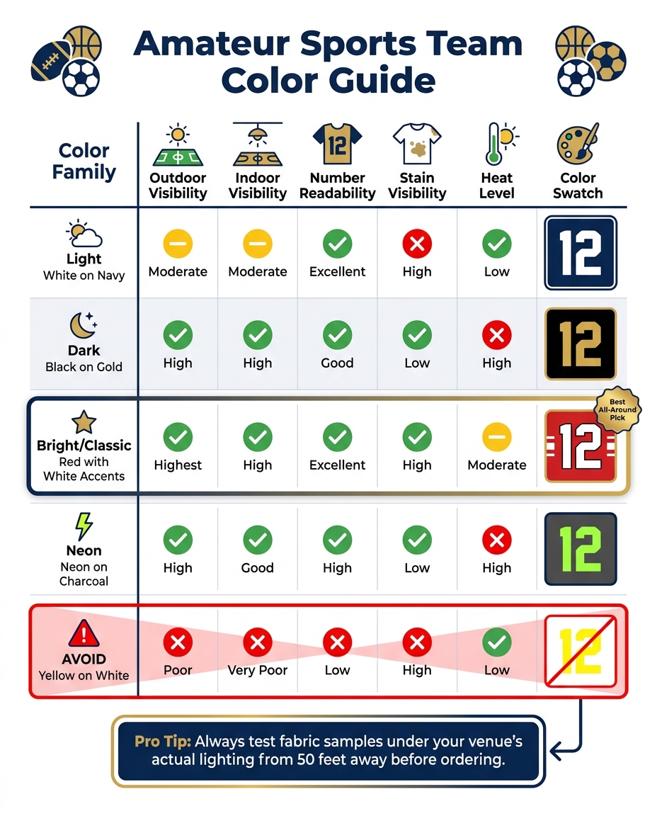
Amateur Sports Team Color Guide: Visibility, Heat & Readability at a Glance
Once you’ve narrowed things down by contrast, team identity, lighting, and comfort, this chart makes the final call a lot easier.
Use it to compare your top color options for visibility, durability, and heat.
| Color Family | Example Combination | Outdoor Visibility | Indoor Visibility | Number Readability | Stain Visibility | Heat |
|---|---|---|---|---|---|---|
| Light | White on Navy | Moderate; can blend in bright sun | Moderate | Excellent with dark numbers | High – shows grass and dirt quickly | Low |
| Dark | Black on Gold | High; strong contrast against green surfaces | High | Good with a white underbase | Low – hides stains well | High |
| Bright/Classic | Red with White Accents | Highest; stands out on most surfaces | High | Excellent from a distance | High – white trim shows dirt | Moderate |
| Neon | Neon on Charcoal | High, especially in low light | Good | High | Low – charcoal hides grime | High |
| Avoid | Yellow on White | Poor; washes out easily | Very poor | Low | High | Low |
A few patterns stand out right away.
Black on gold tends to look sharp under stadium lights. The tradeoff is simple: dark fabrics hold more heat when the weather gets warm.
Red with white accents is one of the safest all-around picks. It gives you strong contrast, clear numbers, and solid readability from a distance.
Before you place an order, check your league’s uniform rules. Many U.S. leagues require clear home-and-away color differences.
When you’ve matched the palette to your field, gym, and season, stick with it.
Conclusion
The best team colors strike a balance between visibility, identity, and comfort. It also helps to see how those colors hold up after repeated washing. Dark base shades like navy and charcoal usually hide dirt better and tend to look cleaner for longer.
For fully sublimated custom uniforms, Wooter Apparel can carry the same colors across jerseys, shorts, warmups, and accessories for a consistent look.
FAQs
How do I test uniform colors before ordering?
Use digital mockups and jersey design tools to test color combinations and contrast before you commit. They make it much easier to spot issues early. After that, request physical samples so you can check the fabric and colors in real-world conditions.
Review those samples under different lighting, including stadium lights, and on camera to make sure numbers and logos stay legible. It’s also smart to test how the jersey holds up when washed and stretched. Before finalizing the design, get feedback from the team so the final version looks good and works in practice.
What colors work best for night games?
For night games, go with high-contrast color pairings that stay easy to read under stadium lights. Neon yellow works especially well in low-light conditions, and a dark base like charcoal or navy paired with a bright neon accent can help players, coaches, and fans see details more clearly.
It’s also smart to test fabric samples under your venue’s lighting before you make a final call. Some colors, especially red and green, can shift or start to look muddy under artificial light.
Should we choose light or dark jerseys for summer?
For summer, lighter colors – especially white – are usually the better pick for hot outdoor games. They reflect sunlight, which can help players stay cooler on the field. Darker colors tend to absorb more heat, so they may feel less comfortable.
Whatever color you go with, make sure the jersey and lettering have strong contrast. That way, officials and fans can read them without squinting.