
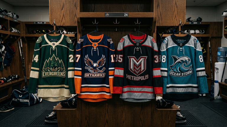
When you watch a hockey game, it’s easy to notice the big things, the team colors, the logo, and the player numbers. But what separates an average jersey from one that looks truly professional isn’t always obvious at first glance.
The best custom hockey jerseys aren’t defined by flashy graphics alone. Instead, they’re built around dozens of carefully considered design choices that work together to create a polished, premium look. From the stitching around the crest to the way the sleeve stripes align, these subtle details make all the difference.
Whether you’re designing jerseys for a youth hockey team, a high school program, an amateur league, or a competitive club, understanding these hidden design elements can help you create uniforms that players are proud to wear.
Let’s take a closer look at the details that give professional hockey jerseys their unmistakable appearance.
Every Professional Hockey Jersey Starts with a Strong Identity
Before a designer chooses colors, fonts, or patterns, they focus on one question:
What does this team represent?
The most memorable hockey jerseys aren’t just attractive; they tell a story.
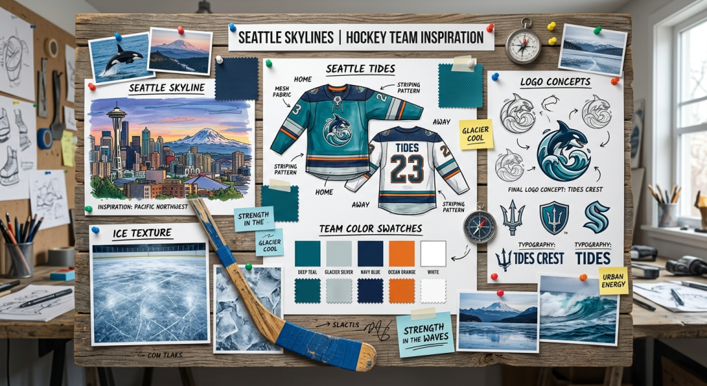
Think about what defines your team:
- Your hometown
- Your mascot
- Local traditions
- Team values
- Club history
- Playing style
Every design decision should reinforce that identity.
For example, a team called the Wolves might use sharp angular striping inspired by claw marks, while a coastal team could incorporate subtle wave-inspired graphics into the sleeves.
Professional-looking jerseys always have a purpose behind every design choice.
Premium Fabric Makes a Bigger Difference Than Most People Realize
A jersey can have an incredible design, but if the fabric feels cheap, players notice immediately.
Professional custom ice hockey jerseys use materials designed specifically for fast, physical play.
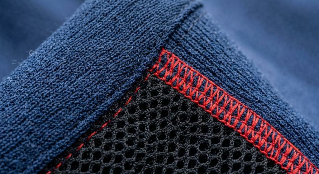
Quality fabrics offer:
- Excellent breathability
- Moisture-wicking performance
- Lightweight comfort
- Durability against contact
- Resistance to repeated washing
Modern polyester performance fabrics also maintain vibrant colors throughout an entire season, preventing the faded appearance that lower-quality jerseys often develop.
Players spend hours wearing these uniforms. Comfort matters just as much as appearance.
The Crest Is the Centerpiece of the Jersey
Your team logo naturally becomes the focal point.
That’s why professional jerseys pay close attention to crest quality.
Instead of using oversized graphics that dominate the front, great designs balance the logo with clean spacing around it.
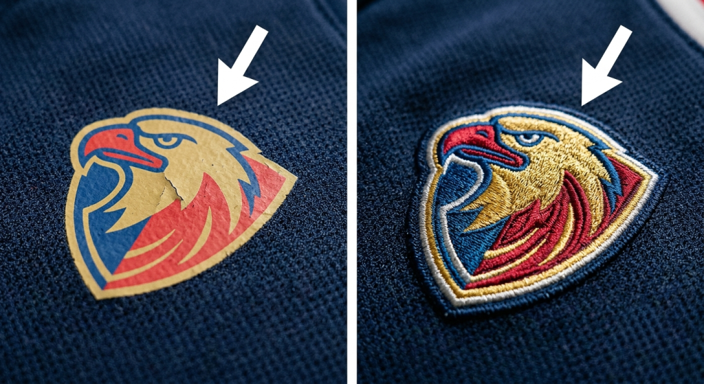
Professional crests typically feature:
- High-resolution artwork
- Sharp edges
- Balanced proportions
- Durable application methods
- Proper placement on the chest
A poorly centered or low-quality logo can instantly make even an expensive jersey look amateur.
The best logos attract attention without overwhelming the overall design.
Sleeve Striping Creates Balance
Many people don’t realize how important sleeve striping is.
Take a look at professional hockey uniforms, and you’ll notice that sleeve stripes almost always align with the jersey’s overall design language.
Good striping helps:
- Create symmetry
- Break up large color areas
- Improve visual movement
- Connect the sleeves to the body design
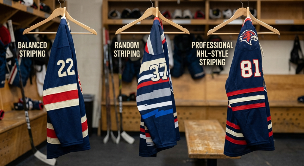
Rather than adding random stripes, professional designers carefully match widths, spacing, and colors throughout the uniform.
Simple, consistent striping almost always looks more professional than complicated graphics.
Typography Shapes the Team’s Personality
Numbers and names aren’t just functional.
They’re a major part of the jersey’s identity.
Professional hockey jersey design focuses heavily on typography because it’s one of the first things fans notice.
Great typography should be:
- Easy to read
- Consistent
- Unique without being distracting
- Visible from across the rink
- Scalable for every jersey size
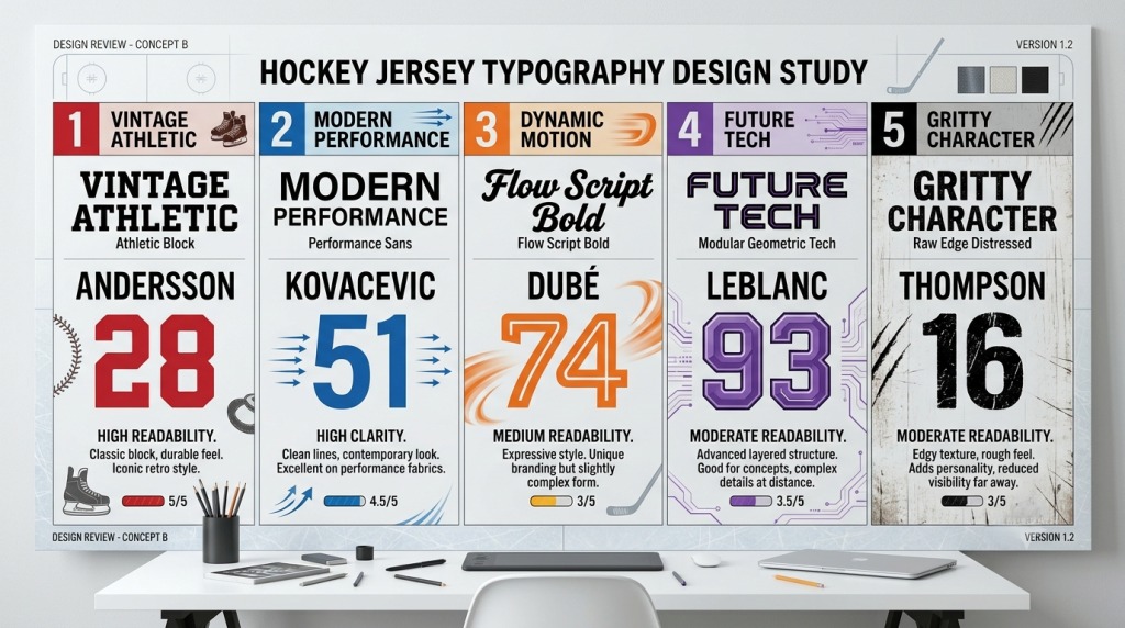
Many professional teams invest heavily in custom fonts because typography becomes part of their brand.
Avoid fonts that look trendy today but outdated next season.
Classic designs tend to age much better.
Small Details Create Premium Jerseys
Some of the best design features are almost invisible.
Professional jerseys often include hidden details that reward fans who look closely.
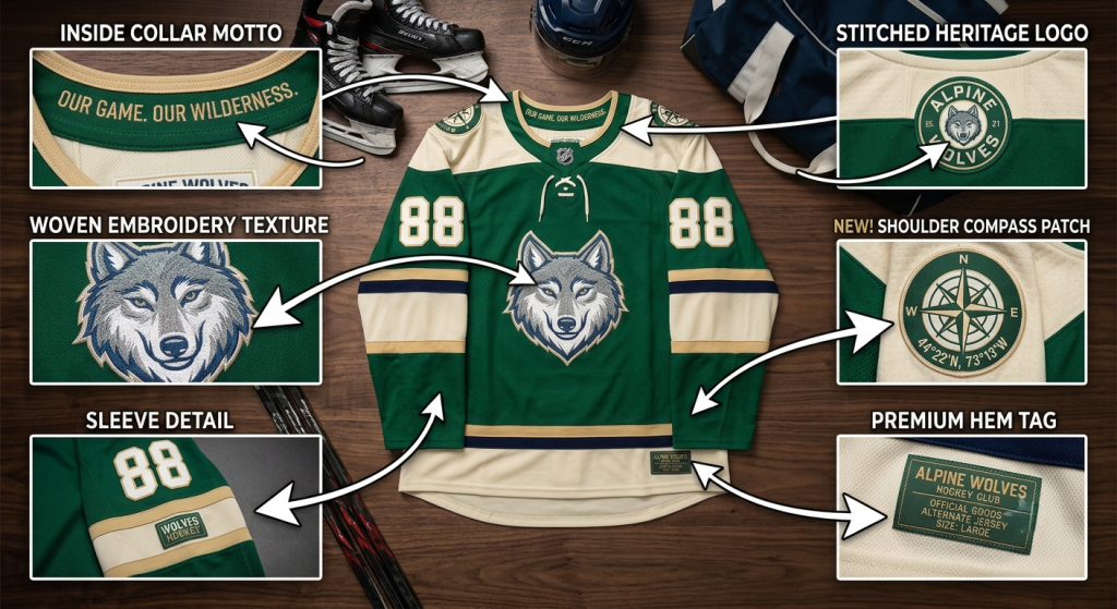
These might include:
- Team motto inside the collar
- Founding year stitched near the hem
- Local coordinates
- Championship years
- City map textures
- Mascot-inspired patterns
- Subtle tonal graphics
These details don’t overwhelm the design.
Instead, they add personality while maintaining a clean appearance.
It’s one of the biggest differences between ordinary jerseys and professional uniforms.
Color Placement Matters More Than Color Choice
Choosing great colors is important.
Using them correctly is even more important.
Professional designers carefully balance colors across the jersey.
Instead of placing colors randomly, they create visual flow.
A strong color layout usually includes:
- One dominant color
- One supporting color
- One accent color
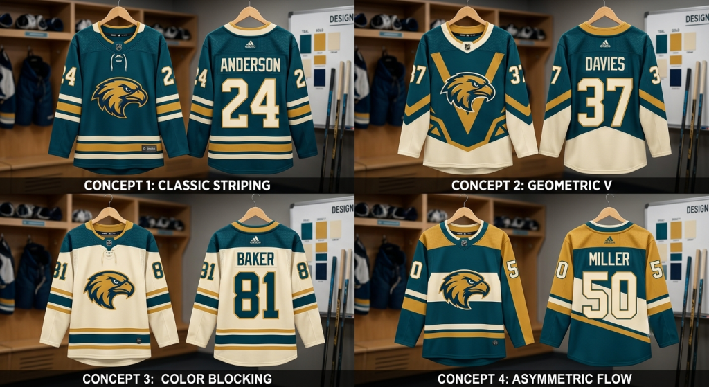
This creates contrast without making the jersey feel busy.
Too many colors often compete for attention.
Simple palettes usually produce stronger branding.
Shoulder Yokes Add a Professional Touch
One detail many casual fans overlook is the shoulder yoke.
This extra panel across the shoulders is common on professional hockey jerseys.
Besides adding structure, it also creates opportunities for additional contrast.
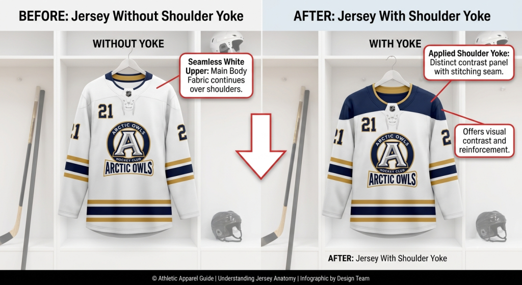
Teams often use the shoulder yoke to:
- Introduce secondary colors
- Separate upper and lower jersey sections
- Highlight logos
- Improve visual balance
It seems like a small feature, but it significantly improves the overall appearance.
Stitching Quality Speaks for Itself
Professional jerseys aren’t just printed well.
They’re constructed well.
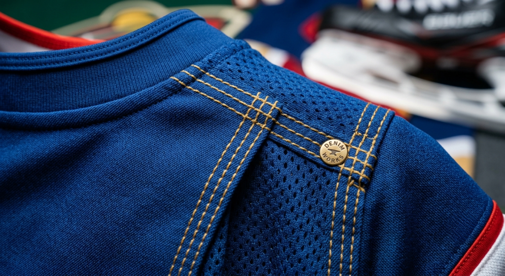
High-quality stitching helps jerseys maintain their shape after countless games and washes.
Look for:
- Reinforced seams
- Even stitching
- Durable collars
- Strong sleeve construction
- Clean finishing
Poor stitching often becomes noticeable long before graphics begin to fade.
A well-made jersey simply feels more premium.
The Collar Should Complement the Design
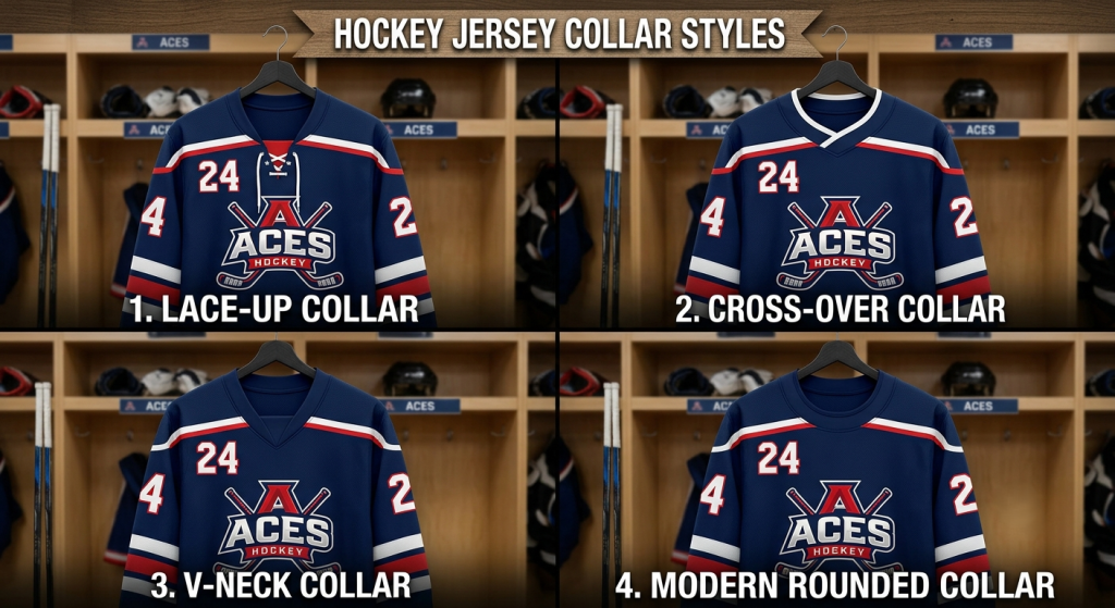
The collar often receives very little attention.
Yet it frames the entire jersey.
Professional hockey jerseys usually feature collars that match the team’s personality.
Popular options include:
- Traditional lace-up collars
- Modern crossover collars
- V-neck styles
- Rounded performance collars
Whatever style you choose, the collar should match the overall design instead of looking like an afterthought.
Player Numbers Should Always Be Easy to Read
Great-looking numbers aren’t enough.
Officials, teammates, broadcasters, and fans all need to read them quickly.
Professional jerseys prioritize visibility by using:
- Strong contrast
- Appropriate sizing
- Balanced spacing
- Clear outlines when necessary
Oversized decorative fonts often reduce readability.
Simple, bold numbers almost always perform better.
Consistency Across the Entire Uniform
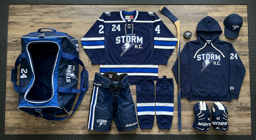
A professional hockey uniform isn’t just the jersey.
Everything should work together.
That includes:
- Hockey socks
- Shell pants
- Practice jerseys
- Warm-up jackets
- Team hoodies
- Equipment bags
Using the same colors, typography, and branding throughout creates a unified identity.
Teams immediately appear more organized and professional.
Fit Makes Every Design Look Better
Even the best-designed jersey loses its impact if the fit is poor.
Professional hockey jerseys allow room for protective equipment while maintaining a clean silhouette.
Players should have:
- Comfortable shoulder movement
- Full arm mobility
- Proper jersey length
- Breathable construction
A balanced fit improves both appearance and on-ice performance.
Avoid Overdesigning the Jersey
One mistake many teams make is trying to include every exciting idea.
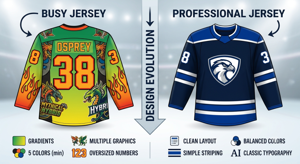
Imagine a jersey featuring:
- Four patterns
- Multiple gradients
- Five colors
- Metallic graphics
- Oversized numbers
- Busy sleeve artwork
Instead of looking professional, the design becomes overwhelming.
The best hockey jerseys usually rely on:
- Clean layouts
- Limited colors
- Strong typography
- One signature design feature
Professional designers know when to stop adding elements.
Sometimes removing one graphic improves the entire jersey.
Professional Jerseys Balance Tradition with Innovation
The greatest hockey jerseys respect tradition while embracing modern performance.
Many successful teams update their uniforms gradually instead of introducing completely new designs every season.
That approach helps build long-term recognition while keeping the jersey fresh.
Small improvements, such as updated fabrics, cleaner typography, or refined striping, can modernize a uniform without losing its identity.
Consistency builds stronger brands.
Why These Details Matter for Every Team
You don’t have to play professional hockey to benefit from professional design principles.
Whether you’re creating custom hockey uniforms for:
- Youth leagues
- High schools
- Travel teams
- Recreational clubs
- Adult leagues
- College programs
The same design philosophy applies.
Thoughtfully designed uniforms help players feel more confident, strengthen team identity, and leave a lasting impression on opponents and fans alike.
A professional appearance often starts before the puck even drops.
Bringing Your Hockey Jersey Vision to Life
Designing a hockey jersey isn’t simply about choosing colors or adding a logo.
It’s about creating an identity that players proudly represent every time they step onto the ice.
Start by asking yourself:
- What story should our jersey tell?
- Which colors best represent our team?
- What details will make our design memorable?
- Will this jersey still look great five years from now?
When you answer those questions first, every design decision becomes easier.
The result is a jersey that doesn’t just look professional, it feels like it belongs on the biggest stage.
Conclusion
The finest hockey jerseys are built on details that many people never consciously notice. Clean typography, balanced color placement, quality stitching, premium fabrics, thoughtful striping, and meaningful design elements all work together to create a uniform that feels authentic and professional.
Rather than chasing short-lived trends, focus on timeless design principles that reflect your team’s identity and perform well on the ice. Whether you’re outfitting a youth team or designing uniforms for a competitive club, investing in professional custom hockey jerseys creates pride, strengthens team culture, and leaves a lasting impression every time your players take the ice.
In the end, it’s not one dramatic feature that makes a hockey jersey memorable, it’s dozens of small details working together perfectly.
Frequently Asked Questions
What makes a hockey jersey look professional?
A professional hockey jersey combines premium fabric, clean typography, balanced colors, quality stitching, readable numbers, and thoughtful design details that represent the team’s identity.
Why are custom hockey jerseys important?
Custom hockey jerseys help teams establish a unique identity, improve player confidence, strengthen team unity, and create a polished appearance both on and off the ice.
What fabric is best for hockey jerseys?
High-performance polyester fabrics are the most popular choice because they are lightweight, breathable, moisture-wicking, durable, and designed to withstand the physical demands of hockey.
How many colors should a hockey jersey have?
Most professional jerseys use two or three primary colors with one accent color. A limited color palette creates stronger branding and a cleaner, more recognizable design.
Should hockey jerseys prioritize style or performance?
The best custom ice hockey jerseys balance both. Eye-catching designs build team identity, while breathable fabrics, comfortable fits, and durable construction help players perform at their best.
How can teams create timeless hockey jersey designs?
Focus on clean layouts, classic typography, consistent branding, meaningful design elements, and high-quality construction instead of following short-lived design trends. Timeless jerseys remain recognizable and relevant for years.