
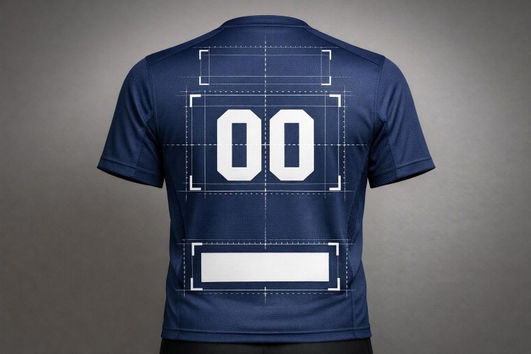
When designing custom jerseys, the back panel is the most visible area during gameplay, making it the ideal spot for player names, numbers, and sponsor logos. To achieve a clean and professional look, follow these key guidelines:
- Divide the back panel into zones: Upper, middle, and lower sections serve different purposes. Names and smaller logos go near the collar, large numbers in the center, and optional branding near the hem (keeping at least 1–2 inches above the edge).
- Size and placement: For adult jerseys, player numbers should be 10–12 inches tall, with names 2–3 inches high. Maintain strong contrast for visibility and align elements along the vertical centerline.
- Consider fabric movement: Stretchy or textured materials can distort designs. Use durable application methods like silicone transfers to prevent issues.
- Sport-specific adjustments: Basketball, soccer, baseball, and football uniforms have unique requirements for number and logo sizes due to gameplay visibility and fabric types.
- Avoid high-wear areas: Keep logos away from seams, underarms, or fold-prone areas to ensure durability and comfort.
Proper placement ensures jerseys look polished, maintain readability, and balance team identity with sponsor visibility. Always test designs on one jersey before full production to avoid costly errors.
How to Line Up Names and Numbers For The Backs of T Shirts or Jerseys
sbb-itb-4d95ad3
Back Panel Design Zones Explained
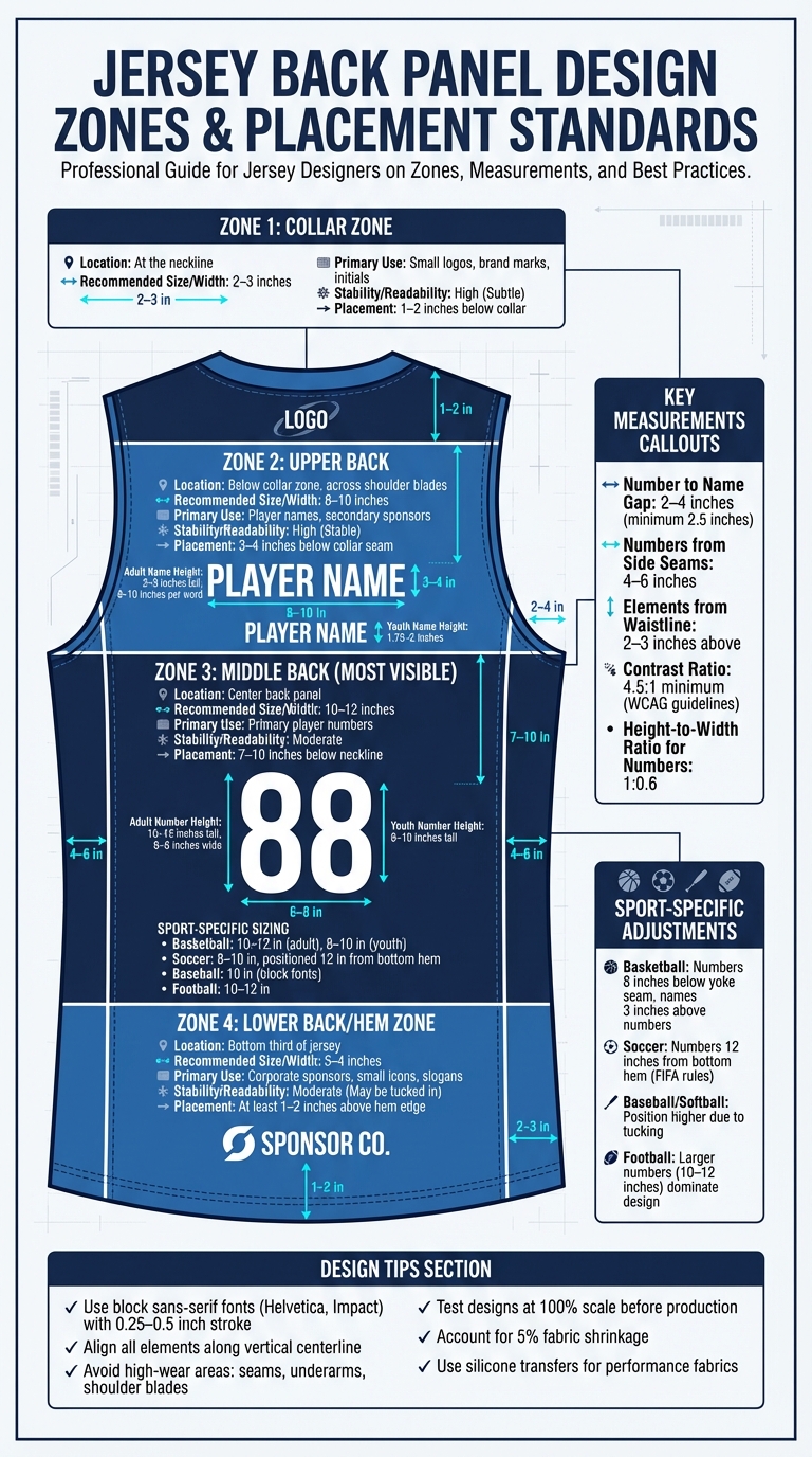
Jersey Back Panel Design Zones Guide with Sizing Standards
Primary Back Panel Zones
The back panel of a jersey can be divided into three key zones: upper, middle, and lower. Each zone serves a specific purpose, helping to balance design and functionality.
In the upper back zone, place player names or small logos 3–4 inches below the collar seam. This area is perfect for subtle elements that won’t overshadow larger designs.
The middle back zone is the largest and most visible area, making it ideal for player numbers and prominent logos. For adult football jerseys, numbers should be 10–12 inches tall, while soccer jerseys typically use numbers between 8–10 inches. For youth jerseys, scale these down to 6–8 inches for better proportion and readability.
The lower back zone is less traditional but growing in popularity for creative branding, slogans, or modern design elements. When placing logos near the bottom hem, keep them at least 1–2 inches above the edge to avoid visibility issues caused by fabric folds or tucking.
| Zone | Recommended Size/Width | Primary Use | Stability/Readability |
|---|---|---|---|
| Collar Zone | 2–3 inches | Small logos, brand marks, initials | High (Subtle) |
| Upper Back | 8–10 inches | Player names, secondary sponsors | High (Stable) |
| Middle Back | 10–12 inches | Primary player numbers | Moderate |
| Lower Hem | 3–4 inches | Corporate sponsors, small icons | Moderate (May be tucked in) |
How Fabric Movement Affects Placement
Once the zones are defined, it’s essential to consider how fabric movement during gameplay impacts logo placement. Performance fabrics, which often stretch and flex, can distort logos if not properly positioned. The middle back zone typically experiences the most movement, especially when players bend or twist. For this reason, it’s critical to use durable application methods like screen printing or digital hybrid transfers.
"Stretchy or textured materials may limit intricate details or large prints." – Imprint Connect
To minimize distortion, avoid placing logos near seams or folds, as these areas are more prone to movement. Heat press pads can help stabilize logos over thick seams, ensuring a clean application. For sublimated performance fabrics, silicone transfers are recommended to maintain adhesion and prevent dye migration, even under intense stretching or heat.
The upper back zone, located across the shoulder blades, remains relatively stable. This makes it a great spot for text-based designs, sponsor names, or secondary branding. In high-intensity sports like cross country, smaller designs are preferable to maintain breathability and flexibility.
Wooter Apparel applies these principles to every custom jersey, ensuring designs not only look great but also endure the demands of competitive play. These insights into fabric movement and placement set the stage for precise customization in future sections.
Back Name and Number Placement Standards
Sizing and Positioning Guidelines
For proper placement, position the player number 7–10 inches below the neckline, with the name sitting 2–4 inches above. In basketball jerseys, NBA standards require numbers to be 10–12 inches tall, placed 8 inches below the yoke seam, and names in 2.5-inch height fonts located 3 inches above. Soccer jerseys adhere to FIFA rules, with 10-inch tall numbers centered 12 inches from the bottom hem.
Adjust sizing based on jersey type. Adult jerseys typically feature 10–12 inch tall numbers (with a width of 6–8 inches) and names at 2–3 inches tall (spanning 8–10 inches per word). Youth jerseys use 8–10 inch numbers. Maintain a 1:0.6 height-to-width ratio for clear readability. Baseball jerseys favor 10-inch block fonts, while basketball jerseys use larger 12-inch numbers for better visibility during quick gameplay.
Align all elements along the vertical centerline. Numbers should be 4–6 inches from the side seams, tapering by 1 inch on curved backs. Place elements 2–3 inches above the waistline to minimize wear. For soccer jerseys, lower the placement by 1 inch to accommodate longer torsos.
Color Contrast and Visibility
Once sizing and alignment are set, ensure the text is visible with strong color contrast. This is crucial for readability from a distance. Follow WCAG guidelines by aiming for a 4.5:1 contrast ratio. For example, white numbers on dark navy achieve an 8.6:1 ratio, while black outlines on light gray also provide excellent visibility. Use block sans-serif fonts like Helvetica or Impact, with a 0.25–0.5 inch stroke, as they are easier to read. Avoid thin serif fonts, which can be harder to distinguish.
To prevent overcrowding, keep at least a 2.5-inch gap between names and numbers. Be mindful of scaling – oversized numbers on smaller jerseys can cause distortion. Always review designs at 100% scale and conduct wash tests to account for up to 5% shrinkage before finalizing production. Wooter Apparel ensures all custom jerseys meet professional standards for visibility and durability, combining functionality with lasting quality.
Back Sponsor Logo Positioning
When incorporating sponsor logos on the back of jerseys, it’s essential to ensure they complement the name and number placements without making the design feel overcrowded or hard to read.
Placement Conventions by Sport
The positioning of sponsor logos varies depending on the sport, as name and number sizes differ across uniforms. For soccer jerseys, sponsor logos are typically placed 3–4 inches below the collar seam in the upper back area or just below the player number. This works well because soccer uniforms feature relatively small back names (2 inches tall) and numbers (8–10 inches tall), leaving enough room for branding.
In football jerseys, the larger back numbers (10–12 inches tall) dominate the design. As a result, sponsor logos are usually placed in the upper plate area above the numbers. Similarly, ice hockey jerseys require adjustments due to 3-inch names and 10–12 inch numbers, which limit available space for sponsor logos. For cross country and other endurance sports, smaller, lightweight designs are favored to maintain breathability. Logos in these cases are minimal, complementing 6–8 inch numbers with compact branding.
In some cases, lower back placement is a viable option to avoid crowding traditional areas. This works particularly well when upper-back space is already occupied by team branding.
Balancing Sponsor Logos with Team Elements
Achieving a clean and balanced look requires careful sizing and placement of sponsor logos. For logos placed in the upper center back, aim for a width between 8 and 12 inches. If the logo is positioned directly under the collar, it should be scaled down to ensure it doesn’t interfere with the player’s name. Smaller logos near the collar must have high-contrast details to remain legible.
To avoid a cluttered design, limit the back elements to 2–3 items. If the sponsor logo is large, simplify the front of the jersey to maintain balance. Use tools like T-squares or laser alignment devices to ensure the sponsor logo is perfectly aligned with the back name and number. Proper alignment creates a professional and cohesive look that highlights both sponsor visibility and team identity.
Design Considerations for Back Placement
Logo Proportions and Sizing
The back panel offers plenty of space, but it’s best to focus your design on the upper two-thirds. This keeps the overall look clean and professional while avoiding clutter near the waistline. Keeping this balance aligns with the natural zones of the back panel.
For adult jerseys, upper back designs should typically span 8–10 inches in width, while full back graphics can go up to 10–12 inches. These designs should be positioned 4 to 6 inches below the collar to avoid crowding the neckline. If you’re placing a smaller logo near the back neck, it should sit 1 to 2 inches below the collar and measure around 2 to 3 inches wide.
The way a logo is shaped can also influence how large it appears. Circular logos often seem larger than horizontal or vertical ones because they cover more surface area. For embroidered designs, scale them based on the smallest details – threads need extra space to maintain clarity.
When working with sublimated jerseys featuring intricate patterns, make sure logos and numbers stand out by adding a solid color backing or a bold contrasting outline (at least 2 to 3 pixels thick). On fabrics like spandex blends, opt for smaller, simplified logos to prevent distortion. Since performance materials are lightweight and moisture-wicking, avoid large or heavy designs that could make the jersey stiff or uncomfortable.
By carefully sizing and positioning logos, you can ensure clarity while keeping the garment functional and visually appealing.
Avoiding High-Wear Areas
To maintain the integrity of your design, steer clear of high-wear zones like seams, shoulder blades, and underarms. Placing logos near seams can lead to uneven ink distribution, while high-flex areas such as the shoulder blades and underarms can stretch and distort the design, affecting both appearance and comfort.
For sports like soccer and baseball, where jerseys are often tucked into shorts, position logos high enough to remain visible and avoid friction at the waistband. The lower third of the back panel should generally stay clear to prevent designs from getting lost in fabric folds. If you’re adding a small logo or sponsor near the bottom, make sure it’s at least 1 to 2 inches above the hemline.
High-friction areas like underarms and side panels should also be avoided for detailed logos, as abrasion can cause peeling over time. For jerseys with thick seams, such as football jerseys, use heat press pads to ensure even pressure during application. Always test a single garment before proceeding with a full order to confirm compatibility between the fabric and the transfer process, saving time and money in the long run.
Sport-Specific Back Placement Guidelines
Here’s a closer look at how to tailor back panel designs for different sports. Each sport has its own requirements to ensure both durability and visibility during gameplay.
Basketball Jerseys
For adult basketball jerseys, numbers should measure 8–10 inches, with player names positioned 3–4 inches below the collar. For youth jerseys, opt for 6–8-inch numbers and names sized between 1.75–2 inches. Since basketball jerseys are typically worn untucked, there’s more flexibility with lower back placement.
Because these jerseys endure constant stretching, it’s crucial to match the heat transfer material to the fabric. Silicone transfers work well with sublimated performance fabrics, as they prevent dye migration and maintain flexibility. Always test one jersey before completing a full order for custom uniforms to ensure proper adhesion and color accuracy.
Soccer Jerseys
Soccer jerseys require numbers and names to be placed high on the back to stay visible during play. Follow the general sizing guidelines used for basketball jerseys, but adjust for the specific fabric type.
Mesh fabrics are common in soccer jerseys, so it’s important to use cover sheets during heat pressing. This prevents scorching and ensures the transfer adheres evenly.
Baseball and Softball Jerseys
For baseball and softball jerseys, which are usually tucked in, position logos, names, and numbers higher on the back panel for better visibility. Player names for adults are typically 2.5 inches tall, while youth sizes are closer to 2 inches. These are generally placed 3–4 inches below the collar.
These jerseys often feature thicker materials and reinforced seams, especially around the shoulders. To apply names and numbers over these seams, use heat press pads to maintain even pressure and proper adhesion. Avoid placing intricate logos near the shoulder blades, as repetitive arm movements can distort the design over time.
Conclusion
Mastering back logo placement is all about understanding the key zones, measuring carefully, and tailoring your design to the specific sport. Whether it’s a small logo positioned 1–2 inches below the collar or a larger graphic centered 4–6 inches down, precision is the key to creating jerseys that look polished and perform well.
Placement isn’t just about appearance – it also impacts how your brand message resonates with fans and rivals. A well-placed design stands out, while a poorly positioned one might get lost in fabric folds or cause discomfort during movement.
To ensure comfort, avoid placing heavy graphics on high-flex areas like seams or shoulders, especially when designing custom pro football jerseys. For stretch fabrics, opt for lighter designs, and always leave a 1–2 inch clearance from the bottom hem to keep designs visible when jerseys are tucked in.
Create balance by pairing subtle elements, like a small left-chest logo, with bold full-back designs. For adult basketball jerseys, keep graphics between 8–12 inches wide to prevent awkward wrapping around the body.
FAQs
How do I size back numbers for my jersey size?
To get the right size for back numbers, start by considering the measurements suited to your sport and jersey size. For example, adult jerseys usually require 8-inch numbers, while youth jerseys often need 6-inch numbers. Be sure to review your league’s rules, as some sports have specific requirements – like 10-inch numbers for football or 8-inch numbers for basketball. Proper sizing not only ensures the numbers are easy to see but also keeps your jersey in line with league standards.
Where should a sponsor logo go if I already have a name and number?
If your jersey already displays a name and number, the sponsor logo should be positioned in a way that avoids overlapping with these elements. Popular placements include below the number on the back or on the front of the jersey. It’s important to ensure the logo doesn’t block the name or number, as these are essential for identifying players during the game.
What print method works best on stretchy performance fabric?
When working with stretchy performance fabrics, choosing the right printing and sewing techniques is crucial to achieve the best results.
For printing, reactive dye printing and dye sublimation are top choices. These methods bond directly with the fabric fibers, ensuring designs that are both vibrant and long-lasting.
When it comes to sewing, opt for a stretch stitch or a narrow zigzag stitch. These stitches allow the fabric to retain its flexibility, preventing seams from breaking or puckering.