
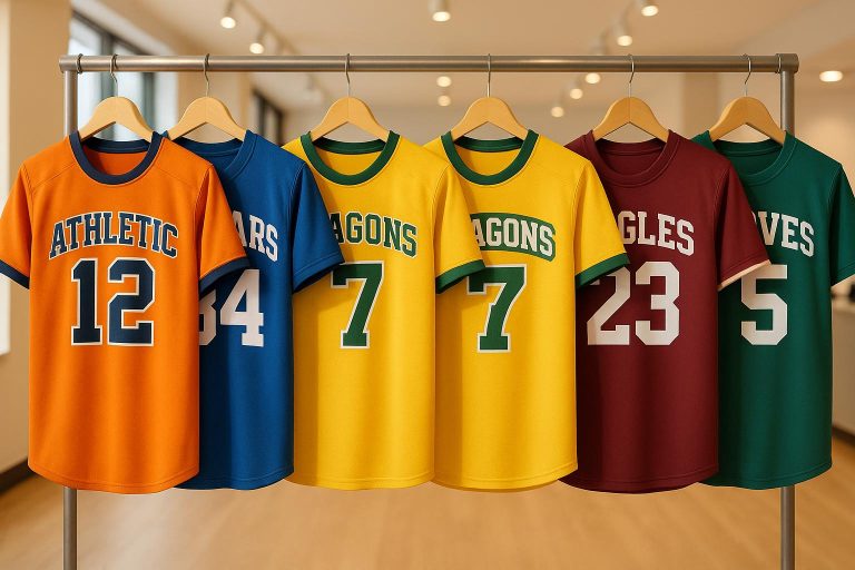
When selecting a font for your team’s jerseys, it’s about more than just style – it’s about functionality, identity, and durability. The right choice ensures readability during games, aligns with your team’s branding, and withstands wear and tear. Here’s what you need to know:
- Prioritize Readability: Opt for bold, clear fonts that are easily visible from a distance and under various lighting conditions. Avoid overly decorative styles that hinder quick recognition.
- Match Team Identity: Choose fonts that reflect your team’s personality – modern and sharp for competitiveness, script for tradition, or clean and geometric for innovation.
- Ensure Compatibility: Test fonts for different jersey elements (names, numbers, logos) and confirm compliance with league regulations on size, style, and contrast.
- Focus on Durability: Use production methods like sublimation for long-lasting designs. Medium-weight fonts balance clarity and resilience.
Key Tip: A well-chosen font not only enhances your team’s look but also strengthens fan engagement and brand recognition. Always test designs in real-world scenarios before finalizing.
How To Create Your Own Baseball Jersey Font
Know Your Team’s Identity and Branding
The font on your team’s jersey does more than just display a name or number – it embodies your team’s identity. It’s a visual representation of your team’s core values and personality. To get it right, start by aligning your font choice with what makes your team stand out.
Define Team Values and Personality
What sets your team apart? Whether it’s a reputation for fierce competitiveness, a nod to tradition, or a focus on cutting-edge strategies, these traits should guide your font selection. For instance:
- Bold, modern fonts with sharp edges convey strength and a competitive edge.
- Elegant cursive or script fonts exude sophistication and tradition, much like the iconic styles of the New York Yankees, Los Angeles Dodgers, and Chicago Bulls.
- Geometric and clean fonts suggest innovation and a forward-thinking approach, ideal for teams looking to refresh their image.
To ensure the font resonates, involve key stakeholders – players, coaches, and even loyal fans – in the decision-making process. This collaborative approach helps create a design that truly reflects your team’s character.
Match Fonts with Team Colors and Logos
Once you’ve nailed down your team’s personality, it’s time to ensure the font complements your colors and logo. The goal is a seamless, cohesive look that ties everything together. For example:
- Use contrasting colors – dark fonts on light jerseys or vice versa – to ensure maximum readability on the field.
- Keep in mind that color plays a huge role in perception. Studies show that up to 90% of first impressions about a brand are influenced by color.
When integrating your logo, consistency is key. If your logo features bold, angular lettering, pairing it with a delicate script font can feel mismatched. Instead, aim for harmony between fonts, colors, and logo design. For added impact, consider weaving your logo into broader design elements – like stripes or geometric patterns in your team colors. A unified visual identity not only boosts brand recognition but also strengthens team spirit and fan loyalty, creating a strong "us vs. them" mentality.
Focus on Readability and Legibility
When it comes to jersey fonts, readability should always come first. Style is great, but it takes a backseat to making sure the text is easy to read – even from a distance.
To achieve this, go for fonts with thick, bold letterforms that stay clear even when players are moving. Clean lines and strong contrast are crucial, as they ensure the text remains visible under different viewing conditions.
Avoid Overly Decorative Fonts
While decorative fonts might look appealing in a design draft, they often fall short in real-life scenarios. Fancy scripts and intricate details can become a headache to read, especially when players are in motion or when the font is scaled down. This is why it’s better to stick with fonts that have broad, bold letters. These fonts not only grab attention but also maintain their shape at smaller sizes and complement detailed logos effectively.
For officials and fans alike, quick and easy identification is key – whether it’s spotting a favorite player or reading a number during the game.
Test Visibility in Different Conditions
Your font needs to perform reliably in various conditions. Factors like lighting, jersey color, and viewing distance can all impact readability. To ensure your choice works, test fonts against different background colors and in various lighting scenarios, from bright stadium lights to natural sunlight. Look for fonts that minimize glare and maintain clarity in all these settings.
Distance testing is just as important. Print sample jerseys or create mockups, then view them from multiple distances – courtside to the farthest seats. To mimic real game conditions, have someone wear the test jersey and move around. This will help you determine if the font stays legible when in motion.
Ultimately, pick a font that stays clear no matter the distance or lighting. Also, double-check that it meets production and league standards before finalizing your choice.
sbb-itb-4d95ad3
Check Font Functionality and Compliance
After narrowing down your font options based on readability, the next step is to ensure they perform well in real-world applications. A font might look fantastic on your screen or in a mockup, but if it doesn’t align with production needs or league regulations, it’s not a practical choice.
Check Font Flexibility for All Elements
Your font needs to work seamlessly across all aspects of your jersey design. A typeface that looks bold and clear for large numbers might become illegible when scaled down for player names or sponsor text. This is why testing how your font performs in different sizes and placements is a must.
Create mockups to see how the font handles various applications. For instance, a font that looks great for a simple "23" might struggle with longer names like "Rodriguez" or intricate slogans. Smaller text, such as sponsor logos, often presents additional challenges, requiring clarity even at reduced sizes.
Maintain consistent legibility across all scales. Some decorative fonts may lose their charm when shrunk, while others can appear cluttered. It’s also essential to match the font to your jersey’s theme. A sleek, modern font pairs well with contemporary designs, whereas a retro font might be better suited for vintage-inspired graphics. The goal is to enhance the overall look without letting the font overpower other design elements.
Meet League Standards
Once you’ve confirmed the font’s adaptability, the next step is to ensure it complies with your sports league’s specific guidelines. Different leagues have rules about font sizes, styles, and visibility to ensure names and numbers are easy to read for both officials and fans.
For example, most leagues require strong color contrast – dark numbers on light jerseys and vice versa – to ensure readability from a distance. Size requirements also vary; professional leagues often enforce stricter guidelines, but all leagues mandate minimum sizes for names and numbers to maintain visibility. Additionally, some leagues may prohibit certain font styles, favoring block or sans-serif fonts over decorative or script styles. To avoid issues, consult your league’s rulebook or speak with officials to confirm your font choice before moving forward with production.
Confirm Compatibility with Production Methods
Production methods can significantly affect how your chosen font appears on the final jersey. Each method – whether embroidery, sublimation, or heat transfer – comes with its own set of requirements and limitations.
Embroidery, for example, is the most restrictive. Fonts smaller than 14 points can look rough or unreadable because the thread may overwhelm fine details. Bold, simple fonts work best for embroidery, while cursive or decorative styles can lose clarity. Avoid fonts with outlines, shadows, or narrow characters, as these can become cluttered or disappear entirely. Sticking to a single, bold typeface ensures clean results.
Sublimation offers more flexibility, allowing for intricate, multi-colored designs. However, it typically works best when applied to a white fabric base. Heat transfer printing is another option, ideal for numbers and sponsor logos on colored jerseys. That said, fonts with thin lines or small details may be prone to peeling over time.
| Production Method | Best Font Types | Size Requirements | Limitations |
|---|---|---|---|
| Embroidery | Bold, simple fonts | Minimum 14pt | Avoid outlines, shadows, or narrow text |
| Sublimation | Complex designs | Flexible sizing | Works best on white fabric |
| Heat Transfer | Block letters | Standard sizing | Thin details may peel |
Testing your font with actual production samples is the best way to ensure it meets your expectations. This step helps you identify potential issues early and ensures your jerseys look and perform exactly as intended.
At Wooter Apparel, our design team thoroughly tests fonts across all production methods to deliver custom jerseys that meet the highest standards of design, durability, and functionality.
Balance Appearance with Performance Durability
When it comes to jersey fonts, it’s all about finding the right balance between how they look and how well they last. Sure, eye-catching fonts grab attention, but durability ensures your jerseys survive the wear and tear of competitive play and endless wash cycles. The best fonts not only elevate the design but also stand up to the demands of the game. With that in mind, let’s talk about how your font choice should work with your overall uniform design.
Work with the Uniform Design
Your font shouldn’t just sit on the jersey – it should feel like it belongs there. It needs to blend seamlessly with logos, sponsor patches, and team colors, creating a cohesive look without overwhelming the design. A good strategy is to establish a visual hierarchy by varying font weights and sizes. For example:
- Use bold weights for player numbers to make them stand out.
- Opt for medium weights for player names to keep them readable.
- Apply lighter weights for secondary details to avoid clutter.
Think about the vibe you want your team to project. Bold, striking fonts scream power and energy, perfect for intense sports like football or hockey. On the other hand, a more polished and subtle font might suit sports that emphasize tradition, such as golf or tennis. Whatever you choose, make sure it pairs well with your team’s colors and has strong contrast for easy readability. A subtle outline in a secondary color can tie everything together while keeping the text legible.
Letter spacing also plays a big role. Tighter spacing can create a sleek, athletic feel, but don’t overdo it – letters that are too close together might blur when viewed from a distance. And since jerseys often feature multiple text elements (like patches or commemorative badges), make sure your primary font complements these secondary details without clashing.
Focus on Durability of Font Application
Looks aren’t everything – your font also needs to withstand the realities of game day and laundry day. Durability is just as important as readability, and the method you use to apply the font can make all the difference. For long-lasting designs, sublimation is a top choice. This process embeds the ink directly into the fabric, making it resistant to cracking, fading, or peeling. High-quality inks and proper heat and pressure during the printing process are key to ensuring the design stays intact.
Font weight also impacts durability. Medium-weight fonts strike the best balance – they’re easy to read and hold up well during production and wear. Thin fonts can disappear during embroidery, while overly thick fonts might lose their finer details. Consider how often the jersey will be washed. For items like youth league uniforms that see frequent laundering, durable methods like sublimation or high-quality screen printing are ideal.
Stick with classic, athletic typefaces that stay professional and legible over time. These fonts make it easier to reorder jerseys or add new players to the roster without worrying about mismatched styles.
At Wooter Apparel, we use sublimation to ensure your fonts stay sharp and vibrant, no matter how many games or washes they go through. This way, your team can count on looking sharp all season long.
Conclusion: Key Points for Choosing Jersey Fonts
Selecting the right jersey font is about finding the perfect mix of team identity, readability, and durability. Let’s recap the most important aspects to consider.
Your font choice isn’t just about aesthetics – it plays a big role in how your team is perceived and remembered. As Clash Graphics puts it:
"Typography is essential in branding because it communicates a brand’s identity and personality, leading to better consumer engagement and brand recognition." – Clash Graphics
To strengthen your team’s brand, make sure the font aligns with your team’s personality and colors. Fun fact: consistent use of colors can boost brand recognition by as much as 80%.
Readability should never be compromised. Fonts need to be clear and legible whether fans are watching from the stands, on TV, or in different lighting conditions. Skip overly decorative styles that might look cool but make it hard to read.
Check compliance and functionality. Ensure your font meets league standards and works seamlessly across all jersey elements. Also, confirm that it’s compatible with your production method – whether it’s sublimation, screen printing, or embroidery.
When it comes to durability, medium-weight fonts paired with dependable production techniques like sublimation are your best bet. This combination helps prevent issues like fading, cracking, or peeling, even after multiple games and washes.
FAQs
How do I choose a jersey font that represents my team’s identity and values?
When picking a jersey font that captures your team’s essence, think about how it reflects your team’s personality, history, and aspirations. Does your team exude a bold, modern energy, or is it more rooted in a timeless, classic style? Let these traits steer your decision.
Prioritize readability and clarity – the font should be easy to read at various sizes, especially from a distance. This ensures players are easily identifiable and the design remains visually appealing. Before finalizing, test the font on mockups to confirm it works well with your team’s colors and logo. A unified design across all elements will showcase your team’s identity in a polished and professional way.
How can I test if a font is readable and visible during a game?
When selecting a font for a game, it’s crucial to test its readability in various lighting conditions – whether it’s bright sunlight, dim lighting, or under the glare of stadium lights. Experiment with font size, color, and contrast to see how well it stands out against different backgrounds.
For a realistic evaluation, try replicating actual game settings. View the font on uniforms or screens from varying distances, and focus on details like spacing, boldness, and contrast. These factors play a big role in ensuring the text stays clear and easy to read, no matter the situation.
What are the most durable methods for applying fonts to sports jerseys to ensure they last through regular use?
When it comes to adding fonts to sports jerseys, sewn tackle twill and appliqué stand out as the toughest and most reliable methods. Both involve attaching fabric pieces or embroidery directly onto the jersey, creating a clean, professional appearance that holds up over time.
These techniques are built to endure the demands of sports – whether it’s repeated washing or the wear and tear of intense gameplay – making them perfect for team uniforms that need to last.