
When designing for digital screens or printed materials, choosing the correct color mode – CMYK or RGB – is critical. Here’s what you need to know:
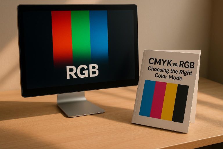
- RGB (Red, Green, Blue): Used for digital screens. It creates colors by adding light, producing vibrant visuals ideal for mockups, presentations, and online content.
- CMYK (Cyan, Magenta, Yellow, Black): Used for printing. It relies on inks to absorb light, ensuring accurate color reproduction on physical materials like uniforms or banners.
Key Takeaways:
- Use RGB for digital designs like mockups, social media content, and online previews.
- Use CMYK for print production to maintain color accuracy on physical products.
- Convert designs from RGB to CMYK early in the process to avoid unexpected color shifts during printing.
- Tools like Pantone can help match colors precisely in print.
Quick Comparison:
| Aspect | RGB | CMYK |
|---|---|---|
| Color Process | Additive (adds light) | Subtractive (absorbs light) |
| Primary Colors | Red, Green, Blue | Cyan, Magenta, Yellow, Black |
| Best Use | Digital screens | Printed materials |
Start with RGB for digital creativity, then switch to CMYK for print precision. This approach ensures designs look great on screen and in print.
RGB vs CMYK: What’s the difference?
RGB Color Mode: Features and Applications
RGB is the backbone of digital design, bringing vibrant, screen-friendly colors to life. Understanding its role and optimal use ensures that your digital creations captivate and leave a lasting impression.
How RGB Works: Additive Color Process
RGB uses an additive color system, where colors are created by combining light on a black screen. When red, green, and blue are all at their highest intensity, they produce pure white light. This is the opposite of how colors mix in paint or ink, which darken as they combine.
Each RGB channel has 256 intensity levels, offering an impressive 16.7 million possible color variations. For instance, a bright red is represented as RGB (255, 0, 0), while a rich purple might be RGB (128, 0, 128).
This additive method makes RGB ideal for backlit displays. Devices like computer monitors, smartphones, and tablets use tiny red, green, and blue lights to blend and produce a wide spectrum of colors.
Best Uses for RGB in Uniform Design
RGB shines during the digital design phase of creating custom uniforms. It’s perfect for crafting initial concepts, adjusting color schemes, and presenting design options to team members or captains. Its vibrant color range ensures that designs look their best on screens.
Online mockups and digital proofing sessions benefit greatly from RGB’s ability to showcase bold, saturated colors. This helps teams visualize their choices in the most dynamic way before finalizing designs for production.
RGB is also essential for social media and marketing materials. Whether showcasing new uniforms on platforms like Instagram or Facebook, or displaying options on e-commerce sites, RGB ensures colors appear bright and attention-grabbing. Digital catalogs and product listings depend on this vividness to appeal to potential buyers.
For those using design tools like Adobe Illustrator or Photoshop, RGB offers the flexibility to experiment with striking color combinations. This often leads to creative solutions that can later be adapted for print.
While RGB dominates in digital applications, its counterpart, CMYK, takes center stage for print. Up next, we’ll explore CMYK’s features and its role in bringing designs to life on paper.
CMYK Color Mode: Features and Applications
CMYK is the backbone of professional printing, transforming digital designs into tangible prints. This color mode plays a crucial role in custom apparel production, ensuring that designs maintain their intended appearance when transferred from screens to fabrics.
How CMYK Works: The Subtractive Color Process
Unlike RGB, which creates colors by combining light, CMYK uses a subtractive process. It relies on ink to absorb – or subtract – specific wavelengths of light from a white surface. The four ink colors – Cyan, Magenta, Yellow, and Key (Black) – are blended in varying amounts to produce a wide spectrum of printable colors.
When all four inks are applied at their maximum levels, they absorb nearly all light, resulting in a dark, rich black. Each CMYK value, expressed as a percentage (0%–100%), determines a specific color. For instance, a vibrant orange might be represented by C:0%, M:50%, Y:100%, K:0%, while a deep navy could be C:100%, M:80%, Y:0%, K:20%. This percentage-based system gives printers precise control over the ink application, ensuring consistent and accurate colors across production runs and materials.
The "Key" or black ink component is particularly important. Adding black enhances details and creates depth in shadows, which is essential for achieving sharp, professional-quality designs. This meticulous control over ink application ensures that designs are ready for reliable and accurate printing.
Best Uses for CMYK in Uniform Design
When it comes to translating digital designs into physical products, CMYK is indispensable. Custom team uniforms – whether basketball jerseys, soccer shorts, or football pants – depend on CMYK color profiles to ensure precise color reproduction on fabric. Before production begins, digital files must be converted to CMYK to prevent color shifts that can occur when printing directly from RGB files. Colors that appear vibrant on a monitor may look muted or inaccurate on fabric if not properly converted.
CMYK’s subtractive color model is particularly well-suited for addressing the unique way fabrics interact with ink. This ensures uniform color consistency across all pieces, even when different materials are used. By adhering to CMYK’s standardized specifications, manufacturers can achieve reliable results, whether for initial production or future reorders.
At Wooter Apparel, for example, CMYK values serve as essential guidelines, ensuring that every uniform piece matches perfectly – even across multiple production runs. Techniques like sublimation printing and screen printing are specifically designed to work within CMYK workflows, guaranteeing that every detail of the design is reproduced as intended.
In short, CMYK bridges the gap between creative designs and their physical realization. While RGB might be the starting point for digital creativity, CMYK ensures that the final product meets the highest standards of color accuracy and quality, making it the go-to choice for professional uniform production.
sbb-itb-4d95ad3
CMYK vs RGB: Key Differences
Grasping the core differences between CMYK and RGB is crucial for making smart choices in color management, especially when designing custom uniforms. These two color modes follow distinct principles and are tailored for specific roles in the design and production process.
Side-by-Side Comparison of CMYK and RGB
As mentioned earlier, RGB uses an additive process, while CMYK relies on a subtractive method. Beyond this technical foundation, practical differences significantly affect your workflow.
| Aspect | RGB | CMYK |
|---|---|---|
| Color Process | Additive (adds light) | Subtractive (absorbs light) |
| Primary Colors | Red, Green, Blue | Cyan, Magenta, Yellow, Key (Black) |
| Color Range | 16.7 million colors | Around 4,000 printable colors |
| Best Applications | Digital screens, web graphics, mockups | Print materials, physical products |
| File Compatibility | Web browsers, digital design tools | Professional printing systems |
| Color Values | 0-255 per channel | 0%-100% per ink color |
This breakdown highlights the technical strengths of each mode.
One major difference lies in the color gamut. RGB supports a much wider range of colors (16.7 million) because it uses light, while CMYK is limited to about 4,000 colors due to the constraints of physical inks.
RGB colors stay consistent across calibrated screens, which makes them ideal for digital use. On the other hand, CMYK is better suited for predictable, accurate results in printing because it’s specifically designed for physical production.
Which Color Mode is Better for Your Needs?
Deciding between RGB and CMYK boils down to your project’s purpose and where the designs will be used. Neither mode is inherently better – they’re simply optimized for different tasks.
- Use RGB for digital designs, mockups, and online visuals. It’s also perfect for brainstorming and exploring creative ideas, thanks to its extensive color range.
- Use CMYK for printed materials like custom uniforms, banners, business cards, or any other physical product. Starting your design in CMYK ensures the printed outcome matches your expectations, as RGB’s vibrant tones often appear duller when converted for print.
For custom uniform projects, combining both modes strategically is the best approach. Start with RGB for digital mockups and client previews to showcase vibrant designs. Then, switch to CMYK for production to ensure accurate color reproduction.
At Wooter Apparel, this dual approach is standard. RGB is used for digital mockups, helping clients visualize their designs, while CMYK ensures precision during production. This workflow guarantees both creative flexibility and reliable results.
To avoid surprises, convert from RGB to CMYK early in the process. Delaying this step can lead to rushed adjustments or compromise the final look of your designs.
Lastly, consider your timeline and budget. RGB workflows are quicker for approvals and revisions, while CMYK requires more time for color management and proofing. However, investing effort in proper CMYK preparation can save you from costly reprints and ensure the final product meets expectations.
Choosing the Right Color Mode for Custom Team Uniforms
Picking the right color mode for custom uniforms is all about balancing your creative ideas with the practical needs of production. This ensures that what you see on your screen translates as closely as possible to the final printed product.
Using RGB for Digital Mockups and Previews
The RGB color mode shines during the early design stages, especially when you’re creating digital mockups or sharing initial concepts with teammates, coaches, or stakeholders. Its wide color range allows designers to craft vibrant, eye-catching visuals that showcase the full potential of a uniform design.
When presenting to clients, RGB mockups look bold and vivid on screens, which is especially important for sports like basketball or football, where team colors are a key part of identity and fan connection. Plus, working in RGB makes it easier to experiment with different color combinations, gradients, and effects during the design process. These quick adjustments help teams finalize their vision more efficiently.
That said, it’s crucial to manage expectations at this stage. Everyone involved should understand that printed uniforms may look slightly different from the digital mockups. This is because screens and printers handle colors differently. Once the design is finalized in RGB, the next step is converting it to CMYK for production.
Converting to CMYK for Print-Ready Files
After the design is approved, converting it to CMYK early in the process is essential. This allows enough time to make necessary color adjustments and get client approval for the print-ready version.
During the conversion, some colors – like bright greens, vibrant blues, and neon shades – may shift because they fall outside the CMYK range. While this is normal, it’s important to carefully review these changes to ensure the design still meets expectations. Tools like Adobe Illustrator’s soft-proofing feature can simulate how CMYK colors will look when printed, helping you catch potential issues before production begins.
You’ll also need to check fine details to ensure they print clearly. Colors that appear distinct on a screen might blend together in print, so adjustments may be needed to preserve contrast and visual impact. Once the CMYK version is ready, create a proof and review it under appropriate lighting – what looks good on a monitor in an office might appear different under the gymnasium lights where the uniforms will be worn.
This careful preparation leads into Wooter Apparel’s color accuracy process, ensuring a seamless transition from digital design to the final product.
Wooter Apparel‘s Color Accuracy Process

Wooter Apparel has developed a thorough system to ensure digital designs translate into high-quality printed uniforms. Their in-house design team specializes in understanding how colors interact and complement each other in uniform production.
Central to Wooter’s process is their use of the Pantone Color System, which provides precise color matching. As Wooter explains:
"One important thing to note is that experienced printers use Pantone Colors. Pantone is a universal color code system that every printer recognizes. This means the color should come out almost identical no matter which printer is used."
This system is invaluable because it offers hundreds of shades for a single color – there are over 200 shades of orange alone in the Pantone system. To simplify this for customers, Wooter offers a "Color Finder" tool, making it easy to pick exact shades and avoid guesswork.
Wooter combines full-sublimation printing technology with a rigorous quality assurance process. They describe their QA approach as follows:
"We do a QA test at the end of our production cycle for EVERY order. For bigger orders we follow a very strict cycle because we send out sizing sets AND custom samples to ensure the color, size, and design is 100% correct and exactly what you will be expecting."
To support this process, Wooter advises submitting designs as original vector files (.ai or .pdf). These formats ensure sharp, high-quality prints that align perfectly with their full-sublimation techniques. This method not only preserves the vibrancy of the designs but also ensures the colors remain intact through regular wear and tear.
Conclusion
Understanding the difference between CMYK and RGB is key to ensuring your custom uniforms turn out exactly as envisioned. Each color mode has its role in the design and production process, and knowing when to use each can save you time, money, and frustration.
RGB shines when used for digital mockups and presentations. Its vibrant colors look fantastic on screens, offering the flexibility to experiment with bold and striking combinations that reflect your team’s personality. But remember, what looks great on a screen doesn’t always translate perfectly into print.
CMYK, on the other hand, is essential for the production phase. It ensures that the colors you see on your design translate accurately to the final printed product. The best results come from starting your design in RGB for creativity, then switching to CMYK early in the process to maintain consistency and accuracy.
Key Takeaways
- For custom uniforms, plan ahead and convert your designs to CMYK early to ensure color accuracy in print.
- Carefully review files after conversion and think about how the uniforms will appear under the actual lighting conditions where they’ll be used.
- Professional printing systems and standardized color tools like Pantone are invaluable for achieving consistent results across different production runs.
FAQs
How can I make sure the colors in my digital design look the same when printed on fabric?
To make sure the colors in your digital design translate accurately to the final printed fabric, start by working in the CMYK color mode – this is specifically designed for print projects. The most dependable way to verify color accuracy is by printing a physical color proof on the same or a similar type of fabric. This lets you directly compare the printed colors to your digital design and tweak them as needed.
For consistent and reliable results, use color profiles and keep your devices – like monitors and printers – calibrated regularly. Incorporating standardized color systems such as Pantone can also help you achieve precise color matching. These steps ensure your designs look vibrant and true to your vision when printed on fabric.
What should I watch out for when converting designs from RGB to CMYK?
When working on converting designs from RGB to CMYK, there are a few essential steps to ensure your colors stay as accurate as possible. First, make sure to set your document to CMYK mode before starting the conversion. Skipping this can cause colors to look dull or off once printed.
It’s also worth noting that certain bright, vibrant RGB colors can’t be fully replicated in CMYK due to its more limited color range. This can result in noticeable shifts in color. To minimize this, use the correct color profiles that align with your printer’s specifications. This step is crucial to achieving consistent and vibrant results, especially for projects like custom jerseys or uniforms where color accuracy is key.
Why do colors look different on screens compared to printed designs, and how can I set realistic expectations with my team or clients?
Colors can look noticeably different on screens compared to printed designs, and the reason lies in the color models each medium uses. Screens rely on the RGB color model (red, green, blue), which is additive – colors are created by combining light, resulting in vibrant, bright hues. Printers, on the other hand, use the CMYK color model (cyan, magenta, yellow, black), which is subtractive. This model works by layering ink and reflecting light, often leading to colors that appear softer or slightly warmer.
To bridge this gap, tools like soft proofing can simulate how colors will look in print, giving you a clearer idea of the final result. Another helpful step is calibrating your monitor to ensure that on-screen colors are as close to reality as possible. It’s also important to set expectations early – let your team or clients know that printed colors might not exactly match their digital counterparts. With clear communication and thoughtful preparation, you can minimize surprises and keep everyone aligned.