
Strong color contrast in team jerseys isn’t just about style – it’s essential for gameplay, safety, and compliance with league rules. Clear visibility helps players recognize teammates, enhances reaction times, and reduces injuries. Here’s what you need to know:
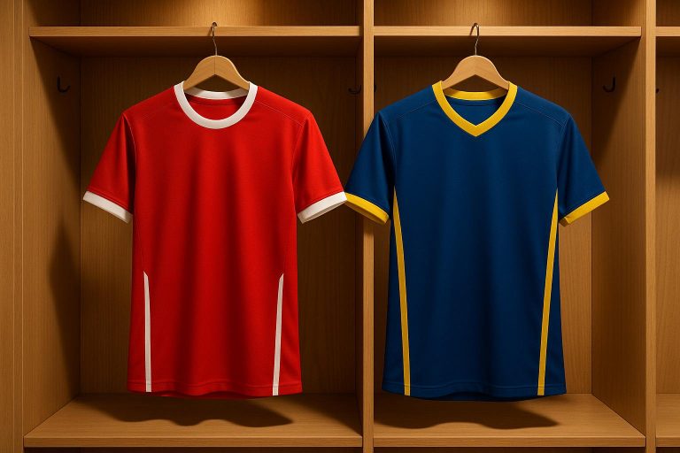
- Contrast Matters: High-contrast colors improve visibility and performance. For example, red is linked to dominance, while blue conveys calmness.
- League Standards: Sports leagues like FIFA, NCAA, and NFHS enforce strict rules for jersey colors, number sizes, and visibility.
- Design Tips: Use bold, complementary colors, avoid red/green combinations (due to color blindness), and ensure numbers and logos are legible.
- Compliance Tools: Tools like WebAIM Contrast Checker help test designs for visibility and accessibility.
- Fabric Choice: Polyester and synthetic blends retain vibrant colors better than cotton.
Quick Tip: Always test jersey designs under different lighting conditions to ensure they meet league standards and enhance on-field performance.
Four Tips for Accessible Color Contrast
Color Contrast Design Rules
Designing jerseys with effective color contrast goes beyond aesthetics – it’s about balancing color theory principles with sports regulations. A well-thought-out contrast not only enhances team identity but also ensures player safety and adherence to league rules.
Color Theory and Contrast Measurements
The foundation of effective jersey design lies in understanding contrast ratios and how colors interact. For jersey numbers and text, aim for a minimum contrast ratio of 4.5:1. For larger elements (18pt or more), a ratio of 3:1 is acceptable.
Here are some key points to guide your color choices:
- Primary and Secondary Colors: Use bold, eye-catching colors for the main jersey elements, complemented by neutral tones to keep the design balanced.
- Complementary Pairings: Choose color combinations that enhance visibility, like navy blue paired with white.
- Color Blindness Awareness: Red/green color blindness affects about 8% of men. Avoid relying solely on these colors for critical distinctions.
“When you adjust your assets with accessibility and compliance in mind, you create a more pleasant environment for everyone.” – ADA Site Compliance
By applying these principles, you set the stage for creating jerseys that are both visually striking and inclusive.
Number and Logo Design Standards
Once you’ve nailed the color contrast, the next step is designing clear, recognizable numbers and logos. Wooter Apparel’s design team emphasizes clarity and adherence to industry standards.
Here’s what to consider:
- Font Selection: Opt for bold, simple fonts for jersey numbers and logos to ensure they remain legible during fast-paced gameplay.
- Logo Contrast: Make sure the logo stands out against the jersey’s primary color.
- Spacing: Leave enough space around numbers and logos to avoid a cluttered appearance.
Always test your designs under different lighting conditions and from various distances to ensure they meet both aesthetic and functional requirements. These refinements not only enhance the jersey’s look but also guarantee compliance with sports regulations.
Sport-by-Sport Color Rules
Major sports have specific rules for jersey colors and contrast to ensure visibility during games.
Soccer Number Rules by FIFA

FIFA enforces strict guidelines for jersey numbers and text to maintain clarity on the field.
Key requirements include:
- Back numbers: Must be 25–35 cm tall and 3–5 cm thick.
- Front numbers: Should measure 10–15 cm in height.
- Player names: Positioned 4 cm above the back number and sized 5–7.5 cm tall.
- Teams must have both a colored kit and a white kit for contrast.
“To allow the manufacturers to enhance our sport through aesthetic creativity and design…in return, those parties are expected to follow the rules.” – FIFA
Basketball, like soccer, follows equally precise standards to ensure numbers and colors are clearly visible.
Basketball Rules: NFHS and NCAA
Basketball jerseys must meet specific visibility and contrast requirements, as outlined by the NCAA and NFHS.
- Back numbers: At least 6 inches tall.
- Front numbers: At least 4 inches tall.
- Number borders: Cannot exceed 1/2 inch in width.
- Neutral zone: A minimum of 4 inches below the shoulder seam.
- Front/back neutral zones: Must be at least 12 inches wide.
“As of 2024 the entire body of the jersey number must be a single, solid color which clearly contrasts with the body of the jersey.” – Bob Colgate, NFHS
Now, let’s look at how football handles uniform color and number requirements.
Football Color Standards
The NCAA has detailed rules for football uniforms to ensure consistency and visibility.
| Requirement | Home Team | Visiting Team |
|---|---|---|
| Basic Color Rule | Dark colors are allowed | White jerseys are standard |
| Number Height (Front) | Minimum of 8 inches | Minimum of 8 inches |
| Number Height (Back) | Minimum of 10 inches | Minimum of 10 inches |
| Number Style | Permanent Arabic numerals | Permanent Arabic numerals |
| Color Exception | Colored jerseys allowed with written agreement | Requires conference certification for colored jerseys |
“We kind of had a loophole in the rule that we didn’t specify that everyone on the home team had to wear the same color dark jersey.”
sbb-itb-4d95ad3
Jersey Design and Rule Compliance
Designing jerseys that align with league standards while showcasing team identity demands a balance of thoughtful fabric choices, precise color testing, and skilled design work.
Fabric Types and Color Quality
Fabric choice plays a crucial role in how colors appear and hold up over time. Each material interacts differently with light and dyes, influencing visibility during games and overall durability.
| Fabric Type | Color Performance | Durability |
|---|---|---|
| Polyester | Retains vibrant colors with minimal fading | Highly resistant to wear |
| Cotton | Absorbs dyes well but may fade with time | Moderate color stability |
| Synthetic Blends | Offers vibrant, consistent colors | Excellent resistance to washing |
Factors like UV exposure and frequent washing can dull colors. Opting for high-quality synthetics ensures the jerseys maintain their contrast and vibrancy throughout the season.
Tools for Color Contrast Testing
To ensure jerseys meet league visibility and accessibility standards, several digital tools are available:
- WebAIM Contrast Checker: Evaluates color combinations for compliance with WCAG standards.
- Colour Contrast Analyser (CCA): Analyzes how colors perform under various vision conditions.
- TPGi Color Contrast Tool: Provides real-time contrast ratio calculations and compliance feedback.
“Simplicity and directness are aesthetic choices that also happen to support accessibility.” – Martha Wilkes, Designer and Accessibility Strategist in OIT’s Office of the Chief Technology Officer
These tools provide the data needed to meet strict standards, but it takes skilled designers to translate the findings into visually impactful and compliant jersey designs.
Working with Jersey Designers
Once fabric performance and color contrast have been verified, professional designers step in to craft the final look. Their expertise ensures the jerseys are not only compliant but also striking. For instance, Wooter Apparel’s process includes:
- Digital verification to confirm compliance before production
- Selecting materials optimized for long-lasting color stability
- Custom sublimation printing for accurate color reproduction
- Quality checks to guarantee visibility and adherence to league rules
“A player’s appearance on the field conveys a message regarding the image of the league and directly affects the league’s reputation and success”
A good example of this meticulous process is the Pittsburgh Steelers‘ 1934 throwback jerseys. In 2014, they received NFL approval four months before the season began, showcasing the importance of advanced planning and compliance.
Summary
Choosing jersey colors with strong contrast is about more than just style – it directly impacts player safety, recognition, and compliance. High-visibility shades like neon orange, yellow, and green make players easier to spot during games, improving on-field identification and reaction times. This thoughtful selection can even enhance overall performance.
To fully maximize these benefits, teams need to keep several design factors in mind:
Environmental Adaptation
- Neon orange stands out in natural settings, while lime or yellow works better in urban environments.
- Take into account typical lighting conditions during games for optimal visibility.
Psychological Impact
A study by FittDesign in July 2024 found that red uniforms can heighten feelings of aggression and intensity – an advantage in contact sports.
Compliance Requirements
For instance, the NFL requires teams to submit their jersey color choices well in advance.
Wooter Apparel helps teams meet these standards with their advanced digital verification system. Their sublimation printing process ensures precise color reproduction while adhering to league-specific rules.
FAQs
Why is color contrast important for team jerseys, and how does it impact safety and performance in sports?
Color contrast plays a crucial role in team jerseys, as it helps players quickly distinguish between teammates and opponents during a game. Using high-contrast colors improves visibility, making it easier for players to communicate and coordinate on the field. This not only enhances overall team performance but also minimizes the chances of accidental collisions or misplays.
Beyond the practical benefits, clear color contrast ensures teams meet sports regulations, which often mandate easily recognizable uniforms. Picking the right jersey colors isn’t just about functionality – it also adds a professional and polished look, helping teams perform effectively while maintaining a sharp appearance.
What are the color contrast rules for team jerseys in sports leagues like FIFA and the NCAA?
Sports organizations like FIFA and the NCAA have established specific rules about color contrast in team jerseys. These guidelines help ensure players are easy to distinguish on the field, making the game clearer for players, officials, and fans.
FIFA, for example, requires teams to register at least two kits with contrasting colors – one dark and one light. Typically, the home team wears darker shades, while the visiting team opts for lighter tones or white. To further enhance visibility, player names and numbers must be in a contrasting color to the jersey.
The NCAA follows a similar approach. Opposing teams are required to wear jerseys with clearly contrasting colors, with the visiting team often wearing white. Additionally, jersey numbers must stand out sharply against the uniform’s background to ensure they’re easily readable during the game.
These rules not only meet league standards but also make the game more enjoyable and accessible for everyone watching.
How can teams design jerseys that meet league rules while ensuring clear visibility on the field?
To create jerseys that meet league rules and ensure they’re easy to see, teams need to stick to their league’s specific guidelines. Most leagues require home and away jerseys to feature contrasting colors – often dark shades for home games and white for away games. Additionally, jersey numbers should stand out sharply against the base color, making them easy to read for referees, players, and fans.
Opting for bold, high-contrast colors not only keeps teams within the rules but also boosts visibility and strengthens their identity on the field. Vibrant colors like red or yellow work particularly well for standing out during gameplay. By carefully blending league standards with smart color choices, teams can design jerseys that are both compliant and visually impactful.