
Clear color contrast is essential for making team uniforms readable and recognizable in all conditions. Whether it’s player numbers, names, or logos, good contrast ensures visibility on the field, court, or screen. Here’s what you need to know:
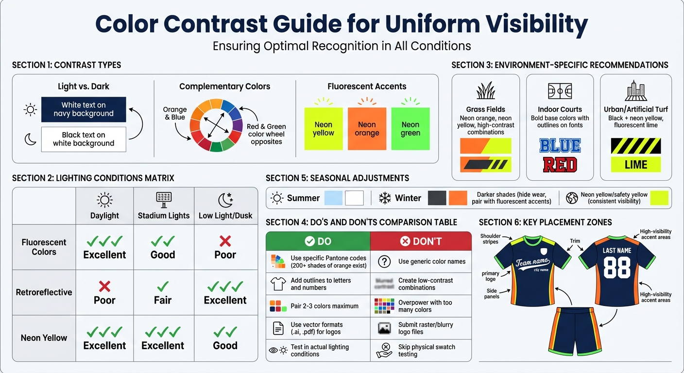
- Light vs. Dark Pairing: Use high-contrast combinations like white text on dark jerseys or black text on light backgrounds for clear readability.
- Complementary Colors: Opposite colors on the color wheel (e.g., blue and orange) create bold, eye-catching designs.
- Lighting Matters: Colors can look different under fluorescent lights, bright sunlight, or stadium lighting. Testing in varied conditions is crucial.
- Pantone Matching System: Ensure color consistency across all materials and lighting conditions by using precise Pantone codes.
- Fluorescent & Reflective Accents: Neon colors improve daytime visibility, while retroreflective materials enhance visibility in low-light settings.
- Avoid Low-Contrast Choices: Steer clear of colors that blend, and use outlines or shadows for added clarity.
Pro Tip: Test your uniform design in different environments and lighting before finalizing to ensure visibility and legibility. Wooter Apparel offers custom designs with advanced sublimation printing to lock in bold, lasting colors starting at $16.99.
Clear contrast isn’t just about aesthetics – it’s about performance, recognition, and the game experience.
Uniform Color Contrast Guide: Effective vs Ineffective Choices for Maximum Visibility
1. Use Light vs. Dark Contrast for Numbers and Jerseys
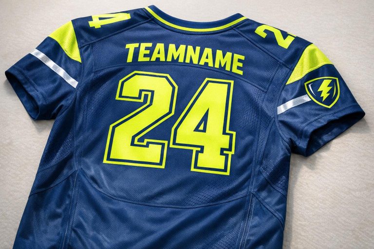
Pairing light and dark colors is a tried-and-true method for ensuring that numbers and lettering on jerseys stand out. Think of a black number on a white jersey or white text on a navy background – these combinations create a sharp contrast that’s easy to read from a distance. This two-tone approach is a staple in sports apparel design, helping players and fans alike recognize details clearly, no matter the setting.
How it Improves Visibility in Different Lighting Conditions
High-contrast color combinations shine in all kinds of lighting. Whether it’s the glare of stadium lights, the softer glow of gym fluorescents, or the brightness of natural sunlight, these pairings prevent names and numbers from blending into the jersey. Using Pantone standards ensures colors remain bold and distinct, no matter the light source.
"If you want your lettering or numerals to stand out more you can refer to the styles as shown on the right." – Wooter Apparel
Best Environments for Use (Grass, Courts, Urban Settings)
This color contrast approach is versatile, performing well across a variety of sports settings. From basketball courts and football fields to urban gyms, the light-versus-dark pairing ensures visibility remains consistent.
Effect on Legibility of Names, Numbers, and Logos
When combined with sports-specific typography, high contrast takes legibility to the next level. The sharp division between light and dark areas ensures player numbers and names are easy to read, even from a distance. For example, the number #23 on a jersey remains crisp and clear from 50 feet away, thanks to vector graphics that maintain sharp edges and avoid blurring.
"To achieve the best print results our color table contains the chromatic recipes in order to create the best possible definition on fabric." – Wooter Apparel
2. Apply Hue Contrast with Complementary Colors
Hue contrast takes the concept of light-and-dark contrast to the next level, making uniforms even more visually effective.
Complementary colors – those directly opposite each other on the color wheel, like orange and blue or red and green – create eye-catching combinations. These pairings are especially effective on uniforms, where vibrant contrasts help players stand out. Picture a neon green accent against a black jersey: it’s bold, unmistakable, and perfect for fast-paced action on the field or court.
"You want to have a combination of colors that harmonize and not overpower each other." – Wooter Apparel
To keep the design balanced, pair a primary color with one or two accents. This approach highlights key details, like names and numbers, without making the uniform look overly busy. Limiting the palette to two or three colors ensures a clean, cohesive appearance.
How It Improves Visibility in Different Lighting Conditions
Complementary colors adapt differently depending on lighting. Fluorescent shades like neon orange and green are particularly effective outdoors, offering sharp contrast during daytime play. Neon yellow (also known as safety yellow) maintains high visibility in both low-light and bright conditions, making it a versatile choice for games at dawn, under stadium lights, or even on TV screens. These vibrant hues are especially impactful in televised games, where they stand out more effectively than standard colors.
Best Environments for Use
On grass fields, green accents can help teams stand out against darker or neutral-toned opponents. For indoor sports like basketball or volleyball, adding outlines to fonts and numbers creates an extra layer of contrast. This ensures that text doesn’t blend into the jersey’s primary color, keeping it legible even during high-speed gameplay.
Effect on Legibility of Names, Numbers, and Logos
Accent colors are great for drawing attention to logos, trim, and accessories without detracting from essential details like names and numbers. The key is to avoid overly intricate patterns or gradients, which can make designs look cluttered. By pairing a bold accent with a solid base color, you ensure that names and numbers remain readable from a distance. For high-action sports, designers often add outlines to letters and numbers, ensuring they pop against the complementary background. This thoughtful use of hue contrast enhances uniform readability while maintaining a polished, professional look.
3. Adjust Colors for Different Lighting Conditions
When designing uniforms, it’s not just about picking colors that look good in one setting. Lighting plays a huge role in how colors appear. Stadium lights, cloudy skies, or indoor lighting can all change the way colors are perceived. A shade that stands out under bright stadium lights might look dull on an overcast day, and bold daylight colors can lose their impact indoors.
To tackle this, the Pantone Matching System is your best friend. This system ensures consistent color accuracy no matter the lighting conditions. Whether your team is playing at noon or under Friday night lights, Pantone’s precise color standards make sure the shade you choose stays true. For example, the Pantone system offers over 200 variations of a single color like orange, so you can pinpoint the exact shade you need. Tools like Pantone Bridge Books are especially helpful – they let you compare original Pantone colors with their digitally printed versions, showing how the colors will actually look on fabric in real-world conditions.
"Pantone is a global standard that ensures we’re all speaking the same language when we talk about color, allowing us to do a better job of producing the colors that you ordered." – Wooter Apparel
Professional uniform manufacturers also use advanced fabric color formulations to keep colors vibrant and defined. This is especially important in flat or overcast lighting, where colors can easily look muted. Sublimation printing further enhances this by producing bold, lasting designs that remain vivid regardless of the lighting.
How It Improves Visibility in Different Lighting Conditions
Vector graphics play a key role in keeping logos and numbers sharp and clear in any lighting. Unlike standard image files, vector formats rely on mathematical formulas, ensuring that designs stay crisp and scalable, no matter the size.
Effect on Legibility of Names, Numbers, and Logos
Typography designed specifically for uniforms ensures that names and numbers stay readable, even from a distance and under tricky lighting. Adding outlines to letters and numbers creates a clear contrast against the jersey’s base color, making them easier to read in varying light conditions.
"One mistake people make is just saying ‘orange’. There are over 200 shades of orange in the Pantone system, so it is best to be specific!" – Wooter Apparel
For best results, always submit logos in vector formats like .ai or .pdf files. This guarantees sharp edges and the highest quality output.
4. Select Base Colors That Stand Out in Your Environment
When choosing base colors for your uniform or gear, it’s essential to factor in the environment where they’ll be used. A bold design that pops on a basketball court might fade into the background on a grassy field, and colors that shine indoors can lose their impact under natural light.
Best Environments for Use (Grass, Courts, Urban Settings)
Fluorescent colors like neon yellow, neon orange, and neon green are excellent choices for visibility across different settings. Neon yellow works well in both bright sunlight and overcast conditions, while neon orange is easy to spot from a distance. Neon green, on the other hand, performs consistently in various lighting scenarios.
For grass-based sports like football, these vibrant colors help players stand out against the green backdrop. On indoor courts – such as those used for basketball or volleyball – bold base colors ensure players remain visible. In urban areas or on artificial turf, pairing high-contrast colors like black and neon yellow not only enhances visibility but also maintains a sleek, professional look.
Performance in Different Weather and Seasons
Weather and seasonal changes can significantly affect how colors are perceived. Fluorescent hues, for example, provide excellent contrast in daylight but may lose their intensity in dim lighting. To address this, consider combining fluorescent base colors with retroreflective accents to ensure visibility from midday to dusk.
Paying attention to precise color selection is also critical. For instance, specifying the exact Pantone shade can make a big difference in performance. Did you know there are more than 200 distinct shades of orange in the Pantone system alone? Choosing the right one can help your colors perform consistently across different environments.
5. Add Fluorescent or Reflective Accents for Better Visibility
To improve visibility, consider adding fluorescent or reflective accents to uniforms. Fluorescent colors like neon orange, yellow, and green stand out sharply against most backgrounds, making them ideal for bright daylight settings. On the other hand, retroreflective materials are designed to reflect light back to its source, making them perfect for low-light situations like dawn, dusk, or nighttime. By combining these two materials, you can ensure your team stays visible no matter the time of day. Neon yellow, often referred to as "safety yellow", is particularly effective for all-day visibility, offering a bold and reliable option.
How It Improves Visibility in Different Lighting Conditions
Fluorescent colors thrive in well-lit environments by providing strong contrast against various backgrounds. Meanwhile, retroreflective materials shine – literally – in low-light conditions by bouncing light back toward its source. Neon yellow is a standout choice because it works effectively in both bright and dim lighting, making it a versatile solution for teams with varying schedules.
Effect on Legibility of Names, Numbers, and Logos
Strategically placing neon accents or outlines can dramatically enhance the visibility of names, numbers, and logos on uniforms. For example, pairing dark base colors with neon trim ensures these details remain clear and readable from a distance. A black uniform with neon yellow accents not only highlights numbers and names but also maintains a cohesive look by complementing the logo’s color scheme.
| Material Type | Best Lighting Condition | Primary Benefit |
|---|---|---|
| Fluorescent | Daytime / Bright Light | Creates sharp contrast against backgrounds |
| Retroreflective | Low-light / Night / Dawn / Dusk | Reflects light back to its source |
| Neon Yellow | Both bright and low-light conditions | Stands out in all lighting environments |
6. Avoid Low-Contrast and Problem Color Combinations
Poor color choices can ruin visibility on game day. Sticking to specific Pantone codes helps prevent colors from blending together and compromising clarity. As Wooter Apparel puts it, "One mistake people make is just saying ‘orange’… it is best to be specific!". By using precise color codes, you can ensure your selected shades maintain the sharp contrast needed for a professional and functional look.
How It Improves Visibility in Different Lighting Conditions
Choosing high-contrast color combinations ensures your team stands out, no matter how the lighting changes during the game. When colors clash or overpower one another, it creates visual confusion, making it harder for referees, teammates, and spectators to quickly identify players. The Pantone Matching System (PMS) is a game-changer here, as it provides exact color specifications that stay consistent under various lighting conditions. This level of precision also avoids unexpected color shifts during printing, which can reduce visibility when it matters most. Clear contrast is crucial for maintaining the legibility of essential uniform elements.
Effect on Legibility of Names, Numbers, and Logos
Low-contrast designs can make names and numbers nearly impossible to read from a distance. To avoid this, consider adding outlines or shadow effects to separate text from the jersey’s base color. Logos, too, need special attention – always provide them in vector format (.ai or .pdf) to ensure clean, sharp edges. Raster images, by contrast, can appear blurry and further reduce legibility. Before production, request physical swatches or bridge books to confirm contrast levels, as digital screens often misrepresent how colors will look on fabric.
| Design Element | Visibility Issue | Solution |
|---|---|---|
| Generic Color Names | Colors blend unpredictably | Use specific Pantone (PMS) codes |
| Text Without Outlines | Numbers disappear into the background | Add outlines or shadow effects |
| Raster Logo Files | Blurry edges reduce visibility | Use vector files (.ai or .pdf) |
| Overpowering Pairings | Colors clash instead of complementing | Test combinations with swatches |
sbb-itb-4d95ad3
7. Plan Uniform Colors for Weather and Season
When designing uniforms, it’s not just about style – it’s about practicality. Weather and seasonal changes can significantly impact how colors appear on the field or court.
Performance in Different Weather and Seasons
Weather plays a big role in how uniform colors perform. Neon yellow (also known as safety yellow) is a standout choice because it remains highly visible in almost any condition. Whether it’s a cloudy day, pouring rain, or bright sunshine, its vibrancy ensures players stay noticeable. In the darker winter months, fluorescent colors are excellent for daytime visibility, but adding retroreflective accents can help maintain visibility in low-light scenarios like early mornings or evenings.
Seasonal adjustments matter too. Lighter colors are better for summer, as they reflect heat and keep players cooler, while darker shades work well in winter, helping to mask wear and tear. While white can look sharp and clean, it’s not the most practical choice for muddy or rainy conditions – darker colors like navy or black are better at hiding dirt and stains.
How It Improves Visibility in Different Lighting Conditions
Fluorescent colors, combined with retroreflective accents, can make a huge difference in visibility across various lighting conditions. Alsco Uniforms highlights this perfectly:
"Fluorescent colors offer increased daytime visibility, whereas retroreflective materials are great for low-light conditions. Using both can maximize visibility".
This combination ensures that players are easy to spot, whether it’s a sunny afternoon or an overcast evening.
Best Environments for Use (Grass, Courts, Urban Settings)
The playing environment also influences the best color choices. For outdoor fields with green grass or earthy tones, safety orange offers the highest contrast, making players easy to spot against the natural backdrop. On the other hand, urban settings or indoor courts with darker, grayish tones benefit from fluorescent lime or yellow, which cuts through the visual clutter. Winter sports like snowboarding require a different approach – pairing teal with rust orange creates a bold contrast against the snow.
8. Place High-Visibility Accents in Key Areas
Alongside using contrasting colors, carefully positioning high-visibility accents can make a big difference in legibility. The key is to place these accents where they enhance visibility without making the design feel cluttered.
Effect on Legibility of Names, Numbers, and Logos
The front of a uniform is the go-to spot for showcasing team names, city names, or primary logos, while the back is traditionally reserved for player numbers and last names – helping with quick identification. To improve readability, consider adding outlines to fonts or using a two-tone style. Pairing a main color with a contrasting outline around emblems or logos can make them stand out more clearly. As Wooter Apparel highlights:
"The most important thing about the font is telling us about any outlines you want to use for your letters + numbers".
This strategy ties in seamlessly with earlier design tips, ensuring all elements work together for maximum clarity.
How It Improves Visibility in Different Lighting Conditions
Beyond design tweaks, material choices can further enhance visibility. Adding fluorescent accents to areas like shoulder stripes, side panels, or trim helps uniforms stay noticeable in daylight. For evening games or those under artificial lights, retroreflective materials in these same areas bounce light back toward its source, keeping players visible even as natural light fades. Using these materials strategically ensures visibility across all lighting conditions.
9. Match Accessories to Improve Overall Contrast
Accessories can do more than just complement a uniform – they can take visibility to the next level. By coordinating accessory colors like socks, headbands, or wristbands with the base uniform, you can create striking accents that enhance the overall contrast. When done right, these accessories highlight key elements of the uniform, making players stand out more clearly on the field or court. The trick is choosing colors that create sharp contrasts, ensuring players are easy to spot no matter the environment.
How It Improves Visibility in Different Lighting Conditions
Accessories in fluorescent shades – think neon yellow, orange, or green – shine brightest in daylight, making them ideal for outdoor games. For dimmer settings, like early mornings, evenings, or games under artificial lights, retroreflective materials are a game-changer. These materials reflect light back toward its source, increasing visibility in low-light conditions. Combining fluorescent colors with retroreflective elements is a smart way to ensure your team is noticeable in any lighting. For example, pairing a dark uniform with neon yellow socks and headbands creates a bold, high-contrast look that’s both practical and eye-catching.
Best Environments for Use
Accessories can also adapt to different playing environments. On grass fields, neon green or yellow accessories pop against the natural green backdrop. For winter sports or water-based activities, colors like teal or rust orange provide a strong contrast against snow or water. High-contrast combinations, such as neon green paired with black, are especially effective for drawing attention from a distance.
Performance in Different Weather and Seasons
Seasonal adjustments to accessory colors can keep your uniforms looking sharp while maintaining visibility. In summer, lighter tones work well to complement brighter conditions, while deeper shades are better suited for winter’s muted landscapes. This approach not only enhances contrast but also ensures your team’s look stays aligned with your brand colors year-round.
10. Test Visibility at Different Distances and Lighting Before Ordering
When it comes to printed fabric, digital color displays often fall short of replicating the exact hues and shades. This makes testing visibility a crucial step before placing a full order. It’s your chance to identify any issues with contrast, legibility, and overall appearance, ensuring the design performs well in real-world conditions.
How It Performs Under Different Lighting Conditions
Testing uniforms in various lighting scenarios highlights how your color choices hold up in practical settings. For example, combining fluorescent colors for daytime visibility with retroreflective materials for low-light situations like dawn or dusk games ensures maximum visibility no matter the time of day. Physical testing also confirms that the chosen Pantone colors maintain their intended contrast under stadium lights, natural sunlight, or even overcast skies.
Ensuring Legibility of Names, Numbers, and Logos
Legibility is just as important as visibility. Testing ensures that names, numbers, and logos remain clear and readable at all distances. Features like outlines around letters and numbers can significantly enhance their contrast against the jersey’s background, making them easier to read from afar. To avoid surprises, request a sizing kit to evaluate printed colors and legibility before locking in your final order.
Adapting to Different Weather and Seasons
Weather and seasonal changes can also impact how your uniforms look. Lighter tones tend to perform better under bright summer sunlight, while deeper shades stand out more against the muted tones of winter. Using the Pantone Matching System with physical swatch books instead of relying solely on digital screens gives you a much clearer idea of how the colors will appear in varying weather conditions.
"The colors represented here are only for reference and are not an exact match to those that will be printed on fabric." – Wooter Apparel
Comparison Table
Here’s a quick-reference table that highlights the key principles of visibility discussed earlier. It provides a breakdown of effective and less effective color and design choices, along with their ideal applications.
| Category | Effective Options | Ineffective Options | Best Use Case |
|---|---|---|---|
| Jersey & Number Contrast | Deep bright orange (PANTONE 7413 C) with white outlines | Low-contrast combinations between numbers and the base color | Sports requiring clear visibility from long distances |
| Playing Surface Match | Bright, high-visibility colors (e.g., Pantone 7413 C) on grass | Subdued tones that blend into natural surroundings | Outdoor sports played on grass or natural fields |
| Lighting Conditions | Fluorescent colors for daylight visibility | Muted palettes without contrasting outlines | Games played during daylight hours |
| Design Elements | Numbers and letters with clear outlines and high-definition sublimation printing for sharp edges | Designs without contrast borders or clear definition | Uniforms where readability is critical |
To ensure maximum visibility, it’s essential to use precise Pantone shades, incorporate clear outlines for text, and rely on sublimation printing to maintain sharpness at any distance.
Conclusion
Wrapping up the color contrast strategies we’ve explored, there are a few essential tips to keep in mind when designing effective uniforms.
The right choice of color contrast plays a huge role in your team’s visibility, player recognition, and overall performance. The main points are simple: pair light and dark contrasts, opt for complementary colors that blend well, and tailor your palette to suit the playing environment and lighting conditions.
Before finalizing your design, always test for visibility. Colors that seem perfect on a computer screen can look entirely different under stadium lights or direct sunlight. Testing uniforms in various lighting conditions ensures your color contrast holds up in real-world scenarios. Prototypes are invaluable for evaluating how your design performs on the field before committing to a full production run.
For consistency, use Pantone codes instead of generic color names. This ensures your colors match perfectly across all gear and remain consistent throughout the process. Combined with prototype testing, Pantone codes help guarantee your uniforms perform as intended, no matter the conditions.
Wooter Apparel’s sublimation printing technology ensures your designs stay sharp and vibrant all season long. With over 1,238 reviews and a 4.9-star rating, their quality speaks for itself. Plus, their free design services can help teams choose color combinations that are visually striking without being overwhelming. Check out Wooter Apparel’s website for the latest details and to explore custom uniform options.
FAQs
How do complementary colors enhance the visibility of team uniforms?
Complementary colors play a crucial role in improving visibility on the field or court by offering sharp contrasts. This contrast makes it easier to distinguish players, regardless of lighting conditions. The result? Teammates, opponents, and officials can identify players quickly, ensuring smoother gameplay with fewer visual distractions.
Take blue and orange or red and green, for example. These combinations create a bold, eye-catching effect that not only makes your team stand out but also gives a sense of unity during games.
Why is it important to test team uniforms in different lighting conditions?
Testing team uniforms under different lighting conditions is key to making sure they’re always easy to spot and read – whether it’s under bright stadium lights, natural daylight, or the dim lighting of indoor venues. This helps players and officials quickly identify teammates and opponents, while also meeting league visibility standards.
Good visibility on uniforms can make a real difference during fast-paced games. It minimizes confusion, boosts team coordination, and supports smoother gameplay. It’s a small but essential detail in creating uniforms that truly work for the sport.
How does the Pantone Matching System help maintain consistent colors for uniforms?
The Pantone Matching System (PMS) plays a crucial role in making sure colors stay consistent and accurate throughout various design processes, printing techniques, and materials. This is particularly important for custom team uniforms, where getting the colors just right is key to achieving a unified and professional appearance.
With PMS, you can trust that your team’s colors will look identical – whether they’re on jerseys, shorts, or accessories – no matter the material or lighting conditions. This level of consistency strengthens your team’s identity and ensures they stand out on the field or court.