
When selecting track uniforms, color is more than just aesthetics – it impacts visibility, comfort, and team identity. Here’s a quick breakdown of the key points:
- Visibility: Bright colors like neon yellow or red stand out on the track, making athletes easier to spot for officials and spectators. Dark colors like black or navy look sleek but can blend into shadows or darker backgrounds.
- Heat Management: Bright and lighter shades reflect sunlight, keeping athletes cooler during outdoor meets. Darker colors absorb heat, which could lead to discomfort in hot weather.
- Psychological Effects: Warm tones (red, orange, yellow) project energy and dominance, potentially intimidating opponents. Cool tones (blue, green) convey calmness and focus, suitable for distance runners or technical events.
- Team Branding: Single-color designs reinforce a classic, unified identity, while multi-color designs allow for creative combinations that highlight school colors or logos.
To make the best choice:
- Combine bright and dark colors for balance.
- Use lighter tones for hot climates and darker tones for cooler weather or evening meets.
- Ensure strong contrast between the uniform, track, and background for optimal visibility.
Modern sublimation printing ensures colors remain bold and durable, even after extended use. The right uniform design can enhance performance, comfort, and team pride.
1. Bright vs Dark Colors
The choice between bright and dark colors influences every detail of a track uniform – from how easily officials spot an athlete in a crowded race to how confident that athlete feels stepping onto the track.
Visibility
Bright colors like neon yellow, red, and orange make athletes stand out, even from a distance. At large meets with dozens of teams, these vivid hues help coaches quickly identify their runners and allow officials to verify lane assignments or relay exchanges with ease. High-contrast colors also assist the starter in watching for false starts and ensure photographers capture finish-line moments clearly.
Dark colors like black, navy, or deep maroon, on the other hand, offer a sleek and professional appearance but can blend into shadows or darker backgrounds. A sprinter in all-black might look striking during warm-ups but could become harder to spot under evening lights or against crowded bleachers. That’s why strong color contrast is key – it ensures athletes remain visible no matter the lighting or background. Light tones like white also provide excellent contrast against typical track surfaces, maintaining a clean and classic look while keeping athletes easy to see.
But visibility isn’t the only consideration. Color also plays a big role in keeping athletes comfortable during competition.
Heat and Comfort
Color impacts more than just appearance – it affects how athletes feel on the track. Bright colors reflect sunlight, helping athletes stay cooler during outdoor meets. Dark colors, however, absorb heat, which can lead to discomfort under direct sunlight, even with moisture-wicking fabrics. Over the course of long events or full competition days, these small differences in heat absorption can add up. Incorporating lighter shades in specific areas – like the shoulders or back – can help reduce heat buildup while still preserving the team’s overall look.
Team Branding
Colors also communicate a team’s personality and energy. Bright, warm tones like red, orange, and yellow exude excitement, energy, and aggression. These shades grab attention, leave a lasting impression, and can even boost an athlete’s confidence – qualities that resonate with fans and amplify team spirit.
In contrast, dark colors like black, navy, and deep maroon convey authority, intensity, and focus. Teams aiming for a serious, no-nonsense image often favor these shades. Black uniforms, in particular, are often seen as intimidating, which can provide a psychological edge over competitors.
Thanks to advanced printing techniques, both bright and dark colors retain their vibrancy across jerseys, shorts, and warmup gear, ensuring consistent team branding from one meet to the next.
Many teams now combine these approaches, using a dark base with bright accents – like neon side panels or bold numbers – to create uniforms that balance visibility with a commanding presence. This strategy not only satisfies school color requirements but also optimizes both performance and branding.
2. Warm vs Cool Tones
Once you’ve assessed brightness levels, the next step is evaluating color temperature. This goes beyond just choosing between light and dark shades. The warmth or coolness of your color palette can influence how your team is perceived, how comfortable athletes feel, and how easily they can be spotted on the track.
Visibility
Warm tones like red, orange, and yellow grab attention. These colors create sharp contrasts against standard track surfaces, stadium seating, and neutral backgrounds. This makes it easier for coaches to track their athletes during crowded heats and for officials to quickly confirm lane assignments. Picture an athlete in a bright orange singlet – hard to miss, right?
Cool tones, such as blues, greens, and teals, can feel more subdued, especially in darker shades like navy or forest green. These darker cool tones might blend into the background in low-light settings unless paired with contrasting accents. However, lighter cool tones with bold details work well for visibility. For instance, a sky-blue uniform with white piping or a neon-green outfit with black numbers ensures athletes remain noticeable. For night meets or televised events, cool-tone uniforms can benefit from features like white side panels, bold fonts, and carefully placed accents to keep athletes recognizable under artificial lights.
Heat and Comfort
The temperature of a color directly impacts how uniforms feel during competitions. Darker warm shades – think deep reds, maroons, or burnt oranges – tend to absorb more heat. In states like Texas, Florida, or Arizona, where temperatures often soar past 90°F, these colors can make athletes feel hotter and more fatigued during long meets.
On the other hand, lighter cool tones like sky blue, mint green, and light teal reflect sunlight, making them more comfortable for hot, sunny days. That said, the fabric matters just as much as the color. Advanced materials with moisture-wicking properties, ventilation, and strategic perforations can make even darker warm tones more bearable. A well-designed uniform in a rich warm shade can outperform a poorly made cool-toned one in terms of comfort.
For hot daytime meets, lighter cool palettes are ideal, while darker warm tones work better for cooler, indoor, or evening events. Teams in cooler regions or those competing in early spring can use warm colors without worrying as much about heat, especially when modern fabrics are part of the design.
Team Branding
Color temperature also plays a role in shaping a team’s identity. Warm tones radiate bold, energetic vibes. Colors like red, orange, and yellow can make athletes appear more aggressive and confident. Sprint-focused programs often lean toward these shades to emphasize speed and power. Interestingly, studies suggest that red uniforms may even provide a competitive edge. Research linked to the University of Durham found that Olympic athletes wearing red won about 55% of closely matched bouts compared to those in blue.
Cool tones, meanwhile, suggest calmness and focus. Shades like blue, green, and teal convey a sense of control and professionalism, making them a great fit for distance-oriented teams or those that emphasize strategy. These colors project stability and help athletes maintain concentration during longer events. Distance runners and technical-event specialists often prefer these palettes for their composed and steady image.
Team branding should align with your school or club’s existing identity. If your mascot and logo already feature warm colors like red or gold, carrying those hues into track uniforms reinforces recognition across sports, fan merchandise, and social media. For schools with cool primary colors – navy and silver, for example – adding warm-colored accents, such as side panels or number outlines, can inject energy while maintaining brand consistency.
Many successful programs strike a balance between the two. One approach is to use one temperature family as the dominant base and the other as an accent – think piping, shoulder panels, or gradient fades. Another strategy is to reserve warm tones for competition uniforms to convey intensity, while cool tones dominate warmup gear for a more composed look.
Custom uniform providers can offer digital mockups, sample pieces, and color swatches in both warm and cool palettes. This allows teams to see how designs look on the track, under stadium lights, and on camera before committing to a final design. High-quality sublimation specialists like Wooter Apparel can fine-tune details like shade selection, contrast, and logo placement to ensure the final product combines strong visibility with a polished, cohesive look.
These choices will set the foundation for comparing single-color and multi-color designs.
| Aspect | Warm Tones (Red/Orange/Yellow) | Cool Tones (Blue/Green) |
|---|---|---|
| Psychological effect | Bold, aggressive energy, dominance | Calm, focus, control |
| Visibility on track | High, strong contrast | Subtler; lighter tones or accents boost visibility |
| Competitive perception | May intimidate opponents | Composed and strategic |
| Comfort in heat | Dark shades absorb more heat | Light shades reflect more heat |
| Branding impression | Bold, high-energy identity | Professional, stable image |
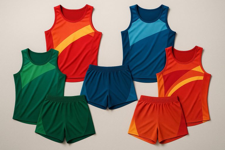
3. Single-Color vs Multi-Color Designs
Once you’ve decided on the color temperature, the next step is choosing between a single-color or multi-color design. This decision impacts more than just aesthetics – it plays a role in athlete visibility, comfort, and even how your team’s brand is perceived.
Visibility
Single-color uniforms in bold shades like red, royal blue, or neon yellow offer a clean, uninterrupted silhouette that makes athletes stand out. This is particularly useful for officials tracking lane violations and for spectators following fast-paced events like sprints or relays.
Multi-color designs can also enhance visibility, but only when crafted carefully. A dominant base color should cover most of the uniform, while secondary colors act as bold accents on areas like side panels, shoulders, or numbers. Overly intricate patterns, however, can be a problem – especially during high-speed events or under stadium lighting, where clarity is key.
Contrast is crucial. Pairing a bright base color with dark numbers and logos ensures athletes are easy to identify. Key branding elements, like logos or school names, should be placed on solid, high-contrast areas like the chest or upper back. Avoid placing numbers or logos over busy patterns or gradients, as this can make them hard to read. Gradients, if used, work best in less critical areas like side panels or lower shorts, ensuring the main design remains clear and functional.
Heat and Comfort
When it comes to heat absorption, the lightness or darkness of a color matters more than the number of colors used. Light colors help athletes stay cooler, while darker shades can trap heat, especially in the sun.
Multi-color uniforms can strike a balance between comfort and style by using lighter shades and breathable mesh in high-heat zones like the chest, back, and underarms. Darker or more saturated colors can then be placed in areas less exposed to direct sunlight. This approach is particularly useful in hot regions like Texas, Florida, or Arizona, where temperature control is critical for performance.
Thanks to sublimation technology, designers can create complex color blocks without adding weight or sacrificing breathability. This technique allows for precise placement of lighter colors and mesh in high-sweat areas while keeping darker, brand-focused colors in less thermally sensitive spots like seams or trim.
Team Branding
Single-color uniforms offer a streamlined, classic look that’s easy to replicate across jerseys, warmups, and fan merchandise. Teams with iconic colors – like Tennessee’s orange or Texas’s burnt orange – benefit from this approach because their color becomes synonymous with their identity.
On the other hand, multi-color designs allow for more creative branding opportunities. By incorporating school colors, mascots, and sponsor elements, these uniforms can create a distinctive visual identity that stands out at major meets. When executed consistently across uniforms and promotional materials, multi-color palettes can make a strong impression.
Psychologically, single-color uniforms convey unity and simplicity, making them ideal for teams that want to project a no-nonsense, intimidating presence. Multi-color designs, however, are often better suited for newer or rebranding teams looking to differentiate themselves and appeal to recruits who associate layered designs with modern performance aesthetics.
A practical strategy for high schools is to use a bold, single-color uniform for championship meets, making athletes easy to spot for recruiters and photographers. For everyday training, a more subdued multi-color kit can incorporate school branding and sponsor elements. However, overly complex multi-color patterns can backfire, making it difficult to identify athletes during crowded events, often prompting teams to switch back to simpler designs.
Single-color uniforms are also easier to reorder and mix across seasons, as tops, shorts, and warmups can be interchanged without clashing. Multi-color sets, however, require careful attention to color matching and may involve higher design costs. Teams should standardize color codes, save print-ready artwork, and plan for consistency to avoid mismatched pieces in future seasons.
Custom uniform providers with experience in track and field, like Wooter Apparel, can help teams navigate these decisions. Their fully sublimated designs and free custom mockups allow coaches and athletic directors to visualize how various elements – branding, color placement, and performance features – come together before finalizing an order.
| Design Type | Visibility | Heat/Comfort | Team Branding | Example Teams/Colors |
|---|---|---|---|---|
| Single-Color | Good | Good | Strong, classic identity | Tennessee (Orange), Texas (Orange) |
| Multi-Color | Excellent | Good | Creative, expressive branding | Kansas (Pink & Powder Blue) |
sbb-itb-4d95ad3
Pros and Cons
Balancing the tradeoffs involved in uniform design is essential to creating apparel that performs well in visibility, heat management, and team identity. Every color choice must weigh factors like competitive settings, climate, and branding objectives.
Bright versus dark colors present a core dilemma. Bright uniforms shine under stadium lights and on dark tracks, making it easier for officials to monitor lane violations and for coaches to spot athletes in crowded heats. However, under the harsh midday sun, these colors can appear faded and may lack the commanding presence that darker uniforms provide. Darker colors, on the other hand, project authority and professionalism, while also doing a better job of hiding stains, keeping the team looking sharp throughout the season. The downside? Dark colors absorb more sunlight, increasing heat stress during warmer months, and they can reduce visibility against darker surfaces, especially on overcast days.
Warm tones versus cool tones bring both functional and psychological effects into play. Warm colors, like red and orange, convey energy and aggression. Studies even suggest that athletes wearing red win roughly 55% of closely contested Olympic combat matches, likely due to the perception of dominance. These colors are attention-grabbing but can feel overwhelming, and darker shades still retain heat. Cool tones, such as blues and greens, evoke calmness, confidence, and focus. They stand out cleanly against red or black tracks but may lack the bold intimidation factor of warm tones. Additionally, darker cool shades can blend into certain track surfaces, and lighter cool tones, while better at reflecting heat, tend to show sweat and dirt more easily.
Here’s a quick breakdown of these tradeoffs:
| Color Approach | Key Pros | Key Cons |
|---|---|---|
| Bright Colors | High visibility on dark surfaces; stand out under stadium lights | Can appear faded in harsh sunlight; may lack a commanding appearance |
| Dark Colors | Project power and sophistication; hide stains; look polished in photos | Absorb more heat, increasing thermal stress; less visible on dark tracks |
| Warm Tones | Signal energy and dominance; red linked to higher win rates | Can feel overly intense; darker shades still absorb heat |
| Cool Tones | Convey calm and focus; clean look against red/black tracks | May lack intimidation factor; lighter tones show sweat and dirt |
| Single-Color Designs | Simplify recognition; reinforce brand identity | May feel plain or generic if widely used |
| Multi-Color Designs | Add contrast and define movement; create distinct identity | Risk of visual clutter; require careful color coordination |
A practical solution is to combine bright primary colors with darker accents – or the reverse – to balance visibility and aesthetics. For example, royal blue with white side panels and red trim offers a clean, composed look with patriotic flair, while dark navy with neon yellow numbers maintains a professional appearance and ensures bib numbers are easy to read from a distance.
For teams competing in hot climates, lighter-colored uniforms should be prioritized for meets, while darker colorways can be reserved for cooler-weather warmups. Even when branding leans toward darker tones, incorporating lighter side panels or mesh in heat-prone areas can improve comfort without sacrificing style or identity.
Custom uniform providers like Wooter Apparel allow teams to test brightness and contrast in various scenarios – hot weather, red tracks, or night meets – before finalizing designs. Full sublimation printing makes it possible to blend bright and dark elements seamlessly, without adding bulk. Reviewing digital proofs and physical samples in natural light and under stadium conditions ensures the colors work as intended.
Ultimately, your uniform colors should reflect your team’s specific needs – whether that’s thriving in a competitive environment, adapting to the typical weather, or projecting the identity you want to showcase on the track.
Conclusion
Choosing the right track uniform colors is about striking a balance between visibility, comfort, and showcasing your team’s identity. Bright colors, like neon or vibrant hues, stand out against the track, while darker shades convey authority and practicality.
Warm tones such as red and orange are known to energize and sharpen focus, making them ideal for sprinting and jumping events. Studies back up the psychological benefits of these colors on performance. On the other hand, cooler shades like blue and green promote calmness and steady focus, which can be a game-changer for distance runners and athletes in technical events.
For those looking to mix things up, multi-color designs made with sublimation printing allow for creative combinations. You can pair a bold primary color with contrasting accents to differentiate roles or add flair – all without compromising on breathability or adding extra weight. Sublimation printing also ensures that your colors stay vibrant throughout the season.
When finalizing your uniform design, start with your team’s core colors. Choose a primary shade that aligns with the psychological impact you’re aiming for, and ensure there’s strong contrast between the uniform, the track, and the infield. For spring and summer meets in the U.S., lighter tones can help athletes stay cool, while darker kits are better suited for evening or cooler weather competitions. Partnering with a custom uniform provider like Wooter Apparel – offering free design mockups and sublimated printing – gives you the chance to test your designs under various lighting and weather conditions before committing.
Customer feedback highlights the importance of thoughtful color choices. Wooter client Brian F. shared:
"The rest of our league saw our jersey post and said we have the best official looking jerseys in the entire league thank you Mark and thank you Wooter".
Similarly, Feazel L. noted:
"The players loved the uniforms. Everywhere we play people talk about our uniforms. We love them".
These testimonials show that your uniform colors do more than just look good on the track – they leave a lasting impression on competitors and spectators alike.
FAQs
How do track uniform colors affect athlete performance and comfort in various weather conditions?
Color choices in track uniforms can play a big role in how athletes perform and feel, especially as the weather shifts. For hotter, sunnier days, lighter shades like white or pastels work well because they reflect sunlight, helping athletes stay cooler. In contrast, darker tones such as black or navy tend to absorb heat, making them a better fit for cooler conditions.
Bright, bold colors also serve a practical purpose – they improve visibility. This makes it easier for teammates, coaches, and fans to spot athletes during competitions. Beyond functionality, the right color choices contribute to team branding, creating a cohesive and professional look that can uplift team spirit.
How do warm and cool colors in track uniforms affect team performance and competition outcomes?
Colors have a powerful impact on how teams are viewed and can even sway team dynamics and competition results. Warm colors like red, orange, and yellow are linked to energy, passion, and aggression. These shades can uplift team spirit and project a sense of dominance on the field. Meanwhile, cool colors such as blue, green, and purple are associated with calmness, trust, and focus, which can help athletes stay composed under pressure.
When designing track uniforms, it’s important to choose colors that reflect your team’s identity and objectives. A carefully selected color palette doesn’t just make your team stand out on the track – it also reinforces team branding and unity, leaving a strong impression on both competitors and spectators.
How can teams strike the right balance between visibility and branding when designing single-color or multi-color uniforms?
When designing track and field uniforms, teams should prioritize visibility and branding to make a strong impression. A single-color uniform can deliver a sleek, bold look that stands out on the field, especially when paired with contrasting logos or accents. Alternatively, multi-color designs offer more room for creativity and can better reflect a team’s personality or school colors.
To strike the perfect balance, choose colors that pop against the environment where the uniforms will be worn. Bright or contrasting tones work well for outdoor events, ensuring athletes are easily seen. Adding elements like gradients, patterns, or subtle color blocking can elevate the design while maintaining clarity. For a polished, custom look that meets your team’s specific needs, collaborating with sports apparel specialists is a smart choice.