
When designing team uniforms, the choice between color harmony and bold contrast can shape how your team is perceived, performs, and connects with fans. Here’s the breakdown:
- Color Harmony: Uses similar or complementary colors for a polished, unified look. Ideal for teams prioritizing calmness, trust, and a professional image. However, it can reduce on-field visibility and may lack energy.
- Bold Contrast: Combines sharply different colors for high visibility and a striking appearance. Perfect for fast-paced sports and teams seeking to stand out. On the downside, it can feel overwhelming if overdone.
Quick Overview:
- Color Harmony: Balanced, calm, and timeless but less noticeable in action.
- Bold Contrast: Eye-catching, energetic, and highly visible but may sacrifice subtlety.
Choosing the right approach depends on your team’s identity, sport, and goals. Both strategies have their strengths and challenges, so balance is key.
Color Harmony in Uniform Design
What Is Color Harmony?
Color harmony in uniform design refers to creating balanced color combinations that naturally complement each other. These combinations often use colors positioned close to one another on the color wheel, like blues and greens, or variations within the same color family, such as different shades and tones of blue.
Some popular approaches to achieving harmony include:
- Analogous schemes: Pairing colors that sit next to each other on the wheel, like navy blue, royal blue, and teal.
- Monochromatic palettes: Using different shades and tones of a single color, such as light gray, charcoal, and black.
- Triadic harmony: Selecting three colors evenly spaced on the color wheel but toning them down to ensure balance and cohesion.
These methods create a sense of visual stability and sophistication. Harmonious color combinations are naturally pleasing to the eye because they follow established principles of color theory, making uniforms look cohesive and well-designed.
Benefits of Harmonious Color Schemes
Harmonious color schemes bring several advantages to team uniforms, especially when it comes to building a strong identity and lasting recognition. A great example of this is the Indian Cricket Team, whose iconic blue jerseys have become synonymous with their identity. Known as the "Men in Blue", their consistent use of blue over the years symbolizes calmness, trust, and unity. This choice has not only fostered national pride but also created a deep emotional connection with fans.
"Team colours are not just about aesthetics; they are essential in creating a cohesive identity." – Team Spirit, Jeremy Lipscombe
From a performance perspective, harmonious colors can have a calming effect on athletes, promoting focus and reducing anxiety. This is especially beneficial in sports that demand precision and strategic thinking, where colors like blues and greens can help players remain composed under pressure.
On a practical level, harmonious uniforms excel in media and merchandise. Their balanced color relationships look great under various lighting conditions and camera settings, ensuring that teams maintain a professional appearance in broadcasts and promotional materials. This consistency strengthens the team’s visual brand across platforms.
"Consistent colors in uniforms and branding foster a sense of pride and belonging, motivating athletes and creating a bond between players and supporters."
Another advantage is the timeless appeal of harmonious color schemes. Unlike trendy, bold combinations that can quickly feel outdated, balanced palettes retain their professional look over time. This makes them a smart, cost-effective choice for teams planning to stick with a uniform design for several seasons.
However, harmonious schemes aren’t without their challenges.
Drawbacks of Color Harmony
While harmonious color schemes have clear benefits, they can pose challenges, particularly in competitive sports. One major issue is reduced visibility on the field, especially in outdoor settings where weather conditions like rain or fog can dull color perception.
"Some sports are played in open-air stadiums (e.g. soccer, football) in which visibility might be obstructed by rain or fog and thus blunt color effects."
This visibility problem can impact gameplay. Harmonious colors may make it harder for players to quickly identify teammates or for officials to make accurate calls. In fast-paced sports, even a slight delay in distinguishing between players can affect performance.
"The need to fundamentally differentiate visually between opponents is of utmost importance for players to separate ‘friend from foe’ in team sports, for officials to make the right calls and for spectators both in the arena as well as on TV (or other digital means) to enjoy the game and their fandom. Without this fundamental contrast, sports is almost impossible to play."
Low-contrast combinations can also appear washed out on screens, diminishing the viewing experience for fans and potentially weakening the team’s media presence.
Another drawback involves the psychological impact during competition. While harmonious colors promote calmness and unity, they might lack the dynamic energy or intimidation factor some teams seek. Research suggests that bold colors like red can provide psychological advantages, with studies linking red uniforms to dominance and increased testosterone levels.
Finally, uniform color research has its limitations. Many studies focus on color wavelength but overlook other factors like lightness and chroma, which determine how vivid or muted colors appear. This gap in research means teams opting for harmonious palettes might not have all the data needed to predict how their colors will perform in real-world scenarios.
Bold Contrast in Uniform Design
What Is Bold Contrast?
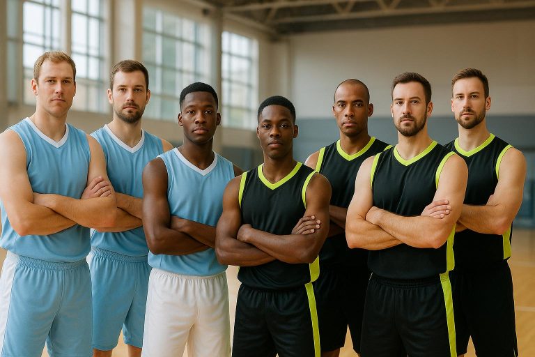
Bold contrast in uniform design revolves around pairing colors that strongly differ from one another, either by using opposites on the color wheel or combining light and dark shades. Think of classic combos like black and white, red and white, or navy blue with bright yellow – these combinations create a sharp visual divide that makes each color pop. Another approach is mixing warm tones, like bold red, with cool shades, such as blue, to add an energetic and dynamic feel.
Advantages of Bold Contrast
Using bold contrast in uniforms comes with several perks. For one, it significantly improves visibility. High-contrast designs ensure that players are recognizable to teammates, spectators, and officials, even from a distance. These designs also emphasize team logos, fonts, and colors, giving them a striking and memorable appearance.
The psychological effects of bold contrasts are just as impactful. Colors like red are known for their high-energy appeal and ability to grab attention. Black uniforms can project strength and intimidation, while yellow or gold accents naturally draw the eye and radiate positivity. Colors also influence mood – darker shades might encourage a more aggressive mindset, while brighter hues can uplift energy and morale. For younger players, wearing uniforms with bold contrasts can even boost confidence and make them feel more professional.
Challenges of Bold Contrast
While bold contrast offers many benefits, it also presents unique design challenges. Striking the right balance between colors can be tricky – what looks great on paper might not translate well when paired with logos, numbers, and other uniform elements.
Ensuring the design is clear and functional during gameplay is crucial. Too much contrast can be overwhelming, while too little might fail to make an impact. To achieve clarity, designers often pair dark and light shades, such as navy blue with white or black, creating a clean and effective separation. Careful planning is essential to make sure the final design is both eye-catching and practical.
Color Harmony vs Bold Contrast: Direct Comparison
Side-by-Side Comparison Table
Deciding between color harmony and bold contrast can significantly influence a team’s uniform design. Here’s a quick breakdown of their differences:
| Feature | Color Harmony | Bold Contrast |
|---|---|---|
| Visibility | May blend in more in busy environments | High visibility; players easily stand out |
| Emotional Impact | Calm, cohesive, and trustworthy | Energetic, dynamic, and attention-grabbing |
| Branding | Timeless and reliable | Bold and modern |
| Readability | Can suffer if contrast is weak | Excellent, especially with contrasting text colors |
Research from the 2004 Olympic Games revealed that athletes wearing red – a prime example of bold contrast – often displayed greater dominance compared to their blue-clad counterparts. This highlights how color choices can influence both perception and performance.
Color harmony works by blending adjacent hues to create a smooth, unified look. In contrast, bold designs use opposing colors to create a striking and attention-grabbing effect.
When to Use Each Approach
Color harmony is ideal for creating a professional, classic image. It’s perfect for established institutions or corporate leagues that want to project reliability and tradition.
On the other hand, bold contrast thrives in competitive settings. It enhances visibility and impact, as seen with the Seattle Seahawks’ "Action Green" jerseys, which boosted merchandise sales by 12%. Youth sports teams, in particular, benefit from bold designs since they make it easier for coaches, parents, and officials to spot players in fast-paced games.
Colors like red, which evoke adrenaline and aggression (favored by 22% of professional teams), are excellent for intense sports. Meanwhile, blue’s calming and focused vibe suits games requiring sustained concentration. Fast-action sports often lean toward bold contrasts for their energy, while games emphasizing precision can benefit from harmonious schemes.
Ultimately, the choice comes down to your team’s identity and goals. Teams aiming for a modern, standout look should consider bold contrast, while those prioritizing tradition and dependability will find color harmony more fitting.
sbb-itb-4d95ad3
Practical Tips for Custom Uniform Design
Key Factors to Consider
When designing custom uniforms, start by aligning the design with your team’s identity. Use your school or team colors, logos, and any regional elements to create a cohesive look. This consistency not only reinforces your brand but also helps fans and supporters instantly recognize your team.
Visibility is another critical element. On the field or court, players need to stand out, especially during fast-paced games. Choosing contrasting colors can make it easier for teammates, coaches, and officials to identify players quickly, which is particularly important in youth sports for both safety and game flow.
Colors can also influence performance and mood. Studies show that certain colors evoke psychological effects – red, for instance, often conveys power and dominance, while blue promotes calmness and focus. The demands of your sport should guide your color choices. High-contact sports like football or hockey might benefit from bold, warm tones like red or orange to amplify intensity. On the other hand, sports that require precision and focus, such as tennis or baseball, might be better suited to cooler shades like blue or green.
Functionality should never be overlooked. Uniforms need to be made from lightweight, breathable, and durable materials that can handle the physical demands of the sport. Additionally, the colors should remain vibrant even after multiple washes and seasons.
Finally, involve your players and coaches in the design process. Their feedback not only ensures the uniform reflects the team’s personality but also fosters a stronger emotional connection to the final product. Once the design is ready, the next step is bringing it to life – and that’s where Wooter Apparel comes in.
How Wooter Apparel Can Help
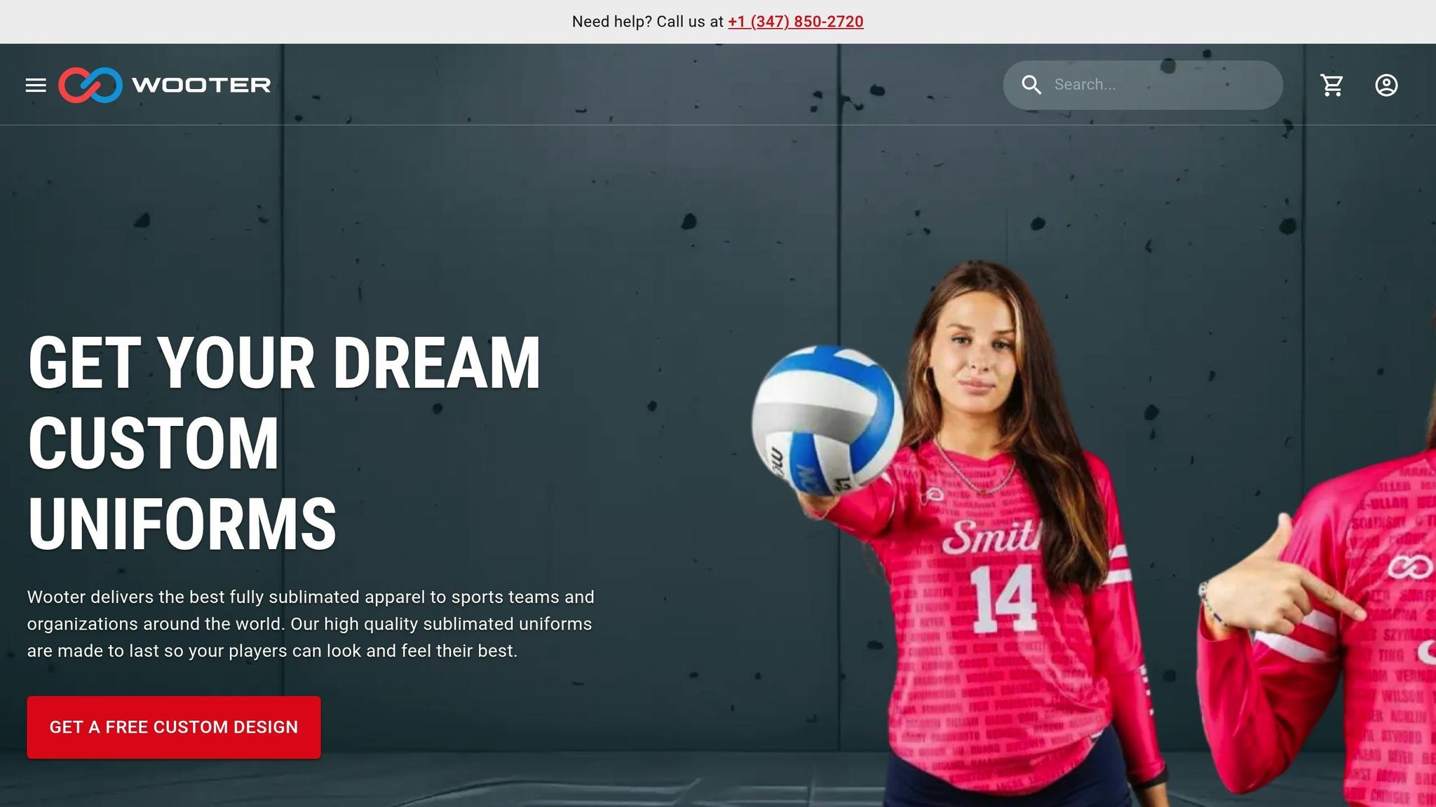
Wooter Apparel simplifies the process of creating custom uniforms by offering free design services. Whether you’re aiming for a bold statement or a more harmonious look, they’ll help turn your vision into reality.
Here’s how it works: submit your team’s logos, roster, and preferred colors, and Wooter Apparel will provide a free custom design preview. This allows you to see exactly how your uniform will look before placing an order, ensuring the final product is both visually appealing and true to your team’s identity.
With over 1,600 reviews and a 4.8-star rating, Wooter Apparel has proven its expertise across various sports. Their fully sublimated uniforms are built to last, maintaining vibrant colors without fading, cracking, or peeling – even after rigorous use. Whether you choose bold contrasts like red and black or cooler tones like green and blue, the results are polished and professional.
Their pricing is accessible for teams at all levels: basketball sets start at $39.99, soccer uniforms at $27.99, and football packages at $59.99. These prices include high-quality sublimation, ensuring your chosen colors and designs look sharp and stay that way.
For teams on a tight schedule, rush production options are available without compromising quality. Wooter Apparel also provides 24/7 customer support to assist with design decisions, color selection, and technical questions.
With a standard turnaround time of just 2–3 weeks and worldwide shipping, Wooter Apparel ensures your team gets professionally designed uniforms quickly. This flexibility makes it easy to accommodate last-minute changes or updates to your roster while keeping your team looking sharp for the season.
Conclusion: Choosing the Right Color Approach for Your Team
Key Takeaways
When it comes to uniforms, both color harmony and bold contrast offer distinct advantages, and the choice depends on your team’s priorities. Color harmony emphasizes unity and professionalism, creating a cohesive look that fosters team spirit and presents a polished image. However, these designs might not provide the high visibility needed for fast-paced games where quick recognition is crucial.
On the other hand, bold contrast maximizes visibility and energy, using striking color combinations to make elements like numbers, names, and logos pop. Interestingly, research backs this up – a German study found that English soccer teams wearing red uniforms won about 10% more games. This suggests that bold color choices can have psychological benefits, adding an edge beyond aesthetics.
But there are trade-offs. Harmonious schemes might lack the visual differentiation needed for fast action, while overly bold contrasts can feel overwhelming or even distracting for players and fans. The key lies in striking the right balance, tailored to your sport and your team’s identity.
Final Recommendation
Crafting the perfect uniform starts with understanding your team’s needs and the demands of your sport. For high-speed sports like basketball or soccer, bold contrasts are ideal – they ensure players can quickly distinguish teammates and opponents. Teams that prioritize tradition and unity, however, might prefer harmonious color schemes that convey stability and professionalism.
The nature of the sport also plays a role. High-contact sports often benefit from energizing colors like red and black, while precision-focused sports may find calming palettes like blue and green more effective.
To make this process easier, Wooter Apparel offers a free design service to help you visualize your ideal uniform. Their team of professional designers understands how different color strategies function across sports and can guide you in exploring both harmonious and bold options.
Ultimately, the best color choice is one that balances practicality with your team’s unique identity. Whether you lean toward a cohesive look or an attention-grabbing design, professional guidance ensures your uniforms not only look great but also enhance performance and help your team stand out for all the right reasons.
How to pick colors for your design (A little lesson in contrast)
FAQs
What factors should a team consider when choosing between color harmony and bold contrast for their uniforms?
When choosing between color harmony and bold contrast for uniforms, teams need to consider their objectives and the message they want to convey.
A harmonious color scheme works well when the focus is on showcasing unity, professionalism, and a strong sense of team identity. It creates a polished, cohesive appearance that reflects collaboration and togetherness. On the flip side, if the goal is to make a bold statement, intimidate opponents, or grab attention, opting for bold contrast can deliver a striking visual impact.
The decision ultimately hinges on whether the team prioritizes a subtle, unified aesthetic or a design that stands out and commands attention.
How do different color schemes in uniforms impact athletes’ performance?
Colors have a surprising ability to shape an athlete’s mindset and performance. Vibrant shades like red and orange are often tied to feelings of energy, motivation, and assertiveness. These colors can help fire up confidence and fuel a competitive edge. In contrast, softer hues like blue and green are associated with calmness and focus, making them ideal for maintaining composure in high-pressure moments.
When it comes to designing team uniforms, it’s not just about looking good – it’s about tapping into the psychological power of color. By selecting colors that align with their goals and strategies, teams can influence how players feel and perform during the game.
What are the differences in visibility and emotional impact between using harmonious colors and bold contrasts in team uniforms?
Bold color combinations, like black paired with neon yellow, are a great way to boost visibility and ensure team members stand out on the field. This can be especially helpful for safety and quick identification during fast-paced games. On the flip side, using more coordinated color schemes creates a polished, professional appearance that exudes calmness and builds trust among players and spectators alike.
From an emotional perspective, bold contrasts bring out feelings of energy, confidence, and even aggression, making them a strong choice for teams aiming to project intensity and dominance. Meanwhile, harmonious colors emphasize balance, unity, and teamwork, which can uplift morale and strengthen the bond among team members. Deciding between these styles comes down to the team’s identity, goals, and the message they want their uniforms to communicate.