
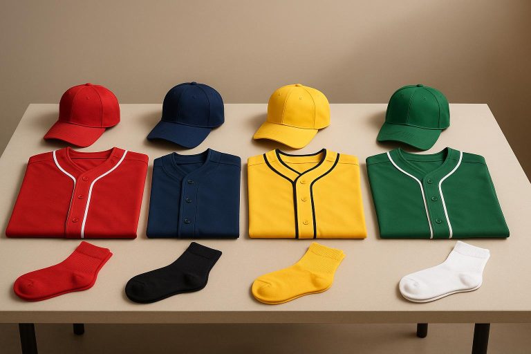
Uniform colors are a big deal for team identity and morale. Here’s how to get it right:
- Pick Primary Colors: Choose colors that reflect your team, are visible in all lighting, and work across different materials.
- Use Standard Color Codes: Stick to Pantone, CMYK, RGB, or HEX to ensure consistency.
- Test Colors on Fabrics: Check how colors look and last on different materials under various conditions.
- Choose the Right Printing Method: Sublimation printing is ideal for vibrant, durable designs.
- Document Everything: Keep a detailed record of colors, codes, and fabric guidelines for future orders.
- Maintain Colors: Wash in cold water, air dry, and store properly to keep uniforms looking fresh.
- Update Seasonally: Adjust colors slightly to match seasonal lighting while staying on-brand.
Nike Team Builder Uniform Designer
1. Select Primary Team Colors
When choosing your team’s primary colors, think about both style and practicality. Your color palette should:
- Reflect your team’s identity
- Be easily recognizable on the field or court
- Stay visible under different lighting conditions
- Look consistent across various fabric types
Here are some key points to keep in mind:
- Color Contrast: Pair light and dark shades to improve visibility. For example, dark navy paired with bright gold stands out more than two similar dark tones.
- Color Psychology: Colors can influence perception. For instance:
- Red conveys energy and passion
- Blue suggests trust and stability
- Green symbolizes growth and endurance
- Purple represents ambition
- Black exudes power and sophistication
- Production Details: Certain colors, like metallics or neon shades, may need special manufacturing techniques.
If you’re using sublimated uniforms, remember that light colors often need darker bases for better opacity, while dark colors work well on lighter backgrounds. A carefully chosen palette lays the groundwork for your team’s visual identity. Collaborate with skilled designers to fine-tune your choices and ensure consistency throughout production.
2. Use Standard Color Codes
Using standard color codes is key to maintaining consistency across all designs. Precise codes help ensure colors match perfectly, even over long periods.
Common Color Code Systems
- Pantone (PMS): Ideal for solid colors and widely used in the industry.
- CMYK: Best for full-color printed materials.
- RGB: Used for digital displays and online visuals.
- HEX: Tailored for web-based design tools.
Tips for Implementing Color Codes
- Document Everything: Keep a detailed record of the exact color codes for every uniform element.
- Account for Material Differences: Fabrics can affect how colors appear, so adjust codes for processes like sublimation as needed.
- Test Thoroughly: Always review physical samples or digital proofs under different lighting conditions before production.
To streamline collaboration with manufacturers, organize your color specifications in a clear, standardized format like this:
| Color Element | Pantone | CMYK | RGB |
|---|---|---|---|
| Primary Color | PMS Code | C-M-Y-K % | R-G-B Values |
| Secondary Color | PMS Code | C-M-Y-K % | R-G-B Values |
| Accent Color | PMS Code | C-M-Y-K % | R-G-B Values |
Communication Tips
- Share digital swatches with manufacturers to ensure clarity.
- Keep a physical color standards guide on hand for reference.
- Maintain open communication throughout the production process.
Collaborating with designers who understand the complexities of sublimation printing can make a big difference. Once your color codes are finalized, ensure all printing methods accurately replicate these specifications for consistent results.
3. Track Colors with Digital Tools
Using digital tools to manage colors is key to keeping your team uniform designs consistent. These tools help you log, store, and share exact color details, ensuring every production step sticks to your color standards.
Professional design software often includes color management features that let you document everything about your team’s colors – primary shades, accent tones, trim details, and alternate options. This ensures everyone involved in production is working with the same guidelines.
To keep your color assets organized, create a master palette file in your design software, provide a clear color guide for manufacturers, and use digital swatches for approvals.
Here are some tips to maintain color accuracy:
- Version Control: Save dated versions of your files to avoid mix-ups during updates or new orders.
- Cloud Storage: Store your digital assets in the cloud for easy access and added security.
- Digital Color Proofing: Use calibrated monitors and proofing tools to confirm colors are accurate.
4. Test Colors on Different Fabrics
Testing colors on multiple fabric types is key to maintaining consistent branding. While digital tools are helpful, combining them with hands-on fabric testing provides a complete picture of how your colors will look and perform.
Keep these fabric-specific details in mind:
- Fabric texture: Colors appear brighter on smooth fabrics compared to textured ones.
- Material composition: Synthetic materials tend to retain colors better than natural fibers.
- Surface finish: Matte and glossy surfaces can impact how colors are perceived.
- Material weight: Heavier fabrics may showcase colors differently than lighter ones.
To ensure accurate results, conduct these essential tests:
- Light test: Observe colors under different lighting conditions.
- Wash test: Run fabric samples through several wash cycles to assess durability.
- Stretch test: Check if colors remain consistent when the fabric is stretched.
Here’s a quick guide to how different fabrics perform with color:
| Fabric Type | Color Performance | Best For |
|---|---|---|
| Polyester | Retains vibrant colors effectively | Primary jerseys |
| Mesh | Moderate saturation with breathability | Practice uniforms |
| Cotton blend | Softer colors, prone to fading | Casual team wear |
For the most accurate evaluation, request physical samples of each fabric-color combination. Test them under different conditions, take photos in various lighting, and record performance notes. This documentation will help ensure consistent orders in the future and align with the unified approach established earlier.
5. Choose the Right Printing Method
After nailing down precise color testing, the next step is picking a printing method that ensures consistent, vibrant, and long-lasting colors. At Wooter Apparel, we rely on sublimation printing. This method embeds dye directly into the fabric, making it a go-to choice for custom team uniforms.
Here are some key factors to keep in mind when selecting a printing technique:
| Factor | Impact on Color Quality | What to Consider |
|---|---|---|
| Color Depth | Boosts vibrancy | Look for methods that achieve deep, rich colors |
| Fabric Compatibility | Affects how colors are absorbed | Choose a technique that suits your fabric type |
| Wash Resistance | Impacts color durability over time | Opt for processes that hold up after multiple washes |
| Design Complexity | Influences design accuracy | Ensure the method can handle intricate details |
Sublimation printing is a standout option for polyester fabrics, often used in athletic wear for their moisture-wicking and durable qualities. It delivers professional-grade results and keeps your team looking sharp game after game.
Always double-check your manufacturer’s printing process and color management system to make sure your team’s colors stay consistent throughout the season.
6. Document Color Standards
After setting up digital tracking and fabric testing, the next step is to document your color standards. This ensures your uniforms maintain a consistent look across all orders.
A well-organized color standard document serves as a visual identity guide. It ensures accurate color reproduction, no matter the production run.
| Documentation Component | Required Information | Purpose |
|---|---|---|
| Color Codes | Pantone, RGB, CMYK values | Guarantees precise color matching |
| Primary Usage | Main uniform elements | Identifies where core colors are used |
| Secondary Usage | Accent details, trim | Defines complementary color applications |
| Fabric Guidelines | Material-specific codes | Ensures consistency across different fabrics |
Wooter Apparel’s design team uses detailed color documentation to achieve flawless results. Here’s what one customer had to say:
“Ana was diligent about communication and updates throughout the entire ordering process. She was always eager to respond to any questions I had and was prompt in all our correspondence. Best of all, the jerseys look great on our two-time defending championship team.” – Mark W.
Your color standards document should include:
- Master Color Palette: List every team color with specific codes like Pantone, RGB, or CMYK.
- Usage Guidelines: Clearly define where each color should appear on the uniform.
- Material Specifications: Account for color variations on different fabrics.
- Quality Standards: Set acceptable ranges for color variance.
- Sample References: Attach physical or digital color samples for comparison.
This document works hand-in-hand with your digital tracking and printing processes, ensuring every detail reflects your team’s identity.
Keep both digital and physical copies of your color standards. They make sharing easier and provide a reliable reference during production.
sbb-itb-4d95ad3
7. Check Color Quality
Make sure colors are consistent by checking them under controlled lighting conditions. Here’s a quick guide to lighting setups that can help you spot color changes:
| Lighting Condition | Purpose | Best Time to Check |
|---|---|---|
| Natural Daylight | Verify base colors | 10 AM – 2 PM |
| LED (5000K) | Standard indoor lighting | Anytime |
| UV Light | Check special effects | Dark environment |
| Mixed Lighting | Assess in varied settings | Multiple conditions |
Key Factors to Consider
Impact of Light Sources: Teams like Wooter Apparel rely on D65 lighting (a daylight simulation) to ensure consistent color evaluation throughout production.
Fabric Influence: Different materials, like polyester, cotton, or mesh, can affect how colors appear. Adjust your checks based on the fabric type.
Steps for Verifying Color Quality
- Compare colors to approved swatches.
- Check colors from various angles.
- Ensure uniformity across all pieces.
- Inspect logos and accent details.
- Take photos under standardized lighting for documentation.
Tools for Precision
Using professional spectrophotometers can help you measure color accuracy with high precision. These tools catch subtle differences that might not be visible to the naked eye.
When to Perform Checks
Conduct color quality checks at several stages to ensure consistency:
- During fabric selection
- After printing or dyeing
- Throughout assembly
- During the final inspection
8. Keep Colors Looking New
Keeping uniform colors vibrant relies on proper care. Research from HEX Performance shows that washing in cold water with enzyme detergents can retain 92% of color even after 50 washes.
Care Guidelines
Washing Tips
- Turn uniforms inside out and wash in cold water (below 86°F) to minimize dye bleeding.
- Add 1 cup of white vinegar to the wash cycle – it can reduce dye transfer by up to 73%.
- Use trusted color-safe detergents for better results.
Drying Advice
How you dry uniforms makes a big difference in color retention:
| Drying Method | Color Retention |
|---|---|
| Air Drying | 98% |
| Low Heat | 85% |
| High Heat | 60% |
Stick to air drying whenever possible, or use low heat settings to complement your washing efforts.
Professional Maintenance Tips
In addition to washing and drying, a few extra steps can help maintain the appearance of your uniforms. Rotating between 2–3 uniform sets can cut washing frequency by 40%, keeping colors vibrant for an extra 6–8 months.
Dealing with Stains
Address stains quickly to prevent lasting marks:
- Grass stains? Dab with club soda.
- Blood stains? Apply a 3% hydrogen peroxide solution.
- Keep a portable stain remover handy for emergencies.
Storage Solutions
Proper storage during the off-season is key to preserving uniforms:
- Use breathable garment bags with silica packets to control moisture.
- Store in a cool, dry place – below 70°F with 45–55% humidity.
- Keep away from direct sunlight and UV rays.
- Place acid-free tissue paper between layers to prevent creasing and damage.
For the best care, consider professional dry cleaning every 15–20 wears. Opt for eco-friendly solvents and combine this with rotating uniforms between games to maintain consistent color and quality throughout the season.
9. Update Colors by Season
Changing up your uniform colors with the seasons can give them a fresh look while staying true to your brand’s identity. Small tweaks to your color palette can reflect how lighting changes throughout the year, keeping your team’s appearance consistent and sharp.
Think about how natural light interacts with your colors. For example, brighter shades might pop more in spring and summer for outdoor activities, while deeper tones can stand out better during fall and winter, especially for indoor events.
Collaborating with experienced designers can help you make these seasonal changes work seamlessly with your branding. One satisfied customer shared:
“Jerseys look fantastic! Mark helped me navigate this process and made everything so easy! Highly recommend! Great quality for our softball jerseys and loved the design choices ❤️”
Planning ahead is key. Ordering early ensures enough time for production and quality checks. For example, in December 2023, Wooter Apparel delivered custom jerseys a week before a January 20th game. This kind of preparation makes it easier to incorporate seasonal updates into your uniform strategy.
Wooter Apparel also offers free custom design services, making it simple to explore seasonal color options that keep your uniforms looking stylish and long-lasting.
10. Match Team Brand Colors
Making sure your team uniforms match your brand’s colors is key to building a strong and recognizable identity. This includes aligning with your logos, website, and merchandise. When jerseys reflect your team’s colors accurately, it not only creates a polished look but also boosts visual recognition.
Thanks to advanced design tools and skilled designers, achieving precise color matching is easier than ever. For example, Wooter Apparel offers custom design services that ensure your uniforms perfectly align with your brand’s color palette.
In October 2018, Calix C., a member of a volleyball team, shared that their jerseys matched their team branding perfectly. This attention to detail led to ongoing customer loyalty and repeat orders.
Here’s how to ensure your team uniforms stay consistent with your brand:
- Provide your brand guidelines: Share exact color codes and any branded materials with your designer.
- Ask for samples: Test how colors appear on different fabrics before moving to full production.
- Keep records: Document successful color matches for future reference.
Printing Methods and Results
The printing process plays a major role in creating eye-catching and durable uniforms.
Sublimation Printing
Sublimation printing delivers bright, long-lasting designs. Wooter Apparel focuses on fully sublimated uniforms built for durability and performance.
Color Performance by Method
Each printing method has its strengths:
- Sublimation: Perfect for full-color designs with vibrant gradients.
- Screen Printing: Great for bold, solid colors and simple patterns.
- Heat Transfer: Works well for detailed graphics, especially in smaller production runs.
Material Considerations
The type of fabric impacts how colors appear and how long they last. Polyester-based materials are the top choice for sublimation printing, offering vivid colors and better durability. After choosing the material, thorough quality checks ensure the colors remain consistent and vibrant.
Quality Control
Strict quality control measures are essential. These include pre-production color tests, digital color matching, post-production inspections, and wash tests. Wooter Apparel ensures their uniforms maintain their vibrancy and consistency over time.
Post-production Care
Proper care helps preserve colors:
- Wash in cold water (60–65°F).
- Use mild detergents.
- Turn garments inside out before washing.
- Air dry instead of using a dryer.
- Keep garments away from direct sunlight.
Conclusion
Using consistent and vibrant colors helps create a strong and unified team identity. Achieving this involves careful initial color choices, digital tracking, standardized codes, and strict quality control processes. These steps ensure a seamless experience for customers.
Wooter Apparel’s sublimated uniforms are a great example of effective color management. With a 4.9-star rating from 1,237 customer reviews, teams frequently highlight the brightness and accuracy of their uniform colors, which stay impressive even after repeated use.
For lasting color consistency, focus on these practices:
- Use standardized color codes to maintain uniformity.
- Test colors on actual materials to ensure accuracy.
- Implement thorough quality control to catch any issues early.
- Document color standards for easy reference and replication.
FAQs
How can I keep the colors of my team uniforms consistent across different fabrics and production batches?
Ensuring color consistency for your team uniforms requires careful planning and attention to detail. Start by selecting Pantone colors or other standardized color systems to define your team’s shades. These systems help maintain uniformity, regardless of fabric type or production batch.
Work closely with your manufacturer to request fabric swatches or digital proofs before finalizing the design. This allows you to verify that the colors match your expectations. Additionally, choosing sublimation printing can help achieve consistent and vibrant colors across various materials.
For professional results, consider partnering with a trusted provider like Wooter Apparel, which specializes in custom team uniforms and offers high-quality, fully sublimated designs tailored to your needs.
What makes sublimation printing a great choice for team uniforms, especially when it comes to color vibrancy and durability?
Sublimation printing is an excellent choice for team uniforms because it produces vivid, long-lasting colors that won’t fade, peel, or crack over time. Unlike other methods, sublimation infuses the design directly into the fabric, ensuring the colors remain vibrant even after repeated washes and heavy use.
This method also allows for unlimited design possibilities, including intricate patterns and gradients, without compromising quality. It’s perfect for creating custom uniforms that stand out while maintaining durability throughout the season.
How can I ensure my team’s uniforms maintain consistent colors across future orders?
To maintain consistent colors for your team uniforms, start by selecting specific shades and documenting them using standardized color codes like Pantone or RGB values. This ensures your colors can be accurately reproduced in future orders.
Keep a record of these color standards in a dedicated file or design guide, and share it with your uniform provider when placing orders. If you’re working with a custom uniform specialist, they can help you match and maintain your team’s visual identity over time.
Additionally, request physical color samples or proofs during the design process to confirm accuracy before production. This step helps ensure your uniforms meet your expectations every time.