
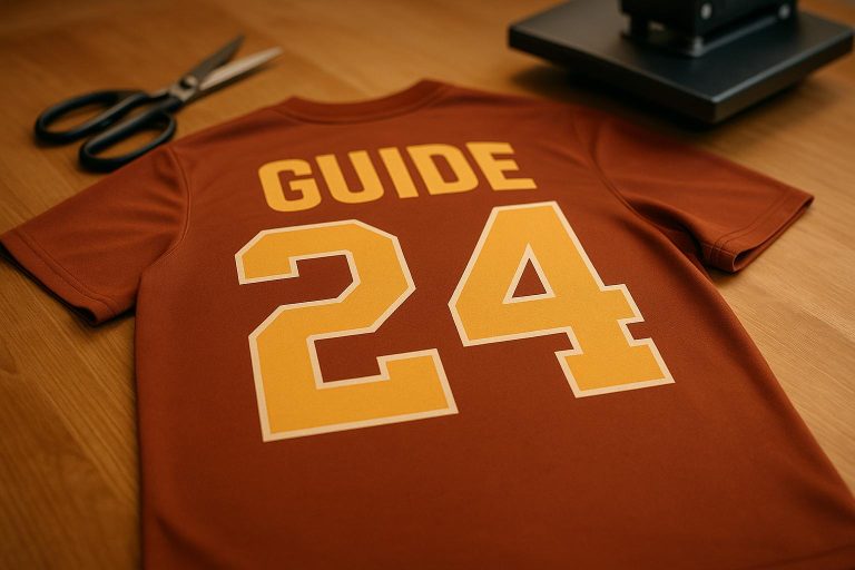
Customizing jersey fonts and numbers isn’t just about style – it’s about creating a clear, professional look that reflects your team’s identity. From bold designs for football to sleek styles for basketball, the right typography ensures readability, builds team spirit, and leaves a lasting impression. Here’s what you need to know:
- Readability is key: Fonts must be legible from a distance, with proper sizing (e.g., back numbers are typically 10-12 inches tall).
- Match your sport: Football favors bold fonts for visibility, while basketball and soccer lean toward sleek, modern styles.
- Placement matters: Numbers go on the back and chest, names above the back numbers, and logos on the chest or sleeves.
- Production impacts design: Sublimation suits complex designs, embroidery works best for bold fonts, and heat transfer is ideal for simpler text.
Whether you’re designing youth team jerseys or professional uniforms, these tips will help you nail the balance between style and functionality.
Getting Creative with Number Styles for Team Uniforms
Jersey Typography Basics
Creating the perfect jersey typography starts with a solid grasp of a few key principles to elevate your team’s overall look. The fonts and numbers you choose aren’t just about style – they need to be easy to read from a distance, reflect your team’s identity, and stay consistent across all gear. These elements are the backbone of any successful custom jersey design.
Readability and Visibility
The top priority for jersey typography is simple: it has to be readable. Whether it’s a referee identifying players during a fast-paced game, fans spotting their favorite athletes from the stands, or broadcasters calling the action, clarity is non-negotiable. If your typography falls short here, even the most stylish design won’t save it.
Viewing from a distance brings challenges you don’t encounter in everyday design. What looks sharp on a screen can turn into a blur when seen across a field or court. Jersey numbers are typically 10 to 12 inches tall to ensure they’re legible from far away.
Another factor that often gets overlooked is letter spacing. When numbers or letters are packed too closely – think of combinations like 88 or 11 – they can blend together, making them hard to read. Proper spacing ensures clarity, even when the jersey fabric stretches during play.
The production method you choose also impacts readability. Embroidery works best with bold, simple fonts at least 14 points in size, as intricate details often get lost in the stitching. On the other hand, sublimation allows for more complex, multi-colored designs and works especially well on white fabric. Heat transfer is a solid option for block letters but may not handle fine details as well over time.
Beyond just being legible, typography also plays a big role in shaping your team’s identity.
Team Branding Through Typography
Typography isn’t just functional – it’s a way to tell your team’s story. The fonts you pick can reflect the personality and values of your team, creating a connection with players and fans. For example, a youth soccer team might lean toward sleek, modern fonts to convey energy and innovation, while a rugby club might prefer bold, classic fonts that emphasize strength and tradition.
Different sports also come with their own visual expectations. Football and rugby often use bold fonts like CS Frank for better visibility, while basketball and soccer favor sleek sans-serif styles for a modern look. Track teams, aiming to evoke speed, might opt for sharp, angular fonts like CS Antlia.
Consistency is critical for building a strong team brand. When your jerseys, warm-ups, banners, and even digital content use the same typography, it creates a unified and recognizable look. This cohesive style not only strengthens team identity but also deepens the bond with fans. Collaborating with a design team can help ensure every detail aligns with your vision. As Tammy S., a swim team coordinator, shared about her experience with custom uniforms:
"The design team took my thoughts and created several perfect options for our swim team, using our logo created by one of our swimmers. The team absolutely loves the fit and comfort of the warm ups and wears them with pride".
Your font choice should also reflect the expectations of your audience. Some leagues and communities cherish tradition and lean toward classic designs, while others embrace modern trends. Whether you’re designing for a recreational league, a competitive travel team, or a professional organization, understanding your audience ensures your typography resonates with them.
Next, we’ll dive into how to choose the right font style to align with these principles.
Selecting the Right Font Style
Picking the right font for your team jerseys is about more than just looks – it’s about capturing the spirit of your sport and reflecting your team’s identity. A good font not only communicates your brand but also performs well under different viewing conditions.
Font Styles for Different Sports
Every sport has its own visual vibe, and your font should match that energy. For example, football and rugby jerseys often feature bold, heavy fonts that radiate strength and toughness. These sports are all about power, so fonts with thick strokes and sharp lines work best. A great example is CS Holver, which gives off a strong, athletic vibe, perfect for teams that want to exude professionalism and grit.
For basketball and soccer, sleek sans-serif fonts are the go-to. These sports thrive on speed and modernity, so clean, streamlined typefaces are ideal. CS Foster, for instance, blends boldness with a touch of sophistication, making it a solid choice for teams aiming to balance strength and style on their jerseys.
When it comes to volleyball, golf, or corporate leagues, script fonts are often preferred. These fonts deliver a polished and stylish look while maintaining a sense of team identity.
Track and field teams, on the other hand, benefit from sharp, angular fonts that scream speed and agility. CS Antlia, with its pointed edges and dynamic design, is a great fit for teams looking to highlight quickness and precision.
For a more traditional approach, Jersey M54 is a classic choice. Its rugged design, featuring curve-in edges, gives off an intimidating, competitive vibe that works well for teams embracing a timeless aesthetic.
Balancing Style and Readability
While style is important, practicality should never take a backseat. The best fonts are those that look great while maintaining readability, even from a distance. A font might appear stunning on a computer screen, but if it’s hard to read during a game, it’s not the right fit.
Avoid overly decorative fonts that can compromise legibility. Instead, focus on clean and straightforward designs that make it easy to identify players. High contrast between the font color and the jersey background is also crucial for quick recognition.
Font weight plays a big role, too. For minimalist designs, CS Hovan Mono is a bold, modern monospace font that ensures readability with its clean lines and uniform spacing. If flexibility is what you need, Atletico offers six different weights – thin, ultralight, light, regular, medium, and bold – allowing you to tailor the font to your specific needs while keeping a consistent look. Similarly, Hecolle is a smart choice for teams with longer player names. Its slightly condensed design ensures even lengthy names fit comfortably on jerseys without sacrificing readability.
Your production method also matters. Bold, simple fonts work best for embroidery, while sublimation opens the door to more intricate designs. Choose a font that not only aligns with your brand but also works seamlessly with your production technique.
At the end of the day, your jersey typography should reflect your sport, your team’s personality, and the need for clear player identification during competition.
Font and Number Placement Guidelines
After discussing typography styles, it’s time to focus on placing fonts and numbers effectively. Proper placement impacts both visibility and the overall look of the jersey. Here’s a breakdown of how to position these elements for maximum effectiveness.
Standard Placement Locations
The back of the jersey is the go-to spot for player numbers and names. This placement is universal across sports because it’s what spectators, officials, and cameras see most during a game. Numbers are typically centered between the shoulder blades and mid-back, while player names sit above the number, aligned across the shoulders.
The front chest area is reserved for team logos, usually on the left or right side. This keeps the logo noticeable without overwhelming the design. Some teams also add smaller numbers to the front, placing them either centered on the chest or slightly off-center to make room for the logo.
Sleeves and side panels are increasingly used in modern jersey designs. These areas are ideal for subtle logos or numbers, adding visual interest without cluttering the main design. Sleeve numbers are especially popular in sports like basketball and football, offering an extra reference point for fans and officials.
Size Recommendations
Getting the size right is essential for visibility. Numbers that are too small can’t be seen from the stands, while oversized text can look awkward and unbalanced.
For jersey numbers, back numbers on adult jerseys are typically 10-12 inches tall, ensuring they’re visible from a distance. Front numbers are smaller, around 4-6 inches, since they’re viewed up close and share space with logos.
Player names are usually 2-3 inches tall. This size ensures names are readable without overshadowing the numbers. Oversized names can dominate the design and detract from the overall aesthetic.
Here’s a quick reference table for standard sizing:
| Element | Adult Size | Youth Size | Primary Location |
|---|---|---|---|
| Back Numbers | 10-12 inches | 8-10 inches | Center back, between shoulders and mid-back |
| Front Numbers | 4-6 inches | 3-5 inches | Center chest or offset for logo |
| Player Names | 2-3 inches | 1.5-2.5 inches | Upper back, centered across shoulders |
| Sleeve Numbers | 3-4 inches | 2-3 inches | Upper sleeve area |
For youth jerseys, sizes are scaled down to maintain the same visual impact. For instance, back numbers are reduced to 8-10 inches, and player names are adjusted to 1.5-2.5 inches.
Spacing, Contrast, and Production Tips
Proper spacing is just as important as size. Crowded designs can be hard to read, so leave enough room around each element. Numbers should not sit too close to the neckline or hem, and consistent gaps between elements help maintain clarity.
Color contrast is another key factor. High contrast between numbers and the jersey background ensures quick recognition. For example, dark numbers on light jerseys – or vice versa – work best. The lettering color should complement both the jersey and the numbers, creating a balanced and cohesive look.
Finally, consider the production method. Bold, simple fonts are ideal for embroidery, though they may require slightly larger sizing for clarity. Sublimation techniques allow for more intricate designs and can handle smaller details without sacrificing readability.
sbb-itb-4d95ad3
Common Font Options for Jerseys
The font you choose for your jerseys does more than just display player names and numbers – it tells a story about your team’s identity. Whether you’re aiming for a classic, timeless look or a modern, edgy vibe, the right font can make all the difference. Let’s explore some popular options teams often turn to.
Classic and Bold Fonts
Jersey M54 is a rugged, tried-and-true option designed specifically for sportswear. Its curved edges give jersey lettering a traditional feel, making it a favorite across a variety of sports. This font delivers a straightforward, no-frills aesthetic that teams have trusted for years.
CS Frank has earned its place as a staple for football, rugby, and baseball teams. Its thick, bold strokes create an authoritative presence, perfectly capturing the power and tradition these sports represent.
Atletico stands out for its versatility, offering six weight variations: thin, ultralight, light, regular, medium, and bold. Teams often use the bold weight for numbers and lighter weights for names, achieving a cohesive but visually interesting look without switching fonts. Its balanced mix of curves and straight edges makes it adaptable to different jersey styles, all while being budget-conscious.
These classic fonts are not only timeless but also practical. They maintain clarity across various sizes and production methods, making them reliable choices for any team.
While these fonts emphasize tradition and strength, modern fonts bring a fresh, dynamic edge to jersey designs.
Modern and Sleek Fonts
Triton offers a sharp, contemporary aesthetic with its clean lines and unique shaping. Perfect for basketball and soccer teams, this font appeals to younger audiences seeking a modern, standout look.
CS Hovan Mono takes a minimalist approach with its monospace structure, providing excellent legibility even from a distance. Its consistent character width works beautifully for both jerseys and digital media, making it a versatile choice for teams embracing a futuristic vibe.
CS Foster strikes a balance between boldness and elegance. Ideal for soccer or basketball jerseys, this font adds a touch of sophistication while ensuring readability.
For teams that want to emphasize speed and agility, CS Antlia is a standout option. Its sharp, angular design visually conveys motion and athleticism, making it especially popular with track teams or sports focused on precision and quickness.
Hecolle is a practical choice for fitting longer names on jerseys without sacrificing legibility. Its slightly condensed design ensures that even lengthy names like "Richardson" or "Williamson" remain clear and impactful.
For a refined yet contemporary look, CS Hecate blends traditional typography with modern flair. This font is perfect for teams with a strong sense of history who still want to stay current.
These modern fonts cater to teams looking for a sleek, innovative style, offering a fresh take on jersey design while maintaining functionality.
When deciding between classic and modern fonts, think about the message you want your team to convey. Classic fonts exude strength, tradition, and reliability, while modern fonts emphasize speed, innovation, and a forward-thinking attitude. Both styles ensure excellent readability and visual impact. The choice ultimately depends on how you want your team’s identity to shine.
Creating Your Custom Jersey Design
It’s time to bring your vision to life and finalize your jersey design. This step ensures that all the elements – like fonts, colors, and placements – are perfectly aligned for production. With the right tools and techniques, you can achieve jerseys that look professional and perform exceptionally well.
Design Tools and Customization Platforms
Modern design platforms make creating custom jerseys a seamless process, often pairing you with experienced designers to guide you. For example, Wooter Apparel offers a free custom design service where you work directly with a dedicated sales representative and design team. Whether it’s font styles, team colors, or logos, you share your preferences, and they provide multiple design options based on your input. This allows you to visualize exactly how your fonts and numbers will appear on the finished jerseys.
"I came up with an idea of what I wanted and they made it happen." – Juan R.
This collaborative process eliminates much of the guesswork. Instead of struggling with software on your own, you get expert advice on critical details like font scaling, color contrast, and visibility standards. For instance, they’ll ensure that numbers are at least 10–12 inches tall for proper readability and that the text contrasts well with the jersey color. They’ll also flag potential issues, such as fonts that may not suit certain production methods or other design elements that need tweaking before production begins.
Once your design is finalized, the next step is choosing the right production method to bring it to life.
Customization Methods Explained
The production method you select plays a key role in how your design translates onto the jersey. Each method affects the look, feel, and durability of your fonts and numbers, so understanding the options is essential.
Sublimation is ideal for intricate designs. This method infuses ink directly into the fabric, making it perfect for multi-colored fonts, gradients, and detailed graphics. It’s especially effective with modern fonts like CS Hovan Mono, which feature clean lines and sharp details. Sublimation works best on white or light-colored synthetic fabrics and ensures that designs remain vibrant and intact, even after heavy use and repeated washing. Plus, it maintains flexibility in font size and style without adding weight or texture to the jersey.
Embroidery offers a premium, textured finish that adds depth to your design. It works best with bold and simple fonts, such as CS Frank, which have thick strokes and minimal details. Fonts with thin lines or intricate elements don’t translate well into stitching, as they can appear cluttered. Embroidery requires a minimum font size of 14 points for clean results. While it provides unmatched durability and a polished look, it’s less suitable for complex or highly detailed designs.
Heat transfer printing strikes a balance between sublimation and embroidery. This method uses heat-activated vinyl or transfer paper to apply designs, making it a great choice for block letters and straightforward fonts. It delivers vibrant colors and handles standard sizing well, but delicate font elements or thin details may peel over time, especially with frequent use.
| Production Method | Best Font Types | Size Requirements | Design Flexibility | Durability Considerations |
|---|---|---|---|---|
| Sublimation | Complex, multi-colored designs | Flexible sizing | High | Best on white or light fabrics |
| Embroidery | Bold, simple fonts | Minimum 14pt | Limited | Outlines may appear cluttered |
| Heat Transfer | Block letters | Standard sizing | Moderate | Thin details may peel over time |
Different sports often lean toward specific methods. Basketball and soccer teams tend to prefer sublimation for its lightweight feel and design freedom. Football and rugby teams favor embroidery for its durability and classic look. Baseball and softball teams might opt for heat transfer as a practical middle ground.
To ensure the best results, communicate clearly with your production team about your chosen method. This helps align your font choices, sizing, and design complexity with the capabilities of the production process.
Conclusion
Designing jersey fonts and numbers is all about finding the right mix of readability, team identity, and production quality. The fonts you choose should make numbers easy to see from a distance while also reflecting your team’s unique personality and style.
Different sports have their own typographic preferences. For example, football and rugby often use bold fonts for better visibility, while basketball and soccer lean toward sleek, sans-serif styles. Script fonts are a natural fit for volleyball, and sharp, angular fonts work well for track teams. These choices not only enhance the look of your jerseys but also create a visual identity that resonates with your team’s spirit.
The production method you choose also plays a big role in how your design comes to life. Sublimation allows for detailed, multi-colored fonts, while embroidery works best with bold, simple designs at a certain size. Heat transfer printing, on the other hand, is ideal for block lettering. Once you’ve ensured your design meets these technical requirements, focus on tying everything together into a cohesive team look.
Key details like proper spacing, high contrast, and alignment with team colors and logos are essential for keeping numbers legible and reinforcing your team’s identity. These elements also help connect with fans and make your jerseys stand out.
If you need help with the process, professional design services can make things easier. For instance, Wooter Apparel offers free custom design consultations. Their experienced designers can assist with everything from font selection to production compatibility, ensuring your jerseys turn out exactly as you envisioned. Whether you’re gearing up a youth team or preparing for high-level competition, these tips will help you create jerseys your team will wear with pride.
FAQs
How can I select the best font style to match my team’s sport and identity?
Picking the perfect font for your team’s jerseys is about showcasing your team’s character and the nature of the sport. For instance, bold, block-style fonts are a great fit for action-packed sports like football or basketball. On the other hand, sleeker, more refined fonts can be a better match for soccer or baseball teams.
When making your choice, prioritize readability – especially from a distance – and ensure the font pairs well with your team’s colors and logo. The font should also reflect your team’s vibe, whether it’s fierce, timeless, or cutting-edge, to create a polished and unified look.
What are the best methods for creating custom jersey designs?
When it comes to creating custom jersey designs, the best production method depends on factors like the complexity of the design, the fabric being used, and how the jerseys will be worn. Here’s a breakdown of popular techniques:
- Sublimation printing: Perfect for bold, all-over designs with vibrant colors. This method is incredibly durable, making it a top choice for sports jerseys that need to withstand frequent use and washing.
- Screen printing: Ideal for simple, bold designs. It’s also a cost-effective option, especially if you’re producing jerseys in large quantities.
- Heat transfer vinyl (HTV): A great option for adding personalized details like names or numbers. This method delivers a clean, professional look.
Each method has its own advantages, so it’s important to weigh your team’s specific needs and style preferences when deciding which one to go with.
What’s the best way to make jersey numbers and names stand out while keeping them easy to read?
To make jersey numbers and names both stylish and easy to read, focus on three key elements: font style, size, and contrast. Opt for bold, clean fonts that are simple to recognize from a distance, steering clear of overly intricate or decorative designs. When it comes to size, ensure the numbers and letters are proportionate to the jersey. Typically, numbers on the back should be about 6–8 inches tall, while names are usually 2–4 inches, though this may vary depending on the sport.
High-contrast colors are essential for visibility. Pair dark text with light jerseys or light text with dark jerseys to ensure the details stand out. Placement matters too – names should be centered across the upper back, with numbers positioned just below. This setup ensures everything is clearly visible during gameplay.