
Hockey jersey number placement is all about clarity, visibility, and compliance with league standards. Whether for youth leagues, professional teams, or custom laced hockey jerseys, adhering to these rules ensures players are easily identifiable during fast-paced games. Here’s a quick overview of the key guidelines:
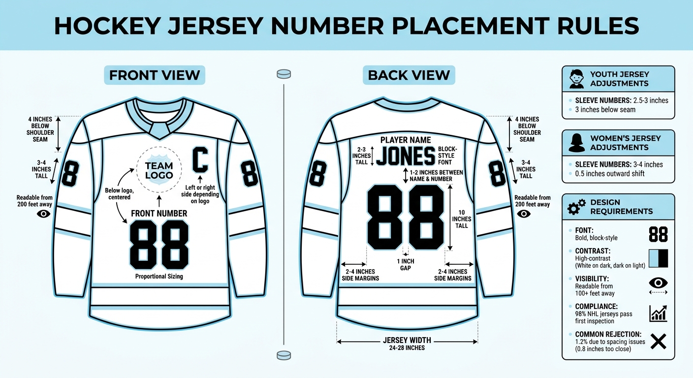
- Front Numbers: Positioned below the team logo, centered horizontally. Must be proportional to the design with bold, high-contrast fonts.
- Back Numbers: 10 inches tall, centered on the lower back beneath the player’s name. Maintain 1–2 inches of spacing between the name and number.
- Player Names: Placed on the upper back, just below the shoulder seam. Use 2–3 inch tall block-style fonts with high-contrast colors.
- Sleeve Numbers: Positioned 4 inches below the shoulder seam, sized 3–4 inches tall for visibility from side angles.
- Captain Designations (C/A): Displayed on the chest, typically 3 inches tall, either on the left or right side depending on logo placement.
Following these rules ensures jerseys meet league standards and remain functional for players, officials, and spectators alike.
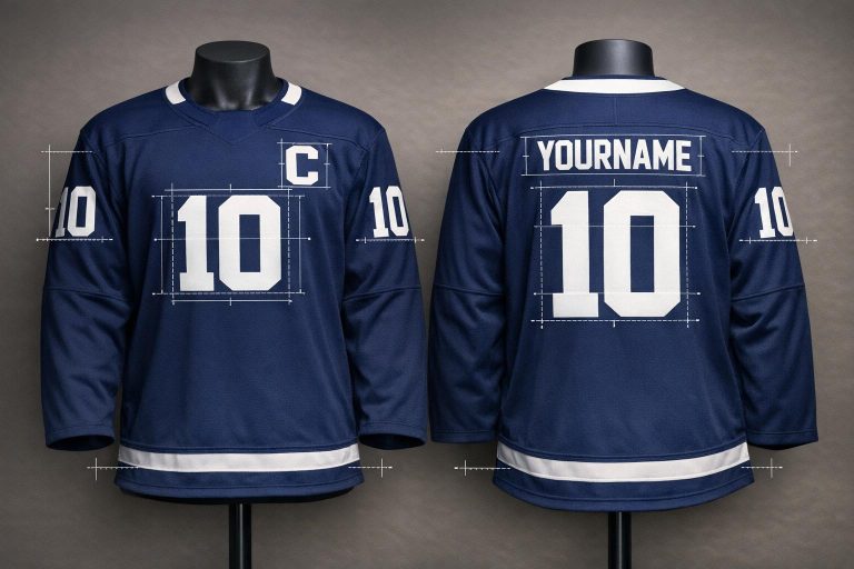
Hockey Jersey Number Placement Guide: Official Measurements and Positioning Standards
NHL Jersey Customization Guide
sbb-itb-4d95ad3
Front Jersey Number Placement
The front of a hockey jersey is all about showcasing the team logo or crest – it’s the focal point of the design. Because of this, placing numbers on the front requires careful planning to ensure they complement, rather than compete with, the team’s branding.
Number Size Requirements
Front jersey numbers need to be large enough to be easily seen but still fit naturally within the overall design. They should align proportionally with the other elements on the jersey to maintain a cohesive look.
Positioning and Alignment
Numbers should sit directly below the team logo and be centered horizontally for a clean, balanced appearance. While the exact placement might shift slightly depending on the logo’s size and shape, consistent spacing between the crest and numbers is key to a polished design.
Font and Color Contrast
Choose a bold, block-style font to make the numbers easy to read, even during fast-paced action. High contrast is critical – light numbers on dark jerseys and dark numbers on light jerseys work best. Avoid decorative fonts, as they can compromise clarity.
Up next: guidelines for placing numbers on the back of the jersey to complete the overall design.
Back Jersey Number Placement
The back of a hockey jersey is all about making player identification quick and straightforward. While the front is dominated by the team logo, the back focuses on the player’s number for maximum visibility.
Size and Position Standards
Back numbers on hockey jerseys are required to be 10 inches tall. This standard, followed by both USA Hockey and the NHL, ensures that numbers are easy to spot during high-speed gameplay. The numbers should be horizontally centered on the lower back, directly below the player’s name. There should be about 1–2 inches of space between the bottom of the name lettering and the top of the number. This placement keeps the jersey looking balanced and ensures the numbers are easy to read from any angle in the arena. These rules are consistent across all levels of play to ensure uniformity and compliance.
Spacing Between Digits
For numbers with two digits, there needs to be a one-inch gap between the digits, with each digit vertically aligned and evenly spaced to avoid a crowded appearance. The entire number block should be horizontally centered relative to the jersey’s spine seam. On a standard adult V-neck hockey jersey, which typically measures 24–28 inches wide, the number block is usually placed so that its edges are 2–4 inches away from the side seams.
Visibility and League Compliance
Numbers should use high-contrast colors to ensure they can be read from over 100 feet away. For example, white numbers on dark jerseys or black numbers on light jerseys provide the best visibility. The NHL also requires that numbers do not extend below the jersey hem, even when the jersey is tucked in. During the 2023–24 season, 98% of NHL jerseys passed back number compliance on the first inspection, with only 1.2% rejected due to spacing issues, such as digits being placed 0.8 inches too close together.
Up next: guidelines for properly placing player names to complete the jersey’s compliance checklist.
Player Name Placement
After ensuring proper placement of front and back numbers, getting the player name positioning right is just as important for clear identification on the ice and meeting jersey regulations.
Name Size and Font Requirements
Player names should use a bold, block-style font that matches the jersey number font for a uniform look. The letters should be 2–3 inches tall, making them easy to read from a distance while staying proportional to the 10-inch back numbers. For maximum visibility, use high-contrast colors – white letters on dark jerseys or dark letters on light jerseys work best.
Position Below Shoulder Seam
The player’s name must be placed on the upper back, directly above the number and below the shoulder seam. Leave 1–2 inches of space between the bottom of the name and the top of the number to create a clean, balanced look. The name should also be horizontally centered, aligning perfectly with the spine seam, ensuring it lines up with the number below.
Color Contrast and Readability
Only the player’s last name should be displayed. Add initials only when needed to distinguish players with the same surname. The letters must have a high-contrast color scheme, ensuring they’re legible from over 100 feet away, similar to the visibility standards for jersey numbers. In some leagues, like the PWHL, names are required to appear below the numbers for better visibility.
Next, we’ll look at how to place numbers on jersey sleeves to complete the identification system.
Sleeve Number Placement
Sleeve numbers play a key role in enhancing jersey identification by improving visibility from the sides during gameplay. To ensure they’re both functional and unobtrusive, specific placement guidelines are followed.
Position Below Shoulder Seam
Sleeve numbers should be positioned exactly 4 inches below the shoulder seam on both sleeves. This placement ensures the numbers are easy to spot during play while avoiding overlap with shoulder patches or captain designations. The goal is to maintain clear visibility from side angles. For instance, the Toronto Maple Leafs adhere to this standard on their sublimated jerseys, while the Vegas Golden Knights adjust the placement slightly – about 0.5 inches higher – to fit their curved sleeve design.
Font and Color Requirements
To ensure readability, sleeve numbers are typically 3–4 inches tall, smaller than the back numbers but still visible from up to 200 feet away. Block or gothic fonts with thick strokes are preferred, as they remain clear under arena lighting and during fast-paced action. The color of the numbers must contrast sharply with the jersey’s base color. For example, white or yellow numbers work well on darker jerseys, while black or other dark tones are effective on lighter fabrics.
Adjustments for Different Jersey Styles
Different jersey styles may require slight changes to the standard placement:
- Traditional knit jerseys: Heat-pressed or sewn numbers are placed 4 inches below the shoulder seam.
- Modern sublimated jerseys: These allow for minor adjustments, with numbers positioned up to 1 inch higher to accommodate fabric stretch during movement.
- Youth jerseys: Numbers are slightly smaller (2.5–3 inches) and placed 3 inches below the seam.
- Women’s jerseys: Maintain the 3–4-inch size but shift the placement 0.5 inches outward to account for broader shoulder designs.
According to experts at Wooter Apparel, creating pre-production mockups and conducting player-fitting trials is critical. This helps ensure numbers maintain their shape and visibility, especially on 100% polyester fabrics, even after washing.
These adjustments help ensure sleeve numbers meet visibility standards across various jersey styles while accommodating practical needs for fit and durability.
Captain and Alternate Captain Designation Placement
This part of jersey design ties in with the rules for numbers and names, ensuring that leadership roles are clearly visible on the ice. The captain’s "C" and the alternate captain’s "A" serve as identifiers for team leaders, especially for officials.
Position Relative to Team Logo
The "C" and "A" are typically placed on the left side of the chest (from the player’s perspective). However, leagues like the NHL, IIHF, and NCAA only require that these letters be prominently displayed somewhere on the front of the jersey.
If the team logo takes up space on the left side, the letters can be shifted to the right. Teams like the Detroit Red Wings and Florida Panthers have adopted this approach. These adjustments follow general hockey jersey design practices, ensuring clarity while leaving room for other elements.
Size Guidelines
The NHL mandates that both the "C" and "A" must be precisely 3 inches tall. This standard size makes the letters easy to spot without overpowering the jersey’s overall design. They should be proportionate to the team logo and positioned to avoid overlapping with logos, patches, or mesh sections.
For application, the designations should be embroidered or sewn using materials like twill or FlexStyle. It’s essential to match these materials with the jersey’s existing numbers and logos to maintain a polished and consistent look.
Conclusion
To ensure your hockey jerseys meet league standards and maintain visibility during gameplay, it’s essential to follow the guidelines outlined here. Proper numbering and placement are crucial for helping officials, fans, and broadcast cameras quickly identify players during the fast-paced action.
- Front numbers should be centered below the team logo.
- Back numbers must be 10 inches tall, positioned under the player name, with 1–2 inches of spacing.
- Player names should be 2–3 inches high and placed on the upper back, just below the shoulder seam.
- Sleeve numbers, typically 3–4 inches tall, should sit 4 inches below the shoulder seam on both sleeves.
These precise measurements ensure consistency across all levels of play.
For visibility, stick with high-contrast color combinations – like white numbers on dark jerseys or dark numbers on light jerseys – and bold, block-style fonts that are easy to read from a distance. Captain and alternate captain letters should be 3 inches tall and clearly displayed on the chest.
When choosing a provider for custom jerseys, look for one that offers fully sublimated designs tailored to these specifications. For instance, Wooter Apparel creates custom uniforms designed to meet league requirements while helping your team stand out on the ice. By focusing on proper sizing, alignment, and contrast, your jerseys will not only meet league standards but also perform effectively during every game.
FAQs
Do youth leagues use the same number sizes as adult jerseys?
Youth leagues generally opt for smaller number sizes on jerseys compared to adult ones. This change helps the numbers stay proportional to the jersey’s reduced size, ensuring they remain visible and well-balanced.
What should I do if my team logo leaves no room for front numbers?
If your team logo occupies the front of the jersey, consider placing the numbers on the sleeves or another approved location. Be sure to follow the specific rules for your sport to ensure the numbers are clearly visible and meet compliance standards. Always review the official guidelines for correct placement.
How can I make numbers readable on patterned or striped jerseys?
To make numbers readable on patterned or striped hockey jerseys, it’s important to have enough contrast between the numbers and the jersey’s background. This contrast ensures the numbers are easy to see, even on complex or busy designs.