
In sports, contrast in team uniforms is key for visibility and recognition. High-contrast designs make it easier for players, referees, and fans to distinguish teams, improving gameplay and reducing errors. Here’s what you need to know:
- High Contrast Works Best: Pairing light and dark colors (e.g., black and white) ensures clarity, especially in fast-paced games.
- Low Contrast Causes Issues: Similar colors (e.g., navy and black) can lead to confusion on the field.
- Lighting and Surfaces Matter: Uniforms should be tested under various lighting and playing conditions to maintain visibility.
- Design for Accessibility: Use color combinations that are clear for those with color blindness, such as black and yellow.
Wooter Apparel offers custom, durable uniforms with sharp color contrast, ensuring players stand out while maintaining team identity. Their free design services and sublimation printing ensure high-quality, functional designs for any sport.
How Contrast Works: The Science Behind Visibility
Understanding how color contrast works can explain why some uniforms are more effective than others. The way a uniform stands out – or blends into its surroundings – boils down to three main factors.
Color Contrast Basics
Contrast is created by differences in brightness, hue, and saturation. For example, pairing white with black maximizes brightness contrast. These elements combine to make uniform components more or less visible against each other and their environment.
- Brightness: This creates striking contrast. Think of a white number on a black jersey or black text on a white background – classic combinations that ensure maximum visibility.
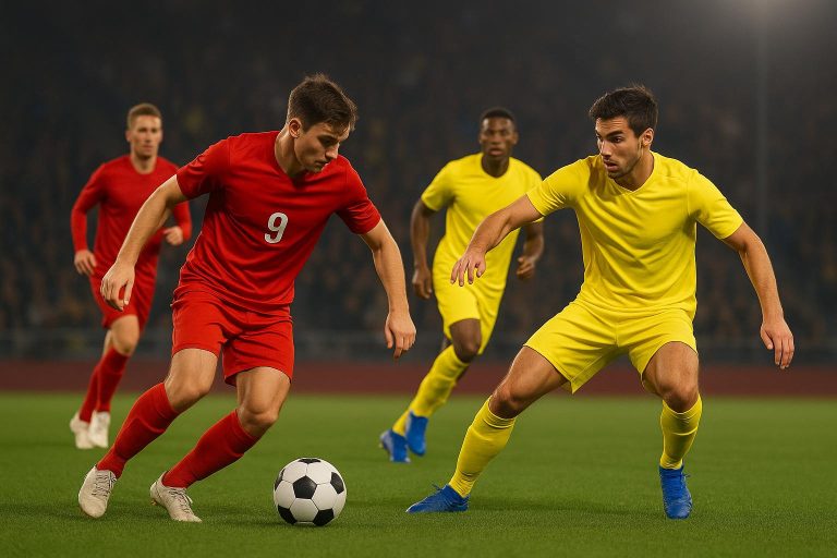
- Hue: This refers to the actual color. Opposing colors on the color wheel, like yellow and blue, produce strong contrast in hue.
- Saturation: This measures how vivid or intense a color looks. High-saturation colors, when paired with neutrals, can make elements pop and improve visibility.
Even fabric finishes – whether matte or shiny – can influence how uniforms appear under stadium lights. These basics set the stage for understanding the differences between high-contrast and low-contrast designs.
High-Contrast vs. Low-Contrast Uniforms
High-contrast uniforms use striking combinations, like dark jerseys with light numbers or vice versa. These designs are easier to see, especially in fast-paced or low-light situations. Studies show that high-contrast uniforms improve player recognition and reduce errors during gameplay. When players can quickly spot teammates and opponents, the game runs more smoothly.
On the other hand, low-contrast uniforms – where jersey and number colors are similar – can create confusion. For example, a navy blue jersey with black numbers might look sleek but often causes visibility issues during play.
Here’s a quick comparison:
| Uniform Type | Visibility Level | Example Colors | Pros | Cons |
|---|---|---|---|---|
| High-Contrast | High | Black/White, Yellow/Blue | Easy recognition, fewer errors | May not fit traditional styles |
| Low-Contrast | Low | Navy/Black, Red/Maroon | Subtle, traditional look | Harder to distinguish, more errors |
| Neon/Vibrant | Very High | Neon Yellow, Orange | Great in low light, modern look | Might not match team identity |
These differences highlight why contrast matters so much in uniform design.
Color Contrast Examples in Team Uniforms
Real-life examples show how these principles work in action. Classic high-contrast pairings like black and white, white and black, or yellow and blue are popular because they maximize brightness and hue differences, ensuring players stand out.
Teams are also experimenting with modern touches like gradients, metallic finishes, and neon accents to improve visibility and refresh their image. These designs not only enhance visibility but also help teams stand out in a crowded sports landscape.
However, not all designs work in every setting. A uniform that looks bold under bright stadium lights might lose its impact in overcast skies or indoor arenas. Testing uniforms under various lighting conditions ensures they maintain their visibility advantage when it counts the most.
What Affects Uniform Visibility
While choosing the right color contrast is essential, other factors like the playing surface, lighting, and considerations for color blindness are just as important in ensuring uniforms stand out during games. These elements can significantly influence how visible and effective uniforms are in different environments.
Playing Surface Backgrounds
The surface where a game takes place has a big impact on which colors stand out and which tend to blend in. For instance, on green grass or turf, colors like red, yellow, white, and neon stand out vividly. On the other hand, green uniforms can fade into the background, making it harder for players and officials to distinguish them.
Hardwood courts bring their own challenges. With the natural tones of brown and light wood, colors like blue, black, and red provide strong contrast, while lighter shades can appear washed out under bright gym lighting. When selecting uniform colors, it’s crucial to consider the specific playing surface.
Artificial turf varies widely in color, from deep greens to lighter synthetic shades. In low-light settings, neon colors often become the go-to choice for visibility. The key is to avoid colors that closely resemble the surface, as they can make players harder to spot.
| Playing Surface | Best Uniform Colors | Colors to Avoid |
|---|---|---|
| Grass/Natural Turf | Red, Yellow, White, Neon | Green, Earth Tones |
| Hardwood Courts | Blue, Black, Red, Purple | Beige, Light Brown |
| Artificial Turf | Neon, White, High-Contrast | Colors Matching the Surface |
Lighting Conditions
Lighting plays a huge role in how uniforms appear. Bright daylight can make lighter hues seem washed out, so bold contrasts are essential. Since sunlight changes throughout the day, a uniform that looks vibrant at noon might lose its impact as shadows grow longer.
Night games and indoor arenas bring their own lighting challenges. Indoor lighting varies greatly between venues, affecting how colors appear. Neon yellow and orange are often recommended for low-light conditions because they remain easy to spot even as natural light fades.
The type of fabric also matters. Matte fabrics absorb light, making colors appear deeper, while shiny materials reflect light, which can cause glare or unexpected color changes under stadium lights.
Designing for Color Blindness
Another critical factor is designing for viewers with color blindness. Around 8% of men and 0.5% of women experience some form of color vision deficiency. This means certain color combinations may be hard to distinguish, such as red and green or blue and purple .
To address this, high-contrast combinations like black and yellow work well, as they rely on brightness differences rather than subtle color variations . Using neutral tones for jersey numbers against colored backgrounds also ensures readability for players, referees, and fans.
During the design process, teams can use tools that simulate different types of color blindness. This helps identify potential visibility issues early, ensuring that the final uniform design is clear and distinguishable for everyone.
How to Create High-Contrast Uniforms
Designing high-contrast uniforms is all about blending functionality with team identity. By carefully selecting colors, testing their impact, and incorporating neutral tones, teams can ensure their uniforms are both visually striking and practical for gameplay.
Picking the Right Color Combinations
The foundation of a high-contrast uniform lies in selecting colors that stand out against each other. Pairing light and dark shades – like navy blue with white or black with bright hues – creates a strong visual distinction. This makes it easier for players, referees, and fans to identify teams during fast-paced action .
Professional teams offer great examples of this principle. Borussia Dortmund‘s black and yellow kits are instantly recognizable, while the Dallas Cowboys‘ navy blue and white uniforms maintain clarity on grass and turf alike. When choosing colors, teams should strike a balance between boldness and tradition. Established teams often stick to classic palettes, while newer teams might explore modern trends like gradients, metallics, or neon accents.
It’s also important to consider how colors interact with different playing surfaces. Once you’ve narrowed down your options, use digital tools to preview how the colors will look in action.
Tools for Testing Color Contrast
Digital tools are invaluable for evaluating how well colors work together. Platforms like Adobe Color, Color Contrast Analyzer, and online accessibility checkers can measure contrast ratios and simulate how uniforms appear in various conditions. These tools are particularly helpful for avoiding problematic combinations, such as red-green or blue-yellow pairings, which can be difficult to distinguish for individuals with color vision deficiencies.
But don’t stop at digital testing – real-world evaluation is just as important. As Duane R., a team manager, explained:
"I ordered some prototypes so I could gauge their wear and make some tweaks."
By testing prototypes under different lighting conditions, teams can ensure their uniforms look vibrant and perform well in actual gameplay scenarios.
Using Neutral Colors for Better Readability
Neutral tones like black, white, and gray are essential for making uniforms readable. These colors provide a clear background for text and graphics, ensuring numbers and names are easy to see from a distance . For instance, black numbers on a white jersey or white numbers on a dark jersey are highly legible – something that’s critical for referees, spectators, and broadcasters alike.
The versatility of neutral colors makes them a reliable choice for key elements like player numbers. White text pops on dark uniforms, while black text works seamlessly with lighter ones. This ensures maximum clarity, regardless of the game setting.
| Color Combination | Visibility Level | Sports |
|---|---|---|
| Black & Yellow | Very High | Soccer, basketball |
| Red & White | High | Football, combat sports |
| Blue & White | High | Baseball, soccer |
| Neon Yellow & Black | Extremely High | Safety, low-light games |
Neutral tones also help avoid common design missteps, like selecting colors that are too similar in shade. Modern uniform designs often pair high-contrast neutrals with creative accents or patterns, allowing teams to showcase their brand identity while keeping key details – like numbers and names – visible in every game situation .
sbb-itb-4d95ad3
Wooter Apparel: Custom High-Contrast Uniform Solutions
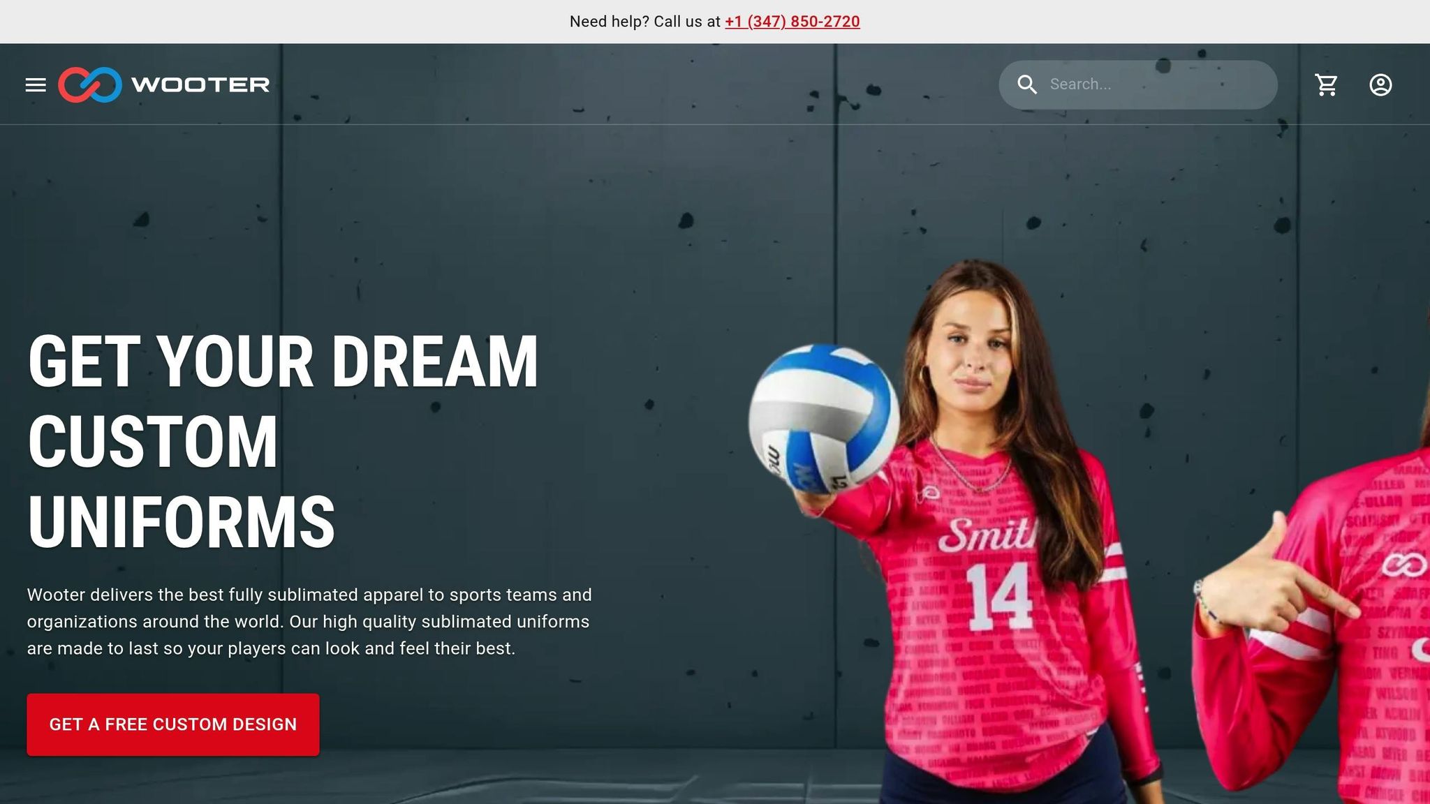
Wooter Apparel takes the concept of visibility and brings it to life by creating uniforms that stand out on any playing surface. Their focus on contrast and design ensures players are easily recognizable during the game.
Fully Custom, Durable Uniforms
Using advanced sublimation technology, Wooter Apparel produces uniforms with vibrant, long-lasting colors. Unlike traditional printing, sublimation infuses the design directly into the fabric, ensuring the colors stay bright and sharp over time. With more than 2,000 five-star reviews, teams consistently highlight the quality and visual appeal of these uniforms. Hannah A., for instance, shared her experience:
"The color match was perfect to our teal and they shipped quickly."
This level of color precision is crucial for teams that prioritize visibility and player identification, especially in fast-paced sports environments.
Free Custom Design Services
To make sure every team gets exactly what they need, Wooter Apparel offers free custom design services. Teams work with professional designers to experiment with color combinations, ensuring the final look balances style and performance. As Kythe H. remarked:
"Designs were awesome and any changes were made quickly and precise."
This collaborative approach ensures that every uniform not only looks great but also meets the specific needs of the team.
A Complete Lineup for Every Sport
High-contrast designs shouldn’t stop at jerseys – they should extend across all team gear. Wooter Apparel offers a full range of products, from jerseys to warmup apparel, allowing teams to maintain a cohesive look. For example, a basketball team can carry their navy-and-white color scheme across all their gear for a unified appearance.
| Product Type | Price Range | Key Features |
|---|---|---|
| Custom Jerseys | $16.99 – $24.99 | Fully sublimated, reversible options |
| Custom Shorts | $16.99 – $34.99 | Standard and retro styles, reversible |
| Warmup Gear | $22.99 – $24.99 | Jackets, pants, tear-away options |
| Shooting Shirts | $14.99 – $17.99 | Multiple sleeve lengths and styles |
Wooter Apparel ensures that every piece of team apparel contributes to a consistent, high-visibility look, keeping teams sharp and recognizable at every stage of the game.
Key Points for High-Contrast Uniform Design
Why Contrast Should Come First
When it comes to designing effective uniforms, contrast is non-negotiable. It’s the backbone of a design that not only looks sharp but also enhances team performance and recognition. High-contrast uniforms make it easier for players to identify teammates and opponents, which is critical for smooth gameplay and executing strategic moves.
For example, pairing colors like navy and black might seem appealing, but under certain lighting conditions, they can blend together, creating unnecessary confusion during crucial moments. Sticking to contrasting color schemes not only eliminates this issue but also ensures compliance with most league regulations.
Want to see how this principle comes to life? Wooter Apparel’s approach to uniform design takes these ideas to the next level.
How Wooter Apparel Can Help Your Team
Wooter Apparel offers free custom design services to help teams achieve the perfect balance of contrast and style without the hassle. Their design experts collaborate with coaches and team managers to test color combinations, ensuring every uniform meets the visibility standards of the sport. These tailored designs not only improve on-field recognition but also strengthen team identity.
Their fully sublimated printing process guarantees vibrant, durable colors that won’t fade or crack, even after a demanding season. This method embeds the colors directly into the fabric, ensuring the sharp contrast needed for maximum visibility.
A pro tip? Check your uniform designs in grayscale to confirm the clarity of contrast. Wooter Apparel’s team can assist with this step, making necessary adjustments before production begins. They also suggest keeping an alternate set of jerseys with clearly contrasting colors for situations where the primary uniforms might not provide adequate visibility.
FAQs
How can teams design uniforms that stay visible in any lighting?
When designing uniforms that need to stand out under various lighting conditions, contrast and color combinations are key. Pairing light and dark colors creates high-contrast designs that remain highly visible, whether under bright stadium lights or natural daylight. This approach ensures your team looks sharp and eye-catching in any setting.
Wooter Apparel specializes in creating fully customizable, sublimated uniforms that combine style with performance. Their designs ensure your team’s colors stay vibrant and noticeable, no matter the game environment.
What are the best uniform color combinations for better visibility, including for individuals with color blindness?
When designing team uniforms, picking high-contrast color combinations plays a key role in ensuring players are easily recognizable during games. Pairing light and dark shades – like white with navy blue or yellow with black – helps uniforms stand out, especially in the chaos of fast-paced action.
For players or spectators with color blindness, some color pairings can be tricky to differentiate, such as red with green or blue with purple. To make uniforms accessible to everyone, choose colors with distinct brightness levels that are easier to tell apart.
If you’re on the hunt for custom team uniforms, look for options that strike the perfect balance between performance, style, and visibility to suit your team’s unique needs.
How does the playing surface affect uniform visibility, and what colors work best for different surfaces?
The playing surface plays a big role in how well team uniforms stand out during a game. For instance, darker uniforms can blend into green grass fields, making players less noticeable, while lighter colors tend to pop against the same background. On indoor courts, bright or contrasting colors are generally easier to see against wooden floors or neutral-toned surfaces.
To make uniforms more visible, opt for colors that sharply contrast with the playing surface. On grass fields, bold shades like yellow or red can make players more noticeable. For darker surfaces like asphalt or turf, lighter tones such as white or pastels work better. Don’t forget to factor in lighting conditions – daytime games and evening matches under artificial lights might call for different approaches to color selection.