
When designing uniforms, logo size plays a critical role in how the final product looks and feels. A well-sized logo ensures visibility, enhances team identity, and maintains a clean, balanced appearance. However, choosing the wrong size can lead to cluttered designs or logos that are too subtle to notice.
Key takeaways:
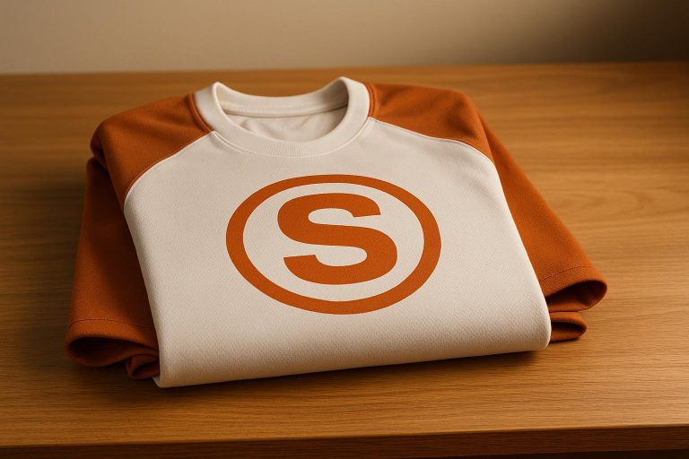
- Big logos (6–10 inches) work well for the chest but can overwhelm if too large.
- Small logos (1–3 inches) are ideal for sleeves or collars but may lack visibility.
- Placement matters: Chest logos can be larger, while sleeve and collar logos should be smaller to maintain balance.
- Printing method affects logo clarity: Screen printing suits large, colorful designs, while embroidery is better for small, detailed logos.
- Test designs on actual uniforms to avoid placement or sizing issues.
The right logo size depends on the uniform type, placement, and the team’s goals. Following proper sizing guidelines ensures logos are visible, professional, and aligned with the overall design.
Logo Placement 101: Tips to make the Perfect Shirt!
What Research Shows About Logo Size and How Uniforms Look
Studies show there is a strong link between how big the logo is and how good, clean, and balanced team uniforms look. To work well, logos need to be easy to see from about 6 feet. This is key when making choices about design. For instance, bigger and bright logos look good when printed on shirts, while small, neat logos fit better if sewn on. Big logos often make teams seem more sure and skilled. But if the logo is the wrong size, too big or too small, it can cause clear problems for how things look.
Issues With Logos That Are Too Big
If the logo is too large, it can take over the whole shirt and mess up how it should look. It can also cause trouble, such as making the picture look strange on seams or spots like sleeves and shoulders, where the fabric moves a lot.
Issues With Logos That Are Too Small
But if the logo is too small, people might not catch it from far away, and fans may miss it. Small logos will not stand out and can make the team look less strong or less sure. This may hurt how people view the brand and how good the team seems.
Logo Sizes That Work Best for Each Spot on the Shirt
To fix these problems, experts give clear tips for how big the logo should be in each spot. On shirts for grown-ups, the main logo in the center is best if it’s 6 to 10 inches wide, since it is the main thing people will see. The smaller logo on the left chest, which acts as a second logo, should be between 3 and 4 inches. For logos on sleeves, the best width is 1 to 3 inches, but some may need up to 4 inches. On youth or women’s shirts, logos look good at 2 to 3 inches wide to fit well with the shirt size. On bigger shirts, like XL or XXL, adding half an inch to one inch to the width helps keep the shirt balanced and look right.
Keep these points in mind so the team logo is easy to see, looks strong, and the shirt looks just right for both fans and players.
| Place on Shirt | Right Size Goes Here | Main Use |
|---|---|---|
| Big front chest | 6–10 inches | Main sign on shirt |
| Left chest | 3–4 inches | Extra sign or logo |
| On the sleeves | 1–3 inches | Spread look in view |
| Kids/Women’s | 2–3 inches | Good fit on small size |
| XL/XXL | Add 0.5–1 inch | Still looks in shape |
For big logos on the back, you may use up to 13 inches across and 8 inches high. This size makes your logo pop, so folks can see it with ease. On jackets with long sleeves, you can let the logo run up to 15 inches long. The width of these logos should stay between 1 and 4 inches. For seeing the logo well, keep it in the middle of the sleeve, both side-to-side and up-and-down. Take care not to put big logos near the seams or spots where the cloth may move and pull. That way, your logo will not twist or look odd when the person moves. These steps help keep your logo simple, easy to see, and nice to look at, no matter where you put it. Follow these rules to make sure your logo works well and stands out all the time.
Uniforms: How to Make Logos Look Good
When you make uniforms, how big the logo is matters. The right size helps the clothes look neat and nice. Use rules like balance, right size, and where things should go. This helps the logo fit well with the rest of the clothes and makes people look sharp and smart.
Logo Size Rules
Balance means things don’t look too heavy on one side. The size should match the shirt and other lines or shapes. Put the logo straight and in the same spot on each shirt so it looks tidy. For example, a logo in the middle of the shirt can be bigger than logos on the arms or collar. The chest has more room. Make sure you can read the logo from six feet away.
How Logos Go with All the Stuff on Uniforms
Uniforms can have many things on them, like names, numbers, lines on sleeves, or designs. Make sure nothing is too close together or messy. If the team logo is on the front, put the player’s number on the back or sleeve. Make both not too big or too small, so everything fits well. If the shirt has lots of colors or shapes, pick the logo size so it can still be read and the shirt doesn’t look busy.
Pick colors and spots for the logo that show what the team stands for and what the team is about, so the shirt looks good and means something. Also, think about what the shirt is – a jacket, a hat, or a t-shirt – because each one needs a different size logo. This makes us think about how much empty space the logo needs around it, too.
Why Logos Need Empty Space
The space you leave empty near the logo helps people see it better. It makes sure the logo is easy to read and does not fight with other things on the shirt. A good logo should look good big or small, and on many things – on screens, on paper, or on clothes. Always check if there is enough space around it, so it does not look crowded and messy. This way, the logo gets seen and does its job well.
sbb-itb-4d95ad3
Where to Put Logos and How to Measure
Putting a logo in the right spot needs care. Good rules and smart measures help shirts and gear look sharp and alike. These tips work no matter the shirt or sport.
Simple Rules for Where to Place Logos
Each spot for a logo needs its own size. For grown-up shirts, the front logo should be six to ten inches wide. This size is easy to see and does not make the shirt look too full. Small logos, like the ones that go on the left on the chest, should be three or four inches wide. Logos on the arm are almost always three inches wide. Put these in the middle of the sleeve so it looks right. On the back, there is more room for a logo. Make these ten to fourteen inches wide for grown-up shirts. Full back logos can be up to eight inches tall and thirteen inches wide. For small places, like the neck or collar, choose a logo that is two and a half to four inches wide. This adds a nice touch but does not take eyes away from the main logo on the shirt.
Every spot counts and each one has its own rule. Getting the size and place right helps the look stay sharp and the brand stand out, but in a good way.
| Place | Adult Size | Kid/Lady Size | Notes |
|---|---|---|---|
| Chest | 6–10 in | 2.5–3 in | Change for shirt fit |
| Left Chest | 3–4 in | 2.5–3 in | Usual on most shirts |
| Sleeve | 3 in | 2–3 in | Put in the mid of sleeve |
| Back | 10–14 in | 8–10 in | Big back mark, max 13 in |
| Collar/Tag | 2.5–4 in | 2.5–3 in | Quiet brand mark |
These first steps help set up the plan, but each sport has special needs, so you may have to change things as you go.
Team and Sport Needs
Each game has its own rules for where and how big logos should be. Some groups have tight rules and say logos must be from about 2 to 4 inches wide or tall, and tell you where they have to go, like in the middle of the chest or high on the shirt. Not following these rules can lead to fines or might stop a team from playing.
Basketball shirts need logos that let players move well and must not block the view for those who check the game. Football shirts are bigger; their logos have to stay clear of big gear like pads. Baseball and softball shirts, which button in the front, need careful logo spots to keep the shirts neat and nice.
Kids’ shirts use small logos, near 2.5 to 3 inches across, so they fit and look good. Grown-up shirts can use bigger logos, about 3 to 4 inches wide, like on the left chest. Women’s shirts may need more changes since they fit in different ways.
How the logo looks also matters. Jerseys with many colors, stripes, or sponsor signs need smart choices to keep them from looking messy. The main team logo should pop out, and smaller logos should be less bold to keep things clear.
All these points show it is smart to check and test where logos go in real life.
Why Testing on Real Shirts Is Key
Testing logo spots on real shirts and cloth – not just on a screen – helps find problems. It makes sure the end result is what you want and matches your plan.
"I ordered some prototypes so I could gauge their wear and make some tweaks. What they sent were above expectation and I’m looking forward to the next set I’m ordering." – Duane R., Verified Reviewer
How you print the logo can change where you put it. One way is screen print. It is good if you want a big logo with lots of bright colors. Another way is to sew the logo. This is best when the logo is small and has tiny lines. Each way can change how big the logo can be on the shirt or hat. If it gets too big, it may not look clear.
You should also try making samples before you pick. This is because you can find new problems. If the logo is put close to the edge or where two parts of cloth meet, it might pull and look strange when stretched. Also, colors you see on your computer may look different when put on cloth. If you test samples in many sizes, you can be sure the logo looks good. This way, your look stays the same if you wear size small or very large.
Logo Size and How It Changes the Look
Good and Bad Parts for Each Logo Size
Picking the best size for your logo on a uniform is not all about looks. It helps choose how easy it is to see the logo, how well it fits with the rest of the design, and how it works for your group. Every logo size has things that work well and things that might not work so well. You should pick the size that fits what your team wants. Here’s what to know:
Small logos (less than 3 inches) give uniforms a neat look. They blend in with other parts of the shirt and help your group look sharp and smart. They are good if you want a clean, simple look. But, small logos are hard to spot from far away. This might mean other people do not see your logo well, and your brand does not stand out.
Medium logos (from 3 to 6 inches) are in the middle. People can see these logos well without taking too much space on your uniform. They do not jump out too much but are big enough for most people to notice. Still, if the playing field is really big or if your design is plain, a medium logo might not show up much. For instance, a 4-inch logo on the front of a dark shirt is often just right and looks good.
Large logos (over 6 inches) are easy to spot. They catch attention and make sure everyone sees your brand. They stand out a lot. But, huge logos might be too much for your shirt. They can make your uniform look messy and might not follow some rules that teams have. If you use a big logo, think about how it will look so it doesn’t ruin the style.
Here is a quick look at how each logo size can change the main parts of your uniform design:
| Logo size | Seen | Fits with other things | Easy to read | Mess risk | Rules risk |
|---|---|---|---|---|---|
| Small | Hard to see | Fits well | Might be hard to read | Low | Low |
| Medium | Seen well | Fits right | Easy to read | Low | Low |
| Large | Seen best | Can stand out too much | Easy to read | Big mess risk | Big rules risk |
How you put a logo on cloth matters a lot, not just the size. The kind of cloth and how you print the logo change how it will look in the end. For example, putting color on with a screen works well when you want a big, bright logo because the lines and colors stay clear and strong. But stitching works best for small logos with fine parts. Big logos can look good with screen printing, but embroidery can make them lose detail or look less sharp.
The way the whole shirt or outfit looks is also key. If your shirt is just one color, you can use a big logo, and it will still look good. But, if your shirt has lines, shapes, or many names and signs, it’s often better to use a small logo so the shirt does not look too busy. You want the team name or logo to stand out, but also match with the rest of the shirt. If you think carefully about these things, you can make a shirt that looks nice and does its job well. The best shirts or uniforms are easy to look at and help show off your group.
Conclusion: What This Means for Custom Team Uniform Design
Key Points on Logo Size and Balance
Getting the logo size just right is crucial for creating uniforms that are both visually appealing and functional. Research highlights that a well-balanced logo enhances visibility without overwhelming the design. While larger logos can amplify brand presence, going too big might overshadow the rest of the uniform or even violate league regulations. On the other hand, logos that are too small risk being overlooked entirely.
When it comes to application methods, screen printing is ideal for larger, colorful logos as it maintains sharp, vivid colors. Meanwhile, embroidery is better suited for smaller logos with intricate details. To achieve the best results, it’s essential to follow established sizing guidelines, ensuring logos are proportionate and well-placed across all areas of the uniform. For uniforms with bold patterns or detailed graphics, smaller logos help maintain a clean look. Simpler designs, however, can handle larger logos as a striking centerpiece without compromising the overall aesthetic. These principles are the foundation of effective team uniform design.
How Wooter Apparel Supports Custom Uniform Design
Wooter Apparel takes these design principles to heart, offering teams expert support in achieving the perfect logo size and placement for their custom uniforms. Their design team understands the unique needs of each sport, including specific guidelines for logo placement.
Using sublimated designs, Wooter Apparel can seamlessly integrate logos into various parts of the uniform. These designs remain vibrant and long-lasting, even after numerous washes and heavy use. Plus, their free custom design service gives teams the chance to experiment with different logo sizes and placements before committing to a final look. This ensures every uniform achieves a polished, professional appearance while meeting the team’s specific needs.
FAQs
How does the printing method affect the visibility and clarity of logos on team uniforms?
The printing technique you choose can significantly influence how sharp and vibrant a logo looks on a uniform. Options like sublimation, screen printing, and embroidery each bring unique qualities that affect the design’s clarity, color accuracy, and durability.
Take sublimation printing, for instance. This method is perfect for creating detailed, high-resolution logos with bold, lasting colors that won’t fade or peel. It works by embedding the design directly into the fabric, resulting in a smooth and breathable finish. In contrast, embroidery adds texture and dimension, giving the logo a distinct, raised appearance. However, it’s not the best choice for intricate designs or lightweight fabrics, as it can compromise detail or weigh down the material.
Ultimately, the choice of printing method depends on factors like the complexity of the logo, the type of fabric, and the desired look and feel, ensuring the design remains both eye-catching and durable.
Why is it important to use the right logo size and placement on team uniforms?
Using the right logo size and placement on team uniforms is key to keeping the design visually balanced and professional. If the logo is too large, it can dominate the overall look, making the uniform feel cluttered and distracting from other elements. On the flip side, a logo that’s too small or awkwardly placed might go unnoticed, losing its ability to represent the team effectively.
Getting the logo’s size and position just right does more than make the uniform look good – it ties the whole design together. This kind of detail not only enhances the uniform’s appearance but also strengthens team pride, increases brand visibility, and leaves a memorable impression on fans and spectators alike.
How can teams design uniforms that keep their logos visible and balanced, even with complex patterns or multiple design elements?
When designing uniforms with complex patterns or multiple elements, keeping your logo visible and balanced is key. Pay attention to size, placement, and contrast. Choose a logo size that fits the overall design without dominating it. To make it pop, consider bold colors or outlines that enhance visibility against the background.
Wooter Apparel provides custom design services to create fully sublimated, premium-quality uniforms customized for your team. Their expertise ensures your logo not only stands out but also blends seamlessly with the uniform’s overall look, giving it a polished and professional appearance.