
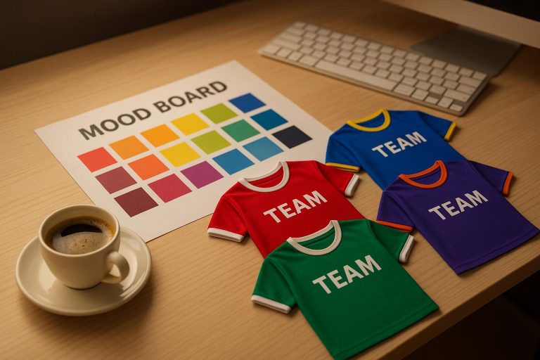
Team colors are more than just aesthetics – they define your team’s identity, boost player confidence, and unite fans. The right colors reflect your team’s values, enhance visibility, and create a lasting impression. Here’s how to choose effectively:
- Define Your Team’s Identity
- Identify core values (e.g., competitive, community-focused).
- Consider your team’s history and mission.
- Understand Color Psychology
- Red signals power and aggression.
- Blue conveys trust and stability.
- Black represents sophistication and strength.
- Green suggests harmony and endurance.
- Consider Practical Factors
- Match colors to your sport and audience.
- Test colors under different lighting and conditions.
- Balance primary, secondary, and accent colors for visibility.
- Test and Finalize
- Use mockups and player feedback.
- Ensure visibility from stands and on-camera.
- Factor in durability and weather performance.
Team colors aren’t just a choice – they’re a statement. Thoughtful selection ensures your team stands out, connects with fans, and builds a strong legacy.
Color Theory and Sportswear Design: Choosing the Right Colors for Your Brand
Step 1: Define Your Team’s Identity and Values
Start by defining your team’s core identity. Your colors should go beyond just looking good – they need to reflect the heart and soul of your team. This foundation ensures your color choices truly represent who you are and what you stand for.
Identify Key Values and Mission
What drives your team? Is it grit, discipline, or a focus on community? These traits should guide your color choices rather than personal preferences or fleeting trends.
- Competitive teams often lean toward bold colors like red, orange, or black – shades that exude energy and determination.
- Teams focused on precision and reliability might prefer navy blue, forest green, or burgundy, which convey trust and stability.
- Community-oriented teams might draw from local inspirations, such as school colors, city flags, or regional traditions.
Write down three to five words that capture your team’s essence – maybe you’re "fierce", "united", "innovative", "traditional", or "resilient." Keep these descriptors front and center as you explore color combinations. The goal is to ensure every choice reinforces at least two of these qualities.
Your team’s history also plays a role. If you’re a new team, you have the freedom to experiment. For established teams, consider the colors already tied to your legacy – fans often associate certain shades with your uniforms, logos, or traditions.
Consider Your Sport and Audience
Your sport and audience should also influence your decisions. Different sports come with their own expectations for team colors:
- Football teams often favor bold combinations like black and gold or red and white.
- Basketball teams tend to choose dynamic, eye-catching schemes that pop under arena lights.
- Baseball teams typically stick with classic palettes, such as navy, red, or forest green.
Think about your audience as well. Youth teams might benefit from playful, vibrant colors, while adult teams often opt for more professional, commanding palettes.
Where you play matters, too. Indoor sports under artificial lighting can handle subtler combinations, while outdoor sports need colors that remain vibrant in natural light and varying weather conditions. A color that looks fantastic in a meeting room might fade into the background under stadium lights.
Your local context is another factor. Teams tied to schools, neighborhoods, or cities often incorporate local colors or avoid clashing with rival teams. For example, if the high school in your area has worn red and white for decades, a new basketball team might want to carve out its own identity with a completely different palette.
Practical Considerations
Budget is always a factor. Some color combinations – like metallic accents, neon shades, or intricate multi-color designs – can significantly increase costs, especially for custom uniforms and gear. Sticking to standard colors and simpler designs can help keep expenses in check.
Finally, think about how your colors will look across different uses. While they need to shine on jerseys, they’ll also appear on warm-up gear, equipment bags, social media graphics, and promotional materials. A color that looks stunning on fabric might not translate well to digital screens or printed materials, so versatility is key.
Step 2: Understand Color Psychology and Meaning
Colors evoke instant emotional reactions that go far beyond personal taste. When people see your team’s colors, their brains process those hues in milliseconds, forming impressions about your team’s personality, energy, and even skill level. Knowing the psychological impact of colors allows you to pick shades that align with your team’s identity instead of clashing with it.
The way people associate emotions and traits with colors comes from a mix of evolution, cultural influences, and personal experiences. These connections are often consistent across groups, making color psychology a reliable tool for shaping how your team is perceived. By understanding these links, you can ensure your color choices reflect your team’s core values and message.
Here’s a breakdown of what common colors convey for sports teams.
Common Sports Colors and Their Meanings
- Red: Red grabs attention, exudes power, and signals aggression. It projects competitive intensity but can sometimes come across as impulsive if not balanced. Teams in red often appear dominant, making it a strong pick for those wanting to showcase strength and fiery determination.
- Blue: Blue represents trust, stability, and professionalism. Navy blue, in particular, suggests authority and reliability, while lighter blues feel approachable and team-focused. It’s a great choice for teams that value precision, teamwork, and consistency.
- Black: Black is all about sophistication, power, and intimidation. It pairs well with accent colors and is often chosen by teams aiming to appear elite, serious, and unyielding.
- White: White symbolizes purity, precision, and fresh starts. It creates a clean and polished look, ideal for teams that emphasize skill and technique over raw aggression. Plus, it reflects light well, making it practical for hot outdoor games.
- Green: Green conveys growth, harmony, and strength rooted in nature. Dark greens suggest stability and endurance, while brighter greens feel lively and fresh. This color suits outdoor teams or those with a focus on environmental awareness and community ties.
- Orange: Orange radiates energy, enthusiasm, and creativity. It’s bold but less aggressive than red, making it perfect for teams that want to stand out with a vibrant, approachable image.
- Purple: Purple has long been associated with royalty, luxury, and individuality. It’s a color for teams confident in their uniqueness, often blending power with a touch of creativity.
- Yellow and Gold: These colors project optimism, energy, and success. Gold, in particular, signals achievement and excellence, making it a favorite for championship-level teams. Yellow, while bright and cheerful, works best as an accent due to potential visibility challenges.
- Gray: Gray offers a sense of neutrality and balance. It’s professional and serious without the starkness of black or white, making it a solid choice for teams that want to appear focused and composed.
The shade and intensity of a color matter too. Bright, saturated hues feel energetic and bold, while muted tones give off a more refined and controlled vibe. For example, a bright red screams intensity, while a deep burgundy suggests strength with sophistication.
Regional and Local Considerations
While color psychology provides universal cues, local context adds another layer of meaning. Your region, climate, and community culture can heavily influence how your colors are perceived. What works in one area might carry a completely different message elsewhere.
In many American towns, high school sports establish strong color associations over decades. If the local high school team has worn blue and gold for 50 years and racked up championships, those colors might carry extra prestige. On the flip side, adopting the colors of a historically unsuccessful team could send the wrong message.
Geography and climate also play a role. Bright colors thrive in sunny southwestern states, blending naturally with desert landscapes. In northern regions with long winters, those same colors might feel out of place or overly flashy. Teams in areas with distinct seasons often benefit from colors that stand out against varied backdrops – green grass in summer, brown fields in fall, or snowy landscapes in winter.
Demographics matter too. Communities with strong cultural or religious ties may have specific color preferences rooted in tradition. Choosing colors that resonate positively with your audience ensures your team is embraced rather than unintentionally alienating anyone.
Economic factors and local sports fandom can also influence your choice. Amateur teams in areas with strong pro sports followings might benefit from using colors that complement, rather than compete with, the local pro teams. This can create a sense of connection and make your team feel like part of the larger sports community.
Don’t forget about your rivals. If your main competition wears red and black, choosing the same colors could confuse fans and weaken your identity. Opting for contrasting colors helps set your team apart and can even make rivalries more visually striking.
Finally, consider the venues where you’ll play. Indoor arenas with specific lighting might make some colors appear washed out or overly intense. Outdoor fields with green grass, red clay, or concrete surfaces can either enhance or dull certain color combinations. Climate also plays a practical role – rainy areas might benefit from colors that hide water spots, while sunny regions need shades that resist fading. Dusty environments call for colors that mask dirt and wear.
sbb-itb-4d95ad3
Step 3: Create Eye-Catching Color Combinations
Choosing the right color combinations is about more than just aesthetics – it’s about creating a look that’s professional, memorable, and functional. Your team colors should not only look great together but also stand out in the stands, translate well onto various materials, and reflect your team’s identity. To achieve this, focus on selecting complementary colors that provide enough contrast to ensure visibility and usability.
Once you’ve narrowed down your options, apply some basic principles of color harmony to make sure your choices work well together.
Basic Color Harmony Rules
Color harmony is what makes certain combinations feel natural and visually appealing. Here are some tried-and-true approaches:
- Complementary colors: Think red and green or blue and orange. These pairings create maximum contrast, making them bold and attention-grabbing. However, too much of both colors can feel overwhelming, so balance is key.
- Analogous colors: These are neighbors on the color wheel, like blue and green or red and orange. They offer a cohesive and polished look but may lack the visual punch of complementary colors when viewed from a distance.
- Triadic schemes: Using three evenly spaced colors on the color wheel – like red, blue, and yellow – can create a dynamic effect. However, these combinations can feel chaotic if not carefully balanced, so most teams stick to two main colors with a third used sparingly for accents.
- Monochromatic schemes: This approach uses shades and tints of a single color, such as navy blue with light blue accents or forest green paired with lime green. It’s clean and unified, perfect for teams aiming for a polished appearance.
To ensure balance, use the 60-30-10 rule: dedicate 60% of the design to your dominant color, 30% to your secondary color, and 10% to accent details like logos or trim. This method keeps the design visually balanced without overwhelming the eye.
Balance Primary and Accent Colors
Your primary color should dominate the uniform and reflect your team’s personality. Secondary colors add interest and support the primary color, often appearing on sleeves, trim, or other smaller sections. Accent colors, used sparingly, can be brighter or bolder to inject energy or highlight specific details, such as numbers or piping.
Contrast is essential for readability and impact. Player numbers and team names need to be easily visible from the stands, so light colors on dark backgrounds – or vice versa – work best. Avoid hard-to-read combinations like red on blue or yellow on white, which might look fine up close but lose clarity from a distance.
It’s also important to test your colors in various lighting conditions. Indoor gym lighting can make colors look different than they do in natural sunlight. Additionally, the material of your uniforms can impact how colors appear. Sublimated designs, such as those offered by Wooter Apparel, allow for more complex color effects like gradients, which aren’t achievable with traditional printing methods.
Compare Color Combinations
After narrowing down your options, evaluate them based on key factors like visibility, uniqueness, cost, and weather performance. Here’s a quick comparison:
| Color Combination | Visibility Score | Uniqueness | Cost Considerations | Weather Performance | Overall Rating |
|---|---|---|---|---|---|
| Navy Blue + White + Gold | Excellent | Moderate | Standard | Excellent | 9/10 |
| Black + Red + Silver | Excellent | Good | Standard | Good | 8/10 |
| Forest Green + White + Yellow | Good | Excellent | Standard | Good | 8/10 |
| Purple + Gold + White | Good | Excellent | Higher | Good | 7/10 |
| Orange + Black + White | Excellent | Good | Standard | Excellent | 8/10 |
Visibility scores reflect how well the colors stand out under different lighting and from a distance. High-contrast combinations tend to score better.
Uniqueness measures how distinctive your colors are compared to others in your league – common schemes like red and white may score lower if widely used.
Cost considerations account for the price of specialty colors or metallic finishes, with standard colors typically being more budget-friendly.
Weather performance evaluates how the colors hold up in different conditions, like sun exposure, frequent washing, or muddy fields. Light colors may show dirt more easily, while dark colors can fade faster in sunlight.
The ideal combination balances these factors while staying true to your team’s identity and budget. Sometimes, a slightly less distinctive scheme that excels in visibility and durability will serve your team better than a flashy but impractical choice.
Step 4: Apply and Test Your Team Colors
With your color scheme set, it’s time to see how it holds up in real-world scenarios. This is where the transition from theory to practice happens – ensuring your colors work not just on paper but on uniforms and in game conditions. This phase ensures your team’s identity stays consistent across all apparel.
Turning Colors into Uniforms and Apparel
Partner with a professional supplier like Wooter Apparel to create digital mockups of your team’s home, away, and alternate uniforms. Their fully sublimated printing process allows for intricate designs, gradients, and color effects that traditional screen printing can’t replicate.
Ask for mockups that showcase your colors on jerseys, shorts, warmup gear, and accessories. Pay close attention to how your primary and secondary colors interact across different pieces. Sometimes, combinations that look great on screen or paper don’t translate well to fabric textures or when viewed as part of a complete uniform set.
Practical details matter too. Light-colored uniforms may need extra attention to opacity to ensure undergarments don’t show through. Darker colors might require consideration for heat absorption, especially for outdoor games in sunny weather. If you’re incorporating metallic accents like gold or silver, keep in mind they may need special printing techniques, which can impact cost and durability.
Request fabric samples to ensure the digital colors match the final materials. This step can save you from unpleasant surprises when the uniforms are delivered.
During practices, gather player feedback on fit, mobility, and how the colors are placed. Players might notice issues you hadn’t considered, like colors that distract during fast-paced action or make it harder to track teammates on the field.
Testing Colors in Game Conditions
Once your designs are finalized, it’s essential to test how they perform in real game settings. Visibility and durability are key factors to evaluate. Have your team wear the uniforms during scrimmages and test them under different lighting conditions to ensure they remain clear and consistent.
Visibility from the stands is often overlooked. What’s legible up close might be hard to read from 50 feet away. During scrimmages, ask spectators in various seating sections to evaluate the readability of numbers and names on the uniforms. This feedback can help you address potential issues before they become problems during important games.
Consider how your uniforms will look on camera for social media and broadcasts. Colors that look vibrant in person might not translate well under certain lighting or camera conditions. Testing your uniforms in these scenarios ensures they photograph well and maintain their appeal across all platforms.
Don’t forget to factor in weather and field conditions. Dirt, grass stains, and sweat can affect colors differently. Light-colored uniforms might show stains more easily, while darker ones could fade faster after repeated washes. Conduct durability tests with sample uniforms to see how they hold up over a full season.
Fan feedback is another valuable resource. Since team colors are a huge part of fan identity, their opinions can guide final tweaks. Use social media polls, focus groups, or informal surveys to gauge how supporters feel about the colors.
Document all your findings. Keep detailed records of how the colors perform in various conditions, along with player and fan feedback. This information will be invaluable for future updates and maintaining consistency across your team’s apparel and merchandise.
You may find that having multiple uniform versions optimized for different conditions is the best approach. Many teams use separate color schemes for home and away games, indoor and outdoor venues, or even different seasons. This strategy ensures your team’s identity remains strong while adapting to the demands of each game situation.
Conclusion: Building a Lasting Team Identity
Selecting team colors goes far beyond mere aesthetics – it’s about creating a visual identity that connects emotionally and serves a practical purpose. These colors are the backbone of your team’s appearance, ensuring recognition and leaving a lasting impression on fans, opponents, and sponsors alike.
Your team’s colors will be present across all visual elements, from uniforms to promotional materials, becoming a key part of your story. When those colors consistently reflect your team’s personality and values, they transcend decoration and become a symbol of what your team stands for. A polished production process ensures these colors shine on game day.
Investing in high-quality uniforms, like those offered by Wooter Apparel with their fully sublimated designs, guarantees that your colors remain vivid and impactful throughout the season. Professional-grade production ensures your uniforms can withstand the rigors of competition while preserving the strong identity you’ve worked hard to establish. The feedback and testing you’ve undertaken provide a solid foundation for future updates, ensuring your team’s visual presence continues to evolve effectively.
While team identity can grow and adapt over time, your core colors should remain timeless and recognizable. Subtle updates to accent colors or design details can keep your look modern while staying true to the foundation you’ve built.
Now, your team colors serve as more than just a visual choice – they’re a unifying force that brings players together, excites fans, and creates a lasting impression. The thoughtful effort you’ve put into this process ensures these colors will continue to define and strengthen your team’s legacy for years to come.
FAQs
How can a team choose colors that truly represent their values and mission?
To pick colors that truly represent your team’s values and mission, start by pinpointing the qualities you want to highlight. For instance, red often represents passion and energy, while blue conveys feelings of trust and stability. Think about the emotions and traits that best define your team, and select colors that align with those characteristics.
Equally important is how these colors resonate with both players and fans. The right colors can evoke emotions that build a strong sense of unity and pride, reinforcing the team’s identity. By thoughtfully choosing colors that reflect your mission, you craft a visual identity that feels genuine and impactful.
What mistakes should teams avoid when choosing their colors, and how can they make better choices?
One frequent misstep teams make is opting for colors that are too similar or lack enough contrast, making it tough to tell players apart during games. This becomes even more of an issue in low-light settings or when uniforms visually blend into the environment. Another oversight is choosing colors without thinking about their psychological effects or how well they reflect the team’s identity and values. This can dampen team morale and affect how the public perceives the team.
To steer clear of these problems, go for simple, high-contrast color combinations that improve visibility and make uniforms easy to read. Additionally, select colors that resonate with your team’s personality and the image you want to project – vibrant, energetic shades for a competitive vibe or softer, more relaxed tones for approachability. A well-thought-out color palette can boost your team’s identity and leave a strong impression on fans and rivals alike.
How do local and regional influences shape the choice of team colors, and why does it matter?
Local and regional influences often shape the choice of team colors, as they represent a community’s identity, history, and pride. Many teams take cues from state emblems, historical events, or prominent local features. For instance, coastal teams might opt for ocean-inspired shades like teal or blue, while teams from the Southwest often embrace earthy tones or bold colors that mirror the desert’s vibrant landscape.
Selecting colors that resonate with the local community creates a deeper bond with fans and fosters a sense of togetherness. This connection not only boosts team spirit but also reinforces the team’s brand and identity.