
Sponsor logos on sports uniforms are essential for boosting visibility and generating revenue. Proper placement ensures compliance with league rules, maintains a clean design, and maximizes sponsor exposure. Each sport has its own logo placement standards, such as chest logos for soccer and basketball, sleeve logos for baseball, or upper chest/back logos for tennis.
Key steps include:
- Understanding league rules: These cover logo size, placement, and color requirements.
- Using high-quality files: Vector formats like AI or EPS ensure sharp prints.
- Balancing multiple logos: Prioritize major sponsors and avoid overcrowding.
- Choosing the right printing method: Options like sublimation, DTG, or screen printing depend on fabric and design.
Tools like design software, uniform templates, and alignment grids help achieve precise placement. Testing prints ensures durability and color accuracy, critical for long-lasting uniforms. By following these guidelines, teams can create professional uniforms that meet both sponsor and league expectations.
The Secret to Perfect Design Placement EVERY TIME
Logo Placement Standards and Rules
Placing sponsor logos on sports uniforms isn’t just about aesthetics – it’s a careful balance of tradition, league regulations, and visibility. Missteps can lead to penalties, costly redesigns, or even lost sponsorships.
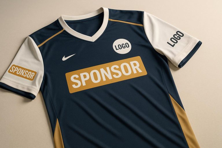
Where to Place Logos by Sport
Each sport has its own conventions for logo placement, influenced by tradition and practical considerations.
Basketball uniforms offer multiple options. The team logo typically appears front and center on the jersey, either above or below the player number. Sponsor logos are commonly placed on the top shoulder, while shorts can also feature sponsor branding.
Soccer has a long-established layout. The team logo is positioned on the left chest, directly opposite the kit manufacturer’s logo on the right. The main sponsor logo takes center stage on the chest, ensuring maximum exposure during broadcasts. Additional sponsor logos may appear on sleeves or the back of the jersey.
Baseball uniforms stick to a more traditional design. The team logo is placed on the left chest, and player numbers dominate the back. Sleeve logos are a popular choice for added visibility.
Football and Rugby prioritize the chest for primary logos. Secondary logos or additional sponsors often occupy the shoulder area. Sleeves and shorts are also common spots for sponsor logos, though their visibility can depend on the action on the field.
Tennis uniforms typically feature logos on the upper chest or upper back of shirts. Shorts and skirts also provide prime real estate for branding, ensuring visibility throughout the match.
Running and Cycling present unique challenges due to athletes’ body positions during competition. For cycling jerseys, logos near the front zipper or on the upper back are most visible during races. In running gear, logos are usually placed on the chest or sleeves for optimal exposure.
While these placements provide general guidelines, always consult league rules to fine-tune logo size, format, and color requirements.
League Rules and Limits
Sports leagues enforce specific rules to maintain uniformity and uphold brand integrity. These regulations cover everything from logo design to placement and size, ensuring every uniform meets strict standards.
- Size restrictions vary by league and sport. For instance, Major League Baseball (MLB) limits manufacturer logos to 2¼ square inches, with no single dimension exceeding 2¼ inches. Only one manufacturer’s logo is allowed per uniform item.
- File formats must meet league standards. For print, AI/EPS vector files are required. Merchandise designs often need 300 DPI JPEG or PNG files, while digital use typically calls for 72 DPI formats.
- Color guidelines are strictly enforced. Leagues specify exact color palettes and typography for sponsor logos, and deviations can result in uniform rejection or costly reprints.
- Placement limits prevent overcrowding. Many leagues cap the number of sponsor logos on each uniform and restrict placements near team numbers or official league badges.
Violating these rules can lead to serious consequences, including fines, uniform replacements, or even sponsorship losses. To avoid these pitfalls, teams should always consult their league’s style guide before finalizing designs.
At Wooter Apparel, we take these regulations seriously, ensuring every uniform we produce is both visually appealing and fully compliant with league standards.
Getting Sponsor Logos Ready for Uniforms
When it comes to adding sponsor logos to uniforms, attention to detail is key. Poor preparation can lead to blurry prints, clashing colors, or an unprofessional look – none of which reflect well on the team or its sponsors. Let’s break down how to get it right.
Getting High-Quality Logo Files
The first step to sharp, professional-looking logos is securing the right file formats and resolutions. Vector files are the gold standard because they can be resized without losing quality. Common vector formats include AI, EPS, PDF, and SVG files.
- AI files are "working" or "master" files created in Adobe Illustrator. These are perfect for making edits or adjustments.
- EPS files are widely regarded as the best for print projects and ensure crisp, clean results.
- If vector files aren’t available, raster files like JPEG or PNG can work, but they need to be at least 300 DPI.
Always request proper logo files from sponsors early in the process to avoid delays. If you’re stuck with a low-resolution file, enlarging it will likely result in a blurry, pixelated print. For printing purposes, save files in the sRGB color profile (sRGB IEC61966-2.1) to ensure accurate colors.
Here’s a quick reference guide:
| File Type | Best Use | Key Advantage | Resolution Requirement |
|---|---|---|---|
| EPS | Print production | Perfect for logos | Vector (scalable) |
| AI | Design modifications | Editable source file | Vector (scalable) |
| PNG | Web/digital use | Transparent backgrounds | 300 DPI minimum |
| JPEG | General print/web | Universal compatibility | 300 DPI minimum |
Once you’ve secured high-quality files, the next step is fine-tuning the logo colors.
Adjusting Logo Colors and Design
Now that you have clean, high-resolution files, it’s time to ensure the logos work harmoniously with the team’s uniform design. Balancing sponsor branding with the overall look of the uniform is a delicate process, but the sponsor’s brand identity must always come first.
If the logo colors clash with the uniform, check if the sponsor has alternative color options in their brand palette. Many brands provide secondary colors that work better in varied contexts. Always get sponsor approval for any changes to their logo to avoid violating brand guidelines.
For jerseys with busy patterns or multiple colors, monochrome versions of logos (black or white) can simplify the design while maintaining a polished look. These versions work especially well when full-color logos would be too distracting or clash with the uniform.
In some cases, subtle tweaks – like slightly muting or brightening colors – can make the logo blend better without compromising its identity. This approach works best when the original colors are already close to fitting the design but need minor adjustments.
Choosing and Balancing Multiple Logos
When dealing with multiple sponsor logos, it’s crucial to maintain a clean and professional appearance. Strategic placement and sizing ensure that no single logo dominates or detracts from the uniform’s overall design.
Start by organizing sponsors based on their partnership levels. Major sponsors should get the most prominent placements and larger sizes, while smaller sponsors can take secondary positions. This hierarchy respects sponsor agreements while keeping the design visually balanced.
Limit the number of logos visible on any single uniform piece. Most professional teams stick to 3-5 logos per item to avoid clutter. To give all sponsors fair exposure, consider spreading logos across different uniform elements – for example, placing some on jerseys and others on shorts or warm-up gear.
Pay close attention to logo sizing. The largest sponsor logo should complement, not overshadow, the team’s branding. Smaller logos, meanwhile, need to remain legible even when scaled down. Test out different layouts by printing samples before moving to final production.
Color coordination becomes trickier with multiple logos. Grouping logos with similar colors together can create a cohesive look. Alternatively, using monochrome versions can unify the design and prevent it from looking too chaotic.
At Wooter Apparel, we collaborate with teams to strike the perfect balance between sponsor visibility and professional uniform design. The goal is always to ensure every logo placement enhances the overall look, rather than detracting from it.
sbb-itb-4d95ad3
Design Tools for Logo Placement
Positioning sponsor logos on uniforms isn’t just about slapping a design on fabric – it’s about precision and professionalism. The tools you use can make or break the final look. Let’s dive into the essential tools and techniques for ensuring logos are placed with accuracy and visual appeal.
Design Software for Precise Placement
If you’re aiming for sharp, professional logo placement, vector-based design software is your best friend. Programs like Adobe Illustrator allow you to scale, position, and align logos perfectly without losing quality. Vector files ensure logos stay crisp, no matter the size, and these tools also let you create guides, use snap-to-grid features, and measure spacing with pinpoint accuracy.
For simpler projects, tools like Canva can be a quick and user-friendly option, though they lack the precision of professional-grade software.
Whichever tool you choose, make sure it supports uploading logos, free placement, and customization of colors and fonts to align with your team’s branding. This flexibility is crucial for fine-tuning the design.
Once you’ve placed the logos, it’s time to preview the design using uniform templates.
Uniform Templates for Visualization
Uniform templates are a game-changer when it comes to visualizing how logos will look on actual garments. At Wooter Apparel, our templates are scale-accurate, allowing you to see exactly how logos will appear across different sizes and styles.
These templates are tailored specifically for sports uniforms, taking into account variations in styles, positions, and sizing. For example, a basketball jersey might require a different logo placement strategy than a soccer kit. Wooter Apparel’s templates provide a clear preview of logo placement across all uniform types, ensuring that designs meet professional and league standards.
With templates, you can eliminate the guesswork and avoid creating separate designs for each uniform size. This streamlined approach saves time while ensuring consistency across the board.
Once the design is visualized, alignment grids become essential for fine-tuning placement.
Alignment Grids and Guidelines
Precision is everything when it comes to logo placement, and alignment grids are the secret weapon for achieving that polished, professional look. Nearly all design software includes grid systems and alignment guides, which help ensure logos are perfectly centered and balanced with other design elements.
Set up horizontal and vertical guides to create a grid system. Use snap-to-grid features to lock logos in place, ensuring consistent spacing between elements like team emblems or stripes. This method is especially helpful when working with multiple logos of varying sizes.
For primary sponsor logos, give them ample space to stand out, while secondary logos can fit into more compact areas. Measurement tools can verify consistent distances from key uniform features like seams, necklines, and edges, adding that extra layer of precision.
If your team has multiple uniform pieces – jerseys, shorts, or warm-up gear – establishing a master alignment guide ensures consistency across all items. This unified approach not only looks professional but also strengthens your team’s brand identity.
Printing Methods for Sponsor Logos
After carefully placing sponsor logos on your design, the next step is to ensure they’re printed with precision and durability. Choosing the right printing method is key to creating vibrant, long-lasting logos on sports uniforms.
Common Printing Methods
The best printing method depends on the fabric, design complexity, order size, and budget. Each technique has its own advantages and ideal uses. Here’s a breakdown of the most popular methods for sports uniforms:
- Sublimation Printing: Perfect for polyester uniforms, sublimation transforms ink into gas that permanently bonds with synthetic fibers. The result? Smooth, fade-resistant prints that won’t crack or peel. However, this method only works on polyester and similar synthetic materials – it’s not compatible with cotton.
- Direct-to-Garment (DTG) Printing: Great for detailed, multi-color logos, DTG uses water-based inks applied directly to the fabric, much like an inkjet printer. This method produces vibrant colors with a soft, natural feel, though it’s less effective on synthetic fabrics and can be expensive for dark garments.
- Direct-to-Film (DTF) Printing: DTF offers versatility across a range of fabrics. Designs are printed onto a special film and then transferred to the garment using heat and pressure. This technique delivers vibrant and durable results, though the prints may feel slightly stiffer and could impact breathability.
- Heat Transfer Vinyl (HTV): Ideal for bold, simple logos, HTV involves cutting designs from vinyl sheets and applying them with heat and pressure. This method creates eye-catching, raised designs that stand up to heavy washing and wear. However, it’s best suited for straightforward designs.
- Screen Printing: A cost-effective choice for large orders with simple designs, screen printing pushes ink through a mesh stencil onto the fabric. It produces vivid, long-lasting prints but requires significant setup time and isn’t ideal for complex, multi-color designs.
Here’s a quick comparison of these methods:
| Printing Method | Best Fabric | Pros | Cons |
|---|---|---|---|
| Sublimation | Polyester | Seamless, vibrant prints; won’t fade or peel | Limited to polyester and light-colored fabrics |
| DTG | Cotton, Cotton Blends | High-detail, soft finish | Less effective on synthetics; costly for dark fabrics |
| DTF | Polyester, Cotton, Blends | Works on various fabrics; durable | Slightly stiff; may affect breathability |
| HTV | Cotton, Polyester, Blends | Durable and bold; great for small batches | Limited to simple designs |
| Screen Printing | Cotton, Silk, Wool | Affordable for bulk orders; vivid colors | Time-intensive setup; not ideal for intricate designs |
At Wooter Apparel, we specialize in fully sublimated uniforms. This approach integrates sponsor logos directly into the polyester fabric during production, ensuring professional, durable results that look sharp season after season.
Testing Prints Before Production
Before committing to full production, always test the prints. A test print helps you spot potential issues early, saving time and money.
Test prints are crucial for verifying color accuracy and logo clarity. Colors that look perfect on a screen might appear different on fabric due to variations in texture, color, or the printing method. Fine details can also blur with certain techniques, especially on textured fabrics or lower-resolution prints.
Providing high-quality photos or physical samples to sponsors ensures their logo is represented accurately. This step also allows for adjustments before production begins, giving everyone confidence in the final product.
Another factor to consider is how the printing method affects the fabric’s feel. Some techniques may alter breathability or comfort, which are critical for athletic performance. The goal is to enhance the uniform’s look without sacrificing functionality.
Finally, test prints are essential for assessing durability. Wash the sample according to standard care instructions and inspect the logo for signs of fading, cracking, or peeling. Sports uniforms are subjected to frequent washing and heavy use, so ensuring the print can withstand these demands is non-negotiable. While the average garment is worn only about seven times before being discarded, sports uniforms are designed to endure an entire season’s worth of action.
Key Points for Sponsor Logo Placement
Getting sponsor logo placement right starts with high-resolution vector files. These files ensure logos stay crisp and scalable, even when resized for printing. Without them, designs can appear blurry or pixelated, which is a no-go for professional uniforms.
It’s also crucial to follow league rules regarding logo size, placement, and the number of logos allowed. Ignoring these guidelines can lead to expensive reprints and even penalties. Once the basics are covered, focusing on precise design techniques helps create a polished, unified look.
When it comes to visibility, the chest area is prime real estate. This spot gets the most attention during televised games and in photos. But don’t overlook secondary locations like sleeves, shoulders, and shorts. These areas can add extra exposure for sponsors, as long as the design stays clean and uncluttered.
The tools you use matter too. Design software, uniform templates, and alignment grids are essential for testing and perfecting logo placement digitally. This step can save you from costly errors down the line.
Achieving a professional look requires balance. Logos should be large enough to stand out but not so big that they overpower the uniform. Avoid placing logos too close to seams, using low-resolution files, or cramming too many elements into one design.
Finally, the quality of the uniform itself plays a big role. Durable, high-quality materials provide a smooth surface for printing, ensuring logos stay sharp and vibrant even after repeated washes and wear. This not only enhances the team’s image but also keeps sponsors happy with their investment.
At Wooter Apparel, we specialize in fully sublimated uniforms that check all these boxes. Our uniforms are designed to keep sponsor logos vibrant and sharp, combining expert design, premium materials, and precise placement to meet the demands of competitive play.
FAQs
How do I properly place sponsor logos on sports uniforms while following league rules?
To ensure sponsor logos are correctly placed on sports uniforms, the first step is to review your league’s specific rules and guidelines. These rules typically cover details like logo size, placement, and the maximum number of logos allowed. For instance, some leagues may specify that logos should not exceed 2.75 inches in width and 1.5 inches in height, and they often designate areas for placement, such as sleeves, shoulders, or the back of the jersey.
When incorporating logos into the uniform design, aim for a clean and professional appearance. Balance is key – logos should complement the team’s branding without making the design feel cluttered. Proper alignment also plays a big role in achieving a polished look. To get this right, consider using high-quality design software or working with experienced uniform providers, such as Wooter Apparel. They can help you create custom uniforms that not only comply with league regulations but also highlight your sponsors effectively.
How can I arrange multiple sponsor logos on a sports uniform without it looking cluttered?
To keep sports uniforms looking polished while incorporating multiple sponsor logos, it’s all about smart placement and a clean design approach. Primary logos should take center stage – think the chest or back – where they’re most visible. Meanwhile, secondary logos can be placed in subtler spots like the sleeves, collar, or lower back to avoid overcrowding any single area.
Color choice plays a big role too. Stick to complementary colors that align with the uniform’s overall design, ensuring logos are easy to read both from a distance and on camera. Steer clear of clashing colors that could make the uniform look too busy. A simple, streamlined design not only reinforces the team’s branding but also ensures sponsors get the visibility they need without overwhelming the uniform’s aesthetic.
What factors should I consider when selecting a printing method for sponsor logos on sports uniforms?
When deciding how to print sponsor logos, the type of fabric plays a key role. For polyester uniforms, sublimation printing stands out. It produces vibrant, durable designs that won’t crack or peel, making it ideal for high-performance sportswear. If you’re working with cotton or cotton-blend fabrics, screen printing is a solid option. It’s durable, cost-effective for larger orders, and delivers great results, though it’s less effective on synthetic materials. Heat transfer printing works well on a variety of fabrics but may not hold up as well over time.
To get the best outcome, think about the fabric’s compatibility with the printing method, how much durability is needed for frequent use and washing, the visual quality you’re aiming for, and your budget. Picking the right method ensures sponsor logos stay sharp and professional all season long.