
Getting logo placement right on soccer jerseys isn’t just about aesthetics – it’s about following league rules and creating a professional look. Here’s what you need to know:
- Key Areas for Logos:
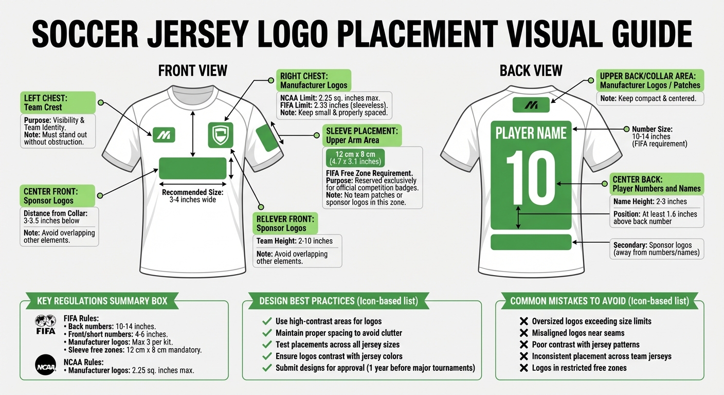
- Left Chest: Team crest for visibility.
- Center Front: Sponsor logos, positioned below the collar.
- Right Chest: Manufacturer logos, kept small and spaced properly.
- Back: Player numbers and names take priority, with sponsor logos placed away from them.
- Sleeves: Reserved for league badges or additional logos, ensuring compliance with free zones.
- Size and Placement Rules:
- Common Mistakes to Avoid:
- Oversized or misaligned logos.
- Poor contrast with jersey patterns.
- Inconsistent placements across team jerseys.
- Design Tips:
- Use high-contrast areas for logos.
- Space elements to avoid clutter.
- Test placements for consistency across sizes.
Following these guidelines ensures compliance with league rules and avoids penalties, while maintaining a polished jersey design.
Soccer Jersey Logo Placement Guide: Zones, Sizes and League Regulations
Basic Principles of Logo Placement
Balance and Visibility
Balance is all about distributing logos evenly so no single element overpowers the design. For example, the team crest typically goes on the left chest, while sponsor logos are placed at the top center – prime spots for visibility during broadcasts. When adding manufacturer logos or extra patches, they should complement these main elements rather than compete with them. Be mindful not to place logos too high near the collar or too low where they might interfere with player numbers; this disrupts the natural flow of the uniform.
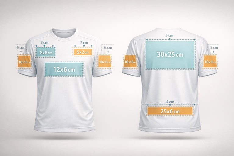
Visibility hinges on positioning logos where they remain clear during gameplay. The chest center is a sweet spot – it stays visible from broadcast angles and doesn’t shift much as players move. For optimal clarity, front logos should measure about 3–4 inches wide and sit 3–3.5 inches below the collar.
Finally, leave enough space between elements to avoid a cluttered appearance.
Avoiding Clutter
Proper spacing is key to keeping the design clean and professional. A cluttered jersey not only looks messy but can also dilute team identity and even result in penalties. For instance, FIFA mandates a 12 cm x 8 cm (about 4.7 x 3.1 inches) "free zone" on sleeves for official badges. This principle extends across the jersey, ensuring there’s enough breathing room between the team crest, sponsor logos, and player numbers. When elements are crammed together, they compete for attention rather than working together as a unified design. Always double-check league rules to ensure compliance.
Working with Jersey Design
Good logo placement works hand-in-hand with your jersey’s colors and patterns. High contrast between the logo and its background is crucial for readability. If your jersey features stripes, gradients, or intricate patterns, position logos in areas where the background is more uniform to prevent them from blending into busy visuals.
Start with the primary placements, like the left chest for the team crest, and then layer additional elements thoughtfully. Each logo should feel like it belongs, enhancing the overall design rather than clashing with it. A well-planned layout ensures the jersey looks polished while staying within league guidelines.
Logo Placement Guidelines by Jersey Area
Designing a jersey involves more than just aesthetics – it’s about balance, visibility, and creating a layout that works for players, fans, and sponsors alike. Here’s how to approach logo placement for different areas of the jersey.
Front of the Jersey
The front of the jersey is prime real estate, so placements here need to be precise:
- Team crest: Position it on the left chest for easy visibility, ensuring it stands out without obstruction.
- Sponsor logos: Place these at the top center, just below the collar. They should be perfectly centered and avoid overlapping other elements.
- Manufacturer logos: These typically go on the right chest. Leave enough space between the manufacturer logo and other elements to maintain a clean, organized look.
These placements create a harmonious and professional appearance for the jersey’s most visible side.
Back of the Jersey
The back of the jersey serves a dual purpose: showcasing player identification and accommodating additional branding.
- Player numbers and names: These take priority, so logos should never obscure or crowd them.
- Sponsor logos: If included, ensure they are positioned well below or above the player numbers to keep everything legible.
- Additional elements: Some teams add small manufacturer logos or commemorative patches near the collar. Keep these compact and centered to avoid detracting from the player’s name and number, which should remain the focal point.
Sleeves and Patches
Sleeves offer extra space for branding but require careful planning to avoid a cluttered look:
- Sleeve logos: Place these on the upper arm where they’re easy to see but won’t interfere with armbands or other elements.
- League badges or patches: Many competitions require a designated area for official badges. Even if not mandatory, leaving a gap for potential patches can give the jersey a clean and adaptable design.
Meeting League Regulations
Getting logo placement right isn’t just about aesthetics – it’s about following league rules. Governing bodies like FIFA and US Soccer enforce strict guidelines for uniforms, and breaking these rules can lead to penalties or even point deductions.
US Soccer and FIFA Rules
FIFA’s Equipment Regulations lay out detailed specifications for uniforms, blending design freedom with strict rules. Here are some key points:
- Number and Name Requirements: Back numbers must measure between 10–14 inches, while front and short numbers should be 4–6 inches. Player names must appear at least 1.6 inches above the back number and measure between 2–3 inches in height.
- Manufacturer Logo Limits: Brand logos are allowed only three times across the kit, covering the jersey, shorts, and socks combined.
- Sleeve Free Zones: Each sleeve must leave a 12 cm by 8 cm area solely for official competition badges, like the FIFA World Cup logo.
- Prohibited Content: According to IFAB Law 4, "Equipment must not have any political, religious or personal slogans, statements or images".
Even with these clear rules, violations still happen.
Common Compliance Issues
Take the 2004 incident with the Cameroon national team. They wore a one-piece Puma uniform that went against FIFA’s rule requiring separate shirts and shorts. This led to penalties.
Other common issues include:
- Oversized Sponsor Logos: Logos that exceed size limits or are placed in restricted areas often cause problems.
- Incorrect Sleeve Badge Placement: Team patches or sponsor logos placed in the reserved "free zone" violate regulations.
- Contrast Problems: Numbers and names must sharply contrast with the jersey. For complex patterns, a solid "number zone" behind the digits may be needed. Reflective or iridescent materials are also off-limits.
To avoid these pitfalls, manufacturers must submit uniform designs to FIFA a year before major tournaments for approval. For recreational and youth leagues, always double-check the specific league’s guidelines before finalizing a design.
sbb-itb-4d95ad3
Common Logo Placement Mistakes to Avoid
When designing jerseys, even small errors in logo placement can disrupt the overall look and may violate league standards. Here are some frequent mistakes to steer clear of.
Oversized or Misaligned Logos
Logos that are too large throw off the jersey’s balance and often violate league regulations. For example, FIFA allows manufacturer logos to appear only three times per kit, with strict size limits like a maximum of 2.33 inches on sleeveless jerseys. Misaligned logos, on the other hand, can shift awkwardly with movement or look uneven, especially if placed too close to seams. To avoid this, use clear reference points like the collar or sleeve seams when aligning logos, and test placements on jerseys of various sizes to ensure consistency.
Low Contrast with Jersey Colors
Logos that blend into the jersey’s background can become almost invisible, especially during broadcasts or from a distance in the stands. This often happens when the logo’s colors are too similar to the jersey’s without any added outlines. To fix this, test how the logo looks under different lighting conditions and on various jersey colors. Adding contrasting outlines – like white borders on dark jerseys or black borders on light ones – can make logos stand out and remain legible.
Inconsistent Placement Across Jerseys
When logo placement varies across team jerseys, it creates a disorganized and unprofessional look. Both US Soccer and FIFA mandate that all player jerseys must have identical design and color, with no room for variation. To ensure consistency, create a standardized template that specifies precise measurements from fixed points like the collar or shoulder seam. Test this template on different jersey sizes to confirm the logo remains in the same position across all sizes. This not only reinforces compliance but also maintains a polished, cohesive design.
Custom Soccer Jerseys with Wooter Apparel

Fully Sublimated Jersey Designs
Wooter Apparel uses full sublimation to integrate logos, colors, and graphics directly into the fabric. This ensures that crests, sponsor logos, and player numbers stay vibrant and durable, even after multiple washes. The process also guarantees precise placement that meets regulation standards.
"The vibrancy and durability of our colors are unbeatable. To achieve the best print results our color table contains the chromatic recipes in order to create the best possible definition on fabric".
This technique not only enhances jersey aesthetics but also provides a solid foundation for personalized design services.
Free Custom Design Services
Wooter Apparel offers professional design services at no additional cost. Teams collaborate with experienced graphic designers to bring their ideas to life. By submitting high-resolution or vector files (like those from Adobe Illustrator or CorelDRAW), teams can ensure precise logo placement. If vector files aren’t available, Wooter’s designers can redraw graphics for an extra fee.
The service includes detailed artwork mockups, allowing teams to specify the exact size and placement of logos and other elements. This ensures compliance with league rules while highlighting team branding. Additionally, teams can select from a wide range of fonts for player names and numbers – or even provide their own font files for a custom look.
Affordable and High-Quality Options
Wooter Apparel combines affordability with quality. Custom soccer jerseys start at just $16.99 per item, with no minimum order requirements – making them accessible for teams of all sizes. For accurate color matching, teams can provide Pantone references during the design process.
With a 4.9-star rating from 1,239 reviews, customers frequently commend the jersey quality and the responsiveness of Wooter’s design team.
Conclusion
Getting logo placement right on jerseys is about balancing visibility with compliance. Teams need to carefully position sponsor logos, team crests, and player numbers in the designated areas while ensuring proper contrast and proportional sizing. For example, FIFA allows only three manufacturer logos per kit – typically placed on the sleeves, chest, and shorts – with strict spacing rules to follow. To avoid penalties, designs often need to be submitted a year ahead of time.
Some key mistakes to avoid include oversized logos, poor contrast, and inconsistent placements. Using stable areas like the left chest or center front for logos helps maintain both recognition and compliance with league standards. Following these principles makes it easier for teams to double-check their jersey designs before final submission.
Wooter Apparel simplifies this process with advanced full sublimation technology, ensuring logos meet league regulations while elevating team branding. Their free custom design services connect teams with skilled graphic designers who create detailed mockups for approval. Plus, with professional-quality jerseys starting at $16.99 and no minimum order requirements, compliant uniforms are within reach for teams of any size.
FAQs
Where should logos be placed on soccer jerseys?
Logos on soccer jerseys are strategically positioned to stand out while keeping the design polished. Here are the main spots:
- Chest: This prime location is often used for sponsor logos or team crests, ensuring they are front and center.
- Sleeves: A common place for extra sponsor logos or league patches.
- Upper back: Typically features player names or smaller logos.
- Lower back: Reserved for player numbers, keeping the design balanced.
Placement must align with league rules regarding size and positioning to maintain a professional and compliant look.
What are the rules for placing logos on soccer jerseys to meet FIFA guidelines?
To align with FIFA guidelines, teams need to ensure their logos adhere to strict rules regarding size, placement, and content. Logos should be placed in approved areas like the chest or sleeves, ensuring they don’t overlap with player numbers or team crests. It’s also crucial that logos exclude any offensive or inappropriate material.
Before entering official competitions, teams should double-check that their jerseys comply with these standards and, if needed, get FIFA’s approval. Following these regulations helps maintain a polished and professional look for your team’s uniforms.
What mistakes should I avoid when designing logos for soccer jerseys?
When designing logos for soccer jerseys, paying attention to details like placement, size, and color contrast is crucial. Missteps, such as positioning logos too close to seams or edges, can lead to distortion. Similarly, oversized logos can make the jersey look cluttered and unprofessional, while logos that are too small might go unnoticed, especially from a distance or on camera.
To ensure the logo stands out, choose colors that contrast effectively with the jersey’s background. This improves both visibility and legibility. It’s also essential to use high-quality, scalable file formats like AI or SVG to prevent issues like pixelation or blurriness. Don’t forget to check and adhere to league-specific regulations about logo size and placement – ignoring these could result in penalties or even disqualification.
By focusing on these elements, you’ll create a jersey that looks polished and professional, helping your team stand out on the field.