
When it comes to sublimation printing for uniforms, proper logo placement is critical for a polished and professional look. Here’s what you need to know:
- Visibility and Readability: Logos should be easy to see and read, even during movement or in photos. High contrast and proper spacing help them stand out.
- Proportionality and Balance: Logo sizes need to match the uniform size to avoid looking awkward. For example, chest logos on adult uniforms are typically 6–10 inches wide.
- Team Identity: Placement affects branding. Logos must be scaled and positioned to reinforce the team’s image without clashing with design elements like names or numbers.
Key Placement Areas:
- Front: Center chest (3–4 inches below the collar) or left chest (2.5–4 inches wide).
- Back: Upper back for visibility, avoiding overlap with names/numbers.
- Sleeves and Legs: Positioned for balance and readability, avoiding seams or design interruptions.
Common Mistakes to Avoid:
- Overlapping logos with text or numbers.
- Placing logos on seams, zippers, or pockets.
- Using the same logo size across all uniform sizes.
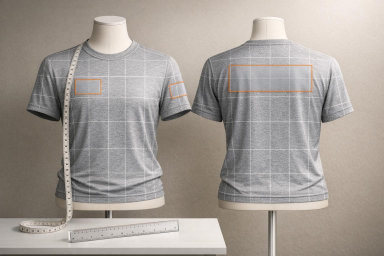
T-Shirt Ruler Guide for Perfect Vinyl & Sublimation Placement | Free Rulers + Directions!
Core Principles for Logo Placement
Getting logo placement right involves three key principles that ensure a polished and cohesive design for team uniforms. These guidelines apply across all types of team apparel.
Visibility and Readability
A logo must stand out and be easily recognized, even during fast-paced action. This requires placing it in areas that remain visible despite movement or equipment. For example, avoid spots where arm motions or gear might obscure it. High contrast is also crucial – a dark logo on a dark background will disappear, while a contrasting design ensures it pops in any setting.
Spacing is another critical factor. The logo should have enough room to stay distinct from numbers, text, or patterns. This clarity is especially important for photographs or broadcasts, where small details can easily blur or go unnoticed. Additionally, the logo’s size should complement the uniform design without overwhelming it.
Proportionality and Balance
Proportionality is key to achieving visual impact. For adult uniforms, chest logos are typically 6–10 inches wide, with adjustments of about ½ inch per size as you scale up from small to extra-large. This ensures the design remains balanced and effective, even during movement.
Balance is equally important. Logos should enhance the uniform without overpowering it. Centered chest logos, for instance, are often positioned 4–6 inches from the centerline, with vertical placement ranging from 3 inches below the collar for smaller sizes to 6 inches for XL. Whether you opt for symmetry or a more dynamic asymmetrical layout, the goal is to avoid an off-center look that could appear unprofessional.
Team Identity and Branding
Where you place a logo can significantly influence how the team is perceived. For youth uniforms, oversized chest logos (like 10 inches wide) can distort during play, while logos that are too small on the back lose their branding impact. Proper scaling and placement can improve logo visibility by as much as 30–40%. Thoughtful positioning not only reinforces team identity but also ensures players are instantly recognizable – whether they’re warming up, competing, or celebrating a hard-earned victory.
Logo Placement Rules by Uniform Area
When placing logos on uniforms, it’s all about balance, visibility, and ensuring the design complements the garment’s structure. Here’s how to approach placement for different areas of a uniform.
Front Placement Rules
The front of a uniform typically offers two key spots for logos: center chest and left chest.
- Center Chest: This is the prime location for maximum visibility, whether during gameplay or in team photos. Logos here should follow proportional guidelines and are usually positioned about 3–4 inches below the collar.
- Left Chest: Ideal for smaller sponsor logos or secondary branding. These logos are generally 2.5–4 inches wide. For youth uniforms, scale the size down to 2–3 inches wide. On women’s uniforms, shift the logo placement 1 inch higher compared to men’s uniforms for better alignment.
For the back, placement becomes trickier as it needs to avoid overlapping with player names and numbers.
Back Placement Rules
Logos on the back should be centered on the upper back to maintain harmony with the uniform’s overall design. However, if the upper back is reserved for player names, consider placing secondary branding on the lower back. Keep in mind how the movement of the garment and its fit might affect the logo’s visibility in this area.
Beyond the front and back, logos on sleeves and pant legs also require careful attention to placement.
Sleeve and Leg Placement Rules
- Sleeves: Position logos about 1 inch from the hem. Centering the logo ensures it stays balanced, even as the fabric stretches during play.
- Pant Legs: Avoid placing logos over seams or other design elements. To maintain readability, uppercase letters in the logo should be at least 0.3 inches tall. For plus-size uniforms, adjust placement by shifting the logo 0.5 inches farther from the center for each size increase.
These guidelines ensure logos remain visible, readable, and well-integrated across all areas of the uniform.
sbb-itb-4d95ad3
Logo Sizing Standards by Uniform Size
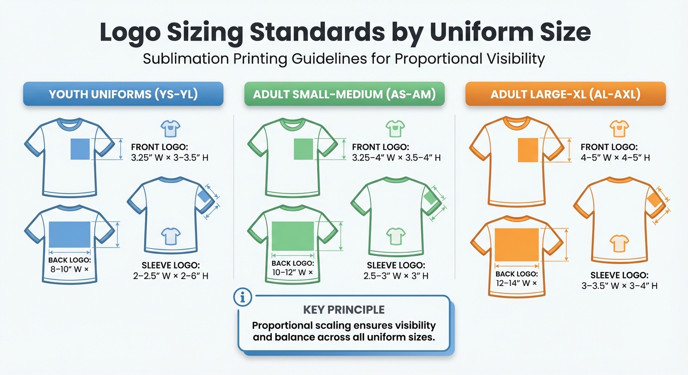
Logo Sizing Guide for Sublimation Printing by Uniform Size
Getting the right logo size for uniforms is all about maintaining visibility and balance. A properly scaled logo ensures that every uniform looks polished and cohesive, no matter the size. The secret lies in proportional scaling – adjusting the logo size to fit the garment while keeping its visual impact intact.
For youth uniforms (sizes YS-YL), the smaller garment sizes call for appropriately scaled logos. Front chest logos should measure around 3.25 inches wide by 3 to 3.5 inches tall. Back logos are typically 8 to 10 inches wide by 4 to 6 inches tall, while sleeve logos should be about 2 to 2.5 inches wide.
When it comes to adult small to medium sizes (AS-AM), logo dimensions increase slightly. Front logos should range between 3.25 and 4 inches wide by 3.5 to 4 inches tall. Back logos expand to 10 to 12 inches wide by 6 to 8 inches tall, and sleeve logos should measure around 2.5 to 3 inches wide.
For adult large to XL sizes (AL-AXL), the largest dimensions are used. Front chest logos should be sized between 4 and 5 inches in both width and height. Back logos reach 12 to 14 inches wide by 8 to 10 inches tall, while sleeve logos can measure 3 to 3.5 inches wide by 3 to 4 inches tall.
To make these guidelines easier to follow, here’s a quick reference table:
Logo Dimension Comparison Table
| Uniform Size | Front (W x H) | Back (W x H) | Sleeve (W x H) |
|---|---|---|---|
| Youth (YS-YL) | 3.25" x 3–3.5" | 8–10" x 4–6" | 2–2.5" x 2–3" |
| Adult S-M (AS-AM) | 3.25–4" x 3.5–4" | 10–12" x 6–8" | 2.5–3" x 3" |
| Adult L-XL (AL-AXL) | 4–5" x 4–5" | 12–14" x 8–10" | 3–3.5" x 3–4" |
These dimensions ensure your logos look professional and well-placed on any uniform size.
Common Logo Placement Mistakes to Avoid
Understanding common mistakes can help you design uniforms that are clear, balanced, and visually appealing. By steering clear of these pitfalls, you can ensure every logo placement enhances the overall design.
Overlapping with Text or Numbers
When logos overlap with player names or numbers, the design can feel cluttered and confusing. This issue is especially common on the back of uniforms, where a centered logo might sit too close to or directly beneath the player number. The result? A messy look that’s hard to read from a distance. On the front, placing a logo too low can interfere with chest numbers or team wordmarks. To avoid this, always maintain enough space between logos and any text or numbers.
Disregarding Uniform Design Elements
Logos that clash with seams, zippers, pockets, or other structural features can disrupt the design and reduce durability. For example, seams can create raised lines that distort the logo, while zippers and buttons can break up the design, leading to uneven printing and faster wear. To prevent this, leave at least 1 inch of clearance around the logo. On polos or button-down shirts, ensure logos are positioned fully above pockets or away from buttons and plackets to avoid creases or obstructions. This careful placement ensures a smooth print and a polished look, even after repeated washing and movement.
Ignoring Proportional Adjustments
Using the same logo size across all uniform sizes can create awkward inconsistencies. A logo that looks great on an adult XL jersey might dominate a youth uniform, throwing off the design balance. On the flip side, a logo sized for youth uniforms might seem too small on adult garments. To address this, use precise tools to ensure the logo scales proportionally for different sizes. This approach keeps every uniform looking professional and cohesive, no matter the size.
Conclusion
Placing logos correctly can mean the difference between a polished, professional look and a disorganized, off-brand design. When you focus on visibility, proportionality, and brand identity, every logo serves its purpose – whether it’s showing team spirit, promoting sponsors, or boosting overall recognition.
To recap the essentials: proper placement ensures logos make an impact while maintaining team cohesion. Logos on the front should stand out without overpowering the design, back logos need to stay clear of text or structural details, and sleeve or leg placements should work in harmony with the uniform’s overall layout.
Steer clear of mistakes like overlapping logos with text or numbers, and make sure every element blends seamlessly. Overcrowding or poor placement can quickly ruin the clean, professional feel of a design.
Thoughtful logo positioning not only strengthens brand recognition but also ensures the lasting quality of sublimated prints.
FAQs
How do I pick logo placement when my jersey has names and numbers?
When jerseys include names and numbers, logos are best positioned on the front chest, upper back, or sleeves to maintain visibility and avoid a cluttered appearance. The back should remain clear for names and numbers, with enough spacing – typically 0.5 to 1 inch – between these elements to ensure a clean look. Keep logos away from seams, zippers, or edges to avoid distortion. Following proper size and spacing guidelines ensures the jersey looks polished and meets professional standards.
What’s the safest way to place logos near seams, zippers, or pockets?
To keep logos intact and looking sharp, make sure they’re placed 0.5 to 1 inch away from seams, zippers, or pockets. This spacing ensures the logo stays visible and avoids unnecessary wear and tear during use or washing. Use tools like rulers or templates for accuracy, and always test placement on a sample garment before moving to full production. Thoughtful positioning not only enhances the logo’s appearance but also helps avoid problems caused by fabric stretching or stress points.
How should I scale one logo across youth, adult, and plus sizes?
When scaling a logo for youth, adult, and plus-size garments, adjust its dimensions proportionally to the garment size. For instance, logos for youth clothing are usually 3–4 inches wide, while adult sizes typically fall between 6–10 inches wide. To maintain a balanced appearance, ensure the logo’s placement stays consistent relative to key reference points like the collar or seams. Before moving into full production, test the scaled logos on sample garments to ensure they look clear and visually appealing.