
Getting logo sizing right on sports uniforms is essential for maintaining a professional look, ensuring brand visibility, and complying with league rules. Properly sized and placed logos make your team stand out while avoiding penalties. Here’s what you need to know:
- Key Placement Areas: Chest, back, sleeves, and collar are the most common spots for logos. Each area has recommended size ranges to ensure visibility and balance.
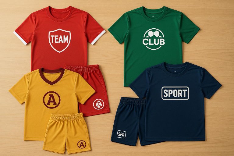
- Standard Sizes: Chest logos (6–10" wide), left chest (3–4" wide), and sleeve logos (around 3" wide) are typical for adult uniforms. Youth sizes require proportionally smaller logos.
- Compliance Matters: Organizations like the NFHS, NCAA, and professional leagues have strict logo size and placement regulations. Ignoring these can lead to fines, disqualifications, or damaged reputations.
- Common Issues: Oversized logos can look cluttered, while undersized ones may be hard to notice, especially in broadcasts. Placement near seams or on uneven surfaces can distort logos.
- Best Practices: Use mockups to preview designs, consult uniform specialists, and test placements for different body sizes to ensure a polished look.
Print Sizing and Placement Trends | Full Apparel Printing Class Replay
Standard Logo Placement Areas and Size Guidelines
Knowing where to place logos on sports uniforms – and getting the dimensions just right – can make a big difference in creating polished, professional-looking team gear. Placement areas and size guidelines vary depending on the sport, uniform design, and whether the gear is for adults or youth.
The most common logo placement spots include the chest, back, sleeves, and collar areas. Interestingly, research shows that logos placed on the top left corner are 89% more likely to be remembered than those on the right side. This explains why left chest positioning is a favorite across many sports. Let’s break down the most popular placement areas and their ideal dimensions.
Center Chest, Left Chest, and Sleeve Logo Sizes
The center chest is one of the most visible spots for logos. For adult uniforms, logos in this area typically measure 6–10 inches wide and 6–8 inches tall, making it a great choice for team names or main sponsor logos.
Left chest logos are smaller but still impactful, with sizes ranging from 3 to 4 inches wide. For adult shirts, this usually means 3 to 3.5 inches wide for small to medium sizes, while larger shirts like XL can handle logos up to 4 to 4.5 inches wide. Most designs for this area end up around 3.5 inches by 2 inches.
Logos on the sleeves are more compact, usually measuring about 3 inches by 1.5 inches. Sleeve logos can range from 2 to 4 inches wide, depending on the design and sleeve size.
Different sports tend to favor specific placements. Football and rugby lean toward chest and shoulder logos, basketball often incorporates chest, back, and shorts, while soccer and tennis prefer front, sleeve, or more subtle upper placements.
Back, Collar, and Secondary Logo Areas
The back of the uniform offers the largest space for logos. Adult uniforms can accommodate designs 10–14 inches wide and 1–6 inches tall. Some guidelines suggest back logos can go up to 10–12 inches wide, making this area perfect for team names, player names, or major sponsor logos. Upper back placement ensures the logo is easily visible during gameplay.
For full back designs, adult uniforms often feature logos up to 8 inches tall and 13 inches wide. However, it’s essential to balance these larger designs with the overall look of the uniform and any league rules about back placement.
Collar and secondary areas are smaller and more subtle. Logos in these spots are usually sized similarly to left chest logos, around 2.5 to 4 inches wide. Collar placement is a great way to add branding without overwhelming the design.
Youth uniforms require scaled-down versions of these designs. For example, back logos on youth sizes generally shouldn’t exceed 8–10 inches in height and 6–8 inches in width.
| Placement Area | Adult Size Range | Youth Size Range |
|---|---|---|
| Center Chest | 6–10" wide, 6–8" tall | Proportionally smaller |
| Left Chest | 3–4" wide | 2.5–3" wide |
| Back | 10–14" wide, 1–6" tall | Max 8–10" height, 6–8" width |
| Sleeves | 3" wide, 1.5" tall | Proportionally smaller |
When designing for youth uniforms, it’s important to adjust logo sizes for each shirt size. For example, a smaller or women’s shirt might look best with a 2.5–3 inch wide logo, while an XL shirt could handle a 4–5 inch wide logo. Proper sizing ensures the logos look balanced and professional, no matter the uniform size.
Logo Sizing and Placement Regulations
Understanding the rules for logo sizing and placement is crucial to avoid fines or uniform rejections. Each governing body has its own set of standards, which can vary widely depending on the sport and competition level.
NFHS, NCAA, and Professional League Standards
The NFHS (National Federation of State High School Associations) enforces some of the strictest policies. For example, in high school basketball, jerseys cannot display any trademarks or manufacturer logos. This strict policy ensures the focus remains on the athletes and the competition, rather than commercial branding.
The NCAA takes a more lenient but still structured approach. Basketball uniforms can feature logos, symbols, or patches, but they must not exceed 2¼ square inches. These can be placed on the back, front, or left shoulder seam of the jersey. Manufacturer logos are also allowed, provided they adhere to the same size restriction.
Professional leagues like the NBA and NFL have their own unique standards. The NBA requires every player’s name on the back of the jersey, with letters no taller than 2 inches. Meanwhile, the NFL’s Compliance Department ensures uniforms meet league standards, including the display of partner logos, while removing or covering any unauthorized branding.
"We don’t want to fine anybody, and we actively try to prevent it." – Akil Coad, Vice President of Compliance, NFL
Additionally, professional sports logos are trademarked and cannot be used on custom apparel without prior permission. Unauthorized use or alteration of these logos is illegal and could result in lawsuits.
| Organization | Logo Size Limit | Placement Rules | Special Notes |
|---|---|---|---|
| NFHS | No logos allowed | N/A | Strictly prohibits manufacturer logos |
| NCAA | 2¼ square inches max | Back, front, left shoulder seam | Manufacturer logos permitted within size limits |
| NBA | Varies by element | Name letters max 2" height | Uniforms must match strictly |
| NFL | League-controlled | Partner logos displayed | Active monitoring for compliance |
These rules highlight the importance of adhering to logo regulations to avoid penalties and maintain professionalism.
Penalties for Non-Compliance
Failing to follow logo regulations can result in significant consequences, including fines, disqualifications, and reputational harm. Non-compliance can also lead to financial losses and negatively impact team morale. The severity of penalties often depends on the violation itself and whether it’s a repeat offense.
Professional leagues are particularly strict in enforcing these rules. For instance, during the 2022 NFL season, Tampa Bay Buccaneers wide receiver Mike Evans was fined $62,222 and suspended for one game due to personal foul penalties during a scuffle. Similarly, the MLB imposes fines on players who fail to comply with uniform standards, such as wearing unauthorized cleats. These examples show that uniform regulations extend beyond jerseys to include all aspects of player attire.
Beyond individual fines, violations can jeopardize sponsorship deals and future revenue opportunities. Uniform policies are designed not just for maintaining order but also for ensuring fair competition. Teams that fail to comply may face disqualification, loss of privileges, or even termination of agreements, which can damage their reputation and brand.
"The consistent use of our logo is crucial in maintaining our brand identity and building recognition among fans and sponsors." – League Marketing Director
These regulations ensure logos are used appropriately and consistently, protecting the integrity of the sport’s branding. They apply not just to teams but also to sponsors, partners, licensees, vendors, and media. Everyone involved in uniform production must understand and follow these rules to avoid penalties and maintain a professional image.
sbb-itb-4d95ad3
Common Logo Sizing Problems Teams Face
Even with clear guidelines in place, teams often struggle with logo sizing and placement issues that can impact their professionalism and adherence to regulations. These challenges usually arise from a lack of understanding of sizing standards or the difficulty of balancing multiple design elements within limited space.
Incorrect Logo Sizes
One of the most frequent pitfalls is using logos that are too large. Oversized logos can dominate the design, throwing off the visual balance and making the overall look feel cluttered. On the flip side, logos that are too small can fade into the background, especially during broadcasts, which diminishes brand recognition and reduces the value for sponsors. Adding to the problem, using outdated logos can hurt brand consistency and create a disjointed appearance.
Placement also plays a critical role. Logos positioned too low or near seams can become distorted or less visible, further undermining their effectiveness.
Now, let’s look at how various uniform styles can complicate logo placement even further.
Placement Problems with Different Uniform Styles
Uniform styles vary widely, and each type presents its own set of challenges when it comes to logo placement and sizing. For example, sleeveless jerseys offer limited space, often forcing logos to compete for room on the chest and back.
Hooded jerseys and warmup gear add another layer of complexity. The materials used in these garments can distort logos, especially on compression or form-fitting designs.
Additionally, the rules for logo placement can differ depending on the sport. What works for a football jersey might not meet the guidelines for a soccer uniform. Teams must adapt their designs to meet the specific requirements of each sport.
Finally, there’s the tricky task of managing space between team and sponsor logos.
Managing Team and Sponsor Logo Space
Balancing team and sponsor logos on a uniform can be a delicate task. Overcrowding the design with too many logos not only looks unprofessional but can also make it harder for any single logo to stand out. Teams often wrestle with ensuring their own branding remains prominent while also giving sponsors the visibility they expect, all within the constraints of size and placement regulations.
To make sponsor logos work, careful coordination is essential. Sponsor marks should complement the team’s branding rather than clash with it. Poorly matched colors or fonts can result in a jarring, unpolished look.
The challenge becomes even greater when there are multiple sponsors, each vying for prime placement on areas like the chest, back, sleeves, or shorts. Teams must navigate these competing demands while staying within regulatory limits and honoring sponsor agreements. Achieving this balance requires thoughtful planning and a skilled design approach.
Logo Sizing and Placement Best Practices
Getting logo sizing and placement right takes thoughtful planning, reliable tools, and expert input. By following proven practices, teams can avoid common mistakes, create professional-looking uniforms, and stay within any required regulations.
Using Sizing Templates and Mockups
Templates and mockups are must-haves when it comes to visualizing how logos will look on uniforms before production starts. These tools allow teams to see the design in context, making it easier to adjust cropping, alignment, and size to avoid costly errors.
By previewing designs across different sizes, teams can ensure consistency in appearance. As Cloe Ann Montoya from Printful points out:
"The design placements discussed in this article should be taken as general guidelines, but the exact positioning will vary based on the t-shirt size. Review mockups carefully to ensure the final result meets your expectations."
Services like those offered by Wooter Apparel include free custom design mockups, giving teams a clear picture of logo placement across various uniform styles before committing to production. These mockups help teams make informed choices about placement and sizing, ensuring the final product aligns with their vision.
Mockups also encourage collaboration. Coaches, team managers, and sponsors can review and approve designs collectively, which keeps branding consistent and reduces the risk of delays.
Next, expert advice can further fine-tune these design plans.
Working with Custom Uniform Specialists
While templates and mockups are invaluable, partnering with custom uniform specialists adds another layer of expertise. These professionals bring a deep understanding of industry rules, fabric types, and logo application methods. They can guide teams on whether embroidery or printing works better for their design, suggest appropriate garment styles, and ensure compliance with league or sport requirements.
Specialists can also simplify intricate logos to ensure they remain clear and readable on different materials. Their guidance not only addresses technical challenges but also streamlines the entire design process. For example, Wooter Apparel creates fully sublimated custom uniforms that maintain logo clarity and color accuracy, drawing on extensive experience in sports like basketball, football, baseball, softball, and soccer.
Involving multiple stakeholders in the design review process is a good idea. Testing the designs with a small group can help pinpoint any practical issues before moving to full production.
Logo Placement Options Comparison
Once designs are refined through templates and expert input, comparing placement options helps achieve a polished, balanced look. Each placement area has its own advantages and challenges.
| Placement Area | Visibility Level | Compliance Risk | Appearance Impact | Best Use Cases |
|---|---|---|---|---|
| Center Chest | High | Medium | Strong brand presence | Primary team logos, main sponsors |
| Left Chest | Medium | Low | Professional, subtle | Secondary logos, league patches |
| Sleeve | Medium | Low | Clean, modern look | Sponsor logos, team initials |
| Back | High | Medium | Bold statement | Player names, large sponsor logos |
| Collar | Low | Low | Refined detail | Small brand marks, manufacturer logos |
| Shorts/Pants | Medium | Low | Extended branding | Additional sponsor space, team marks |
The center chest is perfect for primary team logos or major sponsor marks due to its high visibility during games and broadcasts. However, it often comes with strict size restrictions.
The left chest offers a polished and professional look with minimal compliance concerns, making it ideal for secondary logos or league-required patches. It also allows for easy player movement.
Logos placed on the sleeves provide good side visibility and are a great option for sponsor marks. However, curved surfaces may require design tweaks to avoid distortion.
The back is a bold choice for larger logos or wordmarks but requires careful planning to balance player names and numbers while adhering to size regulations.
This breakdown of placement options helps teams align their design goals with any compliance requirements, ensuring the final product looks sharp and professional.
Key Points for Logo Sizing on Sports Uniforms
Getting logo sizing right on sports uniforms requires attention to detail and adherence to regulations. Here’s how to ensure your uniforms are compliant, visually appealing, and professional.
Check your league’s rules before starting the design process. Organizations like the NBA, FIFA, and NFL have specific guidelines for logo placement and size, so it’s crucial to understand these before creating your uniforms.
Focus on high-visibility areas: The center chest is ideal for primary logos (within size limits), while the left chest works well for secondary logos. The back is a great spot for bold designs but must be balanced with player names and numbers for a polished look.
Avoid sizing mistakes by using professional mockups. Mockups help visualize how logos will look on jerseys, shorts, and warmup gear, ensuring consistency across all pieces. Services like Wooter Apparel offer free custom design mockups, allowing teams to preview logo placement and size on various uniform styles before production. Consistent logo placement, size, and color across all gear reinforces team identity.
Choose fabric and printing methods wisely. Different fabrics require specific printing techniques to maintain durability and clarity. For example, fully sublimated uniforms from Wooter Apparel ensure lasting prints that withstand the demands of sports.
Perform regular uniform checks before competitions. This ensures ongoing compliance with league rules. Educating players about uniform policies and the importance of following regulations can prevent last-minute issues on game day.
Partnering with uniform specialists simplifies the process from design to production. It ensures your uniforms meet regulations while creating a cohesive and professional appearance. These steps will help your team look sharp and stay compliant on and off the field.
FAQs
What are the rules for logo size and placement on sports uniforms to meet league requirements?
When designing your team’s uniforms, it’s crucial to stick to the league’s size and placement rules. For instance, logos typically need to fall within 2.25 to 3.9 inches in height or width and should be placed in designated spots like the center chest or yoke of the jerseys.
Make sure to review your league’s official guidelines for exact measurements and placement requirements before completing your design. This way, your uniforms will not only look sharp but also stay within compliance.
How can I balance team and sponsor logos on sports uniforms for a clean, professional look?
To create a polished and well-balanced uniform design, make the team logo the centerpiece by placing it prominently on the chest or sleeves. This placement ensures it grabs attention and represents the team’s identity effectively. For sponsor logos, choose less dominant spots like the upper back or lower hem, and keep their size modest – typically around 2–3 inches, depending on league or branding rules.
Steer clear of cluttering the uniform with too many logos or over-the-top design elements. A clean and streamlined look not only emphasizes the team’s branding but also gives proper recognition to sponsors without overwhelming the overall design.
How do uniform styles and materials impact the visibility and durability of logos during games?
Uniform styles and materials are crucial in determining how logos appear and endure during games. Bold, high-contrast colors paired with clear, striking designs ensure logos pop on the field, while using top-tier materials keeps them looking sharp and intact despite the wear and tear of gameplay.
Lightweight fabrics, such as moisture-wicking options, improve player movement but might compromise the durability of printed logos over time. Meanwhile, heavier fabrics provide greater durability but could restrict flexibility. Striking the right balance between fabric type and design is key to preserving both the clarity and durability of your team’s logo all season long.