
Typography in sports uniforms is more than just letters – it’s about building team identity, ensuring readability, and connecting with fans. Here’s a quick overview of 2025’s key trends:
- Bold Fonts: High-contrast, heavy-weight typefaces for maximum visibility during games.
- Gradients: Smooth color transitions add depth and personality without sacrificing clarity.
- Custom Fonts: Unique typefaces tailored to reflect a team’s history and values.
- Geometric and Outline Styles: Clean, modern designs with sharp angles and sleek simplicity.
- Typography + Patterns: Integrated text and backgrounds for cohesive, standout designs.
Modern printing methods like sublimation allow for intricate designs, vibrant colors, and durable finishes, making these trends possible. Whether bold or nostalgic, typography plays a vital role in shaping how teams are seen both on and off the field.
15 Game-Changing Sports Fonts For Graphic Designers
How Sports Typography Has Changed Over Time
Sports typography has come a long way – what started as simple lettering for practicality has grown into an art form that mirrors design trends, technological progress, and shifts in culture.
Major Changes in Sports Typography
Over the years, sports typography has shifted from being purely functional to becoming a key element of branding and artistic expression. Each era has brought its own touch, shaped by broader design movements.
Early Days: Simple and Practical (1860s–1900s)
In the beginning, sports uniforms prioritized function over flair. Typography was minimal, serving only to identify players. By the early 1900s, blank uniforms were almost nonexistent in baseball, cementing typography as a permanent fixture in the sport’s visual identity.
The Experimental Period (1909–1930s)
By 1910, teams began experimenting with typography styles. Spalding advertised six lettering styles for baseball uniforms, including Block, Old English, and Script. Bold placements became popular, like the Chicago Cubs’ vertical “CHICAGO” on their road jerseys in 1909 or the Pittsburgh Pirates’ vertical “PIRATES” in 1912. The Buffalo Blues of the Federal League broke new ground in 1914 by using angled script lettering across their jerseys.
Modern Branding Era (1930s–Present)
The 1930s ushered in the era of branding through typography. The Detroit Tigers reintroduced script lettering in 1930, a style that became a staple across teams. Timeless designs like the Los Angeles Dodgers’ script logo and the New York Yankees’ interlocking “NY” logo emerged during this time. The Yankees’ logo, first seen on caps and sleeves in 1909, appeared on jerseys in 1912 and remains iconic today.
The Nostalgia Movement (1970s–Present)
By the 1970s and 1980s, fans developed a love for vintage jerseys. Throwback designs like the Chicago Cubs’ classic uniforms gained popularity. This trend continues today, with teams like the San Diego Padres returning to their brown and gold pinstripes and the Green Bay Packers reviving looks inspired by the 1950s. The NBA celebrated its 75th anniversary in the 2021–22 season with “Classic Edition” uniforms, featuring retro designs for teams like the Celtics, Knicks, and Warriors. The Philadelphia 76ers also embraced a 1970s-inspired style, reflecting the transition from metal to digital typography. This blend of the old and new is central to today’s sports typography.
Contemporary Digital Age
Today, sports typography balances modernity and nostalgia. Sharp, contemporary fonts project ambition, while retro styles tap into fans’ love for history. The global sports jersey market, valued at $5 billion in 2021, continues to grow, highlighting the commercial importance of typography in sports design. Advances in printing technology have opened up even more creative possibilities for teams and designers.
How Printing Technology Improved Typography
The evolution of printing methods has played a huge role in shaping sports typography. Each technological leap has expanded creative options while improving the durability and visual appeal of designs.
From Basic Printing to Digital Precision
Early printing methods were basic and limited in design complexity. The transition from simple block prints to precise digital techniques revolutionized uniform design, enabling intricate details and vibrant colors.
The Sublimation Revolution
Sublimation printing has changed the game for sports uniforms. It allows for vibrant, detailed designs that were impossible with older methods. Here’s how sublimation stacks up against other techniques:
| Feature | Sublimation | Screen Printing | Heat Transfer |
|---|---|---|---|
| Durability | Excellent | Moderate | Lower |
| Feel | Soft and breathable | Heavier ink feel | Can feel plasticky |
| Design Limitations | Unlimited (full-color, gradients) | Limited (few colors) | Moderate |
| Peeling/Cracking Risk | None | High over time | Moderate |
| Cost (small batches) | Higher upfront | Economical in large runs | Moderate |
Sublimation embeds dye directly into fabric fibers, creating vibrant, long-lasting colors that resist cracking or fading. It works especially well with polyester, a favorite in sportswear for its durability and moisture-wicking properties.
Market Growth and Impact
The dye sublimation printing ink market was valued at $716.61 million in 2021 and is expected to reach $1.8 billion by 2030, growing at a compound annual rate of 10.8%. This reflects the increasing demand for high-quality, customized sportswear. As Silvia Kabaivanova, founder of Be Global Fashion Network, puts it:
“Sublimation printing has established itself as the preferred technology for producing sportswear. Why? It offers a unique combination of appearance, durability, and comfort – key elements for every athlete or team wanting to look professional and feel confident on the field.”
Design Freedom and Customization
Modern printing methods enable full-coverage designs, photo-realistic graphics, and intricate patterns like camo or gradients. Affordable customization options have made it easier for school teams, local leagues, and even individual athletes to create professional-looking uniforms.
Environmental Considerations
Sublimation printing is also more eco-friendly than traditional methods, as it requires no water or harsh chemicals. The industry is focusing on sustainability through recycled materials, waste reduction, and greener processes.
Thanks to these advancements, today’s typography trends can achieve everything from bold, modern designs to nostalgic throwbacks – all while maintaining durability and vibrancy game after game.
Top Typography Trends for 2025 Sports Uniforms
Typography is revolutionizing the look of sports uniforms, blending tradition with a fresh, modern edge. This year, the focus is on bold, dynamic designs that look great and serve a purpose – helping teams stand out while maintaining functionality. Teams are ditching overly complex visuals in favor of sleek, impactful styles that project strength and professionalism. Let’s break down the key trends shaping sports typography in 2025.
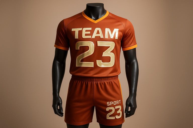
Bold Fonts for Maximum Visibility
Bold fonts are at the forefront of this year’s typography trends. They’re not just about aesthetics – they’re essential for quick recognition in fast-paced games. These strong, high-contrast typefaces ensure players’ names and numbers are easily readable, even at a glance. Fonts like Houston Sports, Sports Invation, Sports Nerford, and Sportify are leading the way in 2025. Designed with sharp edges and defined angles, these fonts exude precision and intensity, perfectly capturing the competitive energy of sports.
Gradients and Color Transitions
Gradients are no longer just subtle accents – they’re now bold design elements that add depth and personality to uniforms. By blending team colors into smooth transitions, gradients create a three-dimensional effect that enhances both readability and visual appeal. Whether it’s a subtle ombré or a dramatic color shift, teams are using gradients to make a statement without overshadowing the overall design. Pairing gradient typography with sharp geometric shapes or clean lines adds contrast and a polished, professional look.
Custom Fonts for Unique Team Identity
Custom fonts are becoming a key part of team branding. By developing proprietary typefaces, teams can create a distinct visual identity that reflects their history, geography, and fan base. These fonts often include unique design elements like custom serifs or stencil-style cuts, giving them an exclusive, tailored feel. Beyond aesthetics, custom fonts are designed to perform well in high-energy sports environments, ensuring clarity and durability.
Outline and Geometric Fonts
Outline and geometric fonts are all about clean lines and modern simplicity. Geometric fonts, with their precise mathematical proportions, deliver a contemporary vibe that appeals to younger fans. These fonts often feature dynamic angles and slanted lines, evoking movement, speed, and direction. This minimalist approach aligns with the broader trend of bold simplicity, emphasizing strong contrasts and straightforward compositions for a sleek, modern aesthetic.
Typography Paired with Patterns
When typography and patterns work together, the result is a cohesive and striking design. Bold lettering can complement complex backgrounds like camouflage, geometric prints, or team-specific motifs, creating a unified look that enhances a team’s branding. The key is maintaining enough contrast between the text and the background, often achieved through bold fonts, outlines, or strategic color choices. Custom patterns that reflect a team’s values and style make uniforms instantly recognizable and memorable. This seamless integration of typography and design reinforces the trend toward dynamic, functional branding systems.
sbb-itb-4d95ad3
Practical Tips for Typography in Sports Uniforms
Creating effective typography for sports uniforms is all about finding the sweet spot between style and practical needs like readability, durability, and consistency. Here’s how to make typography choices that shine both on and off the field.
Balancing Style and Readability
When it comes to sports uniforms, fonts need to be easy to read – even from a distance. Think about how the uniforms will be viewed: a font that looks sharp up close might blur when seen from the stands or on TV.
Opt for bold fonts over thin ones, as thinner styles can lose their clarity under stadium lights or when players are in motion. High contrast between text and background colors is also a must for visibility under different lighting conditions. Before finalizing your design, test how the font looks on the actual fabric, as what works on a screen doesn’t always translate well to textiles.
Finally, keep in mind how the material and printing method can affect the font’s appearance and durability.
Material and Printing Methods
The choice of printing method plays a big role in how your typography looks and lasts. Screen printing, for example, applies thick ink to fabric, making it highly durable and perfect for long-term use. If you’re working with smaller orders or complex multi-color designs, Direct-to-Film (DTF) printing is a great option, offering excellent durability across a variety of fabrics.
Screen prints can last as long as the garment itself, while quality heat transfer prints can hold up for at least 80 washes. To keep printed designs looking sharp, recommend washing uniforms inside out in cold water and avoiding high-heat drying.
For smooth textures, Direct-to-Garment (DTG) printing is ideal, while DTF excels in durability across cotton, polyester, and blended fabrics. Whatever method you choose, make sure it’s consistent across all team materials.
Keeping Typography Consistent Across All Uses
Typography for sports teams isn’t just about the uniforms – it needs to work seamlessly across everything from warm-up gear to merchandise and even digital platforms. Consistency in typography not only strengthens your brand identity but also builds trust, with 90% of potential buyers expecting a cohesive experience across all touchpoints.
To ensure uniformity, create a typography style guide. This guide should outline which fonts to use for different applications and how they should appear across various mediums, including physical uniforms, printed merchandise, and digital media. Since fonts can behave differently depending on the platform or material, test their compatibility early in the design process.
Stick to one or two primary typefaces to avoid visual clutter and keep your branding strong. Train everyone involved in creating team materials on these guidelines, and conduct regular checks to spot and fix inconsistencies before they spread.
Custom Typography Solutions with Wooter Apparel
Creating sports uniforms that incorporate modern typography trends requires a partner with expertise in both design and manufacturing. Wooter Apparel stands out by offering a seamless blend of cutting-edge typography and durable, high-performance uniforms. Here’s how they make it happen.
Fully Customizable Sublimated Uniforms
Wooter Apparel uses sublimation printing to bring bold typography designs to life. Unlike traditional methods that limit colors and design complexity, sublimation allows for unlimited text placement, intricate logos, and vibrant color schemes across the entire uniform.
“Sublimation is a digital printing process that enables unlimited design elements and logos to be printed, and individual personalizations like names and numbers to be included all in one print. Colors are selected, designs are positioned, logos are measured, numbers and names typed, checked, and checked again, before the garment goes to print.” – Jared Musolino, Head Designer for Wooter Apparel
This process is perfect for achieving gradient effects, detailed color transitions, and other modern typography styles. Wooter Apparel’s precise color management system ensures every uniform piece matches perfectly, using Pantone references and custom chromatic recipes to maintain vibrant, consistent designs.
Free Custom Design Services
Wooter Apparel makes it easy for teams to embrace the latest typography trends, even without prior design experience. Their in-house graphic design team specializes in sportswear and sublimation techniques, offering free custom design services that include up to three revisions.
Whether teams bring their own ideas or start from scratch, Wooter Apparel’s designers help craft uniforms that balance style with functionality. They guide teams in integrating typography trends while ensuring names, numbers, and logos remain clear and impactful on the field.
For optimal results, teams should provide logos in vector formats like SVG, AI, EPS, PDF, or CDR. If vector files aren’t available, Wooter Apparel offers logo redrawing services for an additional fee. Finished designs are delivered in both bitmap and vector formats (PNG and PDF), ensuring consistency for future orders and promotional materials.
Multiple Sports and Apparel Options
Wooter Apparel applies modern typography trends across a wide range of sports uniforms and apparel. Each sport presents unique opportunities for typography, and Wooter Apparel’s pricing makes customization accessible for teams of all budgets.
| Sport | Uniform Sets | Individual Jerseys | Typography Features |
|---|---|---|---|
| Basketball | Starting at $39.99 | Starting at $19.99 | Bold player numbers, team names, gradient effects |
| Football | Starting at $59.99 | Starting at $34.99 | Custom lettering, geometric fonts, outline effects |
| Baseball/Softball | Starting at $49.99 | Starting at $24.99 | Classic-modern fonts, pinstripe details, numbering |
| Soccer | Starting at $27.99 | Starting at $13.99 | Minimalist styles, sponsor logos, dynamic text |
Beyond uniforms, Wooter Apparel offers typography customization for warmup gear, hoodies, tracksuits, bags, caps, and socks. This ensures a consistent look across all team apparel, reinforcing the team’s identity on and off the field.
With a 4.9-star rating from 1,237 reviews, Wooter Apparel has earned the trust of teams seeking professional-quality uniforms that merge contemporary typography with athletic performance. Whether using their design templates or working with their experts, teams can count on Wooter Apparel to deliver standout results every time.
Conclusion: Main Points for Modern Sports Typography
Summary of 2025 Typography Trends
Typography in modern sports has become a cornerstone for defining team identity and connecting with fans. Looking ahead to 2025, several trends are shaping the way teams approach their designs. Bold fonts continue to dominate, offering excellent readability and a strong visual punch. Gradient effects are adding a layer of depth and intrigue, while custom fonts allow teams to stand out with designs tailored to their unique brand.
Minimalist fonts are also making waves, proving that simplicity can deliver a sleek and professional look. On the other hand, condensed grotesques bring a mix of boldness and subtle humanist details, creating designs that are both compact and impactful.
It’s important to remember that typography isn’t just about looking good – it’s also about being functional. The best designs strike a balance between eye-catching aesthetics and practical readability. These trends are paving the way for more dynamic and effective uniform designs.
Using Custom Solutions for Team Success
Building on these typography trends, Wooter Apparel offers teams the chance to bring their vision to life with expert custom design services and advanced printing techniques. By working with professional designers, teams can ensure every detail – from font choice to layout – perfectly aligns with their brand and meets the specific needs of their sport.
Consistency is key when it comes to typography. When the same fonts and design elements are used across uniforms, warmup gear, and promotional materials, teams create a unified brand image that boosts recognition and fosters team pride.
Investing in high-quality typography delivers real benefits. Players feel more confident wearing uniforms that are stylish and modern, while fans are drawn to merchandise that reflects current design trends. As one happy customer shared:
“I love the custom jerseys they’re making for us. I couldn’t find what I wanted anywhere, and believe me, I looked. Colors, patterns, fit are excellent.” – Duane R.
FAQs
How do custom fonts enhance a team’s identity on sports uniforms?
Custom fonts are a big deal when it comes to shaping a team’s identity. They give uniforms a standout look that’s hard to forget. Whether the typeface is bold, sleek, or timeless, it can mirror the team’s personality – fierce, energetic, or classic – while uniting players and fans under the same vibe.
On top of that, custom fonts make names and numbers easier to read, which is crucial during fast-paced games. This doesn’t just enhance the team’s branding; it also makes them instantly recognizable on the field or court. By blending style with practicality, custom fonts bring both flair and function to sports uniforms.
What makes sublimation printing a great choice for sports uniforms?
Sublimation printing is a top pick for sports uniforms because it produces bold, durable colors that stay vivid without fading, cracking, or peeling. This is possible because the dye is infused directly into the fabric, making the design a permanent feature of the material.
This method also supports intricate, fully customizable designs, making it ideal for crafting standout team uniforms. Plus, sublimated uniforms are lightweight and breathable, offering added comfort and improved performance during demanding matches. While the upfront cost might be higher, the unmatched durability and quality make it a smart, long-term choice for teams aiming to make an impression on the field.
How can teams maintain consistent typography across their uniforms and promotional materials?
To maintain a cohesive look across uniforms and promotional materials, teams should develop a style guide outlining the exact fonts, sizes, and formatting rules to be used. Stick to just two or three fonts that work well together to keep the design clean and visually appealing.
Using the same typography consistently – whether on jerseys, social media posts, or other platforms – helps solidify your team’s brand identity. It also gives your materials a polished, professional vibe that appeals to both fans and sponsors.