
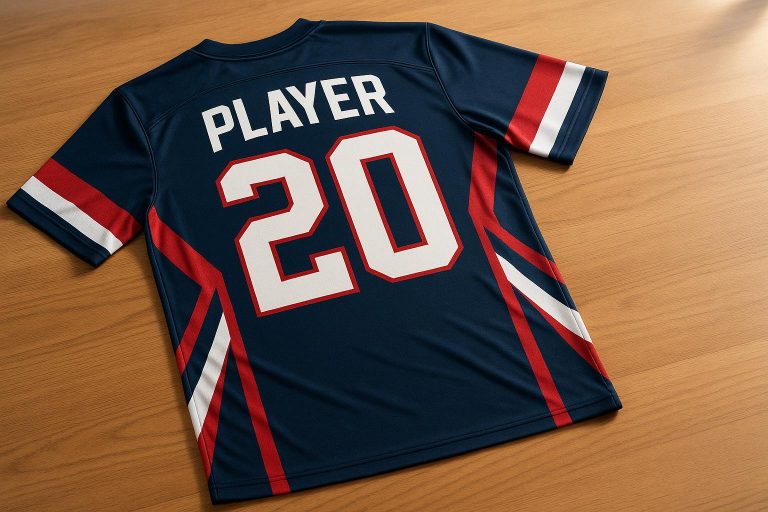
Proper name and number sizing on sublimated jerseys is key for readability, uniformity, and compliance with league rules. Missteps like poor contrast, incorrect proportions, or bad placement can make text hard to read and ruin the overall look. Here’s what you need to know:
- Readability Challenges: Thin fonts, busy patterns, and low contrast can obscure names and numbers.
- Sizing Variations: Youth jerseys require smaller text (e.g., 2-inch names, 6-inch numbers), while adult sizes need larger dimensions (e.g., 2.5–3-inch names, 8–10-inch numbers).
- Placement Tips: Names should sit 1.5–2 inches below the collar, with back numbers positioned to avoid seams or panels.
- Sport-Specific Needs: Football and soccer require larger back numbers for visibility, while basketball and baseball need precise placement to handle movement and button-front designs.
Templates, mockups, and testing ensure consistency across sizes and styles. Adjustments for youth, women’s cuts, and extended sizes maintain balance and clarity, ensuring your team looks professional on game day.
Common Problems with Name and Number Sizing
When it comes to sublimated jerseys, two main challenges often arise: ensuring the names and numbers are easy to read and avoiding sizing mismatches. These issues are critical to address for creating jerseys that look polished and professional.
How Sublimated Designs Impact Readability
Sublimation allows for bold, all-over prints, gradients, and intricate patterns that make jerseys visually striking. But these same design elements can sometimes make names and numbers harder to read.
For instance, low contrast between text and background can cause names and numbers to blend into the design. Imagine white numbers on a light blue gradient or dark text over a camouflage pattern – these combinations can make the text nearly invisible. Busy patterns can also interfere with the clarity of character strokes, making numbers appear thinner or smaller than they actually are.
Lighting and motion add another layer of complexity. A number that looks fine in an office setting might be hard to see under bright stadium lights or in the shadows of an indoor arena. Subtle color combinations, like light gray text on a slightly darker gradient, can lose their impact, especially if the outlines are too weak to provide contrast.
Font choice plays a big role here too. Thin or overly decorative fonts with intricate details might look great up close but become unreadable from the stands. A script font, for example, might seem elegant but could force viewers to strain their eyes to make out the text against a busy background.
Sizing Challenges for Youth and Adult Jerseys
Beyond readability, getting the sizing right for different jersey cuts is key to maintaining a cohesive look across the team.
Using the same name and number design for both youth and adult jerseys without adjustments can lead to problems. On youth jerseys, the text might appear oversized and cramped, while on adult jerseys, the same design might look too small and get lost on the larger surface area.
For youth jerseys, names typically need to be around 2 inches tall and span 7–9 inches, while adult jerseys usually require names to be 2–3 inches tall and span 8–12 inches.
The construction of the jersey can also affect how text appears. Seams, panels, and ventilation zones can distort names and numbers if they aren’t placed carefully. For example, on paneled designs, numbers might unintentionally overlap mesh zones or side panels, reducing their visibility. On youth jerseys, names placed too close to shoulder seams can curve awkwardly, while on adult jerseys, numbers that don’t fill the printable area can look disproportionately small.
Different jersey cuts add their own set of challenges. Women’s fitted designs and tapered torsos can cause names placed too high or wide to wrap around the shoulders or side seams. Larger adult sizes can make standard number sizes look undersized, while loose-fitting youth jerseys might bunch up during play, distorting smaller text and making it harder to read.
The front of the jersey presents additional complications. Team logos, league marks, sponsor details, and neck designs often leave limited space for numbers. In some cases, poor placement can lead to numbers being crowded near the collar or overlapping with other design elements. Baseball and softball jerseys with button fronts face unique issues, as front numbers can be split awkwardly by the placket.
To avoid these problems, it’s essential to review print-ready proofs at full scale and conduct distance tests. Creating samples for key sizes (like youth medium, adult medium, and 2XL) and photographing them on players or mannequins can help identify issues before mass production begins.
In team photos or game footage, inconsistent scaling becomes glaringly obvious. Some players might have names tightly wrapped around their shoulders, while others have large gaps above and below, making the team look mismatched. This often happens when text elements are treated as part of the overall design and scaled proportionally with the jersey, rather than being adjusted individually for each size.
Sizing Guidelines for Names and Numbers
Getting the measurements right is crucial for creating jerseys that are visually balanced, easy to read, and consistent across the entire team.
Recommended Sizes for Different Jersey Types
The ideal sizes for names and numbers depend on the sport and jersey style. Instead of sticking to fixed dimensions, aim for proportions that suit the design.
For basketball jerseys, adult back numbers are typically around 8 inches tall, with names about 2.5 inches high. Youth sizes scale down proportionally, with back numbers closer to 6 inches and names around 2 inches.
Football jerseys need larger numbers due to the viewing distance in stadiums and the fast pace of the game. Back numbers for adults are usually about 10 inches tall, while front numbers range from 8 to 10 inches. Names generally measure between 2.5 and 3 inches. Smaller numbers, like those on shoulders or sleeves, are around 3–4 inches to ensure clarity without overwhelming the design.
Soccer jerseys often feature back numbers at about 8 inches tall and names in the 2–2.5 inch range. Front numbers and numbers on shorts are typically between 3 and 4 inches.
Baseball and softball jerseys come with unique challenges like button-fronts and raglan seams. Names are generally 2.5–3 inches tall, front numbers are 3–4 inches, and back numbers range from 6 to 8 inches.
Here’s a quick reference table to summarize:
| Sport | Name Height | Front Number Height | Back Number Height | Notes |
|---|---|---|---|---|
| Basketball | 2.5 in (adult), 2 in (youth) | – | 8 in (adult), 6 in (youth) | Prioritize visibility for fast play |
| Football | 2.5–3 in | 8–10 in | 10 in | Larger numbers for easy viewing |
| Soccer | 2–2.5 in | 3–4 in | 8 in | Designed for slim-fit jerseys |
| Baseball/Softball | 2.5–3 in | 3–4 in | 6–8 in | Adjust for buttons and seams |
For women’s jerseys, which often feature a more tapered fit, names and numbers may need to be positioned slightly higher or made slightly narrower to prevent distortion along curved seams.
If you’re working with extended sizes like 2XL and up, increase measurements by 0.5 to 1 inch to maintain the same visual impact. Instead of relying on fixed dimensions, think in terms of how much space each element takes up relative to the jersey’s size. This ensures a consistent and unified look across all players.
Placement and Spacing Best Practices
Once you’ve nailed the sizes, proper placement and spacing are key to achieving a polished, professional look.
Vertical placement matters. For adult jerseys, names should sit about 1.5–2 inches below the back collar seam, avoiding awkward curves over the shoulders. On youth jerseys, a smaller gap (around 1–1.5 inches) works better. Leave 1–2 inches of space between the bottom of the name and the top of the back number to create a clean separation. Back numbers should also have 2–3 inches of clearance from the bottom hem to stay fully visible during play.
Horizontal placement requires centering text within the printable area, not just the jersey’s full width. Pay attention to side seams and mesh panels, which can limit usable space. Names should fill about 60–70% of the back panel’s width, ensuring they don’t look cramped or stretched.
Keep margins and gaps generous. Leave at least 0.5–1 inch of space between text and seams to maintain readability. For the gap between names and numbers, aim for 1–2 inches on adult jerseys and slightly less for youth sizes to keep the design balanced.
If the jersey has a complex sublimated background – like gradients or busy patterns – consider adding a subtle outline or stroke to the text. A 0.25–0.5 inch outline in a contrasting color can improve readability without clashing with the overall design.
For jerseys that include front numbers – common in football, soccer, and baseball/softball – balance is equally important. Center the numbers horizontally and place them 3–4 inches below the collar on adult jerseys to avoid interfering with logos or sponsor marks. On button-front baseball and softball jerseys, avoid splitting numbers across the placket. A smaller size or slightly off-center placement can resolve this issue.
Testing your design with full-scale mockups for key sizes ensures everything looks clear and proportionate. By following these guidelines consistently, you’ll create jerseys that not only look sharp on the field but also shine in team photos.
Sizing Adjustments for Different Sports and Body Types
Getting jersey name and number dimensions right means considering the sport, field size, and player body type. These factors directly impact readability and ensure your design stays consistent with the sizing principles already discussed.
Sport-Specific Sizing Requirements
Each sport presents unique needs for jersey layout and number visibility. Let’s break it down:
- Football and Soccer: Outdoor sports like football and soccer demand larger back numbers due to the field size and viewing distances. For adult football jerseys, back numbers are typically around 10 inches tall, ensuring visibility from 30–60 yards. Front numbers, often seen in close-up camera shots, range from 8 to 10 inches. Soccer jerseys, on the other hand, balance slim-fit designs with practicality. Back numbers measure about 8 inches, and names are usually 2–2.5 inches tall. To keep numbers visible during constant motion, they’re positioned high on the back, above the shorts’ waistband.
- Basketball: Played on a smaller court with closer spectators, basketball jerseys feature slightly smaller back numbers, around 8 inches tall. Indoor lighting helps with contrast, ensuring numbers are easy to read without overpowering the jersey design.
- Baseball and Softball: These sports come with their own challenges. Players are more stationary, spread across the diamond, so back numbers for adults are smaller – around 6 to 8 inches. Front numbers, placed on button-front jerseys, are about 3–4 inches tall and must avoid splitting across the button placket. To maintain visibility, numbers are positioned above where the fabric gathers at the waist.
Here’s a quick overview of adult sizing by sport:
| Sport | Key Consideration |
|---|---|
| Football | Large field demands big numbers; front numbers must be visible from high angles |
| Soccer | High placement ensures visibility above waistband; slim-fit limits width |
| Basketball | Smaller court allows smaller numbers; consistent lighting aids readability |
| Baseball/Softball | Avoid button placket; numbers stay above pant line for better visibility |
Youth jerseys adjust proportionally to suit shorter torsos, with tweaks to spacing and placement ensuring balance and legibility.
Adjusting for Youth, Women’s, and Extended Sizes
Beyond sport-specific requirements, jersey designs must also adapt to different body types and cuts to maintain clarity and visual consistency.
- Youth Jerseys: Shorter torsos mean spacing between the collar, name, and number needs to be compressed. For example, a back number positioned 4 inches below the collar on an adult jersey might need to move up to 3 inches on a youth size. Testing designs on the smallest size in an order helps catch spacing issues early.
- Women’s-Cut Jerseys: These jerseys often have tapered waists, narrower shoulders, and curved seams. Names placed too low or wide can distort due to the jersey’s shape. To avoid this, names are positioned slightly higher – about 1.5 inches below the collar – and spaced to accommodate curved panels. Back numbers might also be narrowed or shifted upward to stay centered on the shoulder blades.
- Extended Sizes: For sizes 2XL and above, names and numbers should scale proportionally, increasing by about 0.5 to 1 inch. Avoid horizontal stretching, as it distorts the design. Instead, scale the artwork evenly and ensure it fits within the printable area, leaving enough margin from seams and mesh panels.
Creating separate templates for women’s cuts and extended sizes ensures that names and numbers stay visually centered. Locking reference points, like the distance from the collar to the top of the number, while adjusting scaling for different size brackets, keeps alignment consistent across all sizes – from youth small to adult 4XL.
Digital mockups in multiple sizes help spot issues before production. If possible, print pre-production samples for each sport and size category. This allows you to check readability, on-body distortion, and potential conflicts with seams or panels. These steps help fine-tune your designs, reducing errors and avoiding costly reprints.
sbb-itb-4d95ad3
Using Templates and Workflows for Consistent Sizing
Getting name and number sizing right across all jersey orders requires a well-thought-out system. By setting up repeatable processes with clear dimensions, placement guidelines, and defined safe zones, you can ensure every jersey looks polished and professional – regardless of size. Digital templates and structured workflows eliminate guesswork and reduce the risk of expensive reprints. This approach sets the stage for creating precise and reliable templates.
Creating Standard Templates for Consistency
Templates serve as blueprints, capturing all measurements, placement rules, and safe zones to maintain uniformity across orders. Start by designing these templates at a 1:1 scale in your preferred design software, using U.S. imperial measurements that match your physical size charts. This helps prevent scaling errors when transitioning from digital design to physical production.
Establish fixed reference points for each size category, ensuring guidelines for adult jerseys differ from youth-sized ones. This keeps names and numbers readable and visually balanced. Clearly define safe zones to prevent designs from encroaching on seams, armholes, or ventilation areas – especially since sublimation prints often stretch to the fabric’s edges.
It’s also wise to create separate templates for different sports and jersey styles. For instance, a football jersey might need different number placements or scaling compared to a baseball uniform. Similarly, women’s cuts or extended-length designs might require additional adjustments for a proper fit. Many vendors provide detailed sizing and placement charts, including collar offsets and recommended number heights, which can serve as helpful references. Save these settings in reusable files to ensure consistency across all designs.
Once your templates are in place, the next step is to rigorously test them for accuracy on actual garments.
Testing and Refining Before Production
Before diving into full production, it’s crucial to print physical samples on real jersey blanks. While digital mockups can catch obvious mistakes, only physical testing can reveal how sublimation ink interacts with fabric stretch or how designs align along curved seams and during movement.
Order prototypes for various sizes, including youth, adult, and extended fits. Measure key reference points to confirm placement accuracy and evaluate the fit on mannequins or live models to identify any necessary tweaks.
"I ordered some prototypes so I could gauge their wear and make some tweaks. What they sent were above expectation and I’m looking forward to the next set I’m ordering." – Duane R.
Keep a detailed log of any adjustments made during this testing phase. Test for edge cases, like long names, special characters, or triple-digit numbers, to ensure your templates can handle all variations. If issues arise with custom sizes or specific jersey styles – like design misalignments – integrate these fixes into your standard templates for future use.
How Wooter Apparel Handles Name and Number Sizing

Wooter Apparel takes the hassle out of sizing for custom jerseys by relying on their tried-and-true templates and expert design team. These templates are tailored to meet the unique needs of different sports, body types, and league standards, solving many of the challenges that come with sublimated jersey design. The result? A smooth ordering process and professional-looking jerseys in every size.
Even if you’re not a graphic designer, Wooter Apparel’s free custom design service ensures your jerseys look polished. Their team is well-versed in the technical aspects of sublimation printing, such as how fabric stretch can affect text readability and the specific sizing requirements for various sports.
Using Wooter Apparel’s Custom Templates
Wooter Apparel’s templates are pre-configured with sport-specific sizing standards, automatically adjusting proportions to keep designs consistent across sizes – from youth medium to adult XXL. These templates are based on established standards for popular sports like basketball, football, baseball, and soccer, ensuring every jersey maintains its visual balance.
Their design team often recommends block or varsity-style fonts for clarity, even when stretched across different fabric types. They also ensure strong contrast between text and background colors for maximum visibility. Names are typically placed 2 to 3 inches below the collar, with automatic centering that works for different necklines, including crew necks, V-necks, and athletic collars.
Widths for names are adjusted based on jersey size to avoid distortion. For instance:
- Smaller jerseys (XS–S): 7–8 inches wide
- Medium-sized jerseys (M–L): 9–10 inches wide
- Larger jerseys (XL and up): 11–12 inches wide
This proportional scaling ensures that text looks natural and legible, no matter the size. These standards are applied consistently across all team apparel.
Maintaining Consistency Across All Team Apparel
When you order from Wooter Apparel, you get more than just jerseys – you get a cohesive look for your entire team. Whether it’s jerseys, shorts, or warmup gear, the same design elements and sizing standards are applied across the board, ensuring a unified appearance.
Even reversible jerseys are designed with precision, so names and numbers align properly on both sides and remain easy to read. Women’s and youth jerseys are tailored to account for differences in body shapes, with adjustments for torso lengths and shoulder widths, while extended sizes are scaled proportionally to maintain the same polished look.
Since sublimation embeds these designs directly into the fabric, Wooter Apparel’s team carefully reviews each order before production. They address issues like overly long names or numbers that might interfere with seams, ensuring every detail is perfect before your jerseys are made.
Conclusion
Getting proportional scaling right is key to avoiding awkward distortions or cramped designs. Studies indicate that the height of letters and numbers can differ by 0.5 to 2 inches between youth and adult jerseys, ensuring the design fits appropriately across all sizes.
Another crucial factor is maintaining visual balance. Text placement should look natural, with proper spacing from collars, seams, and panels. Adjusting the width and height of elements based on fabric dimensions ensures they remain readable, whether viewed up close on the court or from the stands during a game.
Templates play a huge role in keeping designs consistent across multiple orders and seasons. They lock in sport-specific standards while automatically adjusting proportions as jersey sizes change. This ensures every jersey – whether it’s a youth small, a women’s fitted cut, or an extended size – looks polished and professional.
Testing sizes on physical samples is a smart step to catch potential issues, like overly narrow text or poor color contrast, before production begins. This proactive approach helps avoid costly mistakes and ensures the final product is both functional and visually appealing.
Having expert design support can make all the difference. Designers experienced in sublimation printing know how fabric stretch impacts readability and which fonts work best on different materials. They can spot potential problems – like text overlapping seams or numbers becoming unclear when stretched – well before production starts.
Ultimately, proper sizing ensures your jerseys look unified and professional. Designs that meet league standards and stay legible during games begin with careful attention to scaling, balance, and workflow consistency. Whether outfitting a youth recreational league or an adult competitive team, these principles guarantee your sublimated jerseys deliver both style and practicality.
FAQs
How can I make sure names and numbers on sublimated jerseys are easy to read, even with busy designs or low contrast?
To make sure names and numbers on sublimated jerseys are easy to read, focus on contrast and placement. Choose bold, high-contrast colors that pop against the jersey’s background. For instance, light-colored text works well on dark backgrounds, and dark text stands out on lighter ones. Steer clear of placing text over overly detailed or busy patterns, as this can make it hard to read.
Stick to simple, clean fonts that are legible from a distance. Numbers should generally be larger than names, with both sized appropriately for the jersey. Pay attention to alignment and spacing, as these details enhance readability and give the design a polished look.
What should I consider when adjusting the size of names and numbers on sublimated jerseys for different sports and jersey styles, like women’s or youth sizes?
When designing sublimated jerseys, tweaking the size of names and numbers takes some careful thought to strike the right balance between readability and fit. Several factors come into play, such as the sport, the jersey’s cut, and the intended audience. For instance, youth jerseys typically use smaller fonts to suit their smaller sizes, while women’s cuts might require adjustments to match their more tailored designs.
Proportionality and visibility are equally crucial. Numbers need to be big enough to stand out during gameplay but not so oversized that they dominate the overall design. Pay close attention to seams and other design elements to prevent any overlap or distortion. Fine-tuning these details ensures the jerseys not only look polished but also fulfill the practical needs of the team.
Why should I test sublimated jersey designs on physical samples before placing a bulk order, and what issues should I watch for?
Testing your sublimated jersey designs on physical samples is a crucial step to ensure the finished product turns out exactly how you envisioned. Sublimation often causes colors to look different on fabric compared to how they appear on a screen, and the placement or sizing of names and numbers might not translate as expected once printed.
During this phase, focus on potential problem areas like color accuracy, alignment of names and numbers, and font readability. Make sure the design fits the jersey’s dimensions properly, and double-check that all elements are positioned where they should be. Taking this extra step can save you from expensive errors and guarantees your team’s jerseys will have a polished, professional look.