
Clear, readable numbers on sports uniforms are essential for players, referees, fans, and broadcasters. Here’s what you need to know:
- Size Requirements: Different leagues have specific rules. For example, high school football mandates front numbers to be at least 8 inches tall and back numbers 10 inches tall. FIFA requires back numbers to be 25–35 cm in height.
- Color Contrast: Numbers must strongly contrast with the jersey for visibility. A 4.5:1 contrast ratio is recommended to ensure clarity under various lighting conditions.
- Placement: Numbers should be centered and positioned for easy recognition, like high on the chest or between the shoulders.
- Material and Printing: Durable methods like sublimation or screen printing ensure numbers stay legible throughout the season.
- Allowed Numbers: Leagues have restrictions, such as NFL position-specific ranges or NBA disallowing the number 69.
- Accessibility: Avoid poor color combinations (e.g., red/green) to accommodate colorblind fans and players.
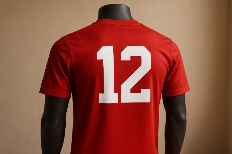
Banned Jersey Numbers in Sports
1. Required Number Sizes by League
Uniform number sizes are essential for ensuring players’ numbers are visible during games, and each league has its own set of rules to meet this need. These standards can vary depending on the level of competition and the sport.
In high school football, clear player identification is crucial, especially during fast-paced action. To meet this need, front jersey numbers must be at least 8 inches high, while back numbers must reach 10 inches, with number bars measuring about 1.5 inches wide. These dimensions are designed to ensure visibility from all angles.
For collegiate sports, the size requirements differ based on the sport:
| Sport | Front Size | Back Size | Additional Notes |
|---|---|---|---|
| NCAA Basketball | Less than 4 inches | More than 8 inches | Numbers must appear on both sides |
| NCAA Baseball | Not specified | At least 6 inches | Numbers are required on the back only |
Professional leagues also enforce strict standards. For example, NBA players are limited to 1- or 2-digit numbers, with a maximum value of 99. This uniformity ensures consistent player identification, especially during televised games.
At Wooter Apparel, we take these regulations seriously. Our custom uniform designs are crafted with these specific requirements in mind, guaranteeing compliance for teams at all levels of play.
2. Number and Background Color Rules
Getting the contrast right between jersey numbers and their background is key to making them easy to read. The numbers need to maintain at least a 4.5:1 contrast ratio with the jersey’s background color to ensure they stand out clearly.
The NCAA emphasizes this by requiring that numbers must be “clearly in distinct contrast with the color of the jersey”. As uniform designs have become more complex, this rule has gained even more importance.
Lighting conditions can dramatically affect how visible numbers are during games. To address this, teams should follow these recommendations for different environments:
| Environment | Recommended Colors | Minimum Light Requirements |
|---|---|---|
| Outdoor Daytime | Neon orange, yellow, green | 500 lux (soccer fields) |
| Night Games | Retroreflective materials | 700 lux (baseball fields) |
These suggestions help ensure numbers remain readable no matter the setting.
Why does this matter so much? Around 1 in 12 men and 1 in 200 women have some form of color vision deficiency. To make sure everyone can read the numbers easily, teams should:
- Stick to one solid color for numbers – skip outlines and shadows.
- Avoid relying only on color to differentiate numbers.
- Test how numbers look under both natural and artificial lighting.
Combining these color contrast principles with proper number size and placement ensures better visibility for players, officials, and fans alike.
At Wooter Apparel, we take these guidelines seriously. When designing uniforms, we incorporate sport-specific regulations while ensuring numbers are visible under all playing conditions.
As design expert JRHcreative puts it:
“To this day, communication grounds me in my best practices color: it’s about contrast and nothing else. Showing depth? Lean on contrast. Pairing complementary colors? Lean on contrast. Increasing the legibility of type? Lean on contrast.”
For outdoor venues, using cooler lighting can also improve visibility.
3. Where to Place Numbers on Uniforms
Placing numbers on sports uniforms is all about making them easy to see while meeting league regulations. Here’s a closer look at how different sports handle these requirements.
In the NBA, players’ numbers appear on both the front and back of their jerseys with specific size rules:
- Front numbers: At least 6 inches tall
- Back numbers: At least 8 inches tall
- Minimum width: 0.75 inches
For MLB, back numbers must be at least 6 inches tall, while front numbers are optional.
Football uniforms, particularly at the high school and college levels, have detailed size and placement rules:
| Location | Size Requirements |
|---|---|
| Front | 8 inches |
| Back | 10 inches |
Key Placement Guidelines
Beyond just size, the way numbers are positioned on uniforms ensures they remain readable during the game. Here’s how it’s done:
- Front Number Positioning: Numbers should be placed high on the chest to avoid being too low.
- Back Number Placement: Numbers are centered between the shoulders, with player names above them in letters at least 2 inches tall.
- Movement and Gear Considerations: Numbers should stay legible even when players are in motion or wearing protective equipment.
At Wooter Apparel, we take these placement rules seriously. Every custom design we create ensures numbers are easy to read, no matter the angle or how intense the game gets. By combining proper placement with the right size and color choices, we help players and fans stay connected to the action.
4. Allowed Number Ranges by Sport
Every sport has its own set of rules when it comes to the numbers players can wear. These guidelines go beyond just size and color – they include specific number ranges that are allowed.
Professional League Number Ranges
Here’s a breakdown of number rules across major leagues:
| League | Available Numbers | Key Restrictions |
|---|---|---|
| NFL | 0-99 | Position-specific ranges (e.g., quarterbacks: 0–19) |
| NBA | 0-99 | Number 69 is not allowed |
| MLB | 1-99 | Number 42 is retired across the league |
| NCAA Football | 0-99 | A maximum of two players can share the same number |
In 2023, the NFL introduced a new rule allowing non-linemen to wear the number 0. This change gave teams more flexibility while still maintaining position clarity.
These regulations not only ensure consistency but also pave the way for unique traditions and memorable moments tied to jersey numbers.
Special Cases and Traditions
In baseball, tradition often dictates that position players wear single-digit numbers, while numbers above 60 are uncommon. This practice dates back to the New York Yankees and has become a hallmark of the sport.
“Numbers become synonymous with a player’s identity and as a result, many choose to attribute meanings to their numbers. For athletes at all levels, the number you wear is a source of pride and a form of deeper self-expression.” – Zach Bayfield, Columnist
Notable Exceptions
There have been some interesting exceptions to the usual number rules over the years:
- Historical Commemorations: In 1963, West Virginia’s Chuck Kinder wore No. 100 during NCAA football to celebrate the state’s centennial.
- Player Preferences: At A.C. Milan, some players opted for numbers that reflected their birth years when their preferred numbers were unavailable. For example, Ronaldinho chose 80, and Mathieu Flamini wore 84.
At Wooter Apparel, we specialize in helping teams navigate these number requirements while designing custom uniforms that meet league standards. Our process ensures compliance with official rules while incorporating team preferences, resulting in uniforms that are both functional and distinctive.
Recent Changes
Starting with the 2023–24 season, NCAA basketball players are now allowed to wear any number from 0 to 99. This marks a shift from the previous rule, which restricted players to numbers containing only the digits 0–5. Changes like these highlight the need for uniform designs that respect tradition while adapting to evolving regulations.
sbb-itb-4d95ad3
5. Materials and Printing Methods
When it comes to uniform numbers, ensuring they remain clear and readable throughout a season requires careful attention to materials and printing methods that can handle the demands of gameplay.
Advanced Printing Techniques
Sublimation printing has become a popular choice for sports uniforms, especially when working with synthetic fabrics like polyester. This process embeds dye directly into the fibers, creating numbers that resist cracking, peeling, and fading over time. At Wooter Apparel, we rely on fully sublimated designs to deliver durable and sharp custom team uniforms.
For natural fabrics, screen printing continues to be a reliable option. This method uses plastisol ink, which sits on the fabric’s surface, offering vibrant colors and exceptional durability. It also holds up well under various lighting conditions.
How Material Choices Affect Printing
The type of fabric plays a crucial role in determining the effectiveness of printing methods:
| Material Type | Best Printing Method | Durability Rating | Color Vibrancy |
|---|---|---|---|
| Polyester | Sublimation | Excellent | High |
| Cotton | Screen Printing | Very Good | High |
| Poly-Cotton Blend | Heat Transfer Vinyl (HTV) | Good | Medium |
| Synthetic Blends | Direct-to-Film (DTF) | Very Good | High |
Each material interacts differently with printing methods, influencing how well numbers endure game conditions.
Key Application Techniques
Heat transfer vinyl (HTV) is a practical option for smaller team orders. When applied correctly, it ensures a clean and professional look. To achieve the best results:
- Pre-heating: This step removes moisture from the fabric, preparing it for application.
- Temperature Control: Use precise heat settings tailored to the fabric type.
- Pressure Application: Apply consistent, even pressure across the entire design.
- Cooling Period: Allow the material to cool completely before handling to ensure proper adhesion.
These steps help maximize the durability of HTV-applied numbers.
Emerging Printing Methods
Direct-to-film (DTF) printing is gaining traction for medium-sized orders. It offers excellent wash durability and produces vibrant, long-lasting designs.
Ensuring Longevity and Quality
To keep uniform numbers readable on the field, teams need to account for several factors: weather exposure, frequent washing, on-field lighting, physical contact during games, and compliance with league regulations. For large-scale orders (50+ uniforms), screen printing provides a cost-effective solution while maintaining a high-quality finish.
6. Making Numbers Easy to Read for All Fans
Roughly 300 million people around the world live with color blindness, making thoughtful design choices essential for an inclusive sports experience.
One of the key factors in improving readability is font selection. Sans-serif fonts like Arial, Helvetica, and Verdana are particularly effective for ensuring numbers are visible under different lighting conditions and from various viewing distances. On the flip side, italics and decorative fonts should be avoided as they can compromise clarity.
Contrast between numbers and uniform backgrounds is another critical consideration. According to WCAG guidelines, a contrast ratio of at least 4.5:1 is recommended for general text. For smaller text, aim for a contrast ratio of 7:1, while larger or bold numbers can stick to the 4.5:1 benchmark.
Accessibility expert Veronica Lewis emphasizes the importance of contrast:
“Color plays a significant role in how I access visual content, especially when it comes to locating items or information of interest, and poor contrast can render items unreadable.”
Given that around 8% of men and 0.5% of women experience some form of color blindness, it’s wise to avoid tricky color combinations like red and green, blue and yellow, or any shades that lack clear distinction.
Enhancing Number Visibility
Beyond contrast and font selection, several design tweaks can make numbers easier to read:
- Add Borders: Use contrasting outlines around numbers to make them pop.
- Optimize Spacing: Leave enough space around numbers to prevent crowding.
- Ensure Consistency: Maintain uniform proportions for numbers on the front and back of uniforms.
At Wooter Apparel, we take these principles to heart. Our sublimated designs allow for precise adjustments to contrast and color combinations, ensuring that numbers remain sharp and readable throughout the season.
Uniform numbers should also:
- Be clearly distinguishable, especially between similar digits.
- Feature bold, strong strokes for better visibility.
- Maintain consistent sizing and spacing for multi-digit numbers.
7. Number Design Mistakes to Skip
When it comes to uniform design, it’s not just about following the rules – avoiding common design missteps is just as important for ensuring clear, readable numbers.
Mistakes in number design can negatively impact performance during games. Ty Halpin, the NCAA’s associate director for playing rules and officiating, points out:
“It’s been a growing concern over the last 10 years or so, just the number of different types of uniforms we see across all sports…But we’ve kind of come to that dividing line where things may have gone too far in some respects and are now creating a competitive issue.”
Interestingly, some coaches intentionally choose hard-to-read numbers to gain a competitive advantage. Ira Thor, a sports information director at Division III New Jersey City University, shared:
“We’ve had coaches tell SIDs in a couple instances that’s exactly why they do it.”
To address this, the NCAA now reviews uniforms before major tournaments to ensure numbers are easy to read.
Design Elements That Hurt Readability
- Font Choices That Miss the Mark
Fonts like italics, slanted styles, small caps, or condensed typefaces can make numbers harder to read [43, 60]. - Overwhelming Visual Elements
Too many logos or design features can clutter the uniform, taking attention away from the numbers [4, 62]. - Poor Color and Contrast
Numbers should stand out with strong color contrast against the uniform background [2, 61].
These design flaws not only compromise clarity but also detract from the overall professionalism of the uniform. At Wooter Apparel, we prioritize clean, simple designs that maintain number readability while reflecting a team’s identity. Our focus on minimalistic styles ensures a polished and functional look.
“There are rules in the books. Just abide by them.”
With stricter standards now in place, manufacturers are stepping up to ensure numbers are clear and easy to identify, reinforcing the commitment to fair play and proper player recognition.
8. Meeting Rules Across Different Sports
Uniform numbers aren’t just about aesthetics – they need to meet specific size and placement rules that vary by sport while maintaining universal design standards. Let’s explore how to balance these requirements across different sports.
Size Requirements Across Sports
Each sport sets its own guidelines for number sizes. For instance, high school football requires numbers to be at least 8 inches tall on the front and 10 inches tall on the back. Meanwhile, FIFA specifies back numbers must measure between 10–14 inches in height and be 1.2–2 inches thick. These differences highlight the need for careful attention to league-specific regulations.
Universal Design Standards
To ensure compliance across sports, certain universal design principles come into play:
Color Contrast Requirements
Numbers must have a minimum contrast ratio of 4.5:1 against the uniform background. This ensures they’re easy to see under various lighting conditions.
Material and Application
Numbers should be either permanently sewn or ironed onto uniforms in a contrasting color. This not only enhances durability but also ensures visibility aligns with sport-specific rules.
“Web content should be easy to see or hear: To ensure content is easy to see, it’s important to consider a font’s family, size, spacing, and color.”
- accessiBe Team
Practical Compliance Tips
Here are some actionable steps teams can take to meet these standards:
- Double-check spacing requirements for your league.
- Use readable fonts that maintain clarity at different sizes.
- Avoid reflective materials, as they can hinder visibility.
- Ensure consistent spacing and alignment on both the front and back of uniforms.
- Maintain at least a quarter-inch border width for adequate contrast.
Don’t forget to consult local rules for any regional variations. These small details can make a big difference in maintaining compliance and ensuring players are easily identifiable on the field.
Conclusion
Throughout this guide, it’s clear that legible uniform numbers play a crucial role in maintaining the professionalism and integrity of any sports team. Ty Halpin, NCAA associate director for playing rules and officiating, underscores this point:
“It’s been a growing concern over the last 10 years or so, just the number of different types of uniforms we see across all sports…But we’ve kind of come to that dividing line where things may have gone too far in some respects and are now creating a competitive issue.”
This statement emphasizes the importance of prioritizing clarity and functionality over fleeting design trends.
To ensure compliance and practicality, teams should focus on a few key elements: sticking to FIFA-recommended sizes, selecting fonts and placements that are easy to read, and choosing colors that provide strong contrast. Durable application methods, like high-quality sublimation printing, also ensure that numbers remain crisp and visible throughout the season.
Wooter Apparel offers custom uniform solutions that balance creative designs with league requirements, helping teams achieve a polished look without sacrificing compliance. By following these principles, teams can create uniforms that not only look great but also enhance player recognition and game management.
When done right, uniform numbers serve as more than just identifiers – they elevate the team’s overall image and ensure clarity from every angle on the field.
FAQs
Why is color contrast important for making sports uniform numbers easy to read?
Color contrast is a crucial factor in making the numbers on sports uniforms easily visible, even from a distance. Using high contrast – like dark numbers on a light background or light numbers on a dark background – ensures that players, referees, and spectators can quickly identify athletes during the fast action of a game. This clarity is essential for keeping things fair and organized in competitive sports.
To achieve this, designers rely on a contrast ratio, which measures the brightness difference between the number color and the background. For smaller numbers, a contrast ratio of at least 4.5:1 is recommended, while larger numbers can work with a 3:1 ratio. These guidelines help ensure that the numbers are clear for everyone, including those with visual impairments. Tools like contrast checkers are handy for testing color combinations and making sure they meet these standards.
What are the most common mistakes teams make when designing uniform numbers, and how can they be prevented?
Teams sometimes make the mistake of opting for fonts that are hard to read, using numbers that are too small, or choosing colors that blend poorly with the uniform. These choices can make it tough to see the numbers during games, leading to confusion for players, referees, and fans alike.
To avoid these pitfalls, stick to a bold, easy-to-read font that’s visible from a distance. Ensure the numbers are large enough to meet league requirements – usually at least 4 inches tall – and select contrasting colors to improve clarity. Getting players involved in the design process can also lead to uniforms that are both practical and visually appealing.
How do printing methods affect the durability and visibility of numbers on sports uniforms?
The way numbers are printed on sports uniforms significantly impacts their durability and visibility. Screen printing stands out as a favorite because it holds up well under tough conditions. Its vibrant colors and sharp details remain intact, even after frequent washes and heavy use, making it a reliable option for sports uniforms.
For those seeking rich colors and intricate designs, sublimation printing is a solid choice. It’s particularly well-suited for technical sportswear, though proper application is essential to ensure the results last. Meanwhile, newer techniques like direct-to-film (DTF) printing are becoming more popular for their durability and ability to maintain clarity over time.
When deciding on a printing method, factors like the sport, uniform design, and frequency of use should guide your choice. A well-executed printing process ensures the numbers stay clear and professional, boosting both functionality and team pride.