
Getting the right logo size for youth and adult uniforms ensures a polished, professional look across all sizes. A single design doesn’t work for everyone – logos must be resized and repositioned to suit the proportions of different age groups. Youth uniforms require smaller logos and adjusted placement due to shorter torsos, while adult uniforms accommodate larger designs.
Key Points:
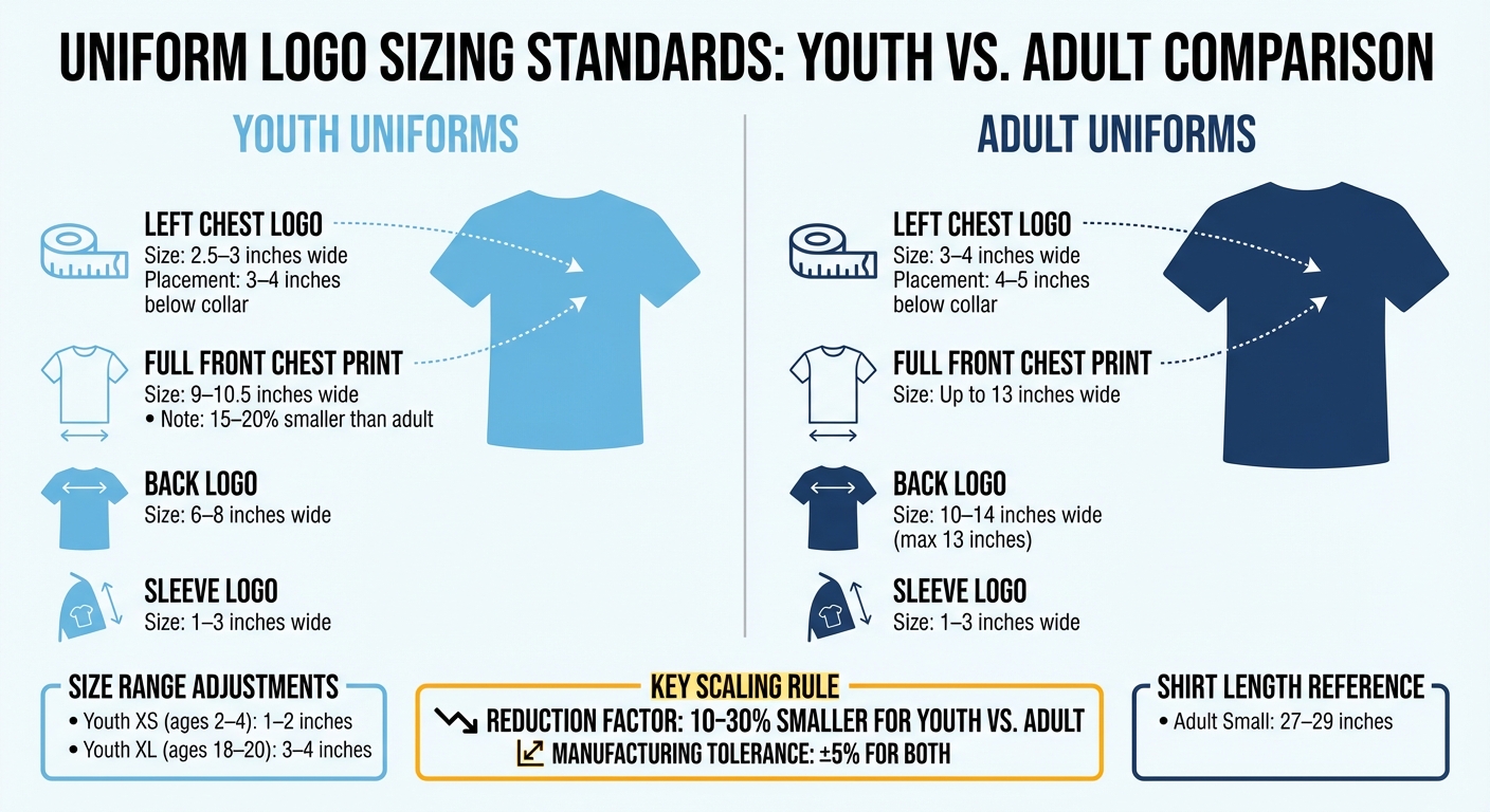
- Youth Uniforms: Logos are reduced by 10–30% compared to adult sizes. Full chest prints measure 9–10.5 inches wide, while left chest logos are 2.5–3 inches wide. Logos are placed 3–4 inches below the collar.
- Adult Uniforms: Larger logos (up to 13 inches wide) are used, with placement 4–5 inches below the collar. Structured shoulders make centering easier.
- Proportional Adjustments: Youth XS needs logos as small as 1–2 inches, while Youth XL can handle 3–4 inches; using crew neck sizing kits helps verify these dimensions. Adult sizes allow for more expansive designs.
Youth vs Adult Uniform Logo Sizing Guide: Dimensions and Placement Standards
Youth Uniform Logo Sizing Standards
Getting logo sizing right for youth uniforms is all about balancing branding consistency with appropriate scaling and placement.
Logo Placement Guidelines for Youth Uniforms
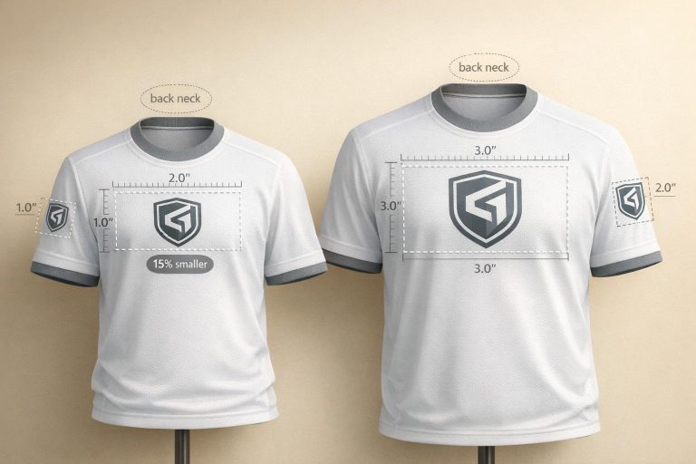
Youth uniforms need smaller logos to fit their proportions. For left chest logos, the ideal size is 2.5–3 inches wide, while full front chest prints should measure 9–10.5 inches wide – about 15–20% smaller than what’s used for adults. On the back, logos typically range from 6–8 inches wide.
Placement is just as important as size. For youth tops, logos should sit 3–4 inches below the collar to accommodate shorter torsos, ensuring the design stays centered and doesn’t look awkwardly low. Sleeve logos, however, remain consistent at 1–3 inches wide, as arm proportions don’t vary as much as torso dimensions.
These adjustments ensure logos look balanced and professional across all youth sizes.
Proportional Adjustments for Smaller Sizes
Scaling logos proportionally is key to maintaining a polished appearance across the youth size range. For a Youth XS (ages 2–4), logos should measure 1–2 inches, while a Youth XL (ages 18–20) can handle 3–4 inch logos. Standard youth t-shirt templates generally scale to 10 inches tall by 9.5 inches wide , which can be verified using reversible t-shirt sizing kits, providing a baseline for designs across sizes.
Custom youth hooded sweatshirts call for even smaller designs. The recommended size is 7.5 inches tall by 9.5 inches wide to avoid overpowering the garment’s limited surface area. Without these adjustments, logos can look oversized, distorted, or out of place, disrupting the overall design of the uniform.
sbb-itb-4d95ad3
Adult Uniform Logo Sizing Standards
When it comes to maintaining consistent branding, understanding the dimensions for adult logos is key. Adult uniforms offer more space, making them ideal for larger logos that convey a polished, professional appearance. Unlike youth uniforms, which require scaled-down designs, adult uniforms benefit from these expanded dimensions, emphasizing the importance of tailoring logo sizes to fit each age group appropriately.
Logo Placement Guidelines for Adult Uniforms
For adult uniforms, the logo should be placed 4–5 inches below the collar. This positioning ensures the design is centered on the longer torsos typical of adult garments. For instance, an Adult Small shirt, which typically measures 27–29 inches in length, provides ample room for a logo to be positioned proportionally. Adult uniforms, such as custom football uniforms with lengths reaching up to 29 inches and featuring structured shoulders, make it easier to achieve balanced and consistent logo placement. The structured shoulders also serve as reliable reference points for alternative placements.
| Adult Shirt Size | Chest Width (inches) | Length (inches) |
|---|---|---|
| XS | 16–18 | 26–28 |
| S | 18–20 | 27–29 |
| M | 20–22 | 28–30 |
| L | 22–24 | 29–31 |
Youth vs. Adult Logo Sizing Comparison
Key Differences in Dimensions
One of the most striking distinctions between youth and adult logo sizing lies in the overall scale. Youth uniforms are smaller, so their logos need to be reduced in size to maintain a balanced look. For instance, logos on the left chest of youth uniforms typically measure between 2–3 inches, while adult uniforms use slightly larger logos, ranging from 3–4 inches. This careful adjustment ensures that logos neither dominate youth uniforms nor appear too small on adult apparel.
Here’s a quick breakdown of the differences:
| Placement Category | Youth Uniform Dimensions | Adult Uniform Dimensions | Adjustment Factor |
|---|---|---|---|
| Left Chest Logo | 2–3 inches | 3–4 inches | 10–30% Reduction |
| Manufacturing Tolerance | ±5% | ±5% | N/A |
| Fabric Type | Flexible/Stretchy | Flexible/Stretchy | High Elasticity |
This table highlights that youth logos generally require a 10–30% reduction in size to maintain visual harmony. Designers use these adjustments to ensure logos look proportionate across all uniform sizes.
Scaling Percentage Reductions
To resize logos for youth uniforms, designers often reduce the logo size by 10–30% to match the smaller garment dimensions. For example, a logo designed for an adult Large might need a 25% reduction to fit properly on a Youth Medium.
Several factors influence the exact percentage of reduction. One key factor is the fabric’s stretchability – since many custom uniforms use stretchy materials, players may sometimes wear a size smaller than expected. Additionally, the uniform’s cut plays a big role. Men’s, women’s, and youth designs have different torso lengths and widths, so logo placement and scaling must be adjusted accordingly to ensure everything looks just right.
Best Practices for Proportional Scaling
General Guidelines for Logo Scaling
Getting logo scaling right does more than just improve aesthetics – it strengthens brand identity across all uniform sizes. A good rule of thumb is to scale logos to fill about two-thirds of the print area. This strikes a balance between making the logo noticeable and avoiding an overcrowded look. Always use the maximum print areas as a guideline, but remember to scale down slightly to maintain proper proportions.
Pay close attention to collar spacing for a balanced design. For youth uniforms, position the design 3–4 inches below the collar. For adults, this spacing increases to 4–5 inches for proper centering.
The type of fabric also affects scaling decisions. Stretchable materials can make logos appear larger when worn, as the fabric stretches with movement. To avoid distortion, test your designs on sample fabrics first. This step ensures the logo looks consistent, even when worn, tying back to the importance of uniformity mentioned earlier.
Consistent Branding Across Sizes
Consistency in branding means nailing the details of logo placement for every uniform size. For full front chest prints, adult sizes typically use dimensions between 6–10 inches, while youth uniforms require smaller prints, around 2.5–3 inches. Secondary logos on the left chest are sized 3–4 inches for adults and 2.5–3 inches for youth. Back designs offer the largest canvas, with adult sizes ranging from 10–14 inches (maximum width of 13 inches) and youth sizes from 8–10 inches.
Prototyping on actual garments is crucial before finalizing your design. For example, compare a youth XL with an adult Small. While their chest widths are often similar (18–20 inches), their lengths differ – youth XL measures 25–27 inches, while adult Small runs 27–29 inches. Testing on real garments gives a clearer picture of how logos will look on different body types, allowing you to fine-tune the design for consistency across all sizes.
These steps ensure Wooter Apparel delivers perfectly scaled logos for custom long sleeve crew neck t-shirts and other uniforms, keeping your team’s branding sharp and cohesive.
Wooter Apparel‘s Custom Logo Sizing Solutions
Benefits of Wooter Apparel’s Custom Uniforms
Wooter Apparel takes the hassle out of logo placement with its custom uniform solutions, built on proportional scaling principles. Instead of simply shrinking adult-sized designs for youth uniforms, Wooter provides separate sizing charts for men, women, and youth. This ensures logos are perfectly scaled for each garment, delivering a consistent and polished look across all sizes.
Their fully sublimated designs embed logos directly into the fabric, so colors stay vibrant and logos remain intact – no cracking or peeling, even after many washes. The slightly stretchy fabric adds comfort and flexibility, and with a 5% manufacturing tolerance, you can count on reliable fit and design consistency.
Another standout feature is Wooter Apparel’s free custom design service, which handles logo placement and scaling to perfection. As James C., a verified buyer, shared:
Jason was prompt and helpful.
Customer feedback speaks volumes, with Wooter Apparel earning a 4.9/5 star rating from 1,355 reviews. Their attention to detail and commitment to quality make their logo scaling solutions a standout choice for teams of all sizes.
Examples of Wooter Apparel Products
Wooter Apparel offers a variety of products tailored to meet different team needs. For example, their Custom V-Neck Basketball Jerseys start at $16.99 per item and cater to all age groups. Thanks to sublimated construction, logos are precisely placed on every size.
For teams looking for an all-in-one solution, the MVP Team Uniform Package is available for $199.99. This package includes jerseys, shorts, and warmups, all designed with coordinated logo sizing to maintain a unified appearance.
To make the process even smoother, Wooter offers sizing kits before placing a full order. This option is especially helpful since custom products cannot be returned or exchanged. Alex A., another satisfied reviewer, noted:
Got my 120 players outfitted in 3 weeks. Sizing was a bit bigger than my previous uniforms but other than that no complaints
Conclusion
Getting logo scaling right for youth and adult uniforms involves more than just shrinking or enlarging the design. A reduction of about 20–25% for youth logos compared to adult versions helps maintain a balanced look. This ensures the branding remains professional and recognizable without overwhelming smaller garments.
Equally important is precise logo placement. Poor positioning – too high or too low – can throw off the uniform’s overall appearance, so careful adjustments are key to achieving a polished look.
Transitional sizes like youth XL present unique challenges. Even if the chest width is similar to an adult small, the shorter length of youth XL requires a different scaling approach. For teams with mixed age groups, offering both youth XL and adult XS options with harmonized logo scaling ensures a seamless, cohesive appearance across all players.
Proportional scaling is the foundation of consistent branding. When logos occupy a similar visual space on both youth and adult uniforms, the entire team appears unified and professional, no matter the size differences. By focusing on these proportional adjustments, teams can achieve a polished, unified look across every uniform size.
FAQs
How do I choose the right youth logo reduction percentage?
When adjusting logo sizes for youth uniforms, it’s essential to scale adult logos proportionally. For instance, if an adult logo measures 4 inches, reducing it to around 2 inches can ensure it fits well on youth uniforms while maintaining visibility and balance. Always test the resized logo on the uniform to confirm it looks appropriate. Additionally, keep league regulations and placement guidelines in mind to ensure consistent branding. Typically, youth logos range between 2–2.5 inches wide, whereas adult logos are usually 3–4 inches wide.
What’s the best way to handle Youth XL vs. Adult S sizing?
When dealing with Youth XL and Adult S sizing, it’s essential to scale the logo proportionally for a balanced and professional appearance. Youth sizes need smaller logos to prevent the design from looking oversized, while adult sizes can accommodate larger logos without issue. Using mockups or samples to test placement ensures the logo remains clear and consistent. Tailoring the size and position of the logo for each category keeps the branding uniform and polished across all uniforms.
How does stretchy fabric change how big a logo looks?
Stretchy fabrics can sometimes alter the appearance of logos, especially when the material is pulled taut. This can cause large or detailed designs to look distorted, which might compromise their clarity and professional appearance. To keep logos looking sharp on stretch fabrics, smaller, strategically placed designs are often a better choice. Conducting tests and creating mockups can help ensure the logo maintains its intended look, allowing you to balance size, placement, and how the fabric behaves for consistent branding.