
Proper sleeve logo placement can make or break the look of a uniform. Here’s what you need to know:
- Why sleeve logos matter: They stay visible during movement, photos, and games, making them prime branding spots.
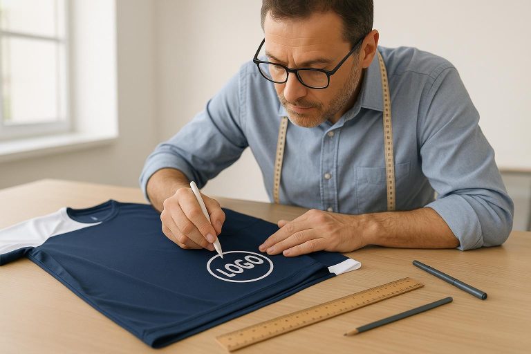
- Placement basics: Center logos on the outer sleeve, 1–2 inches above the hem for short sleeves or 2–3 inches below the shoulder seam for long sleeves.
- Size recommendations: Adult logos should measure 1–3 inches wide. Adjust for youth, women’s, or larger sizes to maintain balance.
- Tools for precision: Use tailor’s chalk, heat-resistant tape, and templates to ensure consistent placement.
- Avoid mistakes: Don’t place logos too close to seams or folds, and always test placement before production.
For a polished, professional look, consistency and attention to detail are key. Whether for sports teams or sponsors, proper logo positioning ensures visibility and compliance with league rules.
How To Print On Sleeves With A Heat Press | Sleeve Print Sizing, Placement & Positioning
Measurements and Positioning Basics
Getting the placement of a sleeve logo just right is essential for a clean, professional look. Consistency matters – every uniform should have its logo positioned in the same spot to maintain a polished, cohesive appearance.
Standard Sleeve Logo Measurements
To position the logo correctly, center it on the outer-facing part of the sleeve. Use the sleeve’s centerline as a guide – imagine or mark a straight line running from the shoulder seam down to the hem. For short sleeves, the logo should typically sit 1–2 inches above the sleeve hem, with 1.5 inches being the sweet spot for most adult garments.
Logo size should match the garment type. For adult shirts, a width of 1–3 inches usually works well. For youth and women’s shirts, reduce the logo size by about 20–30% and place it roughly 1 inch higher to ensure proper proportions. Larger garments, like XL and XXL sizes, may need the logo width increased by 0.5–1 inch to maintain visual balance.
| Garment Type | Logo Width | Vertical Placement | Special Notes |
|---|---|---|---|
| Adult Standard | 1–3 inches | 1–2 inches above the hem | Common sizing for most garments |
| Youth/Women’s | 2–3 inches | 1 inch higher than adult | Reduce size by 20–30% |
| XL/XXL | 3–4 inches | Same as adult placement | Increase width for better balance |
| Long Sleeve | 1–4 inches | Varies by design | Can extend up to 15 inches |
Accurate placement depends on having the right tools and techniques, which we’ll cover next.
Tools for Marking and Measuring
Precision is everything when it comes to logo placement, and the right tools make all the difference. Start by marking the sleeve’s vertical and horizontal centerlines using tailor’s chalk or a removable pencil. Heat-resistant tape is perfect for holding the logo in place. To maintain consistent spacing from the sleeve hem, paper templates – like a 1-inch spacer – are incredibly useful. For added stability, place a heat-press pillow or a trimmed mousepad under the sleeve to create a flat surface and avoid interference from seams.
Here’s a step-by-step process: Measure the sleeve length from the shoulder seam to the hem, mark 1–2 inches above the hem, and align this mark with the sleeve’s outer centerline. Secure the logo with heat-resistant tape to keep it in place.
For curved sleeves, it’s important to follow the natural contour of the arm. This ensures the logo stays equidistant from the front and back edges, keeping the placement visually balanced.
Logo Size and Sleeve Length Guidelines
When working with logo placement, it’s essential to consider both the size of the logo and the sleeve length. These details ensure your design looks professional and well-proportioned on the garment.
Logo Size Recommendations
For adult sleeve logos, aim for a width of 1–3 inches. If the design includes intricate details, you can extend the width to 4 inches. For youth and women’s garments, reduce the size by 20–30% compared to adult measurements, following the adjustments outlined earlier. Larger sizes may require further tweaks for balance.
Long-sleeve garments offer more flexibility for designs. While most logos fit best within the 1 to 4-inch range, vertical logos can stretch up to 15 inches to accommodate elongated graphics.
Sleeve length also plays a key role in determining logo placement, as explained below.
Short vs. Long Sleeve Placement
On short sleeves, position the logo between the shoulder seam and the hem, typically about 2–3 inches below the shoulder seam. This placement keeps the design centered and visually appealing.
For long sleeves, similar principles apply, focusing on the upper portion of the sleeve. Whether you choose a horizontal or vertical layout, the logo should follow the natural curve of the arm. This curved alignment not only enhances comfort but also gives the garment a clean, polished look.
Be mindful of seams and folding areas, as these can distort the logo. Always test the logo at its actual size on a sample garment to ensure it meets your expectations. Proper proportionality and placement are key to achieving a professional finish.
Wooter Apparel specializes in custom uniforms with precise sleeve logo placement to help you achieve the perfect look.
sbb-itb-4d95ad3
Alignment Methods and Application Tips
Getting alignment just right requires a methodical approach and the right tools. The difference between a polished, professional uniform and one that looks amateurish often comes down to careful placement and attention to detail.
Step-by-Step Alignment Process
Begin by using the shoulder seam-to-hem centerline as your main guide for consistent logo placement. Lay the garment flat, ensuring there are no wrinkles or creases. Identify the centerline running from the shoulder seam straight down to the sleeve hem – this will serve as your horizontal alignment reference. For vertical alignment, follow the established guidelines mentioned earlier. For long sleeves, position the logo about 3 inches below the shoulder seam.
To ensure the logo stays in place, center it on the sleeve using the centerline and secure it with heat-resistant tape. This prevents any shifting during the pressing process.
When working with multiple garments, consistency is crucial. Use a placement template or positioning guide to ensure uniformity across all pieces. Mark the centerline and key distances on each garment before starting the application process. These alignment steps lay the groundwork for the application techniques outlined below.
Application Best Practices
After aligning the design, proper application ensures the final result looks professional. Pre-press the sleeve to remove any wrinkles and moisture. Place a heat-press pillow inside the sleeve to maintain its shape and provide even pressure during the application.
Heat-resistant tape is critical for keeping the logo in place and preventing errors during pressing. Be sure to follow the manufacturer’s recommended temperature and pressure settings – this ensures the logo adheres properly without causing damage or distortion to the fabric.
Avoid placing logos near seams or folds, as these areas are prone to stress and can cause designs to warp or crack when the garment is worn. Instead, focus on flat, stable areas of the sleeve for better durability and appearance.
Wooter Apparel’s design team uses these alignment and application techniques to deliver custom uniforms with precise logo placement, giving teams the polished and consistent look they expect.
Sport Rules and Design Balance
Rules and design choices in sports uniforms play a crucial role in maintaining league compliance and ensuring a polished, professional appearance. Beyond basic alignment and measurement guidelines, league-specific regulations and branding preferences significantly influence logo placement.
League Rules and Branding Requirements
In the U.S., sports leagues enforce strict rules around sleeve logo placement. For example, the NBA limits sponsor logos to specific sizes and locations, while the NCAA often bans them entirely. Typically, these regulations restrict logos to 2–4 inches in width and require minimum distances from seams to maintain a clean and compliant look.
Professional leagues also regulate the number of logos allowed on a single sleeve. Soccer jerseys, for instance, often feature a league patch on one sleeve and a sponsor logo on the other, with both positioned equidistantly from the shoulder seam and sleeve hem. Similarly, baseball and softball uniforms commonly place logos about 3 inches below the shoulder seam on the upper sleeve.
Team and sponsor branding adds another layer of complexity. Sponsors often prioritize visibility, which can influence whether their logo appears on the right or left sleeve. For example, if a team already has a left-chest logo, the sponsor’s branding is typically placed on the right sleeve to avoid visual clutter. Always consult league rules before finalizing placement to ensure compliance.
Coordinating with Other Design Elements
Beyond league mandates, achieving a cohesive look requires careful coordination of sleeve logos with other uniform elements. This involves balancing spacing and placement to ensure all elements – such as chest logos, numbers, and names – work together without competing for attention. For example, if there’s a left-chest logo, the sleeve logo should go on the opposite side to maintain balance. Proper spacing from seams and other design elements is key, and the logo should always be horizontally centered on the sleeve’s outer face.
Scaling is another important factor. A logo sized perfectly for an adult jersey might look disproportionate on a youth uniform. Adjustments should be made accordingly. In basketball, where jerseys are sleeveless, logos on shooting shirts or warm-up gear are often placed on the outer bicep to maximize visibility during movement. Recently, subtle sleeve branding has gained popularity, offering a refined look that complements the overall design without overpowering it.
Common Placement Mistakes
Mistakes in logo placement can disrupt both compliance and design balance. A common error is placing logos too close to the sleeve hem – less than 1 inch away – which can lead to distortion, obscuring by seams, or an unbalanced look. Oversized or undersized logos also throw off the visual harmony, so sticking to the 1–4 inch width guideline is essential.
Another frequent issue is failing to center the logo horizontally, which creates an uneven, unprofessional appearance and may violate league standards. Marking the sleeve’s centerline before applying the logo ensures consistent placement across all uniforms. Additionally, logos should never be placed over seams or folds, as this compromises both appearance and durability. Using templates or placement guides can help avoid these issues.
Wooter Apparel’s design team offers expert guidance to help teams navigate these challenges. Their experience ensures compliance with league rules while delivering a polished, balanced, and cohesive design for every uniform.
Key Points Summary
Getting sleeve logos just right requires attention to detail and adherence to league standards. For short sleeves, logos should typically measure between 1–4 inches wide and sit 2–3 inches below the shoulder seam. On long sleeves, they’re usually placed 1–3 inches above the hem. Here’s a quick rundown of the essentials and potential pitfalls.
Accuracy is everything. Use tools like measuring tapes, tailor’s chalk, and templates to ensure consistent placement. Don’t forget to test the logo position on a sample garment before moving into full production. Proper pressing equipment also plays a big role in achieving a polished look.
Always follow league rules for logo size, placement, and quantity to avoid penalties. Missteps – like misaligned logos, incorrect sizing, or placing designs too close to seams – can undermine the final product. Also, adjust your techniques based on the fabric. For example, cotton and polyester require different approaches to ensure the logo stays durable and vibrant.
Wooter Apparel’s expertise in custom uniforms ensures logos are not only compliant but also visually striking. Their designs are built to last and help teams look their best on and off the field.
FAQs
How do I make sure sleeve logo placement is consistent across all uniforms?
To keep the sleeve logo placement consistent across all uniforms, start by measuring and marking the exact spot for the logo on one sleeve. Use a ruler or measuring tape to ensure accuracy. Typically, logos are positioned 1-2 inches below the shoulder seam, but this can vary based on the design and sleeve length. Stick to this measurement as your standard for all uniforms.
To make the process easier, consider creating a template or using tools like heat press guides. These can help you replicate the placement precisely on each uniform. Always double-check the alignment and spacing before applying the logo. This attention to detail ensures a clean, uniform look that makes your team stand out.
What are the most common mistakes to avoid when placing sleeve logos, and how can I ensure proper alignment?
When adding logos to sleeves, some frequent missteps include misalignment, inconsistent sizing, or positioning the logo too close to seams or edges. These errors can result in the logo looking off-center, distorted, or unprofessional.
To get it right, make sure the logo is centered on the sleeve and aligns naturally with the garment’s lines. Use precise measurements – typically, placing the logo about 1.5 to 2 inches from the sleeve hem or seam works well, though this can vary based on the design. Always take the time to double-check the placement before proceeding with printing or embroidery to ensure a clean and polished result.
What league rules should I follow when designing sleeve logos for sports uniforms?
When creating sleeve logos for sports uniforms, it’s crucial to adhere to the specific rules or guidelines set by the league. These regulations typically address logo size, placement, and content restrictions to maintain uniformity and ensure compliance with league standards.
Wooter Apparel specializes in crafting custom team uniforms for sports such as basketball, football, baseball, softball, and soccer. They can assist in designing logos that not only look great but also align with all league requirements.