
Testing logo placement on uniforms ensures your team’s branding looks sharp and professional while maintaining functionality during wear. Proper placement enhances visibility, avoids distortion, and ensures logos remain durable through washes and gameplay. Here’s a quick summary of what to focus on:
- Use Vector Files: Formats like
.aior.pdfkeep logos crisp at any size. - Follow Brand Guidelines: Stick to Pantone color codes and placement rules for consistency.
- Placement Standards:
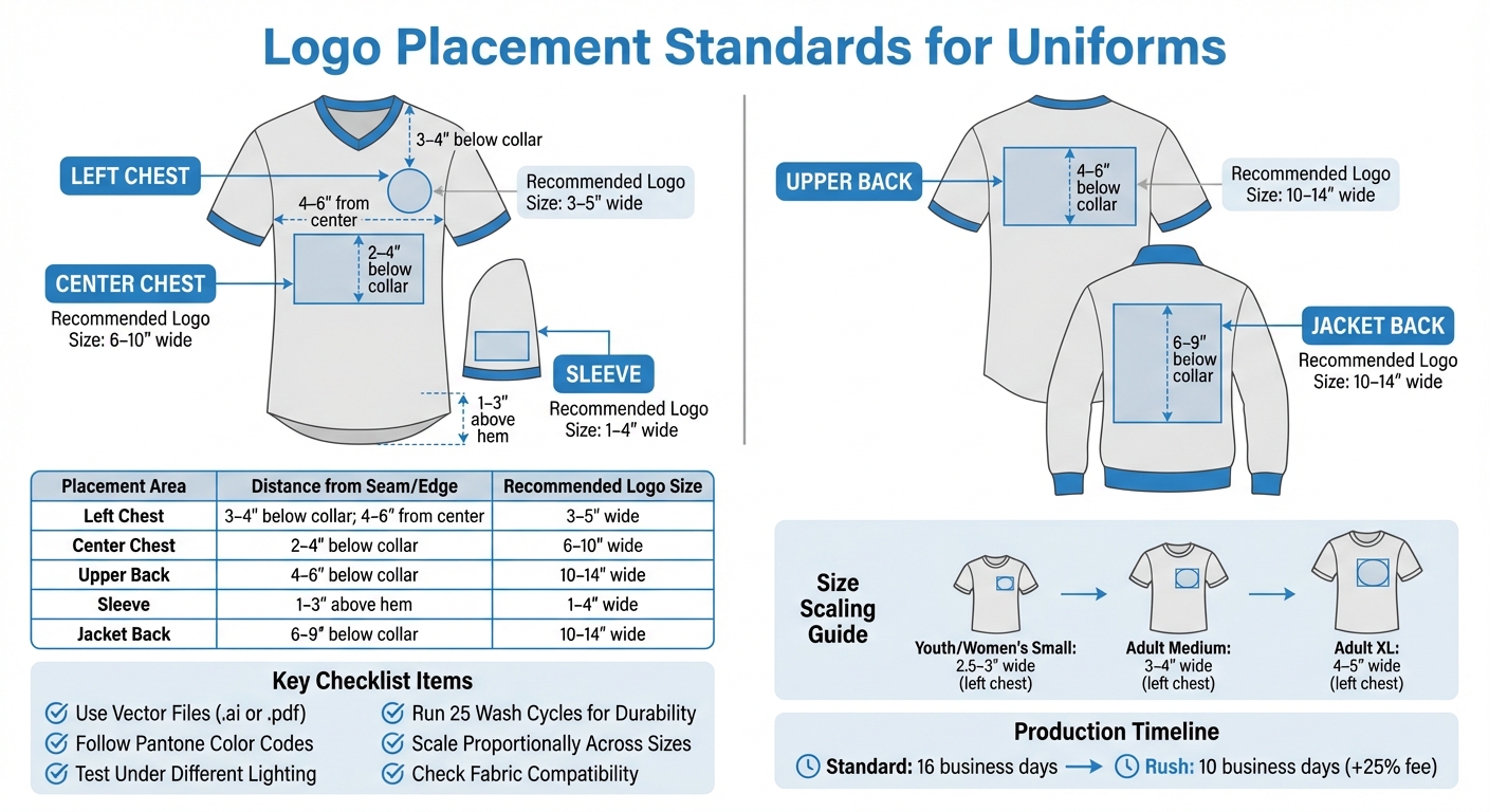
- Center chest: 2–4 inches below the collar.
- Left chest: 3–4 inches below the collar, 4–6 inches from the centerline.
- Upper back: 4–6 inches below the collar.
- Sleeves: 1–3 inches above the hem.
- Check Visibility: Test logos under different lighting and distances.
- Test Durability: Run wash cycles and movement tests to ensure logos stay intact.
- Adjust for Garment Size: Scale logos proportionally across youth, women’s, and men’s sizes.
- Fabric Compatibility: Ensure logos work well with the specific material and printing method.
Thorough testing, including mockups and prototypes, helps catch issues early, saving time and money before production. By following this checklist, you can confidently create uniforms that look polished and perform well both on and off the field.
Logo Placement Standards and Measurements for Uniform Branding
Preparation Steps for Testing Logo Placement
Gathering Materials
Start by collecting the tools and files you’ll need. Make sure you have the original vector files of your logo, such as .ai, .pdf, or CorelDRAW formats. These ensure your logo stays sharp and clear, no matter the size. Without these, you risk ending up with blurry or pixelated prints.
Next, grab a Pantone bridge book and color charts. These tools are essential for ensuring your colors are accurate across different printers and materials. Saying "blue" or "orange" isn’t enough – you’ll need the precise Pantone code for consistency.
You’ll also want artwork mockup templates that work with programs like Adobe Illustrator or CorelDRAW. These templates help you position logos correctly on garments. Don’t forget to include sizing kits. Companies like Wooter Apparel provide these with a refundable deposit, so you can test how logo placement looks across various sizes, from youth to adult. Physical samples can often highlight issues that digital mockups might miss.
Once you’ve gathered everything, double-check that your design aligns with your brand standards.
Reviewing Brand Guidelines
Brand guidelines are your blueprint for maintaining consistency. They outline the rules for logo size, color, and placement, ensuring a uniform look across all designs.
Pay special attention to Pantone color codes and typography. Using the correct Pantone codes prevents color mismatches, which can disrupt the overall design. Reviewing these standards before testing provides a clear benchmark for your Quality Assurance (QA) process. This final step ensures the uniforms match the intended design before production.
Visual Alignment and Placement Checklist
Centerline Accuracy
To find the centerline of a uniform, fold it vertically and use this as your guide for measurements. For athletic jerseys, position the logo 2 to 3 inches below the neck’s edge. Sweatshirts, due to their thicker fabric, need the logo positioned slightly lower – 3 to 3.5 inches from the neck edge.
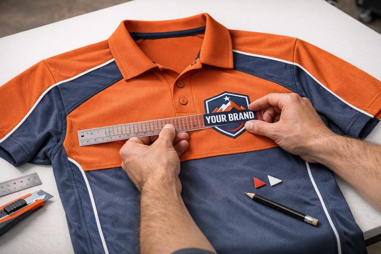
For left-chest logos on T-shirts and polo shirts, measure 4 to 6 inches from the centerline toward the side. This ensures the logo doesn’t sit too close to the armpit or crowd the center. On polo shirts, align the logo with the point where the collar meets the shoulder seam, maintaining the same horizontal distance from the centerline.
Double-check that the logo is evenly spaced from seams to keep the design visually balanced.
Distance from Seams
Maintaining a proper distance from seams is key to avoiding a cramped or unbalanced look. For chest logos, the standard placement is 3 to 4 inches below the collar. On jacket backs, measure 6 to 9 inches from the collar seam to the center of the design to achieve a balanced vertical placement.
Sleeve logos require a different approach. Place them 1 to 3 inches above the hem and center them on the outer arm, ensuring they stay visible without interfering with movement. Be mindful of potential obstacles like zippers or pockets that might distort the logo.
Here’s a quick reference table to summarize these measurements:
| Placement Area | Distance from Seam/Edge | Recommended Logo Size |
|---|---|---|
| Left Chest | 3–4" below collar; 4–6" from center | 3–5" wide |
| Center Chest | 2–4" below collar | 6–10" wide |
| Upper Back | 4–6" below collar | 10–14" wide |
| Sleeve | 1–3" above hem | 1–4" wide |
| Jacket Back | 6–9" below collar | 10–14" wide |
Symmetry and Balance
When producing multiple uniforms, consistency is key. Use fixed garment features, like the shoulder seam or collar intersection, as reference points. For jackets, logos should be placed 6 to 8 inches from the left shoulder seam and 3.5 to 4 inches from the center edge. This ensures the design doesn’t sit too high or low on the wearer.
A standardized placement chart can be a helpful tool during production, ensuring all garments match perfectly. For polo shirts, check vertical alignment using the intersection of the collar and shoulder seam. When scaling for size differences, adjust placement distances by about 0.5 inches per size increase from a standard adult large to maintain proportional balance across youth and adult sizes.
Size and Scale Verification Checklist
Dimension Matching
Once you’ve confirmed the visual alignment, the next step is to verify that the logo’s dimensions are consistent with the intended scale across all garment sizes. Cross-check sizing charts to ensure the logo fits appropriately on garments ranging from Youth (YXS–YXL), Women’s (WXS–W5XL), and Men’s (MXS–M7XL). This helps account for the varying surface areas from the smallest to the largest sizes.
Ordering prototypes is a smart move to see how the logo looks on actual fabric. As Duane R. shared about his experience with Wooter Apparel:
I ordered some prototypes so I could gauge their wear and make some tweaks. What they sent were above expectation.
Prototypes help catch sizing issues early, especially since some customers have mentioned that garment sizes can occasionally run larger or tighter than expected.
For clean, sharp logos across all sizes, always use vector formats to prevent pixelation. For left-chest logo placements, aim for a width of at least 2.5 inches on smaller garments and scale up to 4 to 5 inches for XL sizes. Adjust the logo’s size further to match the proportions of each garment category.
Proportional Fit
After confirming the dimensions, focus on ensuring the logo scales proportionally for each type of garment. Design proofs should reflect proper scaling across youth, medium, and adult sizes to maintain a balanced appearance.
Digital proofs are invaluable for visualizing how the logo looks across all sizes, and sizing kits provide a hands-on way to confirm garment dimensions. This approach ensures you catch any proportional changes as garment sizes increase. Kythe H. highlighted the importance of this step:
Designs were awesome and any changes were made quickly and precise.
Avoid a one-size-fits-all approach for logo dimensions. For instance, left-chest logos on youth or women’s shirts might work best at 2.5 to 3 inches wide, while larger garments like XL sizes can accommodate logos 4 to 5 inches wide. This tailored approach ensures the logo doesn’t overpower smaller garments or get lost on larger ones.
Fabric-Specific Adjustments
Once the size and proportions are finalized, adapt the logo design to suit different fabric types for consistent results. The fabric and decoration method can significantly influence the final dimensions. For example, sublimated polyester supports full-coverage artwork and maintains consistent logo dimensions during heat-pressing. However, traditional methods like screen-printing or embroidery may require adjustments to the logo size.
Stretch fabrics, such as blends with 90% Premium Polyester and 10% Spandex, can distort logos when stretched. Test the logo on both relaxed and stretched fabric to ensure it remains clear and readable under all conditions.
For all-over prints that wrap around the garment, polyester fabrics are typically the best choice. If you’re working with heavyweight 100% polyester air-knit fabric with double-reinforced shoulders, you’ll find it offers a more stable surface for maintaining logo proportions compared to lightweight mesh materials. Always coordinate with your design team to understand how your chosen imprint method – whether sublimation, heat transfer, or embroidery – will affect the final appearance of the logo on the selected fabric.
Visibility and Readability Testing
Distance and Lighting Tests
Once you’ve nailed down the logo’s size and proportions, it’s time to test how it looks from typical viewing distances and under different lighting conditions – think stadium lights, bright sunlight, or the softer glow of indoor gymnasiums. To keep your colors consistent no matter the environment, stick to Pantone Matching System (PMS) guidelines.
The Pantone system is an industry standard for color consistency. As Wooter Apparel explains:
Pantone is a global standard that ensures we’re all speaking the same language when we talk about color, allowing us to do a better job of producing the colors that you ordered.
A Pantone bridge book is especially useful here. It lets you compare original colors with their digitally printed versions, giving you a clear sense of how they’ll appear on fabric under different lighting. To improve visibility further, consider adding outlines to letters and numbers – this can make them pop, even in high-glare or dimly lit settings.
Once you’re satisfied with the logo’s appearance in static conditions, move on to testing how it holds up in motion.
Angle Inspection
Logos don’t just need to look good – they need to stay readable during movement. Check the logo’s visibility from the front, side, and back as players perform typical actions. The front chest area usually features the team name or main logo, while the back showcases player names and numbers. Both areas deserve equal scrutiny to ensure readability during gameplay.
For durability and vibrancy, sublimation printing is a solid choice. This method embeds the design into the fabric, so it stays sharp and bold even during intense movement. Test the logo on actual uniforms, worn by athletes performing sport-specific motions, to identify any readability issues that might arise during action.
Multi-Position Evaluation
Logos aren’t just confined to jerseys – they also show up on shoulders, shorts, and even socks. Test how the logo looks across all these placements. Pay extra attention to lower-body areas like compression shorts or sublimated socks, as these are often viewed from unique angles and may pose different visibility challenges.
Before you greenlight production, run a thorough Quality Assurance (QA) test. This step ensures that printed colors and logo placements match your design expectations under real-world conditions. Catching visibility or placement issues at this stage can save you from expensive reprints later on.
sbb-itb-4d95ad3
Durability and Functionality Tests
Wash and Wear Simulation
To mimic long-term wear, run the logo through 25 wash and dry cycles. Most of the shrinkage – typically over an inch – happens within the first five washes and stops after about 20 cycles. For best results, wash uniforms inside out on a cold, eco-friendly cycle using standard detergent, and tumble dry on medium heat.
For sublimated uniforms, the focus shifts to color vibrancy rather than peeling. As Wooter Apparel explains, "There is no cracking or peeling in a sublimated print, they last as long as the garment". This is because the ink bonds with the fabric at a molecular level, making peeling impossible. To monitor durability, document the logo’s condition before the first wash and then every five washes. Pay close attention to puckering around the logo – this can happen if the logo material and fabric shrink at different rates.
Finally, ensure the logo remains comfortable and functional during athletic movements.
Movement Comfort
Once the logo passes wash durability tests, evaluate how it performs during physical activity. Sublimation keeps the fabric soft since the design doesn’t add any weight or texture. Players should feel only the fabric’s natural softness – no stiff ink, weaves, or stitching.
Focus on areas of high motion, like shoulders or sides, to ensure the logo doesn’t limit movement or cause irritation. Stretch tests are essential to confirm that the logo stretches and recovers with the fabric without cracking. The design should flex seamlessly with the rest of the uniform.
Uniform Consistency
After testing durability and comfort, check for logo consistency across all uniform pieces. Lay out the entire set to confirm that the logo’s scale and position are uniform. With sublimation, designs originate as digital files, ensuring identical placement on every piece. This precision also allows for perfect replication when ordering replacements or additional pieces.
Alignment is key – logos on jerseys should line up visually with branding on matching shorts or warmup jackets. This attention to detail has earned Wooter Apparel a stellar reputation, reflected in their 4.9/5 star rating from 1,239 reviews. Customers often highlight "perfect color match" and "crisp designs" as standout features.
Final Approval and Production Checklist
Compile Testing Results
Gather all test documentation to ensure a smooth production process. This includes photos showing logo placement from various angles, notes from wash simulations, and feedback on movement. These materials help pinpoint the approved design variation and minimize production mistakes.
Make sure all logos are provided in their original vector formats, such as .ai or .pdf, to maintain sharpness. If raster images are used, have them redrawn to avoid pixelation issues. Double-check that all colors align with the specified Pantone codes.
Finalize the roster sheet by confirming accurate player sizes, numbers, and names. Cross-reference this data with Wooter’s sizing charts to ensure consistency.
Once all testing information is compiled, proceed to validate these results against Wooter Apparel’s production standards.
Confirm with Wooter Apparel Standards
Using the compiled testing results, verify that everything aligns with Wooter Apparel’s production guidelines. Compare your findings with their requirements by using artwork mockup templates in tools like Adobe Illustrator or CorelDRAW. Pay close attention to logo placement and ensure color specifications follow the Pantone Matching System (PMS). As Wooter explains, "PMS is a global standard that ensures we’re all speaking the same language when we talk about color, allowing us to do a better job of producing the colors that you ordered".
Before production begins, confirm that the final invoice has been paid or a purchase order has been submitted. Standard production takes 16 business days, but rush options are available for a 10-business-day turnaround at a 25% additional fee. Each order undergoes a final Quality Assurance test after sublimation and stitching. According to Wooter, "The final stage of production is our Quality Assurance test. After passing the QA test, your uniforms are labeled, packaged and shipped out".
Once your order arrives, inspect it thoroughly and report any concerns within 30 days. Corrections cannot be made after this window.
Logo Placement 101: Tips to make the Perfect Shirt!
Conclusion
Testing logo placement on uniforms is a key step in protecting your team’s brand and presenting a polished, professional image both on and off the field. As Wooter Apparel emphasizes, correct logo placement serves as the backbone of custom-branded uniforms. Everything from perfect alignment to durability through washes plays a role in how your team is perceived during competition.
Using a checklist ensures no detail is overlooked. By confirming accurate dimensions, testing visibility under various lighting conditions, and ensuring precise color matching with the Pantone Matching System, you can avoid costly errors before production. Relying on vector files and exact Pantone codes helps maintain crisp, vibrant logos across different materials. With Wooter Apparel boasting a 4.9-star rating from 1,239 reviews, teams consistently report excellent results when these steps are followed.
FAQs
Why should vector files be used for logo placement on uniforms?
Vector files play a key role in logo placement, especially when it comes to custom uniforms. Their biggest advantage? They can be resized to any dimension without sacrificing quality or detail. This means your logo will always look sharp and professional, no matter its size or where it’s placed.
Another benefit of vector files is their precision. They make it easier to align the logo correctly and keep its design intact throughout the production process. This attention to detail is essential for creating uniforms that not only look great but also reflect a high standard of quality.
How can I make sure my logo is clearly visible and easy to read in different lighting conditions?
To make sure your logo grabs attention and stays readable in any lighting, pay close attention to contrast, size, and placement. Choose high-contrast colors that pop against the uniform’s background, and go for bold, straightforward designs that stay clear in both dim lighting and bright sunlight.
It’s a good idea to test your logo in various lighting conditions – indoors, outdoors, and even under stadium lights. This helps you see how it holds up in real-world scenarios. If needed, tweak the colors or placement to ensure it stays sharp and visible no matter the setting.
How can I test the durability of a logo on team uniforms?
To evaluate how well a logo holds up on team uniforms, it’s important to test it under conditions it will actually face. Begin by running the uniform through several wash-and-dry cycles. This will show if the logo fades, peels, or cracks over time. After that, try a stretch test – gently pull the fabric to see if the logo stays intact without warping or distorting. Lastly, mimic physical activities like running or stretching to check if the logo stays firmly in place and remains easy to see. These checks will give you a clear picture of the logo’s durability and long-term appearance.