
Getting jersey names and numbers sized and placed correctly is crucial for clarity, balance, and meeting league rules. Whether for youth or adult teams, proper sizing ensures readability, a professional look, and compliance with regulations. Here’s what you need to know:
- Name Sizes: Adult jerseys typically use 2.5–3 inch letters, while youth jerseys stick to 2-inch letters.
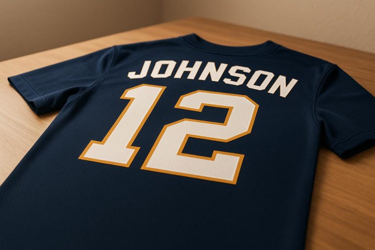
- Number Sizes: Back numbers range from 6–12 inches for adults and 6–10 inches for youth. Front numbers are smaller, usually 4–10 inches for adults and 3–8 inches for youth.
- Placement: Names are positioned 4–6 inches below the collar for adults and proportionally adjusted for youth. Back numbers sit 1 inch below names or 4–6 inches below the collar if no name is included.
- League Rules: Follow specific sizing and placement guidelines for sports like basketball, football, and soccer to avoid penalties.
- Fabric and Printing: Mesh fabrics may require larger designs for visibility, while sublimation printing allows for crisp details even at smaller sizes.
Standard Name and Number Dimensions
Getting the dimensions right is key to creating jerseys that not only look professional but also meet league requirements. These guidelines form the basis for proper placement and design tweaks, which we’ll explore further in later sections.
Name Size Standards
For adult jerseys, names are typically sized between 2 to 3 inches in height, with 2.5 to 3 inches being the most common. Youth jerseys, on the other hand, usually stick to 2-inch letters to suit their smaller size. The width of the name depends on the number of letters and the font style. For example, a short name like "LEE" might need about 6 inches of space, while a longer name like "WASHINGTON" could stretch to 12 inches or more.
Number Size Standards
Numbers, being the main visual identifiers, are larger than names. On adult jerseys, back numbers generally range from 6 to 12 inches, while front numbers fall between 4 and 10 inches. For youth jerseys, these dimensions are scaled down, with back numbers typically measuring 6 to 10 inches and front numbers 3 to 8 inches.
The exact sizes often depend on the sport and its league rules. It’s also essential to follow league-specific guidelines for stroke (outline) width, which can range from 0.75 inches for professional basketball to 1.5 inches for high school football. To keep the numbers visually balanced, aim for a 60–70% width-to-height ratio.
Size Reference Table
Jersey dimensions for names and numbers should be adjusted based on the size of the garment. Here’s a quick reference:
| Jersey Size | Name Height | Front Number | Back Number | Typical Name Width |
|---|---|---|---|---|
| Youth (XS–M) | 2" | 3–6" | 6–8" | 6–10" |
| Adult (S–M) | 2.5" | 4–8" | 8–10" | 8–10" |
| Adult (L–XL) | 2.5–3" | 6–10" | 10–12" | 10–12" |
| Adult (2X–3X) | 3" | 8–10" | 10–12" | 10–12" |
| Adult (4X–5X) | 3" | 10–12" | 12–14" | 12–16" |
For a sport-specific breakdown, take a look at these typical dimensions:
| Sport | Front Number | Back Number | Name Height |
|---|---|---|---|
| Basketball | 4" | 6–8" | 2" |
| Football | 10" | 10" | 2–3" |
| Soccer | Varies | 8–10" | 2" |
| Baseball | 6" | 8" | 2–3" |
When designing jerseys, start with these standard dimensions and adjust as needed to match league rules or the jersey’s style. For example, oversized fan jerseys can handle larger elements – like 3-inch names and 12 to 14-inch back numbers – while tighter performance jerseys might require slightly smaller sizes to maintain a balanced look.
Name and Number Placement Rules
Getting the placement of names and numbers on jerseys just right is key to creating a professional, league-compliant design. It’s not just about the dimensions – it’s also about ensuring everything looks balanced and polished. Below are guidelines tailored to different sports and age groups to help you achieve that perfect look.
Where to Place Names
For adult jerseys, names typically use 2.5–3-inch letters and are positioned 4–6 inches below the collar. Youth jerseys, on the other hand, often feature 2-inch letters with placement adjusted proportionally. To ensure the name is centered, measure equal distances from the jersey’s midpoint – whether the name is short like "CHEN" or longer like "RODRIGUEZ."
Different sports have specific rules, so always check league guidelines. For instance:
- Soccer (FIFA regulations): Names are placed 4 centimeters (about 1.6 inches) above the back number, with letter heights of 2 inches for adults and 1.75 inches for youth.
- Baseball: It’s common to skip names on the back entirely, focusing instead on prominently displayed numbers.
- Basketball and Football: Names follow similar guidelines to ensure they are clear and consistent.
Once the name is in place, you can move on to positioning the numbers for a complete and balanced design.
Where to Place Numbers
Numbers need to be spaced precisely for clarity and visual balance. If the jersey includes a name, the back number should be placed 1 inch below the name. For jerseys without names, the back number is positioned 4–6 inches below the collar.
Front numbers are centered but vary by sport to accommodate team logos and other design elements. Here are some specific league requirements:
- NBA: Front and back numbers are 6 inches tall with a 0.75-inch stroke width.
- NCAA: Front numbers are 4 inches tall, while back numbers are 6 inches tall with a 1-inch stroke width.
- High School Football: Front numbers measure 8 inches tall, and back numbers are 10 inches tall with a 1.5-inch stroke width.
- Baseball: Front numbers must be at least 3 inches wide by 6 inches tall, while back numbers can go up to 4 inches wide by 8 inches tall.
Always use the garment’s midpoint as your reference point, measuring outward equally to keep the alignment consistent on both the front and back.
For youth jerseys, adjustments are necessary to match their smaller size. Youth back numbers generally measure 6–8 inches tall, paired with 2-inch name letters, while adult jerseys use 8–10-inch back numbers and 2.5–3-inch name letters. The goal is to maintain balance no matter the jersey size.
Before applying the design, lay the jersey flat and mark all placement points carefully. Double-check measurements from multiple angles to ensure accuracy.
At Wooter Apparel, we follow these placement standards closely in our custom uniform designs. This ensures every jersey not only meets league requirements but also stands out with a professional and polished look.
Sizing for Different Jersey Types and Body Sizes
When it comes to jerseys, getting the sizing right isn’t just about following standard dimensions. The type of jersey and the wearer’s body size play a big role in creating designs that look polished and well-proportioned across all styles.
Youth vs. Adult Jersey Sizing
Standard adult jersey dimensions don’t always translate well to youth sizes. Simply scaling down the design can lead to issues with clarity and balance. Instead, proportions need to be carefully adjusted to fit smaller garments while maintaining a clean, professional look.
For youth jerseys, elements like letter heights, number sizes, and spacing should be resized proportionally. This ensures the design remains legible and visually appealing. For instance, the space between names and numbers should stay consistent, even on smaller jerseys. If a longer name is involved, the width of the name may need to be adjusted to avoid overcrowding the design.
Testing is key. A name or number size that looks great on an adult jersey might completely overwhelm a youth small. Trying the design on actual jerseys helps ensure everything fits and looks just right.
Oversized and Fitted Jersey Adjustments
Jersey style also impacts how names and numbers should be sized and positioned. Oversized and fitted jerseys each come with their own challenges.
For oversized jerseys, there’s more fabric to work with, but scaling up the names and numbers isn’t the answer. Instead, maintaining standard proportions and adjusting placement to suit the longer garment ensures the design stays balanced.
Fitted jerseys, on the other hand, have less space to work with due to their snug fit. Slightly reducing the size of names and numbers can help avoid a cramped or cluttered look, while still keeping the design clear and comfortable.
Placement also matters. Sleeveless jerseys, for example, require careful positioning of front numbers to avoid crowding the armholes. Raglan-style jerseys, with their diagonal shoulder seams, may need adjustments to name placement to ensure the design doesn’t clash with the seams.
At Wooter Apparel, every jersey style is evaluated individually. Whether it’s a fitted performance jersey or an oversized casual one, our team tailors the sizing and placement of names and numbers to suit the specific garment. The result? A polished, balanced design that complements the jersey’s unique characteristics.
sbb-itb-4d95ad3
Fabric and Printing Methods
The type of fabric and printing method you choose play a major role in how names and numbers look, feel, and last. These factors influence clarity, durability, and fit, ensuring your designs remain sharp and readable through intense gameplay and repeated washes.
How Fabric Type Affects Sizing
The fabric itself impacts how names and numbers appear on jerseys. For instance, mesh fabrics, commonly used in basketball and football jerseys, have an open weave that promotes airflow but can make smaller text or numbers harder to read from a distance. To counter this, slightly increasing the size of letters and numbers helps maintain visibility without overwhelming the overall design.
On the other hand, dazzle cloth and other polyester blends offer a smoother surface, making them ideal for holding printed details. These fabrics allow for standard sizing because their tight weave ensures crisp edges and vibrant colors, even with smaller text.
Stretch fabrics, however, require more careful adjustments. As the jersey stretches during movement, names and numbers can distort, causing letters to widen or numbers to warp. To address this, you’ll need to adjust sizing to account for fabric stretch, ensuring the design stays proportional and easy to read.
Heavier fabrics provide a stable base, helping printed elements retain their shape over time. Meanwhile, lightweight, moisture-wicking fabrics present unique challenges. Their quick-dry properties can sometimes lead to cracking or peeling prints if the sizing and application aren’t perfectly matched to the fabric’s characteristics.
Sizing for Different Printing Methods
Your choice of printing method also affects how you should size names and numbers. Each technique has its own strengths and limitations, which can influence the final look of your design.
Sublimation integrates the design directly into the fabric, creating a durable and vibrant result. Because the ink becomes part of the material, it won’t crack, peel, or fade. This method works particularly well on polyester, allowing you to stick with standard sizing since even fine details and sharp edges are preserved. For example, Wooter Apparel’s fully sublimated uniforms are built to endure heavy use and frequent washing while keeping names and numbers vivid.
Heat transfer is another popular option, offering flexibility for placing designs on various fabrics. However, the vinyl layer can crack if the details are too small or intricate. To avoid this, opt for slightly larger sizing and ensure proper spacing between characters, especially around curves and edges, to reduce stress points where the vinyl might separate from the fabric.
Tackle twill application involves sewing fabric letters and numbers directly onto the jersey. This traditional method is highly durable, making it perfect for jerseys that endure heavy wear and frequent washes. However, because this technique involves stitching fabric pieces, it works best with larger designs. Small, intricate details are harder to execute cleanly with tackle twill, so increasing the size of text and numbers is often necessary.
| Printing Method | Best For | Durability | Color Vibrancy | Cost Efficiency |
|---|---|---|---|---|
| Sublimation | Intricate designs, vibrant colors | Excellent (part of the fabric) | Excellent | Higher initial cost |
| Heat Transfer | Quick application, flexible placement | Good (with proper care) | Good | Lower per-unit cost |
| Tackle Twill Application | Heavy-use jerseys, long-term wear | Excellent | Good | Moderate |
Color contrast is another key factor to consider when sizing designs for different printing methods. Sublimation handles gradients and multi-color designs with ease, so standard sizing works well even for complex patterns. Heat transfer, however, benefits from solid colors and high contrast between the design and the fabric. When the contrast is low, increasing the size of text and numbers can improve visibility.
Ultimately, the combination of fabric and printing method determines the minimum sizing needed for your design. For sublimation on smooth polyester, smaller sizes can still look sharp. For heat transfer on mesh fabrics, larger sizes ensure better durability and visibility. Before committing to full production, testing on actual fabric samples is a smart way to identify any potential issues with sizing, spacing, or readability. This step helps ensure your final design looks great and performs well on the field.
Creating Balanced Jersey Designs
Building on sizing and placement standards, achieving a balanced jersey design means ensuring every element – names, numbers, logos, and sponsor graphics – works together seamlessly. The goal is to create a clear visual hierarchy where each piece complements the others without overwhelming the overall look.
Combining Names, Numbers, and Logos
To keep things organized, divide the jersey into zones for primary and secondary elements. The back is typically reserved for the player’s name and number, making it the primary identification area. On the front, the team logo or wordmark is usually paired with a smaller number. Additional spaces, like side panels, shoulders, and sleeves, can accommodate sponsor logos, league patches, or secondary design elements.
Spacing matters. For example, there should be a 1-inch gap between the name and back number to avoid crowding. On youth jerseys, this same spacing rule applies, but with proportionally smaller text – names are generally around 2 inches tall, while numbers are about 6 inches.
Placement is just as important as spacing. On adult jerseys, names should sit 4–6 inches below the collar, while youth jerseys require the names to be closer – 1–2 inches below the collar – to account for shorter torsos. Team logos on the front chest should measure 3–5 inches for adult sizes and 2–3 inches for youth sizes. A logo that’s too large can overpower the design, leaving little room for other elements like front numbers.
Sponsor graphics need strategic placement to remain visible without interfering with player identification. Common spots include the upper chest (above the team logo), shoulders, or lower hem. Keeping sponsor logos around 2–3 inches in height ensures they enhance the design without dominating it.
"The design team took my thoughts and created several perfect options for our swim team, using our logo created by one of our swimmers. The team absolutely loves the fit and comfort of the warm ups and wears them with pride." – Tammy S.
Side panels are another option for incorporating branding or design elements, such as vertical stripes or repeating patterns. The key is to keep these additions subtle so they don’t distract from the primary identification areas.
For jerseys with long names, reducing the letter height slightly (e.g., from 3 inches to 2.5 inches) or using abbreviations can help maintain balance. Conversely, for shorter names, stick to the standard sizing for a clean, polished appearance.
Keeping Designs Clear and Readable
Contrast is crucial for readability. Pair dark elements with light backgrounds (or vice versa) to ensure names and numbers are easy to see. If the jersey and design elements are too similar in color, adding a contrasting border or outline can help. For example, NCAA rules recommend borders up to 0.5 inches wide when colors are similar, while high school leagues often require about 0.25 inches.
Color coordination also plays a big role in clarity. If your design uses multiple colors, choose combinations that naturally separate each element. Avoid placing similarly colored elements next to each other, as they can blend together when viewed from a distance.
Font choice matters, too. Bold, sans-serif fonts are ideal for numbers because they stay legible even when players are in motion. While script or decorative fonts might look appealing up close, they can become unreadable from the stands. Use such fonts sparingly, reserving them for secondary elements like team wordmarks.
Visual hierarchy ensures the most important elements grab attention first. On the back of the jersey, the number should stand out the most, followed by the player’s name and any secondary graphics. On the front, the team logo or wordmark typically takes precedence, with the front number acting as a secondary identifier.
With Wooter Apparel’s fully sublimated designs, you have the freedom to experiment with color gradients and intricate patterns. However, this flexibility comes with responsibility. Busy backgrounds can make names and numbers hard to see, so consider adding solid color blocks or simple outlines to help these key elements stand out.
Before finalizing a design, test it at full size. What looks balanced on a computer screen might feel crowded on an actual jersey. Viewing the design from 20–30 feet away – roughly the distance between spectators and the field – can help ensure it’s clear and readable.
For jerseys featuring both front and back player identification, consistency is key. Use the same or complementary fonts on both sides, and make sure color schemes and design motifs align seamlessly from every angle.
When juggling multiple design elements, always prioritize function over decoration. Player names and numbers must remain legible, even if it means simplifying or omitting extra graphics. If adding a new element compromises readability or reduces the size of numbers below league standards, it’s better to leave it out.
Collaborating with a professional design team can make this process much easier. With a 4.9-star rating from 1,238 reviews, Wooter Apparel’s team has proven their ability to balance complex design elements while keeping jerseys clear and professional.
Conclusion
Getting jersey name and number sizing right isn’t just about looks – it’s about making sure players are easily identifiable while reinforcing team identity. This guide covered essential measurements, placement standards, and design tips to help you achieve that balance.
Start with the basics: use standard measurements and ensure proper placement. For adult jerseys, larger back numbers paired with proportionally scaled names work best. Youth jerseys, on the other hand, need smaller, adjusted dimensions to maintain clarity from a distance. Positioning matters too – names should be placed at a height that ensures readability, with consistent spacing to avoid clutter. These simple yet crucial steps lay the foundation for a polished design.
Don’t forget about league rules. Double-check that your designs comply with regulations to save yourself from costly do-overs.
The fabric and printing method also play a big role in how the jersey looks and lasts. Fully sublimated jerseys, for example, offer more design flexibility, but you’ll need to ensure strong contrast and readability – especially if you’re working with bold patterns or gradients.
When all the key elements come together, it’s important to keep the overall design clean. Team logos, sponsor graphics, and other details should complement the player’s name and number, not compete with them. Thoughtful placement and spacing can make a world of difference.
For best results, work with professionals who know the ins and outs of jersey design. Companies like Wooter Apparel focus on high-quality materials, precise construction, and expert craftsmanship to deliver uniforms that perform as well as they look. Before production, use a checklist to review measurements, placement, league requirements, and visibility. Testing with full-size mockups can help you catch any issues before it’s too late.
FAQs
How can I make sure my jersey’s name and number sizing meets league requirements?
When designing a jersey, it’s crucial to ensure the name and number sizing meet your league’s rules. Check the official guidelines from your league or organization, as these typically outline specifics like font size, placement, and color contrast.
If you’re collaborating with a custom apparel provider, make sure to share these requirements with them. This ensures your jersey design meets the standards and avoids any potential problems during games or events.
How can I adjust jersey name and number sizes to fit different body types and jersey styles?
When resizing jersey names and numbers, you’ll want to think about the player’s body type and the jersey style. For larger jerseys, go with slightly bigger fonts to keep everything visible and proportional. On the other hand, smaller jerseys call for more compact lettering and numbers to maintain a balanced look. Placement is key too – names are usually centered on the back, while numbers sit a bit lower to avoid any overlap.
For modern or fitted jersey cuts, make sure the design won’t stretch or warp when worn. Always measure in inches for accuracy. If you’re customizing, refer to the manufacturer’s sizing templates to ensure everything lines up perfectly.
How do fabric and printing methods affect the clarity and durability of jersey names and numbers?
The fabric and printing method you choose can significantly impact how clear and durable jersey names and numbers appear. Smooth, breathable fabrics like polyester are ideal because they provide an even surface for printing and enhance comfort during play. In contrast, rougher or lower-grade materials might lead to designs that crack or fade more quickly.
Printing techniques are equally important. Sublimation printing embeds the design directly into the fabric, making it highly resistant to peeling, cracking, or fading, even with heavy use. Other methods, like screen printing or heat transfer, might deliver bright and bold results at first but can wear out faster with frequent washing or intense activity. To keep jersey details sharp and long-lasting, pairing sturdy fabrics with advanced printing methods is the way to go.