
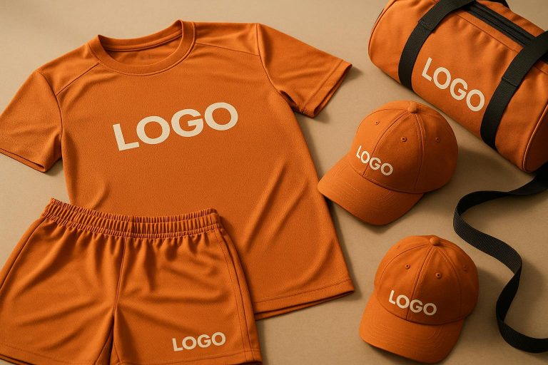
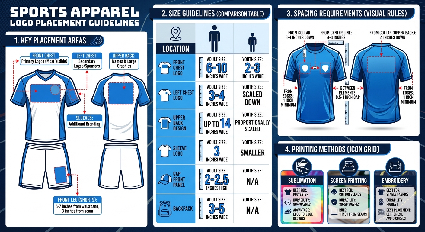
- Key Placement Areas: Front chest for primary logos, upper back for names, and sleeves for secondary branding. Shorts and pants often feature logos on the front leg or side panels.
- Size Guidelines: Adult chest logos range from 6–10 inches wide, while smaller areas like sleeves use 3–4 inches. Youth sizes are scaled down accordingly.
- Spacing Tips: Leave 0.5–1 inch gaps between elements and avoid placing logos too close to seams, zippers, or edges.
- Alignment Tools: Use templates, rulers, or laser guides to ensure precise placement. Always test on worn samples for accuracy.
- Printing Methods: Sublimation works best for polyester, screen printing suits cotton blends, and embroidery is ideal for stable fabrics.
Proper placement ensures logos are visible, professional, and aligned across all sizes and apparel types. This guide provides clear measurements and tips to get it right every time.
Logo Placement Guide for Sports Apparel: Sizes and Positioning
Basic Rules for Logo Placement
Choosing High-Visibility Locations
When deciding where to place logos, focus on areas that naturally draw attention, like the front chest, sleeves, and upper back. The front chest is ideal for primary logos because it stands out during face-to-face interactions and in photos. The upper back, on the other hand, becomes prominent when players are in motion or viewed from behind, especially in stadium settings. Use the front chest for your main logo and the upper back for player names. The left chest is a great spot for secondary logos or sponsor branding.
If you’re working with multiple elements – like a team logo, league patch, or sponsor logo – prioritize the center or left chest for the primary team identity. Reserve the upper back for names or larger graphics, and use the sleeves for additional branding opportunities. This approach ensures a balanced and professional look for your jerseys.
Once you’ve determined the placement, focus on logo sizes and spacing to maintain a polished appearance.
Size and Spacing Requirements
For adult jerseys, front chest logos typically range from 6–10 inches wide, while left chest logos are smaller, around 3–4 inches wide. For youth jerseys, logos are scaled down to 2–3 inches. On the upper back of adult jerseys, designs can go up to 14 inches wide, leaving enough room for names and numbers below.
Spacing is just as important as size. Keep a gap of 0.5–1 inch between logos, numbers, names, or other graphics. Additionally, logos should be positioned about 1 inch away from the garment’s edges. For instance, a left chest logo is generally placed 3–4 inches below the collar and 4–6 inches from the shirt’s center line. Similarly, upper-back logos are placed approximately 4 inches below the collar to leave space for names or numbers.
How to Measure and Align Logos
Proper alignment is key to reinforcing your team’s identity. Start by identifying key points on the garment, such as the center front line, collar seam, side seams, and hem. For a chest logo on adult jerseys, measure 3–4 inches down from the collar and 4–6 inches from the center line for left-chest placements.
To ensure accuracy, use a straight edge or template on a flat garment, and always double-check placement on a worn sample to account for fabric drape. For curved areas like sleeves, flatten the fabric as much as possible and use reference points like the shoulder seam, underarm seam, and sleeve hem.
Professional decorators often rely on tools like transparent rulers, laser alignment systems, and hard templates to achieve precise results. Avoid placing logos near seams, zippers, or pockets by leaving a 0.5–1 inch gap from these bulkier areas. This is especially important for performance fabrics and raglan-style garments, where improper placement can distort the design.
T-Shirt Design Placement Guide & Tools to Help!
Logo Placement by Apparel Type
Fine-tuning logo placement for different types of apparel ensures visibility and a professional look. Here’s how to adapt placement for specific items.
Jerseys for Basketball, Football, Baseball, and Soccer
The center chest is the go-to spot for logos on most jerseys. For adult sizes, logos typically range from 6 to 12 inches wide and are placed just below the collar for maximum visibility. Sleeveless designs, like basketball jerseys, benefit from this centered placement as well.
When sleeves are present, they offer extra space for sponsor or secondary logos. These are usually 3 inches wide and positioned midway between the shoulder seam and armpit, following the natural curve of the sleeve. For full-sleeve jerseys, like those used in baseball or soccer, the upper back becomes a prime spot for larger logos – up to 14 inches wide – placed about 4 inches below the collar to leave room for player names and numbers. Smaller logos, like manufacturer marks or league patches, work well near the neckline, but always check governing body regulations to ensure compliance.
Now, let’s look at how these principles apply to shorts and pants.
Shorts and Pants
For game shorts and pants, the front leg is the best location for logos. Position them about 5–7 inches down from the waistband and 3 inches in from the seam. Side panels also provide a good alternative, with logos placed 7–9 inches down from the seam. Hip placements near the waistband can work too, but avoid areas with elastic bands or heavy stitching that could distort the design. Always test placements on a worn sample to ensure the logo stays visible during movement.
Next up: warmup jackets and outerwear.
Warmup Jackets and Outerwear
When it comes to warmup jackets, the left chest is the ideal spot for logos, ensuring they’re clear of zippers, pockets, and seams. For full-zip jackets, make sure the logo is positioned far enough from the zipper to avoid interference. Hoodies and shooting shirts require extra care to avoid bulky seams or pocket areas. For raglan-style warmups, aligning the logo with the diagonal shoulder seam creates a polished, balanced look.
Caps, Bags, and Other Accessories
For baseball-style caps, the front center panel is the primary location for team logos. These are usually 2–2.5 inches high, scaled to fit within the panel without wrapping onto the sides. Smaller marks or initials can be placed on the side panels, measuring about 1–1.5 inches wide, while staying clear of seams. The back of the cap, just above the closure, is often used for league names or player numbers, typically around 0.5–1 inch high. For embroidered designs, stick to simple shapes to maintain clarity on curved surfaces.
For backpacks, the upper front panel, above the shoulder strap attachments, is the best spot for visibility. Logos here are generally 3 to 5 inches wide. Duffel bags, on the other hand, work well with centrally placed logos on the main side panels, sized between 4 and 8 inches wide. Always test placements on loaded bags to ensure straps and handles don’t obscure the design.
sbb-itb-4d95ad3
Technical Factors That Affect Logo Placement
Understanding the technical side of logo placement is just as important as following basic placement rules. These factors help avoid issues like misalignment or durability problems, ensuring your design holds up over time.
How Printing Methods Affect Placement
The printing method you choose has a big impact on where and how a logo can be placed:
- Sublimation works perfectly for performance polyester fabrics. This method allows for edge-to-edge designs without being limited by seams, as the dye bonds directly to the fabric. Logos created through sublimation can withstand over 50 washes, making it a great choice for full-coverage designs on jerseys and other performance gear. However, it’s most effective on light-colored synthetic materials.
- Screen printing is a solid option for cotton blends, offering vibrant colors that last through 30–50 washes. To avoid issues like ink buildup or cracking, keep logos at least 1 inch away from seams. This method works best for chest and back logos placed on stable fabric areas.
- Embroidery is highly durable, even for high-contact sports. That said, the hoop stabilization process used in embroidery can cause challenges near curved seams or stretchy fabrics, sometimes leading to puckering. For the best results, place embroidered logos on stable areas like the left chest and avoid zones with a lot of movement.
Each method brings its own set of strengths and limitations, making it essential to choose the right one based on the fabric and intended use.
Maintaining Consistency Across All Sizes
To create a unified look across different garment sizes, it’s essential to focus on proportional spacing rather than sticking to fixed measurements. For instance, if a chest logo is placed 4 inches below the collar on an adult large, it should visually appear in the same spot on a youth medium, even if the actual measurement varies. Testing logo positions on multiple sizes before finalizing the design helps ensure they stay consistent as the garments scale up or down.
Testing Logo Placement on Worn Garments
Before finalizing, it’s crucial to test logo placement on garments being worn. This ensures that any shifts during movement stay within 0.5 inches. Have athletes of various sizes wear the samples and perform sport-specific drills. Check logo visibility from 10–20 feet away and gather feedback on comfort to confirm that the logos remain properly aligned and easy to see during play.
At Wooter Apparel, these practices are key to crafting custom team uniforms that combine durability, comfort, and standout visual appeal on the field.
Conclusion
Getting logo placement right can make all the difference between a uniform that looks amateur and one that feels professional. By focusing on key principles – like choosing spots with high visibility, keeping sizes and spacing balanced, and considering technical factors like printing methods and fabric behavior – you can create team apparel that looks sharp and polished on the field. These steps not only enhance the overall design but also strengthen your team’s identity and presence.
To achieve consistent results, stick to standard measurement guidelines, ensure logos are placed far enough from seams, and test placements on actual garments across various sizes. This ensures logos stay visible and aligned, even when players are in motion.
At Wooter Apparel, these principles are part of every custom uniform we create. With over 2,000 five-star reviews and a 4.9-star rating, teams regularly share how much they love their finished uniforms. This level of satisfaction comes from pairing thoughtful placement strategies with precise execution.
No matter the sport – basketball, football, or soccer – applying these logo placement standards ensures your team’s uniforms not only look professional but also inspire confidence. When logos are positioned with care and executed flawlessly, your team’s apparel becomes something players wear with pride and something that truly makes an impact.
FAQs
What tools can help ensure accurate logo placement on sports apparel?
Achieving accurate logo placement on sports apparel calls for the right combination of tools and methods. Sublimation printing stands out for producing sharp, vibrant designs while maintaining consistent positioning. Using computer-aided design (CAD) software is key to crafting precise layouts and verifying alignment before production begins. For the final application, professional heat transfer machines or embroidery equipment ensure logos are not only perfectly placed but also durable enough to withstand the rigors of athletic use.
How do printing methods impact the durability and look of logos on sports apparel?
The printing technique you choose has a big impact on how durable and visually appealing logos look on sports apparel. Sublimation printing stands out for its durability and vibrant results. By embedding ink directly into the fabric, it creates colors that stay bold and won’t crack or peel, even with heavy use. On the other hand, screen printing delivers a strong finish but can develop cracks over time, especially after repeated washes. It also leaves a slightly raised, textured feel. Meanwhile, heat transfer printing offers versatility across different materials, but it’s less resilient – logos are more prone to cracking or fading after several washes.
The best method for your needs depends on what matters most to you: durability, appearance, or the specific type of sportswear you’re customizing.
How can I ensure my logo looks consistent across all apparel sizes?
To ensure your logo looks consistent across various apparel sizes, pay attention to size, placement, and color uniformity. Always use scalable vector files so the logo remains crisp and clear, no matter the size. Carefully tweak proportions to make sure the logo fits each garment perfectly, maintaining its visibility and overall impact.