
Sports typography is critical for creating team uniforms that are both functional and visually striking. It ensures names, numbers, and logos are clear and readable during fast-paced games while also building a team’s identity. Here’s what you need to know:
- What is it? Sports typography focuses on designing fonts for team uniforms and gear. It prioritizes readability from a distance and during motion.
- Why does it matter? Fonts convey a team’s personality, strengthen fan loyalty, and make uniforms instantly recognizable.
- Key principles:
- Clear, readable fonts that work on different materials.
- Consistent typography across all team gear.
- Proper text placement and size for maximum visibility.
- Font types:
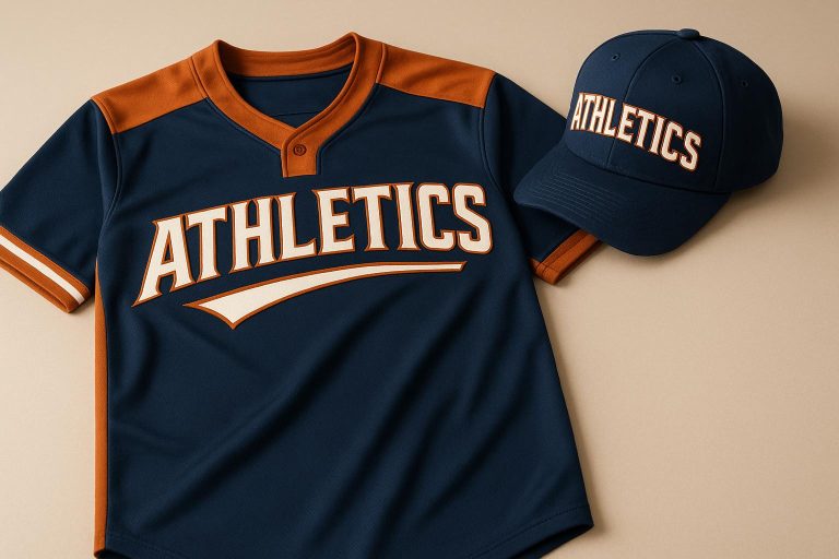
- Block fonts for strength and tradition (e.g., football, baseball).
- Sans-serif fonts for modern, sleek designs (e.g., basketball, soccer).
- Script fonts for a personalized or elegant touch.
- Trends: Geometric and futuristic fonts are gaining popularity, with custom fonts helping teams stand out.
- Printing technology: Dye sublimation ensures vibrant, durable typography on sportswear.
Typography isn’t just about aesthetics – it’s a tool for building team identity and connecting with fans. Whether you’re designing uniforms for youth leagues or professional teams, prioritizing readability, consistency, and quality ensures your typography makes a lasting impact.
7 Best Sports Fonts from Adobe Fonts
Core Principles of Sports Typography
When it comes to sports typography, the goal is to strike a balance between eye-catching design and practical functionality for fast-paced athletic events. The principles below focus on ensuring that team names, player numbers, and other text elements remain clear and effective during gameplay.
Clear and Readable Fonts
In sports, player names and numbers need to stand out immediately. The choice of typeface, along with its size, weight, and spacing, plays a big role in ensuring legibility. Fonts that are easy to read – even from a distance or during movement – are a must.
Simple, familiar typefaces work best for sports uniforms. While decorative or intricate fonts might look appealing up close, they often fail when viewed on a moving player. To avoid confusion, select fonts where every letter and number is distinct. Adjusting spacing or using bold styles can further enhance the clarity of crucial details like player numbers.
Consistency across all team apparel also strengthens the overall branding.
Matching Fonts Across All Gear
Once readability is addressed, maintaining consistent typography across all team gear is essential for reinforcing team identity. Using the same font style across jerseys, shorts, and warm-up gear creates a cohesive look that fans and players alike can associate with the team. Typography is as much a part of the team’s identity as colors and logos.
Unified font styles make official merchandise instantly recognizable. For example, matching logos, numbers, and colors across all gear amplifies the team’s branding. To achieve a polished look, many teams opt for a custom font that ties all their equipment together.
Font Placement and Size Rules
The placement and size of text elements are just as important as font choice. A clear layout with a strong visual hierarchy ensures that key information – like player numbers – is easy to spot. Numbers should be the most prominent element, while player names take a secondary position. This consistent arrangement helps viewers quickly identify players during games.
Contrast is another critical factor. Text should stand out clearly against the background, regardless of lighting or viewing conditions. Proper contrast ensures that the typography remains legible from all angles and distances.
Common Font Types in Sports Design
Typography plays a pivotal role in sports design, shaping how teams and their identities are perceived. Each sport, with its unique traditions and audience expectations, leans on specific font styles to visually express its energy and character.
Fonts in sports often use bold weights and subtle forward slants to convey motion and dynamism, instantly reflecting the competitive nature of athletics.
Block Fonts for Traditional Sports
Block fonts are a staple in traditional American sports like football, baseball, and hockey. These fonts carry the classic collegiate aesthetic that fans often associate with these games. With their thick, uniform strokes and sharp edges, block fonts project strength and stability – qualities that align perfectly with the physical, high-impact nature of these sports.
What makes block fonts especially effective is their bold, clear design, which ensures excellent visibility even during fast-paced action. This makes them a go-to choice for jerseys, scoreboards, and other applications where clarity is crucial. Additionally, they evoke a sense of heritage and pride, making them ideal for teams with long-standing traditions or those looking to establish a timeless presence.
Sans-Serif Fonts for Modern Sports
Modern sports such as basketball, soccer, volleyball, and swimming tend to favor sans-serif fonts. These fonts are sleek and professional, appealing to younger audiences and international fans alike. Their clean, minimalist design complements the fluidity and precision of these sports, creating a sharp, contemporary look.
Sans-serif fonts are also incredibly practical. They maintain clarity across various sizes and formats, whether on a jersey, a digital screen, or arena signage. Their adaptability ensures they remain legible and visually appealing in both print and digital mediums.
Script and Specialty Fonts
For teams looking to add a touch of personality or elegance, script and specialty fonts come into play. Sports like golf, volleyball, and corporate leagues often use these styles to convey uniqueness and charm. Script fonts, with their flowing, handwritten appearance, are particularly suited for youth teams or informal leagues, where the goal is to foster a sense of community rather than intimidation.
However, script fonts require thoughtful application. They work best for team names or logos, where readability isn’t as critical as it is for player numbers or other functional elements. When used wisely, these fonts can create memorable identities that reflect the team’s distinct character.
Ultimately, choosing the right font involves aligning the typeface with the sport’s traditions, the team’s branding goals, and the expectations of its audience. A well-chosen font doesn’t just look good – it strengthens the connection between the team and its fans, leaving a lasting impression.
Custom Typography Design Tips
Custom typography on sports uniforms does more than just display names and numbers – it brings the team’s identity to life. By carefully integrating text elements, you can create designs that are both functional and visually striking.
Adding Names and Numbers
When adding names and numbers, legibility should be your top priority. Players need to be easily identifiable, even from the stands, so opt for fonts that remain clear at a distance.
Bold fonts work well to convey strength and confidence. However, the font style should align with your team’s character and the overall uniform design. For instance, a youth soccer team might look great with a softer bold font, while a high school football team could lean toward a sharper, more angular typeface.
Contrast is key for readability. For example, white text on dark jerseys stands out and ensures that names and numbers are easy to see. Adding personalized details like player names not only enhances visibility but also fosters team pride and a sense of belonging. To make the design process more inclusive, involve the team in selecting the font. This guarantees the final choice resonates with the players who will wear it.
Once you’ve settled on the font, it’s essential to double-check the size and placement on actual uniforms to ensure everything looks just right.
Testing Font Size and Position
After choosing the fonts, test them on real uniforms to ensure they scale and align properly. What looks great on a screen may not translate well to fabric, especially across different uniform sizes.
Using standard measurements can help you get started. For adult shirts, letters are typically 2 inches tall, and names are positioned 2–3 inches below the collar. However, these dimensions should be adjusted based on the shirt size.
Here’s a quick guide for letter height:
| Shirt Size | Letter Height |
|---|---|
| Small | 1.5 inches |
| Medium | 2 inches |
| Large | 2 inches |
| X-Large | 2.5 inches |
And for print width:
| Shirt Size | Print Width |
|---|---|
| X-Small | 7 inches |
| Small | 8 inches |
| Medium | 9 inches |
| Large | 10 inches |
Mock-ups are a great way to spot and fix potential issues before finalizing the design. Pay special attention to centering and alignment, as even minor misplacements can be glaringly obvious when players are in motion. For larger back designs, aim for dimensions around 10–12 inches wide and 10–14 inches tall to maintain a well-balanced appearance.
Lastly, test how the typography looks from various distances. This step ensures that the text remains clear and readable, even from stadium seating.
sbb-itb-4d95ad3
Current Trends in Sports Typography
The evolution of sports typography is being shaped by fresh design ideas and advancements in printing technology. Teams are seizing the opportunity to craft bold, standout identities that shine both on the field and in the digital space.
Geometric and Futuristic Font Styles
Geometric fonts are taking center stage in modern sports design. With their clean lines and balanced structure, they project a sleek, tech-savvy vibe that appeals to today’s audiences. Over the past few years, major brands have embraced these fonts to create impactful and lasting visual identities.
In sports, geometric fonts bring a contemporary edge that resonates with fans who are deeply immersed in the digital world. Take Booster Sans, for example. Its thick strokes and geometric precision make it a favorite for sports logos, uniforms, and banners, offering both energy and clarity. Similarly, Apex Pro combines a minimalist approach with futuristic touches, making it a go-to choice for esports branding and events that emphasize progress and innovation.
Futuristic fonts go even further, incorporating high-tech and experimental elements to position teams as forward-thinking and cutting-edge. Fonts like Neo Outline stand out with their modern, outlined designs, perfect for use on hats, jersey numbers, and digital graphics. The importance of typography in sports branding is highlighted by the fact that 95% of online information is processed through text rather than images, making font choices a crucial factor in shaping fan perceptions across digital platforms.
These trends have inspired many teams to explore the creation of custom typefaces for even greater brand distinction.
Creating Custom Team Fonts
Custom fonts are becoming a key strategy for teams aiming to set themselves apart in a crowded marketplace. Instead of relying on pre-existing font libraries, teams are commissioning unique typefaces that encapsulate their identity, grab fan attention, and boost merchandise sales.
The process of developing a custom font involves balancing creativity with functionality. Designers aim to align the typography with the spirit of the sport while ensuring practical usability. For instance, a basketball team might opt for angular letterforms that suggest speed and agility, while a baseball team might lean into traditional designs that honor the sport’s rich history. Beyond aesthetics, designers also focus on readability, adaptability across media, and offering multiple weights and styles to ensure the typeface communicates a mix of tradition, power, and energy.
Teams are also experimenting with advanced features like dimensional effects, animation capabilities, and variable font technology. These innovations open up new possibilities for dynamic branding across a variety of platforms.
As these custom fonts take shape, advancements in printing technology are ensuring they look as good in practice as they do in design.
Advanced Printing Methods
Dye sublimation printing is transforming how typography appears on sports uniforms. This process infuses dye directly into fabric fibers, offering better color retention and durability than traditional methods. Typography created with sublimation resists issues like fading, cracking, or peeling, making it ideal for high-performance sportswear.
One of the biggest advantages of sublimation printing is its design flexibility. Teams can create full-color, edge-to-edge designs with intricate details that were once impossible to achieve . It’s also cost-effective, allowing for seamless customization – logos, names, and numbers can be incorporated into designs without additional expenses. The global sublimation printing market is thriving, with an estimated annual revenue of $3–$5 billion.
This method works best with high-polyester fabrics, ensuring typography appears sharp and vibrant. Companies like SM Athletics are pushing the boundaries by combining sublimation with techniques like digital and direct-to-garment printing, offering teams even more options for creative typography.
Advanced printing methods also enhance bold, experimental fonts. Designs like Hyper Oxide, a stencil-inspired font that conveys power and speed, and Rushblade, with its sharp, motion-driven lines, benefit from sublimation’s ability to capture fine details and maintain crisp edges. These innovations empower designers to explore new creative possibilities while ensuring the typography performs well both on and off the field.
Wooter Apparel‘s Custom Typography Services
Wooter Apparel blends the art of sports typography with advanced sublimation printing to deliver standout designs for teams. Their approach ensures that typography not only looks great but also meets the demands of high-performance sportswear. Here’s how they make it happen.
Free Custom Design Process
Wooter Apparel offers a free custom design service, giving teams access to a collaborative process with skilled designers. Teams can share essential details like their Pantone team colors, sponsor logo placements, and font preferences. They can select from a curated collection of fonts or submit their own, ensuring a truly personalized result. High-resolution vector logos are preferred, but Wooter can recreate artwork if needed. For those with specific ideas, free design templates are available, allowing teams to take full creative control over their uniforms.
Wooter’s design team excels at crafting one-of-a-kind typography and logo combinations. They can even revamp existing designs into new color schemes at no extra charge. With thousands of original designs in their portfolio, they’re equipped to bring any vision to life.
Typography on Different Products
Wooter Apparel doesn’t just stop at uniforms – they extend their typography expertise to a variety of products, all while keeping prices competitive. Their offerings include:
- Basketball uniforms: Jerseys and shorts start at $16.99 each, with full sets from $39.99.
- Football uniforms: Full sets are priced at $59.99, or $34.99 for individual jerseys.
- Baseball and softball uniforms: Sets start at $49.99, with jerseys available for $24.99.
- Warmup gear: Tracksuits start at $54.99 per set, while hoodies range from $22.99 to $29.99 depending on style.
- Accessories: Bags start at $34.99, caps from $7.99, and practice shirts from $9.99.
This broad product range ensures teams can maintain a consistent visual identity, from game-day uniforms to practice gear, all featuring the same high-quality typography.
Quality and Performance Benefits
Wooter Apparel’s sublimation printing process is a game-changer. By embedding dye directly into the fabric, it ensures typography stays vibrant and durable, even under the rigors of play. This method prevents fading, cracking, or peeling, keeping uniforms looking sharp season after season.
Their commitment to quality is reflected in their 4.8-star rating from 1,657 reviews. Teams frequently praise the visual appeal and durability of their products. For instance, in March 2025, the Circle City Flyers shared their experience: “Their uniforms look amazing, and the kids love them”.
Wooter also guarantees the lowest prices, a fast 2–3 week turnaround, and worldwide shipping. By using premium fabrics and materials, they ensure every uniform maintains a polished, professional look, reinforcing team identity throughout the season.
“Wooter Apparel empowers teams and athletes around the world by offering the best sublimated uniforms and apparel at unbeatable prices.”
Thanks to their advanced printing technology, teams can incorporate intricate typography designs, multiple colors, and detailed effects – all at no additional cost. This makes professional-grade design accessible to teams of all sizes.
Conclusion
Sports typography isn’t just about aesthetics – it’s a powerful tool that builds a team’s identity and even influences performance. The right font choices create instant recognition and establish a professional presence that resonates with fans, opponents, and players alike.
Key Takeaways
- Legibility matters: Fonts must be clear from a distance and retain detail up close. Striking a balance between style and function is essential.
- Consistency builds identity: Uniform typography across all team gear strengthens recognition.
- Font choices reflect personality: Block fonts suit traditional sports, while sans-serif options align with modern styles. Custom fonts can set your team apart, but readability and performance should remain top priorities.
- Practical considerations: Testing font sizes ensures visibility from afar, and high contrast between text and background prevents readability issues during gameplay.
- Durability through sublimation printing: This technology embeds typography directly into fabric, ensuring sharp, long-lasting designs throughout the season.
Typography as a Visual Identity
Typography is more than just letters – it’s a visual language that communicates your team’s spirit and ambition. Thoughtful design choices, from colors to fonts, enhance aesthetics while impacting player psychology and performance. A well-designed uniform doesn’t just look good; it reinforces team identity and boosts recognition on and off the field. Companies like Wooter Apparel make this process seamless, offering tools and expertise to bring your vision to life.
Why Choose Wooter Apparel?
Wooter Apparel offers a free custom design service, connecting teams with experienced designers who understand the creative and technical demands of sports typography. Whether you have a logo or need one created, their team collaborates with you to craft professional, custom uniforms.
Their advanced sublimation printing technology ensures intricate designs with vibrant, long-lasting colors. From youth leagues to adult teams, Wooter Apparel makes professional-quality typography accessible to all. Their streamlined process turns uniforms into bold statements of team identity, helping your team leave a lasting impression far beyond the scoreboard.
Typography isn’t just decoration – it’s a defining element of your team’s story. With the right design approach and a trusted partner, your team’s visual identity can shine brightly, game after game.
FAQs
How do I pick the perfect font to match my team’s style and sport?
When picking a font for your team, it’s all about finding the right balance between style, readability, and the spirit of the sport. For high-energy sports like basketball or football, bold, impactful fonts can convey strength and power. On the other hand, sleeker, streamlined fonts are a better fit for sports centered on speed, like track or cycling.
The key is to choose a typeface that not only captures your team’s personality but is also easy to read on uniforms and gear. The right font doesn’t just look good – it helps your team stand out while fostering a strong sense of identity and pride.
What makes dye sublimation printing a great choice for sports uniforms, and how does it differ from other printing methods?
Dye sublimation printing stands out as a go-to method for creating sports uniforms, thanks to its ability to produce bright, full-color designs that become part of the fabric itself. This process results in prints that resist fading, remain breathable, and feel soft against the skin – ideal qualities for athletes who need both comfort and durability. Unlike screen printing or heat transfer methods, sublimation doesn’t crack, peel, or add extra weight to the material, making it a perfect fit for performance-focused apparel.
What’s more, this technique excels at delivering detailed, custom designs without sacrificing the fabric’s flexibility or breathability. From bold team logos and intricate patterns to personalized names and numbers, sublimation ensures every detail stays sharp and holds up to intense activity and countless washes.
How does custom typography boost team branding and connect with fans in sports?
Custom typography is a powerful way to define a team’s identity, capturing its personality, values, and spirit through visual design. A thoughtfully crafted font doesn’t just look good – it helps your team stand out, giving it a polished and unified appearance that fans can instantly recognize.
When custom typography is used consistently across uniforms, promotional materials, and merchandise, it builds a strong and recognizable brand. This kind of attention to detail strengthens the team’s image and deepens the connection with fans, creating a sense of pride and loyalty. It turns every interaction with the team into something memorable and meaningful.