
Uniform colors are more than just aesthetics – they define a team’s identity, boost player confidence, and influence perception. Whether it’s the Lakers’ purple and gold or the Packers’ green and yellow, iconic palettes combine visibility, psychology, and tradition. Here’s what you need to know:
- Color Types: Use primary colors for identity, secondary for balance, and neutrals for contrast. Accent and trim colors add detail but should be used sparingly.
- Psychology of Colors: Red conveys power, blue suggests trust, and yellow brings energy. These choices can even impact performance, as studies show red uniforms may enhance dominance.
- Design Tips: High contrast ensures numbers and logos are legible. Test colors under different lighting and materials to maintain consistency.
- Sport-Specific Needs: Basketball and football require bold contrasts; outdoor sports like baseball and soccer benefit from lighter colors for heat reflection.
- Trends: Neon accents, gradient effects, and monochromatic designs are gaining popularity, but blending modern elements with established palettes is key.
- Maintenance: Wash sublimated uniforms in cold water, avoid bleach, and air-dry to keep colors vibrant. Proper care extends the life of your investment.
Uniforms aren’t just clothing – they’re a statement of who your team is. By combining psychology, visibility, and practicality, you can create designs that stand out on the field and in fans’ memories.
Sports Color Palette Basics
Understanding the essentials of color palettes is crucial for creating uniforms that not only look cohesive but also ensure visibility and reinforce team branding.
Color Types in Uniform Design
A well-designed uniform uses a mix of color types, each serving a specific purpose.
Primary colors are the cornerstone of your team’s identity. These are the bold colors that dominate jerseys and shorts, instantly making your team recognizable. Think of the Golden State Warriors‘ iconic blue and gold – this combination is unmistakable and synonymous with their brand.
Secondary colors complement the primary ones without stealing the spotlight. They’re typically used in smaller details, like piping, collars, or side panels, to add dimension and balance to the overall design.
Neutral colors – such as white, black, and gray – act as grounding elements. They provide contrast and allow bold colors to stand out. For example, white jerseys with colored accents remain a go-to choice because they create a clean, polished look while ensuring text and numbers are easy to read.
Accent colors bring a touch of flair to the design. Whether it’s a logo, number outline, or decorative detail, these colors add personality. However, they should be used sparingly to avoid overpowering the design.
Trim colors are all about defining edges and creating separation. They outline numbers, borders, and other elements, improving both aesthetics and legibility. For instance, a thin white outline around navy blue numbers ensures they stand out, even against complex backgrounds.
Color Systems and Specifications
Choosing the right color system is essential for maintaining consistency across all platforms and materials.
- RGB is ideal for digital designs and mockups but doesn’t translate well to fabric, as it can appear muted.
- CMYK (Cyan, Magenta, Yellow, Black) is commonly used for traditional printing but struggles with bright, saturated colors. Vibrant reds and blues often lose their intensity when printed in CMYK.
- Pantone colors are the gold standard for uniform production. Each Pantone shade has a precise formula, ensuring consistent color matching across different materials and production runs. For example, specifying Pantone 186 for red guarantees the same shade, whether it’s on jerseys, shorts, or warmup gear.
- HEX codes are perfect for digital branding, ensuring your website and social media graphics align with your team’s uniform colors.
For sublimated uniforms, manufacturers convert your selected colors into specific ink formulations. This process uses heat to embed dye directly into polyester fibers, resulting in vivid, durable colors that resist cracking or peeling. However, extremely bright or metallic effects may require adjustments to your original color choices.
Contrast and Readability
Strong contrast is a non-negotiable aspect of uniform design. It’s essential for ensuring that jersey numbers, player names, and logos are easily visible, whether on the field, in the stands, or during televised games. For instance, a light gray number on a white jersey might look sleek on paper but can become nearly invisible under stadium lights.
Contrast isn’t just about brightness – it’s also influenced by color temperature. Warm colors like reds, oranges, and yellows naturally contrast with cool tones like blues, greens, and purples. The Denver Broncos’ orange and blue combination works so well because these colors sit opposite each other on the color wheel, creating a striking visual separation.
Testing your color combinations under different lighting conditions is crucial. Indoor lighting, outdoor sunlight, and even stadium spotlights can dramatically change how colors appear. A design that looks sharp in one environment might lose its impact in another. Successful teams ensure their color choices perform consistently across all venues.
Additionally, fabric types can affect how colors appear. Jerseys, shorts, and warmup gear often use different materials, which can alter the perception of color. Adjusting formulations for each material ensures a unified look across the entire uniform set.
Color Psychology and Performance in Sports
Team colors do more than just make a statement – they shape identity and influence perception by balancing aesthetics with functionality. When it comes to uniform design, the goal is to merge visual appeal with the practical needs of athletes.
How Colors Affect Psychology
Sports uniforms often rely on the psychological associations of colors to create specific impressions and effects:
- Red: Commands attention with its high visibility and energizing qualities.
- Blue: Suggests calmness and stability, offering a sense of reliability.
- Black: Exudes power and authority, creating a bold and confident look.
- White: Provides a clean, fresh appearance while reflecting heat.
- Yellow and Gold: Adds vibrant accents that enhance visibility and energy.
- Green: Brings a sense of freshness, especially fitting for outdoor sports.
These color choices aren’t random – they’re rooted in psychological principles that make them effective in specific contexts.
Color Applications by Sport
Uniform design also adapts to the unique demands of each sport and its environment. Here’s how color strategies play out across different sports:
- Basketball: High-contrast colors ensure players stand out under varied arena lighting conditions.
- Football: Colors are optimized for visibility across large fields, whether in daylight or under stadium lights.
- Baseball and Softball: Lighter uniforms help reflect heat during daytime games while maintaining their appeal under evening lighting.
- Soccer: Bright and saturated colors make it easier for teammates to identify each other during fast-paced play on expansive fields.
- Indoor vs. Outdoor Sports: Designers account for the difference between artificial indoor lighting and natural outdoor light to maintain clarity and impact.
Cultural and League Requirements
Uniform design goes beyond psychology – it also needs to meet league rules and cultural expectations:
- Many sports leagues enforce guidelines to ensure clear contrast between teams, helping players and fans easily distinguish opponents.
- Traditional color schemes help maintain a team’s brand identity and foster fan loyalty.
- Regional and cultural preferences influence how certain colors are perceived, requiring designers to carefully consider any potential associations or controversies.
- With the rise of television and streaming, colors are also chosen to look sharp on screens, ensuring the uniform’s impact is consistent across all viewing platforms.
By connecting psychological insights with practical design considerations, uniforms play a key role in reinforcing a team’s image and identity.
For teams that want to bring these principles to life, Wooter Apparel offers custom design services. Their fully sublimated uniforms are tailored to meet regulatory requirements, adapt to environmental conditions, and showcase a team’s unique style and identity.
Building a Winning Palette
Designing an effective sports uniform color palette is all about finding the right balance between your team’s identity, visual appeal, and practical considerations. By following a thoughtful process, you can create a design that stands out across all uniform elements.
Starting with Team Identity
Your team’s colors should represent its core identity. This means your palette needs to align with existing brand elements like logos, mascots, school colors, or even historical traditions. These elements serve as the foundation for your uniform design.
Take a close look at your logo to identify dominant colors. If your mascot is a tiger, for example, the natural choice might be orange and black. For school teams, institutional colors often guide the palette. Focus on one or two key colors from your branding to create a stronger and more cohesive impact.
When updating a team’s palette, it’s important to respect tradition. Teams with a long history should carefully consider how changes will resonate with fans and alumni. The best redesigns strike a balance – honoring the past while introducing modern touches.
Think about your team’s personality when selecting colors. A bold team might lean toward strong shades like red or black, while a team known for precision might prefer stable, calming tones like blue or green.
Choosing Main and Accent Colors
Once you’ve established the foundation, it’s time to select your primary and accent colors.
The primary color is the centerpiece of your design – it dominates home uniforms and serves as the main identifier for your team. Choose a color that’s bold enough to stand out, even from a distance, and that pairs well with complementary accents.
Next, pick a secondary color to complement the primary. This color often appears on away uniforms or as trim on home designs. White is a versatile choice because it contrasts well with any primary color and ensures numbers and names are easy to read.
Accent colors add depth and elevate the design. These should be used sparingly, appearing on smaller elements like piping, logos, or other details. Stick to one or two accent colors to avoid a cluttered look. Metallic accents like gold or silver can add a touch of sophistication without overwhelming the palette.
When selecting colors, think about how they interact. Complementary colors (opposites on the color wheel) create high contrast and visual energy, while analogous colors (neighbors on the color wheel) offer harmony and subtlety. Triadic schemes, which use three evenly spaced colors, can deliver a dynamic yet balanced look.
Before finalizing your choices, test how your color combinations perform across different uniform styles, including alternate and special edition designs.
Testing and Refining Your Palette
Testing your palette is a critical step to avoid costly mistakes and ensure your uniforms look great in real-world settings. Physical samples are essential because colors can appear different on polyester fabrics compared to paper or digital screens. The sublimation process used in modern uniform production can also alter colors slightly, so seeing samples in person is key.
Evaluate your color combinations under different lighting conditions. Use techniques like the "squint test" to check the contrast between numbers, names, and background colors.
Consider how your colors will appear in photos and on video. Some combinations that look sharp in person may not translate well on screen. Avoid colors that are too similar in tone, as they can blend together in broadcasts.
Environmental factors also matter. For outdoor sports, consider how colors look in bright sunlight versus cloudy conditions. Indoor sports require colors that hold up under artificial lighting without appearing dull or overly intense.
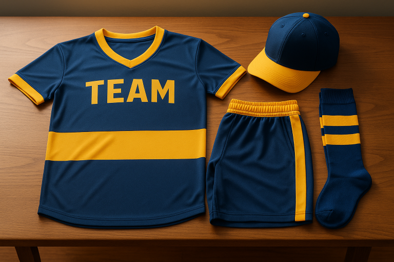
Create mockups of your full uniform set – jerseys, pants or shorts, socks, and any additional gear like warm-ups or accessories. The palette should work seamlessly across all pieces while leaving room for future updates or additions.
For teams ready to bring their vision to life, Wooter Apparel offers expert design support. They’ll help refine your palette, provide accurate fabric samples, and ensure the final uniforms match your approved colors through their specialized sublimation process.
Sport-Specific Palette Requirements
Each sport comes with its own unique set of color needs, balancing performance, visibility, and style.
Basketball and Football
Basketball uniforms often feature bold primary colors like navy, black, or deep red, paired with light, contrasting numbers to enhance readability on the court. The sleeveless design and side panels of basketball jerseys provide an opportunity to incorporate striking contrasts and patterns that stand out during gameplay.
For football, the challenge is different. Uniforms must work cohesively across jerseys, pants, helmets, and accessories to solidify team identity. Football’s bulkier uniforms also require colors that remain sharp and easy to recognize from far away, even in large stadiums. Strong secondary colors are crucial for creating alternate uniforms, while accent colors can add unique, memorable touches to the overall design.
Baseball, Softball, and Soccer
Outdoor sports like baseball, softball, and soccer often favor lighter primary colors to minimize heat absorption under the sun. In baseball, white is a classic choice for jerseys, ensuring high visibility on the field. Bold accents, such as those used for logos and player names, can add a dynamic edge without sacrificing clarity.
Soccer uniforms, on the other hand, benefit from vivid and eye-catching colors that maintain visibility in varying lighting conditions. Given soccer’s global appeal, it’s also essential to consider how colors will appear on TV screens and in diverse weather scenarios. Across these sports, the palette should complement sponsor logos and player names, ensuring clear contrast while staying true to the team’s identity.
Accessories and Warmups
A cohesive color strategy shouldn’t stop at game uniforms – it should extend to all team gear, including warmups, socks, and practice apparel. This ensures a polished and unified team look.
- Warmup gear provides a space to highlight accent colors more prominently, offering a fresh take on the core design.
- Socks, though often overlooked, play a visible role during games. They should either match the primary palette or stick to neutral tones like white, black, or gray to avoid clashing with the overall design.
- Shooting shirts and practice gear can experiment with lighter shades of primary colors or use accent tones as the centerpiece, adding variety while preserving the team’s identity.
Partnering with Wooter Apparel ensures consistency across all uniform elements. Their advanced sublimation process delivers precise color reproduction across different fabrics and gear, from jerseys and shorts to warmup jackets and accessories. This level of consistency is critical for achieving a professional and unified look, both on and off the field.
Finally, consider adjusting accessory colors to match seasonal conditions while staying aligned with the team’s core palette.
Trends and Classic Designs
As we delve deeper into the world of uniform design, today’s trends and timeless classics bring together nostalgia and modern flair. Teams that succeed in this area know how to balance tradition with fresh ideas, ensuring updates feel like a natural extension of their identity rather than a departure from it.
Classic color combinations remain at the heart of many iconic uniforms, while current trends introduce bold new elements that redefine what’s possible.
Classic Color Combinations
Some color pairings never go out of style. Bright red and royal blue, gold with deep maroon, or cream paired with burnt orange have stood the test of time for good reason. These combinations offer strong contrast and excellent visibility, making them ideal for high-energy sports environments.
But even classics can evolve. Subtle updates, like adding metallic finishes or gradient effects, can breathe new life into these palettes. These small tweaks preserve the historical essence fans love while giving the design a contemporary edge.
Current Trends in Sports Uniform Design
The latest trends in sports uniforms are all about blending innovation with visual impact. In 2025, advancements like sublimation printing are bringing bold ideas to life. Gradient and ombre effects, for example, add a sense of movement and depth to uniforms.
High-visibility neon shades – think hot pink, electric blue, and neon yellow – are making waves. These vibrant colors not only create a striking modern look but also improve visibility during fast-paced games. Teams are using these neon tones sparingly, often as accents on numbers, nameplates, or trim, rather than as dominant colors.
On the other end of the spectrum, monochromatic designs are gaining traction. Single-color jerseys with tonal variations create a sleek and powerful aesthetic. Meanwhile, cyberpunk-inspired hues like neon purple paired with bold contrasts are giving uniforms a futuristic vibe. For those looking for something more understated, muted tones like slate gray, sand beige, and forest green offer a polished, sophisticated alternative.
Balancing New Ideas with Tradition
The key to successful uniform updates lies in balancing modern trends with a team’s established identity. Incorporating trendy elements as accents, rather than overhauling a uniform entirely, ensures the design feels both fresh and familiar. For instance, reviving vintage palettes with modern materials can maintain tradition while adding a contemporary twist.
Geometric patterns and bold color blocks are also trending, but they work best when they complement a team’s core look rather than overpower it. For example, geometric panels in traditional colors can add visual interest without straying too far from the team’s recognizable aesthetic.
Advancements in sublimation technology, such as those offered by Wooter Apparel, allow for more experimentation. Teams can explore complex gradients, multiple accent colors, and seamless transitions without sacrificing consistency across uniform elements.
At the end of the day, fan recognition is what matters most. Uniform updates should feel like a natural progression, enhancing the elements fans already associate with their team. Testing new designs on practice gear or warmup apparel can provide valuable insights before making changes to game-day uniforms, ensuring both players and supporters remain connected to the team’s identity.
sbb-itb-4d95ad3
Compliance, Visibility, and Accessibility
Creating a uniform design isn’t just about aesthetics – it needs to meet official standards and work effectively in a variety of environments.
League Compliance Standards
Before settling on a design, check your league’s specific rules and regulations. Many sports organizations require teams to use contrasting colors to make it easier for referees, players, and spectators to distinguish between teams. Since these guidelines can differ between associations and divisions, it’s important to confirm that your design aligns with the necessary requirements.
Broadcast and Audience Visibility
Uniforms should look sharp and clear under all kinds of lighting – whether it’s natural sunlight, indoor arena lights, or the glare of television cameras. Test your design in these different settings to ensure key details remain visible. High-contrast color combinations are especially important for making designs pop on screen.
Accessibility and Inclusion
Accessibility is a key factor in modern uniform design. Using high-contrast color combinations can help those with color vision deficiencies better differentiate between elements. Additionally, bold fonts and appropriately sized text enhance readability, making it easier for everyone to follow the game action.
Color Specification and Proofing Process
Ensuring your team’s colors look flawless, from digital design to physical fabric, requires careful planning, testing, and approval. This phase plays a crucial role in making sure your uniforms reflect the exact colors you envisioned.
Creating and Testing Color Samples
Digital colors rarely translate perfectly onto fabric. To bridge this gap, start by converting your colors to HEX codes for digital mockups and Pantone colors for production. While HEX codes are great for initial designs, Pantone provides a trusted industry standard for consistent color reproduction across materials and printing methods.
If you’re using sublimation printing, keep in mind that colors may shift slightly during the heat transfer process. To avoid surprises, request strike-off samples – small fabric swatches printed using the same method intended for your final uniforms. Test these samples under various lighting conditions, such as indoor lighting, sunlight, and even broadcast lighting, to confirm they appear consistent.
Additionally, consider how the fabric and finish you’ve chosen might impact the final look.
Fabric and Finish Effects
The type of fabric and its finish have a big influence on how colors are perceived. For example, moisture-wicking polyester often makes colors appear more vibrant compared to cotton blends. Similarly, the texture of the fabric matters: smooth finishes reflect more light, making colors seem brighter, while textured fabrics might dull the vibrancy.
Sublimation printing, which bonds ink directly to polyester fibers, can also cause slight shifts in color, especially with shades like reds and blues. Darker colors tend to retain their depth better, while lighter pastels may sometimes appear less vibrant after the printing process.
To ensure color consistency, test every material used in your uniforms – jerseys, shorts, and accessories alike. Each component may react differently to the printing process.
Proofing and Final Approval
Once you’ve tested samples and accounted for fabric effects, it’s time to move on to proofing. Request a complete sample of the uniform, including all components – jerseys, shorts, and accessories – produced to your exact specifications. This allows you to see how the colors work together across the entire design.
Pay special attention to elements like team logos, player numbers, and accent colors. Even minor variations can stand out when viewed on the field or court, so color matching is essential.
To keep everything consistent for future orders or updates, document the approved colors with digital codes and fabric swatches. A color reference kit – complete with fabric samples and their corresponding Pantone and HEX codes – can save time and effort down the road.
Keep in mind that the proofing process typically takes 7–10 business days, so plan your production schedule accordingly. Getting the colors right from the start avoids costly mistakes and ensures your team looks sharp.
At Wooter Apparel, we take color proofing seriously. Our thorough process ensures every custom uniform meets the highest standards of color accuracy and quality, so your team can step onto the field with confidence and style. These steps are key to creating uniforms that stand the test of time.
Maintaining Uniform Colors Over Time
Once you’ve nailed the perfect uniform design, keeping those colors vibrant is crucial for long-term use. Your team’s uniforms are an investment, and proper care ensures they stay looking sharp and professional season after season. Neglecting care, on the other hand, can quickly lead to dull, worn-out gear.
Care Instructions for Sublimated Uniforms
Sublimated uniforms need special attention to maintain their vivid colors and performance. The sublimation process fuses ink directly into polyester fibers, creating designs that resist fading. However, improper washing can still damage both the fabric and the design. Following the right care routine is essential to protect this durability.
- Wash in cold water: Stick to cold water (30–40°F or 15–20°C) to preserve fabric integrity. Hot water can weaken elasticity and cause colors to bleed.
- Turn uniforms inside out: This minimizes friction during washing, protecting logos and numbers from wear.
- Use the right detergent: Choose mild, bleach-free liquid detergent and avoid fabric softeners. Softeners can leave residues that interfere with moisture-wicking and other performance features.
- Use a mesh laundry bag: This adds an extra layer of protection by reducing friction with other items.
- Separate colors: Wash similar colors together and keep whites separate to prevent any accidental bleeding.
Drying is just as important as washing. Air drying is ideal for maintaining elasticity and preventing heat damage. Lay uniforms flat or hang them on plastic or wooden hangers in a ventilated space, away from direct sunlight. If you must use a dryer, opt for the lowest heat setting or an air-dry cycle, and remove the uniforms promptly.
For stains, act quickly. Treat them with cold water and mild soap, avoiding bleach or harsh chemicals that can cause permanent fading.
When it comes to storage, make sure uniforms are completely dry before putting them away. Store them in a cool, dry place, away from sunlight, to prevent mildew, mold, or fading.
Planning for Reorders
Even with proper care, reordering uniforms is inevitable for new team members or replacements. Planning ahead ensures consistent colors across all orders.
- Document everything: Keep detailed records of fabric types, color codes, sizes, and customizations. Store both physical and digital copies of approved designs and color proofs for easy reference.
- Use a color reference kit: This ensures consistency when reordering, preventing color variations between batches.
- Plan ahead: Place reorders 4–6 weeks in advance to allow time for adjustments and avoid rushing.
- Order extras: Ordering a few additional uniforms in common sizes during the initial order can save time later. Dye lots may vary slightly between production runs, so having backups ensures consistent color matching.
Additionally, document any color adjustments made during the proofing process. This simplifies future orders by eliminating the need for repeated trial and error.
At Wooter Apparel, we keep detailed records of every custom uniform order. This ensures seamless reorders and consistent colors across seasons, helping your team maintain a polished, unified look year after year.
Conclusion: Designing Effective Sports Uniforms
This guide has covered the key aspects of sports uniform design, from choosing the right colors to practical maintenance tips. Successful uniforms combine elements like color psychology, visibility, compliance, and brand identity. Every choice, especially regarding color, can influence player confidence, fan engagement, and overall team performance.
Once you’ve nailed the color palette, the next step is making sure every design detail – like numbers and names – stands out. High-contrast accents are crucial for readability, whether you’re in the stands or watching on TV. A jersey’s effectiveness often hinges on how easily players can be identified, so it’s essential to test your designs under real stadium lighting and filming conditions before finalizing production.
Research backs the impact of color on performance. For example, studies suggest that wearing red can enhance perceptions of dominance and even improve competitive outcomes. Peer-reviewed research has found that athletes in red uniforms have a better chance of winning, particularly in Olympic combat sports, due to psychological and hormonal factors. To balance these effects with practicality, teams often incorporate bold colors like yellow and black as trims or secondary elements, ensuring both visual appeal and clarity.
When proofing your designs, real-world testing is a must. Colors can appear different depending on the materials used, so it’s important to create fabric-specific swatches and test them under stadium lighting. Whether it’s jersey bodies, mesh panels, or warmups, material finishes can alter how colors look. Finalize your Pantone or equivalent color specifications only after these tests are complete.
Today’s teams combine scientific insights with tradition to choose colors and designs that inspire confidence, enhance visibility, meet regulations, and solidify their brand identity.
FAQs
How do the colors of sports uniforms impact team performance and fan engagement?
The colors of sports uniforms aren’t just about aesthetics – they have a real impact on both player performance and fan enthusiasm. Research indicates that vibrant shades like red can instill confidence and project dominance, potentially giving athletes a mental edge during competition. Meanwhile, cooler tones like blue are often associated with calmness and focus, helping players stay composed and perform at their best under pressure.
For fans, team colors spark emotional connections and loyalty. Energetic hues like orange can inspire feelings of excitement and optimism, strengthening the bond between supporters and their teams. By carefully selecting colors, teams can boost morale, shape fan perceptions, and enhance overall engagement, proving that color psychology plays a key role in sports uniform design.
How can I keep sublimated sports uniforms looking vibrant and long-lasting?
To keep sublimated sports uniforms looking sharp and lasting longer, here are a few straightforward care tips:
- Gentle washing: Stick to cold water and a delicate cycle to protect the vibrant colors and prevent them from bleeding. Steer clear of harsh detergents or bleach, as they can damage the design.
- Air drying is key: Skip the dryer altogether. Letting uniforms air dry helps maintain the fabric and the sublimated patterns. High heat can weaken or ruin the material.
- Skip the fabric softener: While it might seem helpful, fabric softeners can actually break down the material, impacting the uniform’s quality and performance over time.
By keeping these tips in mind, your team’s uniforms will stay bold and ready for action season after season.
How can teams update their sports uniforms to look modern while honoring their traditional identity?
Balancing contemporary trends with a team’s long-standing identity takes careful consideration. Begin by pinpointing the core elements – like signature colors, iconic logos, or recognizable patterns – that embody the team’s history and should stay intact. Once those are established, you can introduce modern features, such as updated typography, streamlined designs, or understated accents, to refresh the uniforms while keeping their timeless essence.
Taking a gradual approach to updates often works best. It allows for a seamless blend of tradition and modernity, helping to preserve fan loyalty and highlight team pride, all while ensuring the design stays relevant to current aesthetics.