
Uniform color consistency is key to maintaining team identity and brand recognition. Small errors in color matching can lead to wasted materials, production delays, and mismatched uniforms that undermine professionalism. Here’s a quick breakdown of how to ensure precise color accuracy in custom uniforms:
- Set Up Your Design File Correctly: Use CMYK color mode, ensure 300 DPI resolution, and apply ICC profiles for accurate color translation onto fabric.
- Calibrate Equipment: Adjust monitor and printer settings to align with fabric type and ink density. Recalibrate printers every 6–12 months.
- Run Test Prints: Compare test samples to Pantone standards and measure Delta E values (aim for less than 2.0) to ensure accuracy.
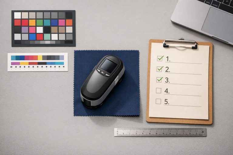
- Use Color Measurement Tools: Spectrophotometers provide precise color readings, reducing human error. Calibrate these tools regularly for consistency.
- Implement Quality Control: Maintain records of test samples, conduct routine inspections, and address any deviations immediately.
Quick Tip: Following these steps can reduce production waste by 20–30% and protect your team’s professional image. Regular inspections and proper calibration are essential for consistent results.
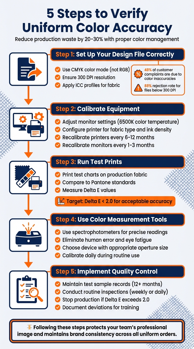
5-Step Process for Verifying Uniform Color Accuracy
Step 1: Check Your Design File and Color Mode
Before diving into production, make sure your design file is set up the right way. Start by switching to CMYK color mode instead of RGB. Why? Fabric printing relies on a subtractive process using Cyan, Magenta, Yellow, and Black inks that absorb light. On the other hand, RGB is meant for screens that emit light, like monitors and smartphones, making it unsuitable for physical printing.
Pay attention to the color gamut differences. Bright, neon, or highly saturated colors that look amazing on your screen often can’t be replicated with textile inks. Designing in RGB and converting to CMYK later can lead to unexpected color shifts, which might distort your brand’s visual identity. Did you know that 48% of customer complaints about fabric print quality are tied to color inaccuracies? Starting with CMYK helps you spot and correct these issues early in the process.
For crisp and detailed results, ensure your design resolution is at least 300 DPI at actual print size. Save your files in high-quality, uncompressed formats like TIFF or high-resolution PNG. Low-resolution files (below 300 DPI) are a major red flag, with an 88% rejection rate. After setting up your file, fine-tune the color profiles to suit the fabric you’ll be printing on.
Review Color Profiles
Color profiles, such as ICC profiles, are essential for translating your design’s colors onto fabric. These profiles adjust for the way different materials – like cotton or polyester – absorb ink. Tools like the "soft proofing" feature in Adobe Illustrator or Photoshop let you preview how your colors will look on various fabrics before production. This step can save you from unpleasant surprises when the final print doesn’t match your expectations.
Once you’ve aligned the color profiles, double-check every detail to ensure your file is ready for production.
Confirm File Settings
Before sending your files to production, verify all settings. Match your design canvas to the exact dimensions of the final output. For instance, if you’re designing a 4-inch logo, ensure it’s at 300 DPI. Avoid upscaling low-resolution images – this won’t improve quality and will result in pixelation. If your design includes transparency, save it as a PNG with a transparent background to prevent unwanted white boxes. Lastly, convert any fonts to outlines to avoid font substitution errors during printing.
sbb-itb-4d95ad3
Step 2: Calibrate Your Printing Equipment and Software
Once your design file and settings are finalized, the next step is to ensure that your printed colors match your intended design. This requires precise calibration of your printing equipment and software. A Raster Image Processor (RIP) plays a key role here – it acts as a translator, managing how colors from your design are interpreted and applied by the printer. Without proper calibration, even the most meticulously prepared design files can result in disappointing prints. Calibration essentially bridges the gap between your digital design and the final printed product.
As noted by the International Color Consortium, "color accuracy is essential for maintaining brand identity and ensuring that the final product meets the desired quality standards". This is particularly critical for projects like custom uniforms, where consistent team colors are non-negotiable, even across multiple orders or seasons. Calibration takes into account variables such as fabric type, ink density, and even environmental factors that can alter how colors appear.
Set Color Parameters
Before diving into printer settings, start by calibrating your monitor. Set the monitor’s color temperature to 6500K if you’re working with sRGB workflows. Disable any vivid or dynamic color-enhancing modes, as these can distort the true colors of your design. For the best results, use a hardware calibrator like the X-Rite i1Display Pro to ensure accuracy.
It’s also crucial to align your media settings with the physical materials being used. This means configuring software settings for fabric type and ink density to match the actual materials you’ll be printing on.
Run Linearization and Calibration
Once your color parameters are adjusted, the next step is calibrating your printer to fine-tune its output. Afterward, create a printer profile to ensure the printer’s output aligns with standard color settings. This process involves printing a standardized color chart and using a spectrophotometer to measure how your printer reproduces colors.
To preview how colors will appear on fabric, use soft proofing tools within your color management software. Programs like Adobe Color or X-Rite ColorMunki can simulate the final print output on your calibrated monitor.
Keep in mind that calibration isn’t a one-time task. Recalibrate printers every 6–12 months and monitors every 1–3 months to maintain consistent results.
Step 3: Compare Test Prints with Standard References
Once your equipment is calibrated, the next step is to print test charts on your production fabric and compare them to established color standards. This process helps reveal how colors appear on the actual fabric, considering factors like texture and material composition – details that screens can’t fully replicate. This step bridges the gap between calibration and ensuring the final product meets quality expectations.
Use Color Reference Guides
Pantone colors are widely accepted as the go-to standard for achieving precise color accuracy in custom football uniforms. By specifying exact Pantone codes – like PANTONE 7413 C – you can eliminate any ambiguity in color selection. Tools like the Pantone Color Finder or downloadable Pantone Color Swatch Book PDFs can help you identify the exact shades you need before production begins.
If your design includes team logos or specific brand colors, refer to your brand guidelines or style guides. These often include pre-approved Pantone specifications to maintain consistency. Importantly, always compare your physical fabric sample with a physical Pantone Formula Guide rather than relying on your monitor, as screen displays can distort colors. Following Pantone standards ensures your uniforms maintain a consistent and professional appearance.
"Pantone colors are universal standard that is used by all printers." – Wooter Apparel
"Giving us the color code from our color swatch will provide the best results." – Wooter Apparel
Measure Delta E Deviation
While visual checks are a good starting point, human perception of color is subjective – our eyes can adapt to subtle shifts, making it easy to overlook small inconsistencies. That’s why objective measurements are essential after visual matching. Delta E (ΔE) is a numerical value that quantifies the difference between printed colors and your reference standards. A Delta E of 0 means a perfect match, while values under 2.0 are generally acceptable for uniform production. This ensures your uniforms consistently align with your brand’s identity.
To measure Delta E, use a handheld spectrophotometer, which captures color across the visible spectrum. For textured or patterned fabrics, rotate the sample 90° and take readings from four different positions, then average the results for accuracy. If the fabric is thin, layer it until the measurements stabilize. This process provides a reliable way to confirm that your colors meet the required standards.
Step 4: Use Color Measurement Tools
Using tools like spectrophotometers helps eliminate the natural limitations of human vision, such as color blindness or eye fatigue, ensuring accurate color assessment. These devices rely on scientific measurements, capturing spectral data and comparing it to established industry standards through specialized software.
"Since we can’t depend solely on our eyes for color verification, we use spectrophotometers to measure test targets or control strips produced from an output device or printer." – Shelby Sapusek, CMO, ColorCasters, LLC
Choose Reliable Measurement Devices
When working with uniform fabrics, it’s important to select a device with an aperture that matches the material’s characteristics. For example, the X-Rite i1 Pro 2 features a 3.5mm aperture, making it suitable for smoother fabrics, while the i1 Pro 3 Plus, with its 8mm LED-driven aperture, is better for textured surfaces. Larger apertures are particularly useful for capturing accurate averages on woven or knitted materials.
If your production spans multiple facilities, investing in high-end devices that offer inter-instrument agreement is essential. This ensures consistent color results across different locations, maintaining tight Delta E tolerances throughout your supply chain.
For spot checks, handheld devices like the Barbieri Spectropad are convenient and don’t require a computer connection. On the other hand, automated options like the Barbieri Spectro LFP qb provide greater precision for high-volume quality control tasks. When measuring translucent materials, such as certain uniform fabrics, layer or stack the material until it is opaque. This prevents background colors from affecting the readings.
Once you’ve chosen the right device, maintaining its accuracy is just as important.
Schedule Regular Device Calibration
To ensure consistent performance, make calibration a routine part of your workflow. Even top-tier spectrophotometers can experience drift over time due to lamp aging or environmental factors. Regular calibration – daily for routine use and every two to four hours during extended sessions – helps counteract these changes. Maintain optimal conditions by keeping humidity levels between 20% and 85%, and avoid exposing the workspace to direct sunlight or chemical vapors.
When handling calibration tiles, use lint-free gloves and clean them with approved isopropyl alcohol wipes to avoid contamination. Between full calibrations, use the built-in green tile reference for quick checks. If the device measures more than 0.2 Delta E off from the printed values, perform a full recalibration immediately. Additionally, schedule annual factory certifications to ensure NIST-traceable accuracy and compliance with ISO 9001 standards.
"Treat the calibration tile as if it’s a precious optical device because it is." – Mike Huda, X-Rite
Step 5: Set Up Quality Control Practices
Once you’ve got precise calibration and measurement nailed down, the next step is ensuring consistent quality control. Even with the best-calibrated equipment, maintaining color accuracy requires constant oversight. By putting structured quality control practices in place, you can catch any deviations before they cause production issues.
Keep Test Sample Records
Create and maintain both physical and digital libraries of test samples from each production batch. Each sample should include detailed labels with key information like the batch number, production date, ink or dye details, substrate type (e.g., polyester for sublimated uniforms), and measured Lab* values from your spectrophotometer. Physical samples should be stored in color viewing booths, while digital records provide a long-term archive.
Organize these records by dye class, substrate, and color standards, and keep them for at least 12 months. This allows you to monitor trends, such as color drift or fading under simulated sunlight exposure. When reordering custom button-down baseball jerseys, these records ensure the new batch matches the original specifications, preserving the professional brand image you’ve worked to establish. Essentially, these samples become your go-to reference for future inspections.
Conduct Routine Inspections
Perform regular spectrophotometer checks to ensure Delta E deviations stay within your acceptable range. For standard operations, weekly checks are sufficient, but during high-volume production, daily spot-checks are a smart move. Additionally, conduct full inspections after equipment maintenance, material changes, or every 500 units to confirm that Delta E remains below 2.0.
If you spot any color deviations, stop production immediately. Re-linearize your printing equipment, adjust ink settings based on spectral data, produce new test prints, and re-measure before restarting. Document these deviations with photos from digital imaging systems, and use them as training opportunities to reinforce Lab color standards with your team. For businesses with multiple facilities, consider third-party programs like Datacolor Certify for supplier audits. These programs help ensure consistent quality across your entire supply chain, keeping your uniform standards intact.
Conclusion: Maintaining Color Accuracy for Professional Uniforms
Keeping uniform colors consistent isn’t just about aesthetics – it’s about preserving your team’s identity. By following the five key steps outlined earlier, from reviewing design files to implementing strict quality control measures, you can ensure that every pro football jersey, short, or warmup piece reflects your brand perfectly. When colors fade or vary from batch to batch, it risks damaging the professional image you’ve worked so hard to establish.
Using Lab color values as part of your quality control process is a game-changer. It not only helps identify color discrepancies early but also reduces production waste by 20–30% – a win for both your budget and your team’s image. These Lab values form the backbone of a reliable system, catching issues before they escalate.
Technological advancements like AI-powered color analysis and inline measurement tools make maintaining consistency easier than ever. These tools allow for real-time adjustments and minimize human error, especially in large-scale operations. For teams managing multiple batches or working with various suppliers, these innovations ensure that every piece of gear – from jerseys to accessories – matches seamlessly.
Beyond just verifying colors, automated calibration and digital Lab records help protect your investment. Regular inspections and precise color management don’t just guarantee sharp-looking uniforms; they reinforce trust within your team and among your audience. Whether it’s for a local league or a high-stakes competitive team, these steps ensure every player looks unified and professional when it matters most.
At Wooter Apparel, we’re committed to providing custom uniforms that meet these exacting standards, so your team can perform and look their best – on and off the field.
FAQs
What’s the easiest way to pick the right Pantone for our team colors?
The simplest way to pick the perfect Pantone for your team colors is by using a Pantone color swatch or a color picker tool. Wooter Apparel provides helpful resources, such as a Pantone Color Swatch Book PDF and an online Pantone finder, to make matching your ideal shades easier. By referencing exact Pantone codes, you can maintain consistent colors across different materials and lighting conditions, ensuring your team’s branding stays on point.
What should we do if the test print looks different than the screen?
If the printed result doesn’t match what you see on the screen, it’s time to check for possible color accuracy problems or printing mistakes. Start by tweaking the color settings and confirming that the correct color profiles are in use. Make sure the printing equipment is properly calibrated as well. Reviewing mockups and testing fabric samples can help confirm that the final product aligns with your vision. This testing phase is essential to ensure your design comes out exactly as planned.
How can we keep colors consistent across reorders and different suppliers?
To keep colors consistent across reorders and suppliers, rely on standard color codes such as Pantone, CMYK, RGB, or HEX. Make sure to document these codes for easy reference in the future. It’s also a good idea to test colors on fabrics in different conditions to ensure they look as intended and maintain their quality over time.
Detailed records are essential – note down color specifications, fabric details, and care instructions. Proper washing and storage practices are just as important for preserving color accuracy in the long run.