
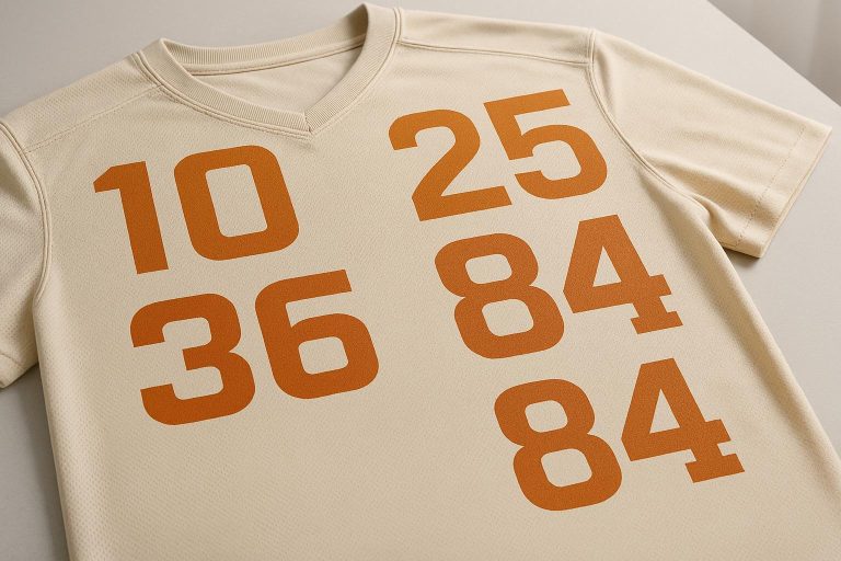
Choosing the right font for jersey numbers impacts both readability and team identity. Fonts need to be bold, legible from a distance, and compatible with printing methods like sublimation or screen printing. Here are the top 10 fonts for 2025:
- College Font Family: Classic athletic style, clear at all sizes, perfect for sublimation.
- Scout – Athletic Typeface: Sharp and bold, great for sports branding and scalability.
- Helofone Sport: Designed for sports, works well with sublimation and other printing methods.
- CS Hovan Mono: Stencil-inspired with consistent spacing, ideal for bold, technical looks.
- CS Holver: Clean and geometric, supports multiple languages with a polished design.
- CS Howard: Gothic-style, bold and angular for a strong sports identity.
- CS Helga: Sleek sans serif with inktrap design for sharp printing results.
- Orqendha: Serif font blending classic and modern aesthetics for unique team looks.
- Team Sport: Modern serif display typeface, bold and highly visible.
- Balegare: Combines calligraphy with athletic design, perfect for soccer and hockey.
Quick Comparison
| Font Name | Style | Best Use Case | Printing Compatibility |
|---|---|---|---|
| College Font Family | Bold, Block | Multi-sport | Sublimation |
| Scout | Sharp, Clean | Branding, Jerseys | Sublimation, Screen |
| Helofone Sport | Bold, Athletic | Jerseys, Logos | Sublimation, Heat Transfer |
| CS Hovan Mono | Stencil, Monospaced | Technical, Industrial | Sublimation |
| CS Holver | Geometric, Sleek | Multi-sport | Sublimation |
| CS Howard | Gothic, Angular | Baseball, Football | Sublimation |
| CS Helga | Modern Sans Serif | Basketball, Volleyball | Sublimation |
| Orqendha | Serif, Classic | Logos, Jerseys | Sublimation |
| Team Sport | Serif, Bold | Team Spirit, Jerseys | Sublimation |
| Balegare | Calligraphy, Athletic | Soccer, Hockey | Sublimation, Heat Transfer |
When selecting a font, focus on visibility, compatibility with your printing method, and how well it represents your team’s identity. For professional results, sublimation printing ensures vibrant and durable designs.
The 10 Best FREE Fonts for Sports Design
How to Choose Jersey Number Fonts
Building on the earlier discussion about legibility, let’s dive into how to pick the perfect font for jersey numbers.
Choosing a font for jersey numbers is all about finding the sweet spot between readability, printing compatibility, and representing your team’s identity. A poorly chosen font can make numbers hard to read during fast action, while a well-thought-out choice enhances clarity and reinforces your team’s image.
For sports jerseys, fonts should be bold and uniformly thick so they remain easy to read from a distance, even during high-speed gameplay. For adult jerseys, numbers around 2 inches work well, while 1.5 inches is ideal for smaller sizes. Always test fonts at game distances to ensure they’re clear.
Matching Fonts to Your Sport and Printing Method
The style of the font should align with the visual language of your sport. For example, basketball jerseys often look great with sleek, modern fonts, while football jerseys tend to favor angular, bolder designs. This alignment creates a natural connection between your team and the tradition of the sport.
Equally important is how the font interacts with your printing method. Different printing techniques have their strengths and pair better with specific font styles:
| Printing Method | Best Font Types | Key Features |
|---|---|---|
| Sublimation | Detailed, intricate designs | Long-lasting and vibrant; ink bonds with fabric for durability and no fading or cracking |
| Screen Printing | Simple, bold fonts | Ideal for large orders; thick ink coverage makes it cost-effective |
| Heat Transfer | Fonts with finer details | Great for small runs; handles detailed designs well |
| Embroidery | Clean, clear fonts | Offers a premium look with durable stitching |
For example, sublimation printing is a standout choice for polyester jerseys because it embeds ink directly into the fabric, keeping the design vibrant and durable. Fonts with consistent line thickness work particularly well with this method, ensuring numbers stay legible from afar.
Testing for Contrast and Character Clarity
Before locking in your font, test it on both light and dark fabric colors. A font that pops on a white jersey might fade into the background on a darker one. Testing ensures the numbers remain sharp and visible, regardless of the fabric color.
Pay special attention to fonts that clearly differentiate similar-looking characters, like 1 and 7 or 6 and 9. This is especially important for two-digit numbers, which are about twice as common as single-digit ones, according to the SoccerNet dataset.
“While it’s easy to criticize some typographic missteps, the truth is that designing for sports is more complicated than some may think.” – Monotype
Ensuring Professional and Functional Design
Ultimately, your font choice should maintain clarity at all sizes, work seamlessly with your preferred printing method, and avoid confusion between similar characters. These elements ensure your jersey numbers not only look professional but also serve their purpose throughout the season.
At Wooter Apparel, we specialize in sublimation printing for custom jerseys, allowing you to pick from a wide variety of font styles while ensuring durability and vibrant colors. We even test fonts at actual jersey sizes to guarantee they’re game-ready and easy to read in action.
1. College Font Family
The College Font Family stands out as a go-to option for jersey numbers, offering a timeless collegiate athletic vibe that works across various sports. It combines a classic university-inspired design with the functionality needed for modern sportswear. Here’s a closer look at why it performs so well in terms of readability and style.
Easy to Read from a Distance
With its bold, block-style design, the College Font Family ensures excellent readability, even from far away. Thick strokes and generous character spacing make the numbers easy to spot from the stands, which is especially important during fast-paced games.
Perfect for Different Sports
This font brings a sense of athletic tradition to any sport. In basketball, it evokes the nostalgic charm of March Madness tournaments. For football, it captures the commanding presence of historic college programs. Its bold, structured design also works seamlessly for baseball, softball, and other sports, giving teams a polished and cohesive look.
Works Across All Sizes
The balanced design of the College Font Family ensures clarity at any size. Whether it’s for youth jerseys (1.5 inches) or adult uniforms (2 inches), the thick, consistent strokes maintain their legibility and proportionality across all jersey dimensions.
Ideal for Modern Printing Techniques
The College Font Family is designed to work effortlessly with today’s printing methods, especially sublimation printing. Its OTF files integrate smoothly with design software. For teams using cutting machines like Silhouette or Cricut, these fonts are fully compatible, allowing for precise heat transfers. The bold lines and consistent structure ensure that when printed – such as via sublimation on polyester jerseys – the ink adheres perfectly, creating vibrant, durable numbers that stay crisp over time.
These features make the College Font Family a dependable option for any team. At Wooter Apparel, incorporating fonts like this ensures our custom jerseys not only look great but also perform exceptionally well, both on and off the field.
2. Scout – Athletic Typeface
The Scout Athletic Typeface delivers a sharp, clean, and bold design, tailored specifically for sports-related projects. Designed by Igor Ovsyannykov and published by Hipfonts, this typeface draws inspiration from sports logo designs and Nike‘s marketing campaigns.
A Perfect Fit for Sports Branding
Scout is all about versatility and athletic charm. It’s an excellent choice for sports branding, whether you’re designing emblems, jerseys, posters, apparel, magazine headlines, or labels. Its bold lettering ensures jersey numbers and team names stand out, making it ideal for a variety of athletic uniforms and promotional materials.
Reliable Across Sizes
What makes Scout truly stand out is its ability to perform across different sizes without losing its impact. Envato Elements highlights its scalability, noting that it maintains its sharpness and clarity whether it’s used for small youth jerseys or larger adult uniforms. Its fully-kerned design ensures proper spacing and excellent readability at any size. This makes it a dependable choice for applications that demand both style and functionality. From youth leagues to professional teams, Scout keeps its bold, polished look intact.
3. Helofone Sport
Helofone Sport is a typeface crafted specifically for sports and gaming designs. It’s perfect for creating logos, tickets, brochures, and, most notably, team jerseys. Each character is designed to deliver a bold, athletic vibe that stands out on any uniform.
Works Seamlessly with Sublimation and Printing
Helofone Sport comes in multiple formats – OTF, TTF, WOFF, and WOFF2 – making it easy to use across various design software. If your team uses Wooter Apparel’s sublimation printing process, this font is fully compatible, ensuring your designs look sharp and professional.
Next up, we’ll explore other fonts that bring unique styles and reliable options for all your uniform design needs.
4. CS Hovan Mono
CS Hovan Mono is a contemporary sans-serif font that combines stencil and monospaced styles, giving it a sleek, industrial feel. Its design, inspired by printed or stamped lettering, makes it a standout choice for team uniforms, where a bold and technical look is key. The font’s structure ensures a visually balanced appearance, perfect for the fast-paced energy of sports.
With 350 downloads and featured in 10 design collections as of 2025, CS Hovan Mono’s monospaced layout guarantees consistent spacing. This not only enhances its legibility but also ensures uniformity, even from a distance. The stencil details add a touch of personality while maintaining clarity, making it ideal for displaying jersey numbers prominently.
Built with modern uniform production in mind, CS Hovan Mono performs well in both print and digital applications. When paired with Wooter Apparel’s sublimation process, the font delivers crisp, clean edges that highlight its industrial aesthetic, ensuring numbers look sharp and professional.
Keep in mind that the demo version is for personal use only. Teams planning to use CS Hovan Mono for commercial uniform production will need to purchase a full commercial license.
5. CS Holver
CS Holver is a font that brings a modern and sleek aesthetic to the table, characterized by its clean, geometric shapes. It offers a complete character set that supports multiple languages, making it versatile for various design needs. Plus, it’s PUA encoded, so you can access all its features without needing any special software.
This font is particularly suited for jersey numbers, thanks to its sharp and polished design. It pairs seamlessly with Wooter Apparel’s sublimation printing process, ensuring crisp and consistent results on uniforms. Beyond sportswear, CS Holver is a great choice for logos, printed materials, merchandise, and even digital projects, making it a reliable option for multiple applications.
sbb-itb-4d95ad3
6. CS Howard
CS Howard is a Gothic-style display sans serif font characterized by its sharp, angular lines and bold, modern look. The high contrast between its thick and thin strokes creates a sense of visual energy and movement that commands attention.
Legibility from a Distance
One of CS Howard’s standout features is its clarity at larger sizes, making it an excellent choice for jersey numbers that need to be seen from afar.
Distinctive and Stylish Design
With its dramatic appearance and consistent stroke weights, CS Howard delivers a strong visual identity. It works equally well whether you’re examining it up close or spotting it from a distance.
Versatility Across Sizes
Thanks to its well-balanced strokes, this font maintains its impact and readability regardless of the size. This makes it a reliable choice for various applications, offering flexibility without losing its bold character.
CS Howard Drawn Variation
For teams looking for something a bit more unique, the CS Howard Drawn Variation provides a fresh take. It blends the font’s clean lines with subtle handcrafted textures, adding an organic feel while keeping it easy to read. This variation brings a touch of personality without sacrificing functionality.
7. CS Helga
CS Helga stands out as a modern sans serif font that blends bold design with practicality. It’s crafted to deliver clarity and performance, making it a top pick for jersey numbers across a variety of sports [28,29]. This font seamlessly combines timeless elegance with a contemporary edge.
Bold Design for Sports Jerseys
With its thick proportions and sturdy letterforms, CS Helga exudes strength and confidence. It’s especially eye-catching on basketball and baseball jerseys, where its bold style complements the energetic nature of these sports.
For teams looking for a more artistic touch, the CS Helga Drawn variation offers hand-drawn details that add a sketch-like texture. This introduces a lively, tactile quality to the design, softening its structured appearance while maintaining its visual appeal. This artistic option enhances the font’s versatility without compromising its practical benefits.
Excellent Readability at Any Size
One of CS Helga’s key strengths is its ability to maintain clarity across different sizes. Thanks to its innovative inktrap design, the font minimizes ink spread during printing, ensuring sharp, readable numbers even at smaller scales [28,29]. Whether used for large jersey numbers or finer details on team accessories, CS Helga keeps its bold character intact while delivering exceptional legibility.
Perfect for Various Printing Methods
CS Helga’s thoughtful design also makes it ideal for sublimation printing. The inktrap features help control ink flow, ensuring crisp and clean results [28,29]. Its durable construction and versatile style options – Regular, Italic, and Reverse Italic – make it a reliable choice for a range of design needs.
This adaptability makes CS Helga a great option for teams collaborating with Wooter Apparel’s fully sublimated uniforms. Its clarity and bold impact ensure professional-looking team gear that stands out on the field or court.
8. Orqendha
Orqendha stands out as a serif sports font that blends a timeless, classic feel with a modern edge. This makes it a great choice for creating bold and memorable team identities. Whether you’re designing logos, printing on t-shirts, or adding flair to jersey numbers, Orqendha delivers. It pairs perfectly with Wooter Apparel’s fully sublimated uniforms, ensuring a cohesive look across all team gear.
9. Team Sport
Team Sport is a modern serif display typeface crafted to capture the essence of team spirit while delivering bold, iconic jersey numbers. Here’s what makes it stand out:
Easy to Read, Even from Afar
With its bold and heavy weights, Team Sport ensures excellent visibility, making it easy to read even from a distance.
Stylish and Versatile for Any Sport
Team Sport isn’t just about readability – it also brings a distinctive flair to sports jerseys. Its bold design enhances the overall look of uniforms while keeping the numbers and letters clear. When choosing this typeface for your team, make sure it aligns with your uniform’s overall design and maintains its clarity.
Works Seamlessly with Printing Techniques
What sets Team Sport apart is its compatibility with modern printing methods. It’s an ideal choice for Wooter Apparel’s fully sublimated uniforms, delivering sharp and vibrant results. Plus, it works well with a variety of printing techniques across different fabrics, ensuring your team’s jerseys look great on and off the field.
10. Balegare
Balegare brings a sleek, contemporary vibe to jersey designs, making it a favorite for sports-related projects. With bold, athletic letterforms, this font captures the energy and dynamism of movement and competition.
A Blend of Calligraphy and Athletic Design
What sets Balegare apart is its unique fusion of calligraphy-inspired elements with a sporty aesthetic. The font comes packed with alternate characters through OpenType features like Stylistic Sets, Alternates, Contextual Alternates, SWASH, and Ligatures. Its narrow, streamlined design makes it a perfect fit for soccer and hockey uniforms. Beyond jerseys, it’s versatile enough for team logos, sports event branding, and any project tied to fitness or active lifestyles.
Adaptable to Any Size
Balegare is PUA encoded, ensuring quick and easy access to its alternate features, making it practical for designs that require scalability.
Perfect for Sublimation and Other Printing Methods
This font is compatible across multiple platforms, including Windows, macOS, and Linux. It can also be converted into a webfont and works seamlessly with cutting machines like Silhouette. For teams working with Wooter Apparel, Balegare’s technical adaptability supports various production methods, such as sublimation printing. Available in both OTF and TTF formats, it also includes multilingual support, making it a versatile choice for global teams. Keep an eye out for Balegare in the upcoming Font Comparison Chart – it’s a strong contender for athletic design needs.
Font Comparison Chart
Here’s a quick breakdown of fonts to help you pick the perfect style for your team jerseys:
| Font Name | Style Type | Best Use Case | Main Benefits | Possible Drawbacks |
|---|---|---|---|---|
| CS Halton | Bold Block | Football | Offers excellent visibility | May look too bold on smaller jersey designs |
| CS Holver | Bold Contemporary | Football | Combines boldness with easy readability during fast-paced games | Can overpower the layout if not sized carefully |
| CS Howard | Structured Athletic | Football, Baseball | Provides a classic sports vibe with clear readability | Lacks appeal for teams wanting a modern aesthetic |
| CS Helga | Sleek Modern | Basketball, Volleyball | Thin, elegant design enhances dynamic movement | Reduced visibility from afar due to its delicate features |
| Bartine | Modern Athletic | Basketball | Clean lines and a stylish, modern appearance | Limited character variety may affect team uniqueness |
| CS Medora | Minimalist Athletic | Basketball | Modern and highly legible with a subtle design | May feel too understated for teams seeking standout fonts |
| Dorelia | Vintage Script | Baseball | Adds a nostalgic, retro charm | Can be hard to read at smaller sizes |
| Garnesline Baseball Sport Font | Retro Calligraphic | Baseball | Classic baseball style with a nostalgic touch | Intricate letterforms may complicate production consistency |
| Triton | Dynamic Athletic | Multi-Sport | Works well with sublimation printing and various sports | Lacks the classic feel some teams might prefer |
| Varsity | Classic Collegiate | All-Sport Jerseys | Timeless and widely recognized across sports | Popularity may reduce uniqueness for some teams |
Use this chart as a quick reference when narrowing down your font options based on your sport and team identity.
Sport-Specific Recommendations
When selecting fonts, sport-specific needs should guide your decision:
- Football jerseys benefit from bold, large fonts like CS Holver, CS Howard, or CS Halton, ensuring visibility on the field.
- Basketball uniforms lean toward thinner, sleek styles like CS Helga, Bartine, or CS Medora, which pair well with the sport’s dynamic movements.
- Baseball jerseys often favor vintage-inspired choices such as Dorelia or Garnesline Baseball Sport Font, offering both character and a nod to tradition.
Printing Considerations
Wooter Apparel’s advanced sublimation printing process works best with fonts that feature clean lines and generous spacing. These attributes ensure sharp, vibrant results across different materials and colors, making your jerseys stand out.
Key Factors to Keep in Mind
When choosing fonts, focus on these essentials:
- Readability: Numbers and letters should be easy to identify at a glance.
- Boldness: Ensure visibility across all jersey sizes.
- Adaptability: Fonts should maintain consistency in appearance, no matter the material or printing method.
By balancing these factors, you’ll create jerseys that look professional and perform well on the field, court, or diamond.
Conclusion
Designing jerseys that balance clarity, style, and performance is no small task. Picking the right font for jersey numbers plays a big role in shaping not just the look of the uniform but also how it performs on the field. For 2025, bold and geometric fonts are leading the way, offering a strong visual impact while keeping things easy to read.
Your font choice goes beyond just aesthetics – it’s a reflection of your team’s identity. Bold, angular fonts can project strength and power, while sleek, streamlined styles suggest speed and agility. Maintaining this visual consistency across uniforms, merchandise, and marketing materials helps solidify your team’s brand and makes a lasting impression.
When deciding on the perfect font, focus on legibility from all distances, compatibility with printing techniques, and scalability for different jersey sizes. It’s also wise to gather input from players, coaches, and fans to ensure the design resonates with everyone, all while staying within league rules.
The fonts mentioned in this guide are tried-and-true options for teams in various sports. Whether you’re designing for a football team that needs high visibility or a basketball team aiming for a dynamic look, choosing the right font can elevate your team’s image and performance.
Looking to make your vision a reality? Wooter Apparel specializes in custom uniforms with sublimated, sharp, and vibrant fonts. Their advanced printing technology ensures your jersey numbers look crisp and clear, no matter the material or color, so your team can perform and look its best – whether on the field, court, or diamond.
FAQs
What’s the best way to choose a font for my team’s jersey numbers to ensure they’re stylish and easy to read?
When selecting a font for your team’s jersey numbers, prioritize bold, clear, and easy-to-read designs that stand out from a distance. Fonts like Varsity, Jersey M54, and Tourney are excellent choices for sports uniforms, blending a stylish appearance with high readability. If you’re aiming for a more modern vibe, clean and straightforward fonts like Helvetica or Arial are great options, offering consistent visibility under different lighting conditions.
Picking a font that strikes the right balance between style and readability ensures your team’s numbers pop on the field while complementing the overall uniform design. Be sure to test the font on the actual jersey material to confirm it looks just as good in real life as it does in your design mockups.
What’s the difference between sublimation, screen printing, and heat transfer for printing jersey numbers?
Sublimation embeds ink directly into polyester fabrics, resulting in bright, long-lasting prints that resist cracking or peeling. This method shines on light-colored or white polyester materials but isn’t suitable for other fabric types.
Screen printing layers ink on top of the fabric, making it tough and perfect for large-scale printing on materials like cotton. While it holds up well, heavy use over time can lead to cracking or fading.
Heat transfer uses heat and adhesive to attach designs to fabrics, providing flexibility for intricate designs on a variety of materials. However, it doesn’t hold up as well as sublimation or screen printing, especially when exposed to frequent washing or wear.
Why should jersey number fonts be tested on both light and dark fabrics before finalizing the design?
Testing jersey number fonts on light and dark fabrics is an important step to guarantee visibility and readability in all scenarios. The color of the fabric can significantly influence how the numbers appear, especially under different lighting conditions or during fast-paced gameplay.
By trying the fonts on contrasting backgrounds, you can ensure the numbers maintain a strong contrast and remain easy to read from afar. This helps players, referees, and fans quickly identify the numbers, making the uniforms not just practical but also visually striking.