
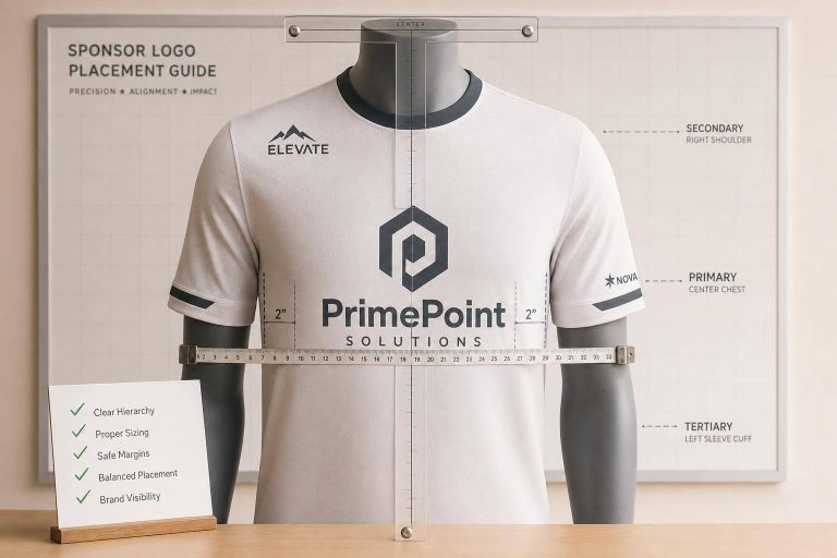
A clean jersey starts with 4 rules: keep the team crest and numbers first, limit the front to no more than 2 sponsor logos, scale youth logos down by 20%–30%, and keep prints off seams, underarms, and mesh zones.
If I were setting up team uniforms, I’d check 5 things before sending anything to print:
- Placement: front center for the main sponsor, sleeves for smaller marks, back only in open space
- Size: adult front sponsor logos often land around 8–12 in. wide; youth versions usually drop to 6.5–9.5 in.
- Hierarchy: team identity first, sponsor second, extra logos last
- Durability: avoid stretch areas, side panels, shoulders, and vents
- Print files: use AI/EPS or 300 DPI art, plus 0.125"–0.25" bleed
Here’s the short version: don’t let sponsor logos crowd the crest, block names or numbers, or sit in spots where they crack and peel. A simple layout usually looks better and lasts longer.
| Area | Do | Don’t |
|---|---|---|
| Front | Put the main sponsor in the center and the crest on the left chest | Use more than 2 sponsor logos or make the sponsor bigger than the crest |
| Sleeves | Keep logos small on the flat part of the arm | Wrap large logos around the sleeve |
| Back | Use space above the name or below the number | Place logos too close to names or numbers |
| Sizing | Scale by garment size | Use one fixed size from Youth Small to Adult XL |
| Production | Place logos on flat zones and review full-size mockups | Print over seams, mesh, or high-stretch areas |
If you want sponsor exposure without a messy uniform, this is the setup I’d follow every time.
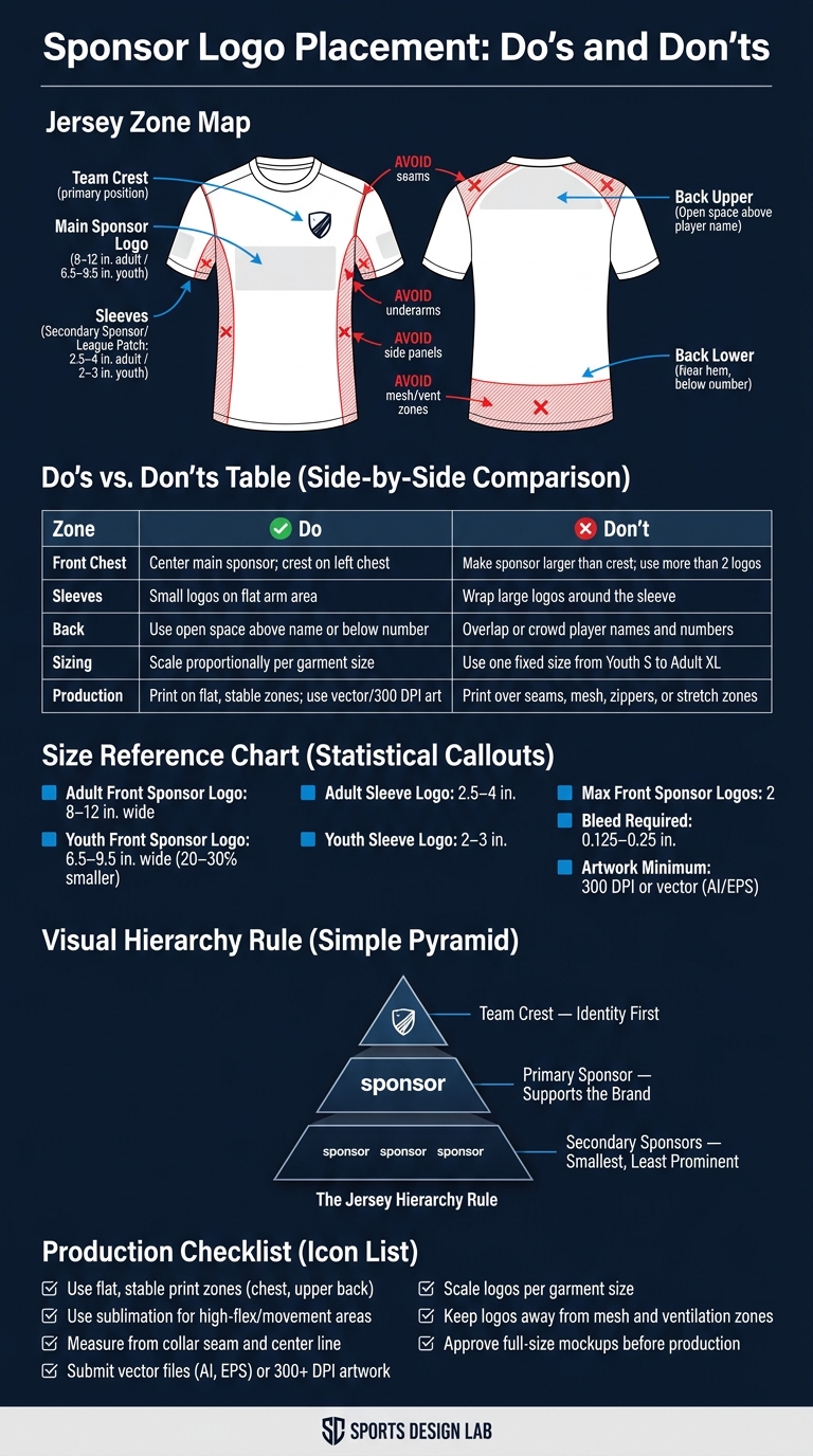
Sponsor Logo Placement on Sports Jerseys: Do’s and Don’ts
Placement checklist by uniform area
Use each uniform zone on purpose: clear placement, print that lasts, and a clean team look. The quick do/don’t table below gives you a fast check before production.
Front chest: strong visibility without crowding the jersey
The left chest is usually the first spot people notice, so place the team crest there. Put the primary sponsor in the center front. The sponsor logo should never be larger than the team crest. Also, keep the front to no more than two sponsor logos.
Sleeves: a clean spot for secondary sponsors
Sleeves are a good fit for secondary sponsors or league patches. Keep sleeve logos small and simple. If a logo wraps around the arm, it can distort during play.
Back: use open space without blocking names and numbers
Use the back only in open areas above the name or below the number, near the hem. Sponsor logos must never crowd or overlap player names and numbers. That hurts readability and can also break league rules.
Scan the table below for the fastest placement check.
| Placement Zone | Do | Don’t |
|---|---|---|
| Front Chest | Center the main sponsor logo; keep the team crest on the left chest | Make the sponsor logo larger than the team crest or use more than two front sponsor logos |
| Sleeves | Keep logos small and centered on the flat part of the arm | Wrap oversized logos around the arm – they will distort during play |
| Back | Use open space above the name or below the number | Place logos so close to names or numbers that they reduce readability |
Size, hierarchy, and layout rules
Once placement is locked in, size and hierarchy do the heavy lifting. They keep the jersey balanced across different sizes and stop the design from feeling crowded.
Match logo size to sponsor role and jersey size
Set logo size by sponsor role, not by habit. The crest comes first, the main sponsor comes next, and secondary sponsors should stay smaller.
That size also needs to change with the jersey itself. A logo that looks clean on an adult large can feel way too big on a youth small. In most cases, youth jersey logos should be about 20–30% smaller than adult versions. The goal is proportion, not a fixed measurement. As Miles Teamwear puts it:
"Scaling designs rather than using fixed measurements helps maintain visual consistency."
A good benchmark: a main center-front sponsor logo on an adult jersey usually lands around 8–12 in wide. On a youth jersey, that same logo should scale down to about 6.5–9.5 in.
Sleeve logos should follow the same pattern. Adult sleeve logos usually sit around 2.5–4 in, while youth versions should stay closer to 2–3 in.
Once each mark is sized, the next step is making sure the eye moves through the jersey in the right order so no sponsor fights with the crest.
Keep a clear visual order across all logos
Good sizing alone isn’t enough. The hierarchy has to stay obvious at a glance.
The basic order is simple: team identity first, main sponsor second, secondary sponsors after that. Use both size and placement to make that order clear. The crest should lead, the main sponsor should support it, and smaller marks should sit back.
When too many logos compete, readability drops. That shows up from the stands and on camera. As Jordan Reeves, Brand Experience Strategist, RareCustom, explains:
"Every jersey should have a clear visual hierarchy. The primary element (usually the front number or team crest) draws the eye first. Secondary elements (team name, sponsor logos) support the primary."
If two logos feel like they’re fighting for attention, that’s usually a sign to shrink one or move it to a secondary area.
sbb-itb-4d95ad3
Production, compliance, and approval checks
Once placement and size are locked in, do a final production review before anything goes to print. What looks clean on a screen can fall apart on the actual jersey. Fabric movement, seam placement, and league rules all shape the end result.
Avoid seams, stretch zones, and distorted print areas
Logos look best on flat, steady areas. If you place a mark over a seam, side panel, shoulder, or underarm, the print can warp, crack, or fight the fabric when it stretches.
Mesh and vent zones can cause problems too. Put a logo over a vent, and you may cut airflow and trap heat. In high-movement areas, use a print method that can flex with the garment instead of working against it.
Confirm league rules and sponsor artwork before production
Before print, check the rulebook for limits on logo count, size, and placement. Use vector files (AI or EPS) or artwork at 300 DPI or higher, and include a 0.125"–0.25" bleed.
The table below covers the most common production choices and the mistakes teams make most often:
| Check | Approved Practice | Risky Mistake |
|---|---|---|
| Print location | Flat, stable zones (chest, upper back) | Over seams, zippers, or side panels |
| Flex zones | Sublimation for high-movement areas | Screen printing or heavy vinyl on shoulders/underarms |
| Positioning | Measured from collar seam and center line | Eyeballing or centering from the preview box |
| Artwork format | Vector files (AI, EPS) or 300+ DPI | Low-resolution PNGs or JPEGs |
| Logo sizing | Scaled proportionally per garment size | One fixed size used from Youth Small to Adult XL |
| Airflow | Logos placed away from mesh/ventilation zones | Large logos blocking airflow in cooling zones |
Review mockups at actual viewing scale
A layout can look fine in the design file and still miss the mark on the jersey. Review each mockup at full print size, not zoomed in. Then step back and look at it from game distance.
That quick check matters more than people think. If the logo blends into the background or the layout feels cramped, adjust the size or move it before production.
Conclusion: The do’s and don’ts teams should follow every time
Once placement, sizing, and approval are set, the rule is pretty simple: use the same hierarchy every time. Put the crest first, the primary sponsor second, and secondary marks last. On the back, keep logos away from names and numbers.
Then check scale against the garment size. Logo size should fit the garment, and sponsor marks should stay smaller than the crest.
Stick to flat zones. Avoid seams and high-flex areas. And approve mockups at full size before production.
That’s the standard for every order. A clean, readable layout beats a crowded one every time.
FAQs
How do I balance sponsor visibility with team branding?
Create a clear visual hierarchy so the team crest stays the main focal point.
Put the primary sponsor in a top spot, like the center chest. Then place secondary sponsors on the sleeves, upper back, or shoulders so the jersey doesn’t feel crowded.
Leave at least 2–3 inches between logos and player names or numbers. Keep spacing, color contrast, and overall style consistent so sponsor logos fit the team brand instead of fighting with it.
What logo changes should I make for youth uniforms?
For youth uniforms, scale logos down for smaller sizes so they still look clean and professional. A good rule of thumb is:
- Front chest: 3.25 in. wide by 3–3.5 in. tall
- Back: 8–10 in. wide by 4–6 in. tall
- Sleeves: 2–2.5 in. wide
That said, size alone isn’t the whole story. Always check league rules for logo size and placement before you finalize anything.
It also helps to work from vector files and review digital mockups across each uniform size. That way, you can spot spacing issues early and avoid a logo that looks stretched, cramped, or just plain off. In many cases, shifting placement by about 0.5 in. per size helps keep the layout balanced.
How can I avoid cracking, peeling, or distorted sponsor prints?
Avoid placing logos over seams, zippers, or buttons. Uneven surfaces can make prints crack, peel, or warp as the garment moves.
It also helps to match the print method to the fabric. Send high-resolution vector files like AI or EPS, or raster files at 300 DPI. And if you’re working with stretched performance fabrics, test the logo first to make sure it doesn’t distort.