
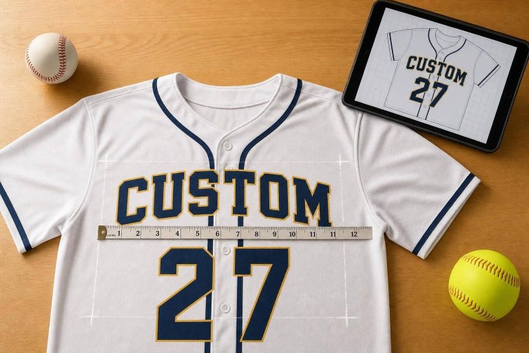
A jersey graphic works when people can read it fast, it fits around seams and buttons, and it prints the right way for sublimation. If I were setting up a baseball or softball jersey, I’d lock in the team name, colors, logo, roster, and sizes first. Then I’d check placement, contrast, font choice, and file setup before anything goes to print.
Here’s the short version:
- Start with the team system: logo, wordmark, player names, numbers, and accent colors
- Plan for the jersey build: button-down jerseys, sleeve seams, and panel cut lines change where graphics should go
- Make text easy to read: strong contrast matters more than screen style
- Follow sport rules: back numbers are often at least 8 inches in baseball and 6 inches in some softball rulesets
- Scale by size: one art size will not fit youth and adult jerseys the same way
- Use print-ready files: vector art and Pantone color references help keep output sharp and color-consistent
- Review the mockup line by line: names, numbers, sizes, spacing, and color all need a last check
One of the biggest mistakes I see is this: a jersey can look fine on a mockup but fail on the field. A front wordmark can split at the buttons. A back number can sit too close to a seam. A busy pattern can cut readability. And a late roster fix can turn into extra cost and delay.
If you want a simple rule to follow, use this one: put team ID first, readability second, and print setup third – then check all three together before you approve the order.
Custom Baseball Jersey Design | Premium Sportswear Project | Behance Breakdown
sbb-itb-4d95ad3
Build the Graphic System Around Team Identity
Treat the logo, wordmark, numbers, names, and accent details as parts of one graphic system. That’s what makes home, away, and alternate jerseys look connected instead of feeling like separate ideas. Once the team identity is set, turn it into a layout you can repeat across the full uniform set.
Define the Core Elements: Logo, Wordmark, Numbers, Names, and Accents
Start with the elements the team has already chosen, then lock in their order and scale. That keeps the layout clean across different jersey colors.
Save all artwork in vector format so it stays sharp at any size. Raster images may look fine on a screen, but they can turn pixelated when enlarged for jersey graphics. That kind of file control also makes color use and placement easier to manage.
Use Color and Contrast to Improve On-Field Recognition
Use Pantone reference colors to keep team colors consistent across the set. The same Pantone codes help home, away, and alternate jerseys match, even when the garments are printed at different times or on different fabrics.
Strong contrast between the jersey body and the lettering helps with fast field-side reading. Two-color letters and numbers can make names and numbers easier to read on both light and dark backgrounds. It also helps to check fabric color with a Pantone bridge book before ordering.
The system needs to hold up even when the jersey color changes. If Pantone codes, vector files, and layout choices stay the same, the full design stays unified across every uniform set. From there, each element can be placed where it reads best.
Place Logos, Team Names, and Numbers Where They Read Best
Put each identity element where people can read it at a glance, even when the jersey is moving. The goal is simple: keep the team system clean, easy to scan, and in the right visual order.
Front and Sleeve Logo Placement Around the Placket
On button-front jerseys, the placket is the biggest problem for front graphics. A key letter or logo detail should never cross it. If a wordmark breaks across the buttons, it can look split or distorted once the jersey shifts during play. A better move is to set the top of the chest wordmark about 2.5–3 inches below the collar seam and adjust the width so the main characters land on either side of the button path, not on top of it.
Left-chest logos tend to read best when placed 1–2 inches left of the placket and 1–2 inches below the collar. That keeps the mark away from both the collar seam and the placket, while helping it feel balanced.
For sleeve graphics, center the design on the sleeve panel and leave at least 0.5–1 inch of space from both the shoulder seam and the sleeve hem. On raglan sleeves, place the logo on the largest unbroken panel instead of letting it run across the seam line.
Back Panel Layout for Player Names and Numbers
After front placement is locked in, the back panel should focus on one thing: instant player ID. Fans in the stands and people watching game footage should be able to spot the number fast, so the number needs to lead the layout.
NFHS baseball rules say back numbers must use plain Arabic numerals that are at least 8 inches tall, in a solid contrasting color, with any border no more than 0.25 inches. In softball, IESA sets the minimum at 6 inches tall with the same contrast and border rules.
Center the number horizontally and place it in the upper half to upper two-thirds of the back panel, starting 2–4 inches below the collar if there’s no name. If a player name is added, it goes above the number – usually 2–3 inches below the collar seam – and should be clearly smaller than the digits.
A good rule of thumb:
- Keep the name at 30–50% of the number height
- Use slightly open letter spacing so short names don’t feel squeezed
- Keep descenders like g, y, and p away from the shoulder seam, especially on smaller sizes
Scaling Graphics Across Youth and Adult Sizes
One graphic size won’t work across every jersey size. A 10-inch back number that looks right on an Adult Large can swamp a Youth Small, crowd the name, or run too close to seams. It makes more sense to scale graphics in proportion, cutting number height by about 0.5–1 inch per size step down so the graphic covers about the same share of the back panel across the size range.
Front wordmarks and logos should follow that same approach. Instead of forcing one fixed width across every cut, keep the same relative width compared with the chest panel. In practice, that often means building two or three separate art scale versions – small youth, large youth, and adult – instead of leaning on one master file.
Always test mockups at the smallest and largest sizes in the run. Those edge cases tend to show problems fast: text that gets too tiny, numbers that feel oversized, or artwork that drifts too close to a seam. Wooter Apparel‘s graded size templates can help guide graphic dimensions by size.
Once placement is set, typography and seam-safe artwork decide whether the design prints cleanly.
Choose Typography and Prepare Artwork for Sublimation
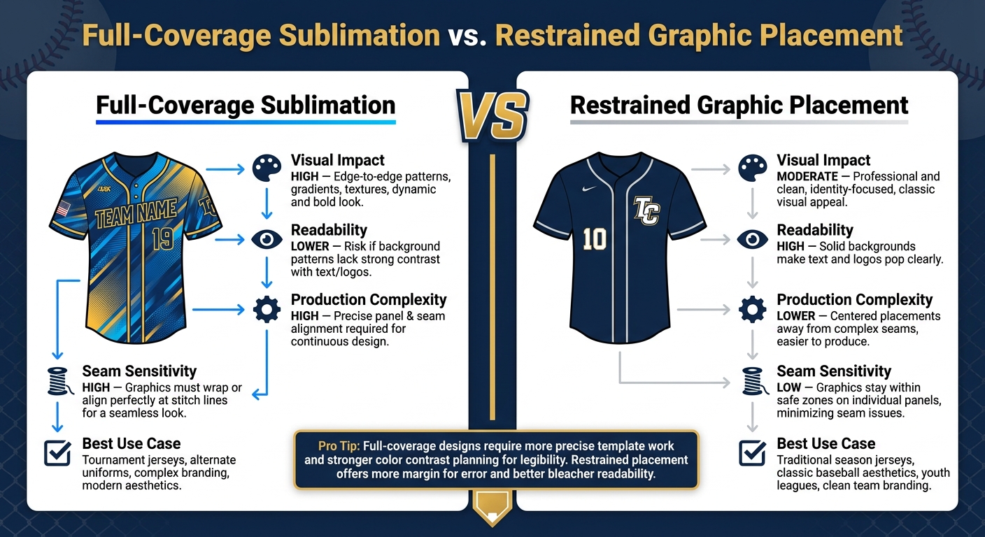
Full-Coverage vs. Restrained Placement: Baseball & Softball Jersey Graphics Compared
Once placement is set, the final jersey usually comes down to two things: can people read the lettering from a distance, and are the files set up the right way for sublimation printing?
Pick Fonts That Stay Readable for Team Names and Numbers
One of the most common jersey design mistakes is picking a font that looks great on a screen but falls apart on fabric. Decorative scripts and tightly compressed fonts are usually the biggest troublemakers. Thin strokes can fade out in print, and cramped spacing can make letters and numbers run together, especially on smaller sizes.
For team names and numbers, use fonts made for sports apparel and put readability first. The goal is simple: make the text easy to read on the field and from the stands.
Design With Panels, Seams, and Safe Zones in Mind
Sublimation works by printing each jersey panel flat before the garment is sewn together. That changes how you need to design. If a graphic runs across a seam, it may end up split between two fabric pieces. Even a small shift during assembly can knock the alignment off. That’s why text, logos, and other small details should stay inside the safe zone of a single panel and away from cut lines.
This is where a concept mockup and a production-ready template part ways. A mockup shows the jersey as a finished piece. A production template shows every panel laid flat, with cut lines and safe zones marked. Design in the production template, not just the mockup.
For artwork files, send logos and graphics in vector format, such as AI or CorelDRAW files, so they scale without losing sharp edges. Use Pantone reference colors instead of screen colors to help keep the printed jersey in line with team branding.
Full-Coverage Graphics vs. Restrained Placement: A Comparison
Choosing between full-coverage sublimation and restrained graphic placement isn’t just about style. It also affects production difficulty, readability, and how much room for error you have at the seams.
| Feature | Full-Coverage Sublimation | Restrained Graphic Placement |
|---|---|---|
| Visual Impact | High; allows for edge-to-edge patterns, gradients, and textures. | Professional and clean; focuses on core identity elements. |
| Readability | Can be lower if background patterns are too busy or lack contrast. | High; typically uses solid backgrounds to make text pop. |
| Production Complexity | High; requires precise alignment across multiple fabric panels and seams. | Lower; focuses on centered placements away from complex seams. |
| Seam Sensitivity | High; graphics must be designed to wrap or align perfectly at the stitch lines. | Low; graphics are usually kept within safe zones on individual panels. |
| Best Use Case | Tournament jerseys, alternate uniforms, and complex branding. | Traditional season jerseys, classic baseball aesthetics, and youth leagues. |
Full-coverage designs can look bold, but they ask for more careful template work and better color contrast planning. Restrained placement gives you more margin for error and is often the smarter move when the jersey needs to stay clear and easy to read from the bleachers.
Review the Final Mockup Before Ordering
Once the artwork has been built around seams and safe zones, the mockup turns into your final quality check. This is the last point where you can catch mistakes before sublimation starts. After production begins, fixes usually aren’t possible.
Check Alignment, Text Clarity, and Color Consistency
Review the front, back, and side views together, not one at a time. That makes it easier to spot issues that can slip by on a single view.
Make sure logos look sharp, numbers are spaced evenly, and player names sit in the right spot on the back panel. Look closely at color across the whole jersey too. The body, sleeves, and side panels should all match the approved design. Then compare seams, armholes, and neck openings against the artwork before you approve anything.
Confirm Sizes, Roster Details, and Reorder-Ready Files
After the layout looks right, go through the roster details line by line. Check each name, number, and size against the approved roster before sign-off. It may feel tedious, but this is where small mistakes turn into expensive ones.
Also, save the approved files for later use. That makes reorders and roster updates much easier when the season moves on and changes come up.
Conclusion: Key Rules for Better Custom Baseball and Softball Jersey Graphics
Good jersey graphics don’t happen by accident. They start with a clear team identity, then build outward: colors with enough contrast to read on the field, logos and names placed where the jersey’s structure supports them, fonts that still read from a distance, and artwork prepared with panels and seams in mind before anything goes to print.
The mockup review is where all that work either holds together or falls apart. Teams that take time to check alignment, verify roster details, and confirm softball jersey size runs before approving an order avoid the most common and costly mistakes. For teams that want professional support through that process, Wooter Apparel offers free custom design assistance and an in-house design department, with a standard turnaround of 3 to 4 weeks after design approval.
FAQs
How do I choose the right jersey font?
Put readability first. Use bold, clean typefaces with strong contrast against the jersey fabric so names and numbers stay easy to see from a distance and while players are in motion.
Choose a font that matches your team’s identity, but skip decorative or thin styles that get tough to read once they’re scaled. Test the font in different lighting and from a distance to make sure it stays clear and polished.
What file types work best for sublimation?
For the best sublimation results, use vector files like AI, EPS, SVG, or PDF. They scale up or down without losing image quality.
If you’re working with raster images instead, save them as PNG or JPG at 300 DPI. Use a transparent background, set the color mode to RGB, and make sure all fonts are embedded or converted to outlines.
How should graphics change by jersey size?
Scale graphics so they keep the same proportions and stay easy to read across jersey sizes. On youth jerseys, text and logos usually need to be reduced by 10% to 30%. That keeps them from looking too big or squeezed into a smaller space.
Placement needs to move with the garment length too. For example, designs are often set 3 to 4 inches below the collar on youth jerseys, compared with 4 to 5 inches on adult jerseys.