
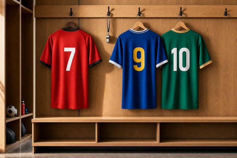
Color can change how a team is seen before the game even starts. From red’s attack-first feel to white’s clean contrast, the five biggest uniform colors shape player image, number visibility, fan memory, and even referee judgment.
If I had to boil the article down fast, it’s this:
- Red looks forceful and urgent, but its edge in winning is mixed: about 55% in some combat-sport data and 50.5% in another review.
- Blue gives off control and trust, and it usually stays easy to read with white numbers.
- Green points to balance, but it can blend into grass and turf.
- Black looks tough, yet studies linked black uniforms with more penalties and harsher calls.
- White works best for contrast and clarity, though glare and stains can be an issue.
What matters most is not just the color itself. It’s how that color works across uniforms, warmups, merch, lighting, and league context. I’d treat color as a team identity system: pick a main color, support it with a second color, and use an accent color with care.
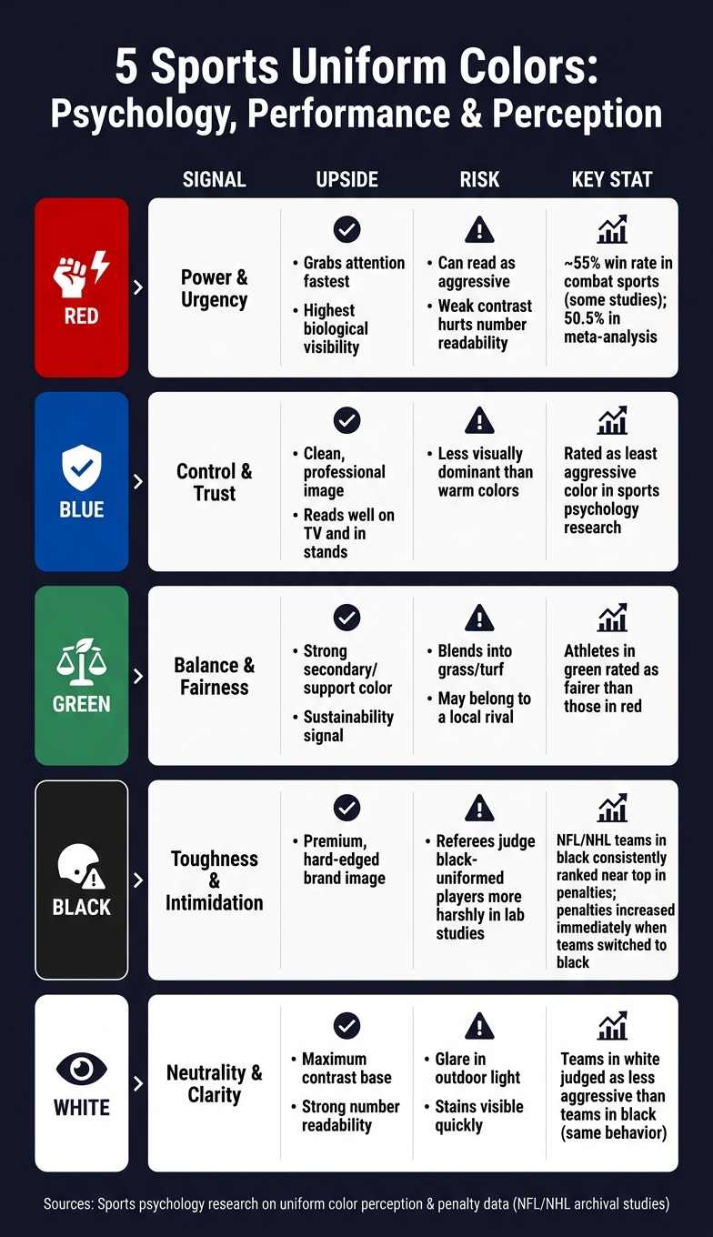
5 Sports Uniform Colors: Psychology, Performance & Perception
The Color Effect – Why Red Wins More Often
sbb-itb-4d95ad3
Quick Comparison
| Color | Main signal | Main upside | Main risk |
|---|---|---|---|
| Red | Power and urgency | Grabs attention fast | Can look too aggressive; weak contrast can hurt number reading |
| Blue | Control and trust | Clean, steady team image | Less forceful than warm colors |
| Green | Balance | Good as a support color | Can blend into the field |
| Black | Toughness | Strong, hard-edged image | More harsh judgment and more penalties in some studies |
| White | Neutrality and clarity | Strong contrast base | Glare and visible stains |
So if you’re picking sports colors, I’d keep it simple: choose for visibility, use contrast well, and stay consistent across every item the team wears.
The top 5 color influences in sports uniforms
Red: dominance, urgency, and competitive intensity
Red sends a clear signal: power, urgency, and attack mode. Research backs part of that up, though not all of it points in the same direction. Athletes in red are often judged as more aggressive and more dominant than athletes in blue or green. In combat sports, competitors wearing red won about 55% of bouts overall, but another meta-analysis put red at just 50.5%, which tells you the edge isn’t reliable across every study.
Where red shows up more consistently is in how people read the athlete. Referees and neutral observers tend to rate red-uniformed players as more intense, even when the actual behavior is the same. That matters. A color can shape the story people think they’re seeing before the replay even starts.
That high-energy look fits sports like football, basketball, and hockey, where teams often want an aggressive public image. The catch is simple: red can hurt readability if it’s paired with dark numbers or low-contrast lettering. Under stadium lights, that can make jersey numbers tougher to read. White outlines around numbers and names fix most of that issue.
Blue: trust, control, and professional identity
Blue gives off a very different feel. It’s tied to calm, focus, trust, and control. In sports psychology research, blue is linked more with agreeableness and fairness than with aggression. Athletes in blue are usually seen as less aggressive and more composed than athletes in red, which makes blue a natural fit for teams that want a steady, disciplined image.
This is also why blue works so well beyond the game jersey. It carries well across home uniforms, travel gear, and fan merch. The overall impression is polished and controlled, which can help in settings like corporate partnerships and community outreach, where trust matters.
From a design angle, blue is one of the safer picks. Blue with white numbers tends to stay easy to read both on TV and in the stands. That range makes it one of the best primary colors for uniform systems.
Green: balance and field visibility limits
Green is often tied to balance and fairness. Studies also show that athletes in green are rated as fairer than athletes in red. For teams that want to lean into teamwork, discipline, and clean play, that’s a pretty strong signal.
The problem isn’t the message. It’s the field. On grass or turf, green uniforms can start to blend into the background, especially in medium or dark shades. Add cloudy weather, late-day shadows, or artificial lighting, and the player can separate less clearly from the playing surface. When that happens, numbers get harder to read for officials, cameras, and fans.
Because of that, green often works better as a secondary color than as the main base. A team can still keep green in its look, but use it as trim or in side panels, then add high-contrast numbers in white or bright yellow so visibility doesn’t take a hit.
Black: toughness, intimidation, and judgment effects
Black builds a hard, intimidating image fast. That’s part of the appeal. But it also comes with a downside that shows up in the data. Archival studies of NFL and NHL teams found that teams in black regularly ranked near the top of their leagues in penalties and penalty minutes. When teams switched to black uniforms, penalties went up right away, with teams penalized more in black than in white.
Lab research points in the same direction. Referees looking at the same plays judged black-uniformed players more harshly than white-uniformed players. So this isn’t just about team style or rougher play. The uniform itself appears to shape judgment.
For contact-heavy sports, that’s a real trade-off. Black can help sell a tough brand, but it may also make officials more likely to see borderline actions in a harsher light.
White: clarity, neutrality, and high-contrast use
White works best as a contrast base. It’s commonly tied to cleanliness and neutrality, and in penalty research, teams in white are judged as less aggressive than teams in black, even when the behavior matches.
Design-wise, white does a lot of heavy lifting. Pair it with dark numbers – navy, black, or dark red – and you get strong contrast that’s easy to read on screen and in person. That’s a big reason white stays so common in uniform sets.
It does have a couple of weak spots. Stains show fast, and bright outdoor light can create glare. Slightly off-white tones can cut that glare, and fabrics that stay opaque when wet help the uniform keep a clean, polished look deeper into the game. Those small design calls can shape the whole color system around the uniform. For teams ready to build their own look, you can get a custom quote to start the design process.
What the research means for team branding
People notice color before they read text or recognize a logo. That matters a lot in sports. When the same colors show up on uniforms, sideline gear, and fan apparel again and again, those colors start to stick in memory. So color isn’t just decoration. It’s a brand system. The goal is simple: turn that split-second visual reaction into a team identity people recognize right away.
Fans also tie their sense of belonging to team colors more than many organizations assume. Ajax learned that the hard way when it planned green stadium seats and fans pushed back, because green belongs to rival FC Groningen. In sports, local color meaning can beat neat, neutral design logic every time.
Comparing the 5 colors: identity, visibility, and perception
Treat these meanings as design inputs, not one-size-fits-all answers.
| Color | Branding takeaway | Main risk |
|---|---|---|
| Red | Highest biological visibility; noticed fastest | Can read as aggressive or polarizing |
| Blue | Signals professional identity and reliability | Less visually dominant than warm colors |
| Green | Can signal sustainability and club identity | Blends into grass and turf; may belong to a rival |
| Black | Signals premium status and a tougher image | Players can be perceived as more aggressive |
| White | Provides maximum contrast and a clean visual base | White can carry different meanings across markets |
Building a stable palette with primary, secondary, and accent colors
The sports brands that last don’t pick colors at random. They use a three-level system:
- One primary color that carries the team’s identity
- One secondary color that adds contrast and helps with readability
- One accent color used sparingly for energy or special editions
That setup keeps the look steady across home jerseys, away kits, sideline gear, digital graphics, and fan apparel without turning into visual clutter.
A classic example of this approach at scale is the Olympic rings. They were designed in 1912 using five colors – blue, yellow, black, green, and red – because at least one of those colors appeared on every national flag at the time. The aim was immediate belonging for every audience.
For a sports team, the same idea works on a smaller stage. The primary color should lock in recognition. The secondary color should help things read cleanly. The accent color should add energy without stealing attention from the core identity. Before choosing that secondary or accent shade, check the local league first. If fans already link that color to a rival, backlash can follow no matter how well the choice works on paper.
Applying these insights to custom uniform design
The next step is simple: take the color system and turn it into game-ready uniforms, warmups, and accessories. That means using the primary, secondary, and accent colors across the full kit so the team looks consistent on the court, field, or sideline. Done well, color supports identity, visibility, and how the team is perceived.
Choosing colors for readability, league use, and seasonal needs
Color choices have to hold up in actual playing conditions – not just on a mockup. They need to read well in daylight, under arena lights, and in indoor gym lighting.
High-contrast white bases improve readability during fast-paced play.
Season also matters. For summer leagues, lighter, high-visibility palettes tend to work best. For fall football or winter basketball, that same palette should extend into warmups and accessories so the team looks pulled together across the full collection.
Using Wooter Apparel to build full team kits around a color system
Fully sublimated uniforms make it easier to keep the palette consistent from item to item. Wooter Apparel‘s fully sublimated uniforms keep jerseys, shorts, warmups, and accessories on the same palette, with free custom design support – so it’s easier to maintain brand consistency and keep future reorders aligned with the original palette.
Conclusion: Picking colors that support performance and brand equity
Put it all together, and color affects both what people feel on game day and how they remember a team over time. It shapes perception, but it also shapes identity. Red, blue, green, black, and white each suggest a different kind of competitive message.
That’s why palette discipline matters more than novelty. Brand equity grows through consistency, and stable, limited palettes make a team easier to recognize across uniforms, merch, and gear.
Just as important, a team’s colors should match the way that team wants to be seen. A program built on physicality and aggression sends one message. A program built on composure and control sends another. When the psychology and the palette line up, the uniform feels deliberate instead of random.
Use Pantone or hex codes rather than generic color names to keep colors matched across every production run. A clear color system helps turn a visual decision into a lasting identity.
FAQs
Which color is best for visibility?
For the best visibility on the field or court, focus on high-contrast color combinations instead of just picking one color. A light-and-dark pairing, like white with navy or black with gold, helps numbers, names, and logos stand out and stay easy to read.
Red is often seen as a strong pick for visibility. Neon accents, such as yellow or electric blue, can also help in low-light conditions.
Do uniform colors affect referee calls?
Yes. Research suggests that uniform color can shape referee decisions because people attach certain traits to certain colors.
In subjective sports like taekwondo and boxing, red is often tied to dominance. That association can nudge scoring in subtle, unconscious ways.
Studies also show that teams wearing black may get penalized more often. One reason is simple: officials can read their actions as more aggressive, even when the play itself isn’t much different.
This effect tends to be much smaller in sports that rely on objective, electronic scoring.
How should a team build a color palette?
Start by defining the emotions and brand identity you want to convey. That gives your color choices a clear job instead of turning them into random picks.
Keep the palette to three colors:
- one primary
- one secondary
- one accent
Use the 60-30-10 rule to keep things balanced.
Choose hues with strong contrast between the jersey base and the numbers so they stay easy to read. Also think about lighting, and use Pantone codes to keep colors consistent across jerseys, shorts, and warmups.