
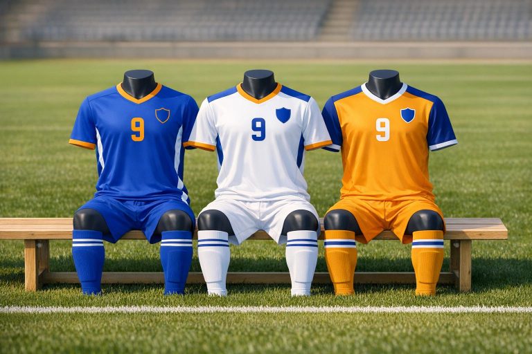
Choosing soccer uniform colors isn’t just about style – it impacts team identity, player performance, and compliance with league rules. Here’s a quick breakdown:
- Define Team Identity: Align colors with your team’s personality (e.g., bold for competitive teams, friendly for youth clubs). Stick to three colors: primary, secondary, and accent.
- Follow League Rules: Ensure colors contrast with opponents, referees, and goalkeepers. Check specific league guidelines to avoid conflicts.
- Prioritize Visibility: Use high-contrast combinations (e.g., navy/white, red/white) for clear on-field distinction. Avoid poor visibility pairings like yellow/white.
- Design Home & Away Kits: Use light colors for home and darker tones for away games. Invert color schemes for a cohesive look.
- Test Before Production: Review digital mockups, order physical samples, and verify readability of numbers and logos under different lighting.
Get feedback from players and confirm compliance with your league to finalize your design. A well-planned uniform ensures your team stands out while meeting all requirements.
Define Your Team’s Identity and Requirements
Answering two key questions upfront – Who is your team? and What are the league rules? – can save you from costly redesigns down the line.
Build Your Team’s Color Identity
Think about the emotion you want your uniform to convey. For example, a youth recreational club might choose custom v-neck soccer jerseys for a friendly and inviting look, while a competitive travel team could aim for something bold and intense. Colors play a huge role here: red conveys energy and dominance, navy suggests authority, and black signals power. Neon shades are also a hit in youth sports, as they project speed and high energy.
Stick to the "Rule of Three" when choosing your colors: pick a base color, a contrasting color, and an accent. This approach keeps your team’s look clean and recognizable. If your team has a mascot, use it as inspiration. A team called "Timber Wolves" might choose colors like charcoal, forest green, or slate gray to reflect the theme.
It’s also smart to check out local high schools and rival clubs to avoid overlapping color schemes. If the dominant club in your area uses navy and gold, picking the same colors could make your team feel less original.
"If the local high school’s colors are navy and gold, using the same palette creates visual confusion in the community and positions your club as derivative rather than distinctive." – Hamco Sports
Know Your League’s Color Rules
Leagues often set strict rules about team colors to prevent confusion. Opposing teams must wear clearly different colors, and referees also need to stand out. Goalkeeper jerseys are another consideration – they must be distinct from all outfield players on both teams and the match officials. Deciding on your goalkeeper kit early can help you avoid last-minute issues on game day.
Check your league’s policy on color conflicts. In many cases, the away team is responsible for changing uniforms if the kits are too similar. Knowing this ahead of time ensures you design home and away kits that are distinct enough to avoid problems. When it’s time to place your order, provide manufacturers with specific color codes, like Pantone or hex values, rather than vague names like "royal blue." This ensures consistency across your jerseys, shorts, and socks.
Once you’ve nailed down your team’s identity and league requirements, you can focus on creating a cohesive and standout home-and-away color palette.
sbb-itb-4d95ad3
Prioritize Visibility and Contrast on the Field
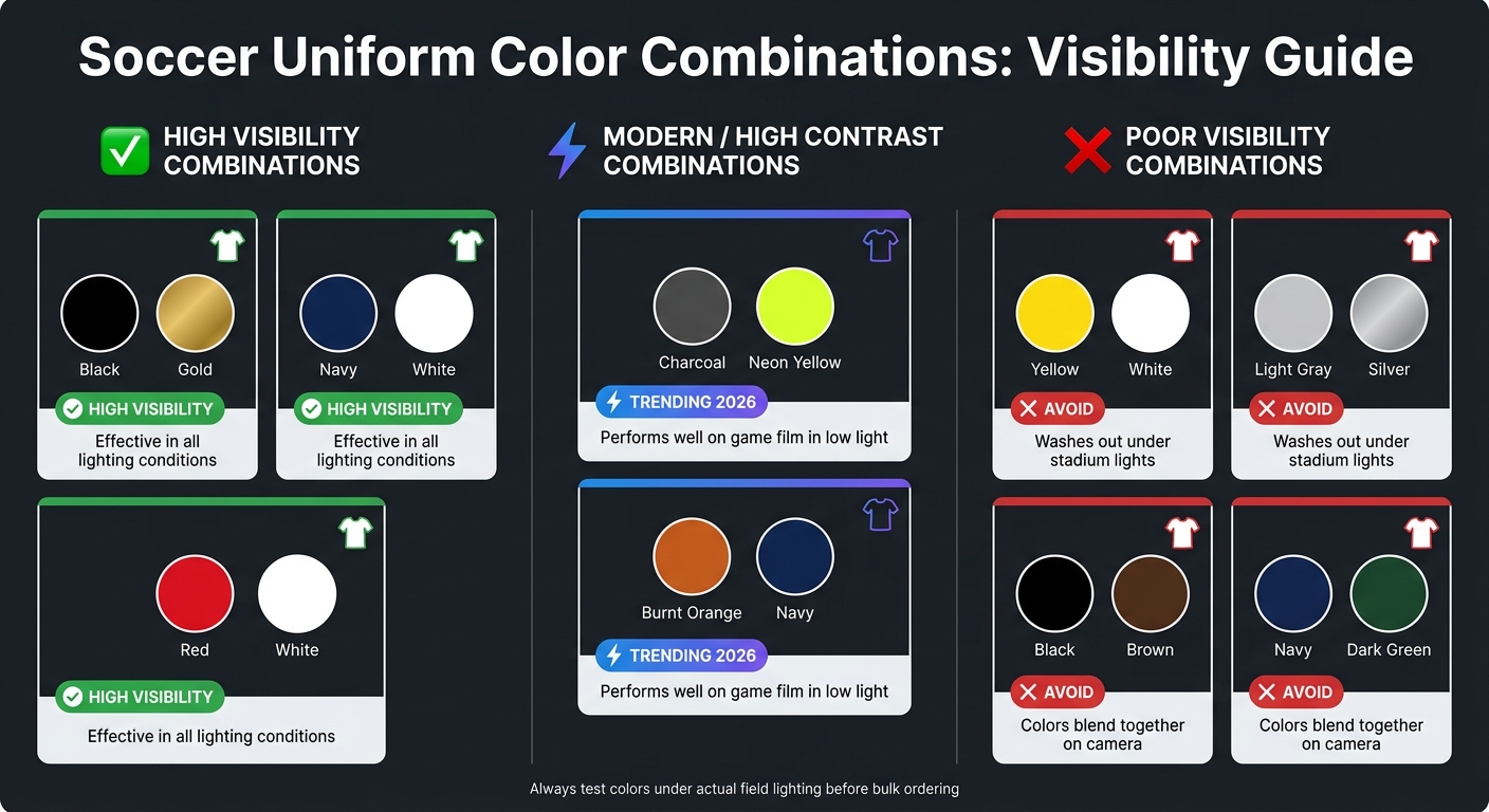
Soccer Uniform Color Combinations: Visibility Guide
Once your team’s identity and color palette are set, the next challenge is ensuring your uniforms stand out during gameplay. This isn’t just about aesthetics – it’s about making sure referees, players, and fans can easily spot your team on the field.
Stand Out from Opponents and Referees
"FIFA regulations mandate teams to wear distinctly different colors for clear on-field distinction." – Hamco Sports
Choosing colors that contrast sharply with opponents and referees is crucial. If team kits are too similar, it can lead to disruptions, like forcing an away team to change uniforms mid-game. For goalkeepers, colors like bright yellow, orange, or neon green are reliable options that avoid clashing with other kits.
For home and away kits, stick to this practical guideline: light colors (such as white, cream, or pastels) for home games, and darker or bold primary colors for away games. This approach minimizes the risk of uniform clashes. A growing trend for 2026 is combining dark base colors like charcoal with neon yellow or green accents. These combinations not only look sharp but also improve visibility on game footage, especially in low-light stadiums.
Once you’ve ensured your team’s colors stand out, focus on refining the details, like the readability of numbers and logos.
Make Numbers and Logos Easy to Read
Clear, legible numbers and logos are essential for effective on-field communication.
"Contrast isn’t just about preference; it’s about whether referees can read your number when it counts." – Gear Team Apparel
To guarantee readability, stick to high-contrast combinations: dark bases with light numbers or light bases with dark numbers. Avoid pairings like yellow numbers on white jerseys or light gray on light gray, as these tend to wash out under stadium lights, making them nearly impossible to read.
Font choice is equally important. Bold block fonts are ideal because they stay clear and legible, even from over 20 yards away during fast-paced action. On the other hand, decorative or thin script fonts can blur and become unreadable. If your jersey design includes a chest logo, keep its size between 3 and 4.5 inches wide to prevent it from crowding the number.
Before finalizing your uniform design, test a sample under artificial lighting. Record it on your phone to see how it looks on camera. If the numbers aren’t easily visible in the recording, they likely won’t be clear enough for referees or scouts during a game.
| Visibility Rating | Color Combination | Notes |
|---|---|---|
| High Visibility | Black/Gold, Navy/White, Red/White | Effective in all lighting conditions. |
| Modern/High Contrast | Charcoal/Neon Yellow, Burnt Orange/Navy | Performs well on game film in low light. |
| Poor Visibility | Yellow/White, Light Gray/Silver | Tends to wash out under stadium lights. |
| Muddy/Low Contrast | Black/Brown, Navy/Dark Green | Colors blend together on camera. |
Build a Color Palette for Home and Away Kits
Pick Primary, Secondary, and Accent Colors
When creating your team’s color palette, stick to three key colors: primary, secondary, and accent. Hamco Sports explains it best:
"The best jersey color combinations follow a simple formula: one dominant base color, one strong contrast color, and one accent. Keep it to three colors max."
The primary color should dominate and establish your team’s identity. The secondary color adds definition to areas like side panels, collars, or sleeve trims. Finally, the accent color, used sparingly, highlights logos, piping, or number outlines. This balance creates a visually striking and cohesive design. For instance, a navy base paired with white as the secondary color and gold as the accent can deliver a sharp, high-contrast look that stands out on the field and in the stands.
Design Home and Away Kits That Work Together
Once you’ve chosen your palette, use it to design home and away kits that complement each other. A popular approach is to invert the color scheme between the two. For example, if your home kit uses red as the primary color with black accents, the away kit could flip this, making black the dominant color and red the accent.
Consistency is key – use the same font for player names and numbers on both kits. This not only ensures a unified look but also simplifies inventory management. Before finalizing your designs, conduct a "clash test." View both kits side by side under different lighting conditions, such as gym or floodlights, to confirm they’re distinct enough. If the kits look too similar, officials may require last-minute changes, which can be a hassle.
| Kit | Primary Purpose | Color Strategy | Maintenance Tip |
|---|---|---|---|
| Home | Assert team identity | Stick to classic club colors and patterns | Darker tones hide mud and grass stains better |
| Away | Avoid color clashes with opponents | Use an inverted palette from the home kit | Choose stain-resistant treatments for lighter colors |
Practicality matters, too – make sure your designs fit your team’s needs.
Factor in Age Group, Climate, and Durability
While the look of your kit is important, practical considerations like age group, climate, and durability can’t be ignored. Youth teams, for example, should avoid colors that overlap with local high school teams to establish a unique identity within the community. For women’s programs, jewel tones like deep teal, burgundy, and magenta are becoming popular alternatives to lighter pastels for the 2026 season.
Climate plays a big role in kit selection, too. In muddy or rainy regions, light-colored home kits can quickly show wear and tear. Meanwhile, in hotter climates, poly mesh fabrics help players stay cool and wick away moisture more effectively than heavier materials. To keep colors vibrant throughout the season, sublimation printing is a smart choice – it embeds dye directly into fabric fibers, preventing cracking, peeling, or fading even after multiple washes.
For a durable and vibrant option, Wooter Apparel’s fully sublimated soccer uniforms are designed to handle the demands of an entire season while keeping your team looking sharp on the field.
Test and Lock In Your Color Choices
Check Mockups and Test Colors on the Field
Getting your colors and design details right is critical to nailing your team’s look. Once your color palette is set, review a digital mockup to catch potential errors before production. Look closely at color accuracy, logo placement, and how the design scales across different jersey sizes. As Hamco Sports wisely notes:
"The cheapest fix is the one made on the mockup."
When sending logos or graphics to manufacturers, always use vector files like AI, EPS, or SVG. These formats ensure sharp, consistent colors across all materials. Avoid vague color descriptions like "royal blue" or "forest green" – these can lead to mismatched results. Instead, provide specific Pantone numbers or hex codes to guarantee that every piece, from jerseys to socks, matches perfectly.
Take it a step further by ordering a physical sample. Test it in different lighting conditions and after several washes to check for durability. Lighting can drastically affect how colors appear – some greens might look dull under fluorescent lights, while reds can shift toward orange under sodium-vapor field lights. Catching these issues early can save you from regretting a bulk order. Companies like Wooter Apparel even offer free custom design support to help fine-tune your mockups before finalizing the print.
Once your production tests are complete, the next step is to get feedback from your players and ensure league compliance.
Confirm Feedback and League Compliance
After verifying the quality of your physical sample, involve your players in the process. Their input is essential for team unity, and when they feel included, they’re more likely to embrace the final design. A uniform that players help shape fosters a stronger sense of pride and cohesion.
Run a quick visibility test to confirm that numbers and logos are readable from a distance. If they’re hard to see on a mockup, they’ll be even harder to spot during a game. When you’re satisfied with the design, check with your league office to ensure your colors meet all rules, especially those addressing color conflicts on game day. For example, leagues often have specific guidelines about which team must change kits if colors are too similar. Additionally, goalkeeper jerseys must stand out from both outfield players and officials, so confirm those details as well.
Getting written approval from your league before placing your bulk order ensures you won’t have to scramble for last-minute fixes.
Conclusion: Putting Your Team’s Look Together
Finalizing your team’s uniform design involves balancing visual appeal, functionality, and durability. Choosing the right colors is key – your palette should reflect your team’s identity, ensure visibility on the field, and withstand the wear and tear of a full season. Opt for colors that represent your team’s spirit, provide strong contrast against opponents and officials, and work well for both home and away kits.
Before committing to production, test your designs thoroughly. Use digital mockups, create physical samples, and seek league approval to avoid any surprises. Pay attention to how the colors look under actual field lighting and secure written confirmation from your league office before placing bulk orders. These steps can save time and money down the line.
Once your design is approved, it’s time to move into production. Companies like Wooter Apparel offer free custom design consultations to help bring your ideas to life. Their team of in-house designers can incorporate your team’s colors, logos, and sponsor graphics into a seamless, ready-to-produce layout. Pricing for custom soccer jerseys starts at $43.74 per unit for smaller orders, with costs dropping to $14.99 per unit for bulk orders of 1,000 or more. Expect a standard turnaround time of 3–4 weeks once the design is finalized.
"This jerseys uniform is obviously very high quality. It looks and feels great. I would highly recommend Wooter Apparel to anyone looking for an expert making of soccer uniforms."
With sizes ranging from toddler (1T–5T) to men’s 7XL, and the option to keep designs on file for easy reorders, Wooter Apparel provides a convenient solution for teams of all sizes aiming to maintain a polished, professional appearance season after season.
FAQs
How do we avoid a color clash with other teams?
Leagues typically follow a home-and-away system for uniforms: home teams wear light colors, such as white, while visiting teams opt for darker or contrasting shades. It’s a good idea to review your league’s specific rules, as some mandate having both light and dark kits available. If there’s a conflict in colors, the home team is generally responsible for switching. Goalkeepers, on the other hand, must wear a color that stands out from both teams’ players and the referee to ensure clear visibility during the game.
What colors are best for hot or rainy weather?
In hot weather, light colors like white work best because they reflect heat, helping players stay cooler. On the other hand, during rainy or overcast days, high-contrast, vibrant, or fluorescent colors are perfect for improving visibility on the field. With Wooter Apparel’s custom design options, you can create sublimated uniforms that offer bold, durable colors and top-notch performance, no matter the weather.
How can we make numbers readable on game film?
To make numbers easy to read on game film, prioritize high contrast between the digits and the jersey. For example, pair light numbers with dark jerseys or dark numbers with light jerseys. Choose bold, straightforward block fonts with large, open spaces in the digits to prevent blurring. If your jerseys feature busy patterns or gradients, include a solid backing panel or a thick outline around the numbers to keep them clear, even during fast action.