
Proper logo placement on jerseys is essential to achieving a professional and polished look. Whether you’re designing custom football uniforms, school, or business, the placement and sizing of logos can make or break the overall design. Here’s what you need to know:
- Best Logo Spots:
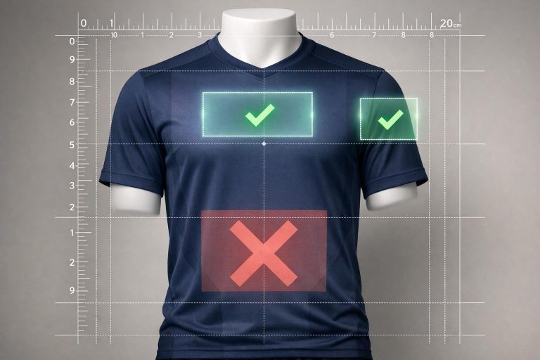
- Front Chest: Ideal for large, central team logos or wordmarks.
- Upper Back: Great for smaller logos or secondary branding.
- Left Chest: A classic choice for crests or brand logos, highly recognizable.
- Sleeves/Shoulders: Perfect for sponsor logos or league badges.
- Common Mistakes to Avoid:
- Avoid placing logos on seams, zippers, or buttons to prevent distortion.
- Size logos appropriately for different jersey sizes – one size does not fit all.
- Don’t overcrowd multiple logos in one area; spread them out for balance.
- Sport-Specific Tips:
- Soccer: Left chest for team logos, center front for sponsors.
- Basketball: Front center for team logos, shoulders for sponsors.
- Baseball: Left chest for primary logos, avoid placing designs over buttons.
- Final Steps Before Production:
- Review mockups for alignment, spacing, and clarity.
- Use templates to ensure logos stay within printable areas.
- Get feedback from key stakeholders and confirm all details before approval.
Key takeaway: Thoughtful logo placement enhances visibility, maintains balance, and ensures your jerseys represent your team with professionalism and style. Follow these tips to avoid costly mistakes and create jerseys that stand out on game day.
Every T-Shirt Placement Explained. DTF, Screen Printing, and Heat Pressing Guide
sbb-itb-4d95ad3
Where to Place Logos on Jerseys
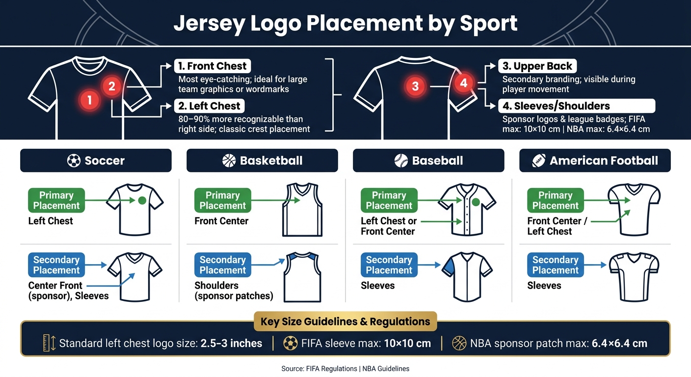
Jersey Logo Placement by Sport: Where to Place Your Logo
Logo placement on jerseys depends on the sport, jersey style, and the number of logos being used. Each placement area offers its own advantages for visibility and design appeal. Here are four key spots to consider:
Front Chest Placement
The center chest is the most eye-catching location. It’s the first area people notice, making it perfect for showcasing large team graphics or wordmarks. Because of its prominence, designs here should be clean and uncluttered. Overcrowding this space can reduce the impact of each element.
Upper Back Placement
The upper back serves as an excellent secondary spot. As players move – whether they’re running, driving to the hoop, or sprinting around bases – this area remains visible to fans, coaches, and cameras. It’s ideal for smaller logos, event branding, or secondary team identifiers, as it doesn’t compete with the player’s name and number below.
Left Chest Placement
The left chest is a classic choice, often reserved for team crests or brand logos. This placement is common in sports like soccer, baseball, and v-neck soccer jerseys. Studies show that logos on the left chest are 80–90% more recognizable compared to the right side. It offers a professional and timeless look without overwhelming the jersey’s design.
Sleeve or Shoulder Placement
Sleeves and shoulders are popular for sponsor logos, league badges, or secondary marks. These areas add visual interest while maintaining a clean overall design. For example, FIFA restricts sleeve logos to a maximum size of 10 x 10 cm, and the NBA limits sponsor patches to about 6.4 x 6.4 cm. These size guidelines ensure logos are noticeable but don’t disrupt the jersey’s balance.
| Sport | Primary Placement | Secondary Placement |
|---|---|---|
| Soccer | Left chest | Center front (sponsor), sleeves |
| Basketball | Front center | Shoulders (sponsor patches) |
| Baseball | Left chest or front center | Sleeves |
| American Football | Front center / left chest | Sleeves |
Logo Placement Mistakes to Avoid
Even the best-designed logo can lose its appeal if it’s placed poorly on a jersey. Here are some common mistakes teams make – and tips to avoid them.
Keep Logos Away from Seams, Zippers, and Buttons
Placing logos over seams, zippers, or buttons is a big no-no. These uneven surfaces can distort the design, making the logo look off. Over time, constant movement around seams can cause prints or embroidery to crack and peel faster than they would on a smooth surface. Plus, heavy prints in areas with a lot of motion can create discomfort during play and wear down quickly. Stick to flat, stable parts of the fabric and avoid areas with structural elements or high-stretch zones.
Size Logos to Fit the Jersey
Once you’ve chosen a flat surface for your logo, the next step is to size it correctly. Oversized logos can restrict airflow and look bulky, while logos that are too small might be hard to read. For most jerseys, standard left chest logos are sized at 2.5 to 3 inches, which strikes a good balance.
It’s also important to avoid using a one-size-fits-all approach for logos across different jersey sizes. A logo that looks perfect on an adult large jersey might appear overpowering on a youth small. Adjust the logo size based on the garment size to maintain a balanced and professional look. Proper sizing ensures the logo complements the jersey rather than overwhelming or underwhelming it.
Don’t Crowd Multiple Logos Together
Spacing is just as important as placement and sizing. Crowding multiple logos in one area can make the design feel cluttered and diminish their impact. Sponsor logos and secondary logos should enhance the overall look, not compete with each other.
To keep the design clean, give each logo its own space. Spread them across different areas of the jersey – such as the front chest, left chest, and sleeves – instead of grouping them all together. A well-spaced layout not only looks more polished but also ensures the design stands out, even from a distance.
Adjusting Logo Placement for Different Jersey Styles
Not all jerseys are designed the same way – each sport has its own unique approach to logo placement. Consider these guidelines to match your jersey style before finalizing your design mockup.
Basketball and Soccer Jerseys
For soccer jerseys, tradition dictates that the team logo is placed on the left chest, directly opposite the kit manufacturer’s logo. The primary sponsor logo is centered on the front, while secondary sponsors are usually positioned on the sleeves or back. This layout is a well-established standard, and straying from it can make the design feel out of place.
Basketball jerseys follow a different setup. The team logo is typically placed at the front center, either above or below the player’s number. Sponsor logos are often located on the top shoulders. Since the player’s number is a dominant feature on basketball jerseys, the team logo must complement it without creating visual competition. Striking a balance between the logo, the number, and sponsor marks is key – overcrowding these elements can make the design feel overwhelming. Some basketball leagues also allow additional logos on the shorts, so be sure to check specific league regulations.
Baseball and Softball Jerseys
Custom reversible button-down baseball jerseys present a unique challenge due to their design. Avoid placing logos along the center front, as the button alignment can disrupt the design. Instead, the left chest is ideal for the primary team logo, ensuring a balanced and cohesive look.
Sleeves are another excellent option for logos. They naturally draw attention during movements like pitching, throwing, and batting. However, sleeve logos should remain simple and appropriately sized – complex designs can stretch and distort during play. Additionally, chest logos should be positioned high enough to stay visible when jerseys are tucked into pants. This small detail often gets overlooked but makes a noticeable difference on the field.
Reversible or Sleeveless Jerseys
Custom reversible basketball practice jerseys demand logos that work seamlessly on both sides, even against contrasting backgrounds. High color contrast is a must – a logo that stands out on a dark navy side might fade into a white or light-colored reverse. Sublimation printing is the go-to method for these jerseys since it embeds the design into the fabric. This ensures durability, prevents cracking or peeling, and keeps the material lightweight.
For sleeveless jerseys, commonly seen in basketball, the absence of sleeves limits the available space for design elements. Keep the layout on the front clean and uncluttered. Allow enough breathing room between the logo, player number, and any additional details to avoid a crowded appearance. This approach ensures the design remains visually appealing and functional.
Steps to Approve Your Jersey Design Mockup
Before you send your jersey design to production, taking the time to review it thoroughly can save you from costly mistakes down the line. Think of this as your final quality check to ensure everything looks and fits as intended.
Check Alignment and Spacing
Start by checking that every logo is placed exactly where it should be. For instance, if you have a front chest logo, confirm it’s centered horizontally between the side seams and positioned evenly – typically about 2–3 inches below the collar for adult sizes, with adjustments made for youth sizes. On the upper back, make sure the logo is properly centered above the player’s name and number.
Next, ensure spacing is consistent across different sizes. Review mockups for Youth, Adult Small, and Adult XL to confirm that alignment holds up across the board. Leave a buffer of 0.5–1 inch of clear space around each logo to avoid crowding seams or armholes.
Use a Placement Template
Once alignment and spacing are checked, use a placement template to guarantee accurate positioning. A placement template outlines the jersey’s printable areas and highlights zones to avoid, like seams, zippers, buttons, collar edges, and armholes. Overlaying your design on this template ensures that all logos stay within safe printing zones and won’t be distorted or cut off during production.
This step is especially important for fully sublimated jerseys, where the entire surface is printable. Without a template, logos might unintentionally end up on side panels or underarm areas, where they could be stretched or partially hidden. Ask your uniform provider for an official template file, import it into your design software, and double-check that no part of your design crosses bleed or trim lines. Some providers, like Wooter Apparel, include measurement markers in their proofs, making it easier to work with precise distances instead of estimates.
Review the Final Mockup
After confirming placement, perform a detailed final review. Zoom in (200–400%) to check for clarity in all logos – request high-resolution or vector files if you notice any pixelation. Double-check that all colors match your brand standards, as even small differences on screen can stand out on fabric. Also, ensure no logos have been stretched or compressed to fit the design, as distorted proportions are easy to overlook but glaringly obvious on the finished product.
Share the final mockup with key stakeholders, such as coaches, player representatives, and sponsors. Set a clear deadline for feedback – 48 to 72 hours is usually enough – and collect all revisions in one round. Send a single, consolidated list of changes to your supplier. Once everyone signs off, save the final approved mockup along with a written record of key specs like chest logo width, back logo position, and sleeve logo distance from the shoulder seam. This documentation simplifies future reorders and provides a reference if the finished jerseys don’t match expectations.
Conclusion: Getting Logo Placement Right on Your Team Jerseys
Logo placement can be the difference between a jersey that looks thrown together and one that screams professionalism. When logos are properly centered, sized to fit the design, kept away from seams, and reviewed through mockups, the final product becomes a true reflection of your team’s identity.
These steps – covering placement, sizing, and mockup approval – are universal. Whether you’re outfitting a local youth league or a competitive travel team, following these basics helps avoid costly mistakes and ensures your team looks its best on game day.
Partnering with the right uniform provider makes this process even smoother. For example, Wooter Apparel offers free custom design services, allowing you to collaborate with their designers on logo placement. They use production-ready sublimation templates and vector artwork to deliver precise results. Plus, their Pantone color matching ensures your logo colors come out exactly as intended on fabric.
"The creative work that is the basis of the design of your Wooter apparel uniform is the same we use for our elite teams." – Wooter Apparel
Once your design is finalized, Wooter stores the artwork for future reorders, making it easy to maintain consistent logo placement season after season. With a 4.9/5 rating from 1,366 reviews, Wooter Apparel has earned a reputation for delivering jerseys that match the approved designs, giving teams peace of mind before production even starts.
FAQs
How do I choose between a front chest and left chest logo?
The placement of logos or branding on a jersey often depends on the sport, branding objectives, and league regulations. The front center is typically reserved for primary team logos or major sponsors because of its high visibility. Meanwhile, the left chest is a common spot for team crests or secondary branding, leaving the center area uncluttered. It’s crucial to check league rules regarding size and placement to ensure everything aligns with official guidelines.
What’s the easiest way to size logos for youth vs. adult jerseys?
To adjust logo sizes for youth and adult jerseys, scale designs proportionally based on torso size. Generally, youth logos are about 10–30% smaller than adult versions. Here’s a quick guide:
- Left chest logos: 2.5–3 inches wide for youth, 3–4 inches for adults.
- Back logos: 8–10 inches wide for youth, 10–14 inches for adults.
Always work with vector file formats to ensure the logos remain sharp and clear, no matter the size.
How can I confirm my logos won’t get cut off or distorted in production?
To make sure logos stay sharp and intact, always use high-quality vector files like AI, EPS, PDF, or SVG. These formats prevent pixelation and maintain clarity. Position designs at least 0.5–1 inch away from seams, zippers, or pockets to avoid distortion.
For accuracy, test placement using physical templates or samples worn by a model to see how the fabric moves. Additionally, perform wash tests to ensure the design holds up and doesn’t shrink. During production, heat-resistant tape can be a handy tool to keep everything securely in place.